Perched atop the city part of the Strahov Monastery compound and the lush surrounding Petrin Hill, the Strahov Brewery is a delightful find in the bustling city of Prague. Just steps from the massive Prague Castle complex, the microbrewery serves about ten variations of St. Norbert beer (3 all year round and 7 seasonally) and the brews are all delicious and fresh with crisp hints of unique flavors.
This brewery has an eye -pleasing beer menu. It introduced five different beers with color, ABV (Alcohol By Volume), IBU (International Bittering Units) scale, description, hops, availability, price, and food pairing. Much like the positioning map beer menu at the Fairmont Chateau Lake Louise, the Strahov Brewery menu eased the burden of my decision-making.
Interestingly, I found that everyone ordered Amber Larger, Dark Larger, or IPA. These three beers were placed on the left side of the menu and each one was supported by its own comment: representing 70% of the production, award winning, or brew master recommended. I noticed that a vertical line in the middle of the menu plays a role of the “visual barrier” and therefore the two beers on the right side did not attract attention. The menu designer used mere categorization effect smartly.
What is the effect of option categorization on choosers’ satisfaction? A combination of field and laboratory experiments reveals that the mere presence of categories, irrespective of their content, positively influences the satisfaction of choosers who are unfamiliar with the choice domain. This “mere categorization effect” is driven by a greater number of categories signaling greater variety among the available options, which allows for a sense of self‐determination from choosing. This effect, however, is attenuated for choosers who are familiar with the choice domain, who do not rely on the presence of categories to perceive the variety available.
In fact, thanks to the fact that for decades smokers just didn’t care where they threw them, there are very likely cigarette butts in the Amazon rain forest, at the North Pole, and on the fast-disappearing Ross Ice Shelf in Antarctica. Practically the only place they are difficult to find is where they belong – in the trash bin.
At the Portobello Road market in London, bins are installed for those who want to throw gums and cigarette butts. For an unidentified reason, these bins have baby faces. As research suggests that large, round eyes, high eyebrows, and a small chin yielded the perception of a babyish facial appearance.
Since baby face or Kindchenschema (baby schema) is “related to the vulnerable nature of a living entity, it elicits responses from adults that increase the infant’s chance of survival. These include increased attention to and protection of the helpless infant (Brosch, Sandder, and Scherer 2007; Lorenz 1943) and increased carefulness and caretaking behavior (Sherman, Haidt, and Coan 2009). (Nenkov et al. 2014, pg. 326)”
Although adding a human face to the tip jar backfires, having a baby face even contributes to the success of high-ranking Black executives. Designing cigarette bins like cute babies must be effective to collect cigarette butts. I wish similar bins are installed in other markets and cities as well to stop cigarette butt litter.
Prior research suggests that having a baby face is negatively correlated with success among White males in high positions of leadership. However, we explored the positive role of such “babyfaceness” in the success of high-ranking Black executives. Two studies revealed that Black chief executive officers (CEOs) were significantly more baby-faced than White CEOs. Black CEOs were also judged as being warmer than White CEOs, even though ordinary Blacks were rated categorically as being less warm than ordinary Whites. In addition, baby-faced Black CEOs tended to lead more prestigious corporations and earned higher salaries than mature-faced Black CEOs; these patterns did not emerge for White CEOs. Taken together, these findings suggest that babyfaceness is a disarming mechanism that facilitates the success of Black leaders by attenuating stereotypical perceptions that Blacks are threatening. Theoretical and practical implications for research on race, gender, and leadership are discussed.
When we are curious about value of an unknown object, we often consider how many people surround it. If it is alone, we believe it is expensive. If it is surrounded by many others, we believe it is cheap. This is because, according to O’Guinn’s et al. (2015), as the social density of a given space increases, “inference of the subjective social class and income of people in that space” fall. Although we like different degrees of crowdedness (D&Department in Tokyo) and even view the same degree of crowdedness differently (Kronen Vanlose in Copenhagen), crowdedness decreases the value of a product.
This article is about social space and material objects for sale within that space. We draw primarily on Goffman’s (1971) concepts of use space and possession territories to predict that as the social density of a given space increases, inferences of the subjective social class and income of people in that space fall. Eight studies confirm that this is indeed the case, with the result holding even for stick figures, thus controlling for typical visual indicators of social class such as clothing or jewelry. Furthermore, these social class inferences mediate a relationship between social density and product valuation, with individuals assessing both higher prices and a greater willingness to pay for products presented in less crowded contexts. This effect of inferred class on product valuation is explained by status-motivated individuals’ desire to associate with higher-status people. To the best of our knowledge, this research is the first to reveal the link between social density, status inferences, and object valuations. As such, it makes a novel contribution to what has come to be known in sociology as the topological turn: a renewed focus on social space.
Then, could we apply the same logic to stores where products are surrounded by other products? In other words, does “product crowdedness” decrease product value as well? This is an important question as stores display items in different ways.
Some stores display various items with a lot of stocks. For instance, at Annam Gourmet, Ho Chi Minh, only a few cans of sea food are on the shelf space with multiple stocks.
Other stores display only few items with few stocks. For instance, Decium, a Canadian cosmetic company introduces a few items without showing their stocks.
According to Wikipedia, doodles are simple drawings that can have concrete representational meaning or may just be composed of random and abstract lines. However, all doodles are not same. Some doodles are hedonic and others are utilitarian.
Hedonic doodles are personal. They are drawings about interpretation of subjective experience, mostly for fun. For instance, I doodled below to remember what I enjoyed while I stayed in Shenzhen, China. I used Mobike, drank HeyTea and wine, took a BYD electronic taxi, visited Macau by ferry, and ate beef, crab, sea food, and noodle each in different places. Its road was wide and its hot water dispenser attracted my attention.
Different from hedonic doodles, utilitarian doodles have practical purposes. They are drawings about objective information, mostly for effective communications with others. For instance, I drew the facet, the shower head, the top bowl, and the shower booth in my bathroom with their sizes and heights when I wanted to replace them with new ones (below).
I like doodling, but I am often intimidated when doodling because of the pressure that I should doodle perfectly. However, I recently learned that if I clarified the purpose of doodling and choose either hedonic or utilitarian, I was not intimidated. Probably, I am not the only one who has a mixed feeling about doodling. Who knows if I keep doodling now and draw a professional graffiti like the one I met in Sao Paulo, Brazil? 🙂
Consumer researchers’ growing interest in consumer experiences has revealed that many consumption activities produce both hedonic and utilitarian outcomes. Thus, there is an increasing need for scales to assess consumer perceptions of both hedonic and utilitarian values. This article describes the development of a scale measuring both values obtained from the pervasive consumption experience of shopping. The authors develop and validate the scale using a multistep process. The results demonstrate that distinct hedonic and utilitarian shopping value dimensions exist and are related to a number of important consumption variables. Implications for further applications of the scale are discussed
Each commercial space has its own purpose. At a restaurant, we eat food. At a bar, we drink beer. At a cafe, we take a coffee. We rarely drink beer at cafes and we do not ask for coffee at bars. As Google Map shows, cafes are not listed when we search for bars. Similarly, bars do not appear when cafes are searched for.
However, some commercial spaces in Buenos Aires, Argentina serve more than one purpose. For instance, Hobbs Palermo looks like a restaurant. However I ordered a bottle of alcoholic beverage late night and, at a day time, I noticed a person who drank only a bottle of Coca Cola. It is a restaurant, bar, and cafe.
Bar El Federal (or the Federal Bar) is even called as cafe bar. Located in the old downtown of Buenos Aires, it is an authentic pub with wooden interiors and antique bottles. However, some people eat sandwich, others drink beers and even the others read books under the dim light.
We can eat pizza at Starbucks. We can drink coffee at Michelin restaurants. If we overcome the thought that one space should be used only for a single purpose, we will be able to use space creatively.
In order to spice up our daily communication, we often humanize what electronic devices do. For instance, we say, our mobile phone is “stupid” or our storage space “gains weight.” This “anthropomorphism” is defined as the attribution of human traits, emotions, or intentions to non-human entities. According to Wikipedia, it has ancient roots as storytelling and artistic devices, and most cultures have traditional fables with anthropomorphized animals as characters.
However, there is another way to spice up our daily communication. We can mechanize what humans do. For instance, we say, we need to “upgrade” our brains or we want to go to bed to “recharge.” This “mechanomorphism” is a conception of something (as the universe or a living creature) as operating mechanically or to be fully accounted for according to the laws of physical science. Differently from anthropomorphism, mechanomorphism seems to be more popular among tech-savvy younger generation.
In Hong Kong, I met an excellent example of mechanomorphism. A chalkboard sign outside a coffee shop says “Another coffee is calling you.” Then there are two options: “Remind me every 5 minutes” or “Msg my brain to do it.”
This paper explores the ambiguity of the “human machine”. It suggests that anthropomorphism results from a “default schema” applied to phenomena, including machines, that a perceiver finds otherwise inexplicable. Mechanomorphism, the attribution of machine characteristics to humans, is a culturally derived metaphor that presently dominates cognitive science. The relationships between anthropomorphism and mechanomorphism pose a special difficulty for the question, “Can machines think?” Does a positive response reflect a cognitive bias on the part of the perceiver or a genuine attribute of the computer? The problem is illustrated for Turing’s “imitation game” for thinking machines, and a strategy for constraining anthropomorphic attributions is proposed.
Background Designers often consider consumer design evaluations. However, whether consumer design evaluations are trustworthy has been rarely discussed. We propose that consumers equate the concept of design with the concept of uniqueness, which suggests that their design valuations are context dependent and unstable.
Methods We test our proposition by conducting one pilot study and three main studies. The pilot study examines which criteria consumers consider when evaluating a design. The three main studies test whether consumer design evaluations depend on the situation and unique products.
Results The results of the pilot study and three main studies demonstrate that subjects evaluated design using aesthetic and functional attributes and their design evaluations were based on the attributes that are not popular in a specific situation.
Conclusions This study contributes to the academic discussion of whether consumer design evaluations are stable. Our findings demonstrate that consumers construct design evaluations on the spot. Therefore, designers who have accumulated professional experience and knowledge, are recommended to follow their own design evaluations rather than the voice of customers.
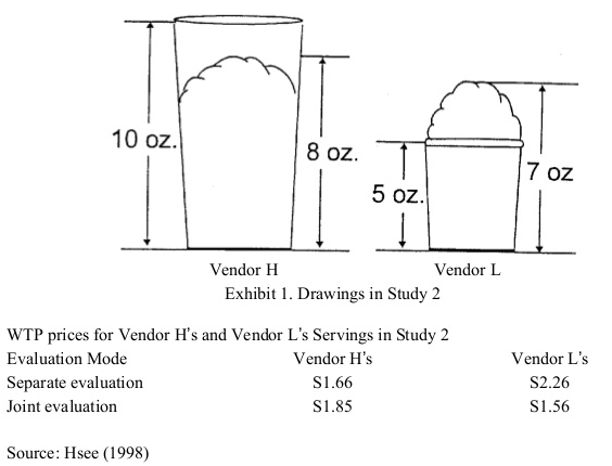
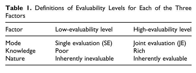
Background People often choose between two competing options: option A (aesthetically superior but functionally inferior) and option F (functionally superior but aesthetically inferior). We hypothesize that people like option A more when it is presented with option F (joint evaluation) than when presented alone (separate evaluation) because people find aesthetic attributes are hard to evaluate. We further hypothesize that this effect holds neither for option F nor among experts.
Methods We briefly reviewed two cases in the Korean automobile industry and then conducted two experiments in China. In the first experiment, we compared preferences about two USB drivers between two evaluation modes. In the second experiments, we compared preferences about two basketball shoes in the joint evaluation between novices and experts.
Results We found from the first experiment that participants increased their preferences for option A in the joint evaluation compared to the separate evaluation. Their preferences for option F did not differ between the two evaluation modes. In the second experiment, only novices preferred option A over option F in the joint evaluation. Experts did not prefer option A over option F.
Conclusions Our findings contribute to the scholarly discussions about form and function. They also provide practical implications to designers and marketers who need to sell aesthetically pleasing products. This work goes beyond design marketing interface to add evaluation mode as an intervention to nudge people to choose aesthetically pleasing products, which has been barely discussed in behavioral economics.
Joo, J., Lee, A. J., & Park, J. H. (2018). A New Framework of Design Management and Three Additional Requirements To Apply Design Management to Korean Companies: Experience Design, Collaboration, and Trial and Error. Design Convergence Study, 17(6), 145–165.
The present research has two objectives. First, we introduce a new framework of design management proposed by Heather Fraser, the Director of Rotman Designworks. It comprises three gears: (1) user understanding, (2) concept visualization, and (3) strategic business design. Second, we investigate the key requirements that are necessary to apply the new framework to Korean companies. We collected fifty reports about the five special lectures from a new product development course at a university in Korea. These lectures were given by three designers and two product managers. We used interpretative analysis and followed three process of qualitative analysis of transcription, coding, and theme discovery. We derived specific requirements for applying design management to Korean companies: (1) experience design, (2) collaboration, and (3) trial and error. We introduced a novel design management framework and clarified the requirements how to successfully apply it to Korean companies. These findings imply that, firstly, executives and practitioners need to improve mutual communication and, secondly, corporations and agencies respect each other in their partner relationships.
“In sum, our review of the past research on design management shows various approaches introducing design into chronological business management and supporting successful business cases. However, it focuses design management in the strategic stage; it does not provide specific assistance with practitioners who are interested in applying design management in their tasks. Therefore, we introduce a model for practitioners to undertake management planning efficiently” (pg. 150)
“…we should accept the meaning of designing the customer experience, which includes the company’s identity, rather than emphasizing the product’s design-centered simple styling. … respect is required in partner relationship of corporations and agencies. In order to activate design management, the corporation’s interior decision-making and organization structure should change” (pg. 162)
Piknic, a unique building in Seoul, hosted an exhibition of a British designer Jasper Morrison. The title of the exhibition was THINGNESS.
For the hundredth anniversary of the Bauhaus, piknic presents an exhibition offering a general introduction to the world of British designer and modernist interior Jasper Morrison, who has created a sensation with his “Super Normal” philosophy. Born in London in 1959 and studied Design at Kingston Polytechnic and the Royal College of Art in London, with a one-year scholarship to the HDK design school in Berlin in 1984. Morrison is considered one of the most important designers of our era, holding supreme status in his field since establishing his studio in 1986 at the age of 27 and working with such distinguished companies such as Vitra, Littala, Muji, and Samsung. Focusing in everything from small daily essentials like knives and forks to the public transportation systems of cities, he places no limits on the areas where he works. As they share in the design journey of someone who has created a wide variety of objects related to human life, we hope all our visitors will find their answer to the question of what constitutes a “Good Thing” – and what makes a “Good Life.”
I participated in a guided tour led by a female “docent.” Although I did neither plan for it nor pay for it, she shared with us interesting story about each work. Listening to why and how each work has been completed enriched the whole tour experience.
He has made a wide variety of products including chair, lighting, kitchen utensil, and home care products. My favorite was the cork side table. Although the docent highlighted the functional feature of the cork which naturally repels termites, I was simply fascinated by how it looks. It reminded me of a wine cork.
This article focuses on somatic experience–not just the process of thinking bodily but how the body informs the logic of thinking about art. We examine the links between embodiment, movement, and multisensory experience insofar as they help to elucidate the contours of art appreciation in a museum. We argue that embodiment can be identified at two levels: the phenomenological and the cognitive unconscious. At the first level, individuals are conscious of their feelings and actions while, at the second level, sensorimotor and other bodily oriented inference mechanisms inform their processes of abstract thought and reasoning. We analyze the consumption stories of 30 museum goers in order to understand how people move through museum spaces and feel, touch, hear, smell, and taste art. Further, through an analysis of metaphors and the use of conceptual blending, we tap into the participants’ unconscious minds, gleaning important embodiment processes that shape their reasoning.