Tag Archives: Curitiba

How to attract attention of pedestrians?

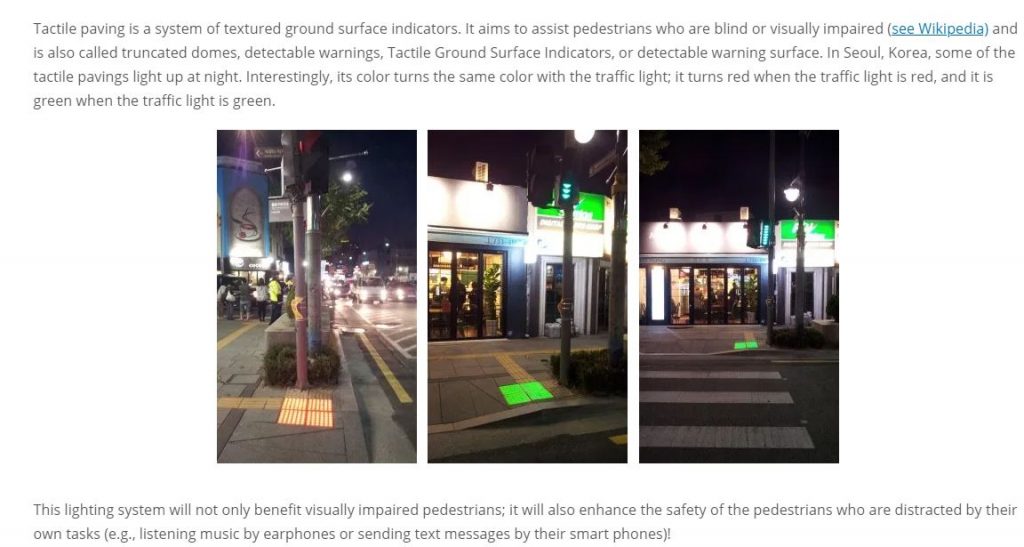
How could we make passing pedestrians stop and look at something? One solution is to apply technology. For instance, tactile pavings or tactile ground surface indicators tell them when to cross roads.

Another solution is to apply design. While I visited Curitiba in Brazil, I was always attracted by fire extinguishers. This is because they are located inside red-yellow squares painted on the ground.
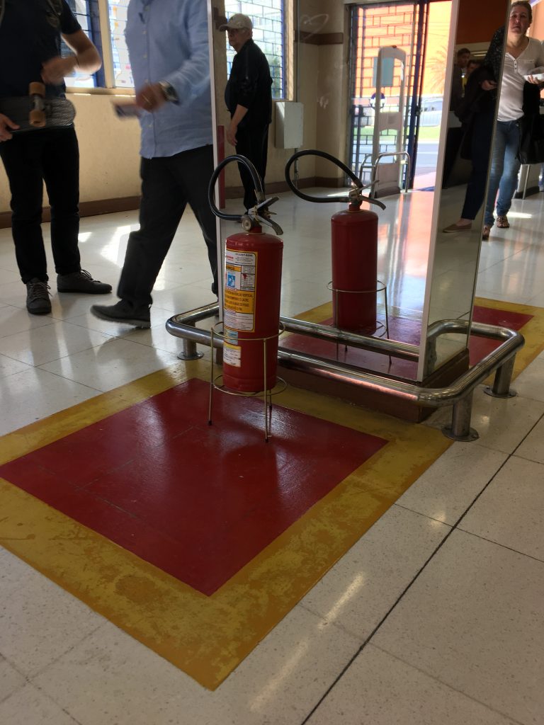
Interestingly, the same rule applies when fire extinguishers are above the ground. Red-yellow squares are painted on the ground even when fire extinguishers are hung on the wall.
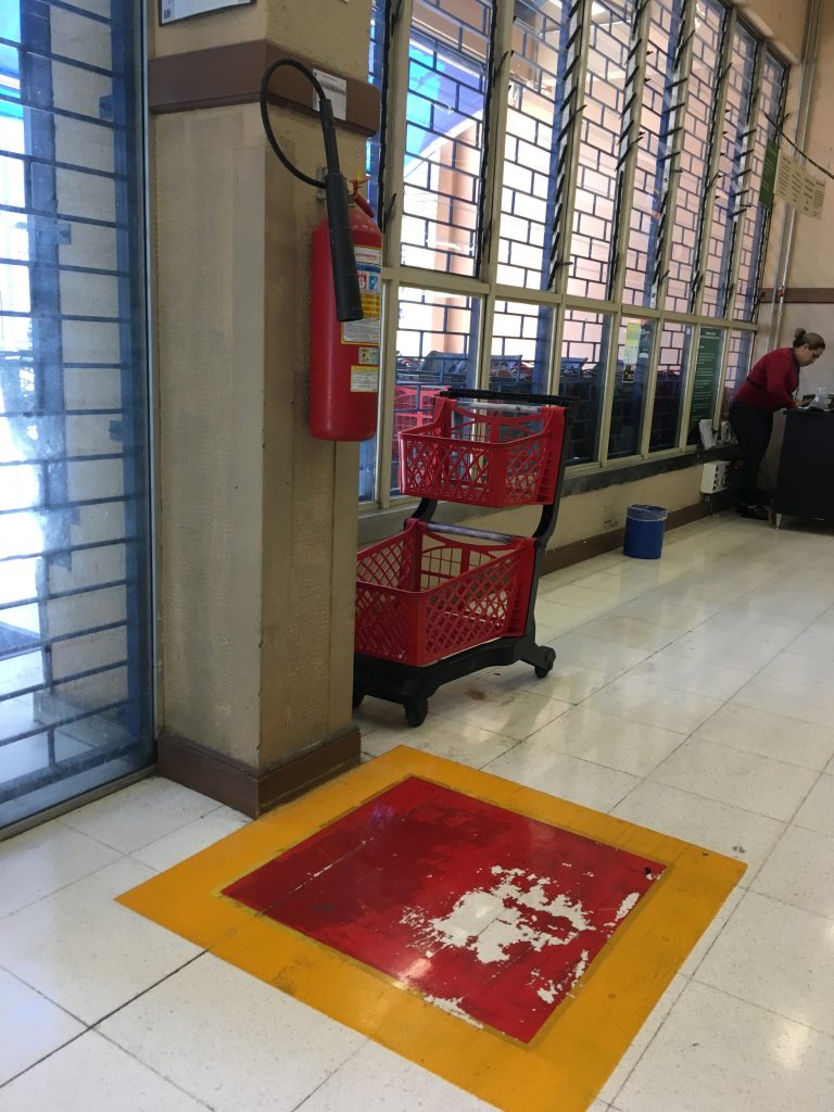
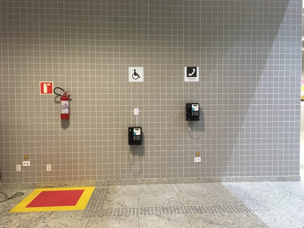
Design beats technology in Curitiba.

***

Reference

Labrecque, L. I., & Milne, G. R. (2012). Exciting red and competent blue: the importance of color in marketingJournal of the Academy of Marketing Science40(5), 711-727.

From beverages to consumer electronics, marketers are using color in innovative ways. Despite this, little academic research has investigated the role that color plays in marketing. This paper examines how color affects consumer perceptions through a series of four studies. The authors provide a framework and empirical evidence that draws on research in aesthetics, color psychology, and associative learning to map hues onto brand personality dimensions (Study 1), as well as examine the roles of saturation and value for amplifying brand personality traits (Study 2). The authors also demonstrate how marketers can strategically use color to alter brand personality and purchase intent (Study 3), and how color influences the likability and familiarity of a brand (Study 4). The results underscore the importance of recognizing the impact of color in forming consumer brand perceptions.
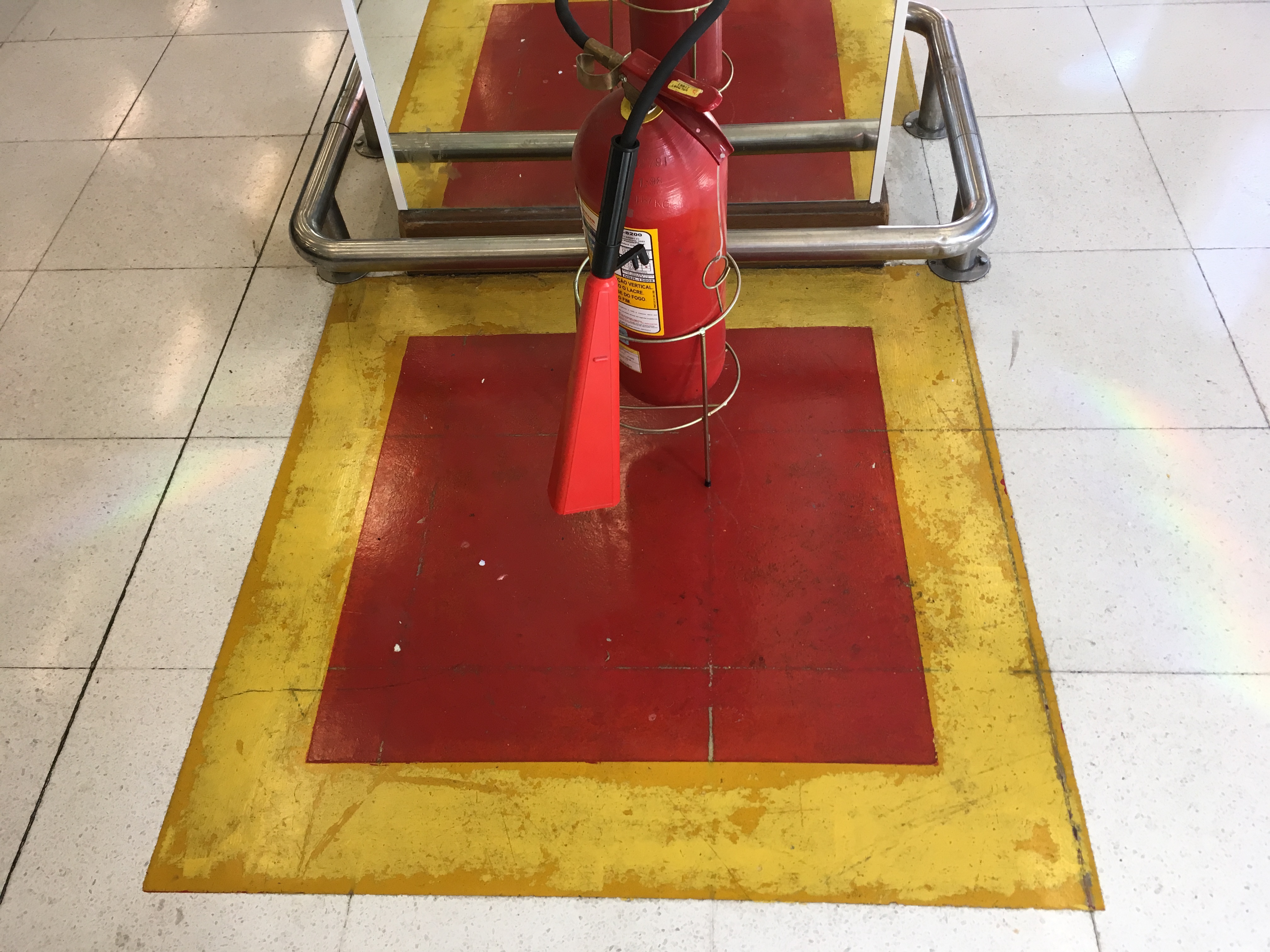
Curitiba has a sophisticated taste of design

I went on a business trip to Brazil and Argentina with a group of colleagues. We gave lectures, led workshops, joined guided tours, and made new friends along the way.

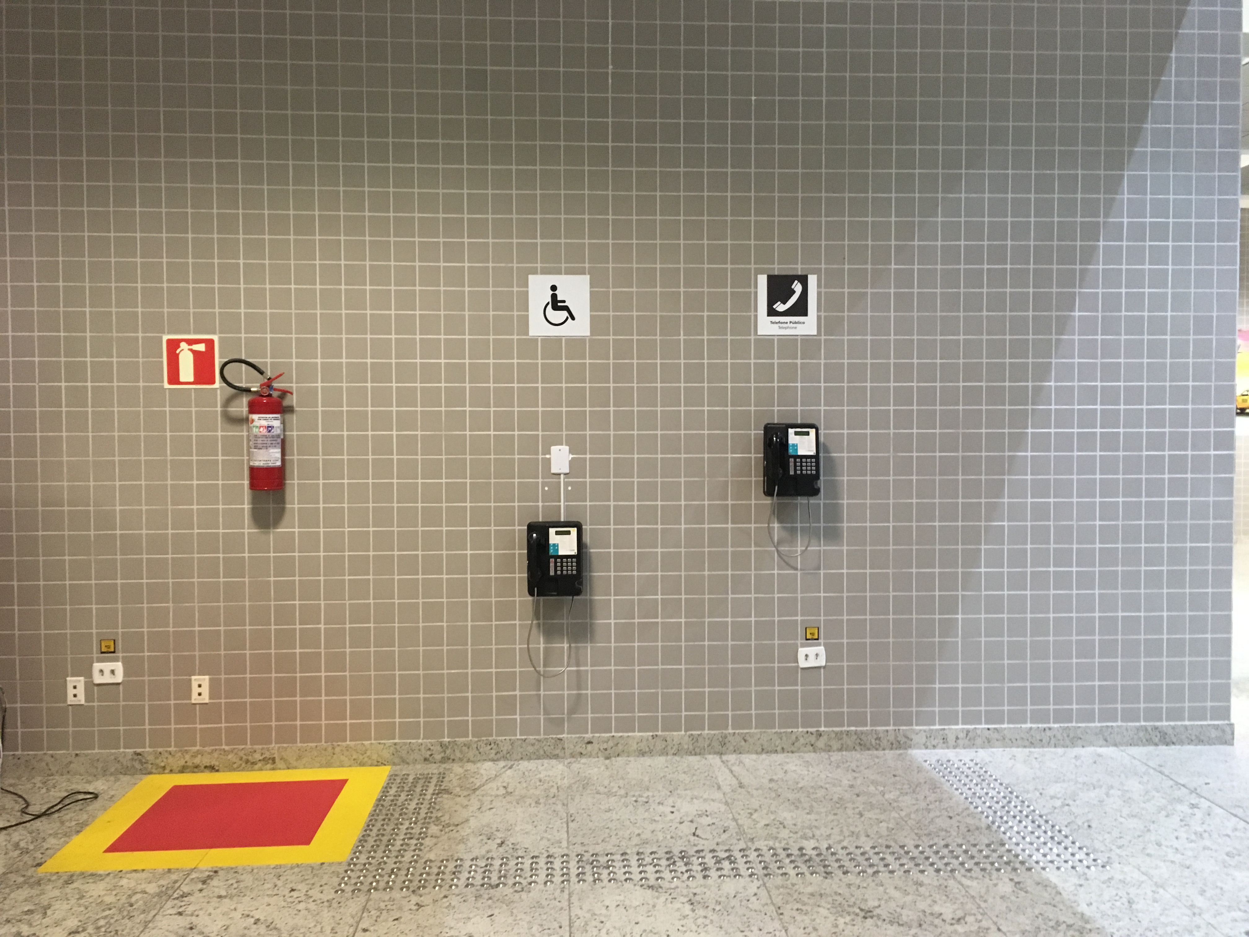
One thing that stood out to me was the airport in Curitiba, Brazil. At the airport, I noticed a fire extinguisher and two public phones mounted on a gray wall. At first glance, they resembled desktop icons. Upon closer look, I found that a red-and-yellow square box was painted beneath the fire extinguisher, and one phone was positioned lower than the other.

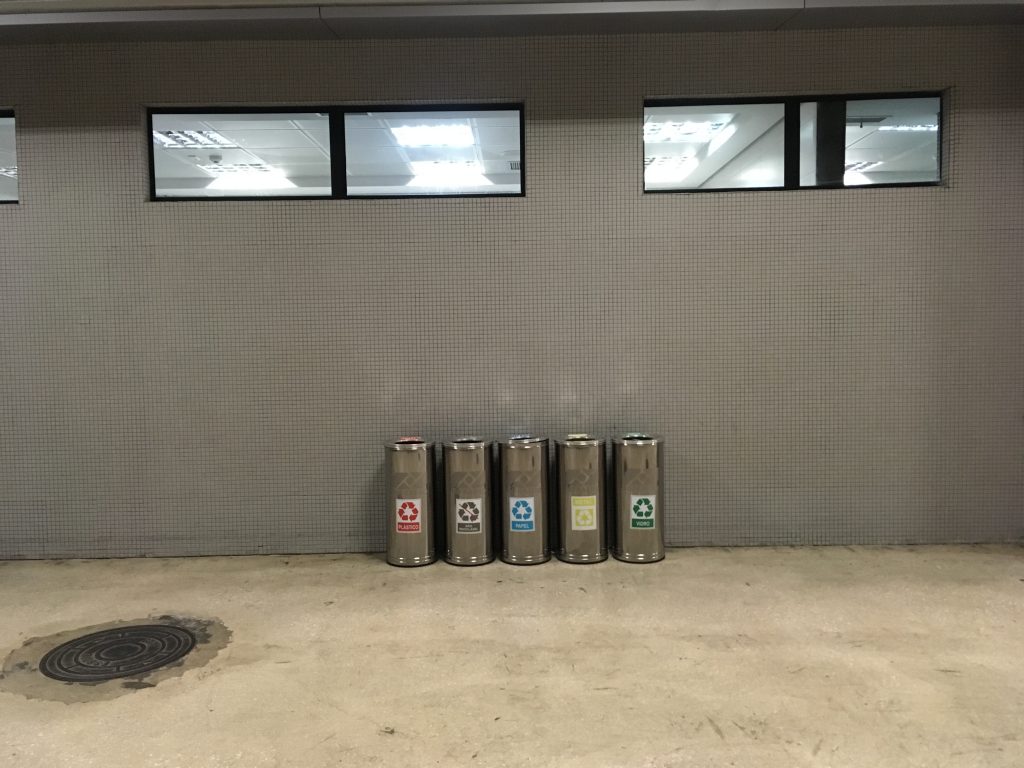
I also observed how Curitiba uses color to promote recycling. Public trash bins were divided into sections, each marked with a distinct color to encourage proper sorting. It became clear that someone in the city thoughtfully used color, shape, height, and arrangement—not as mere decoration but as a tool for communication.

***

Reference

Crilly, N., Moultrie, J., & Clarkson, P. J. (2004). Seeing things: Consumer response to the visual domain in product design. Design Studies, 25(6), 547–577.

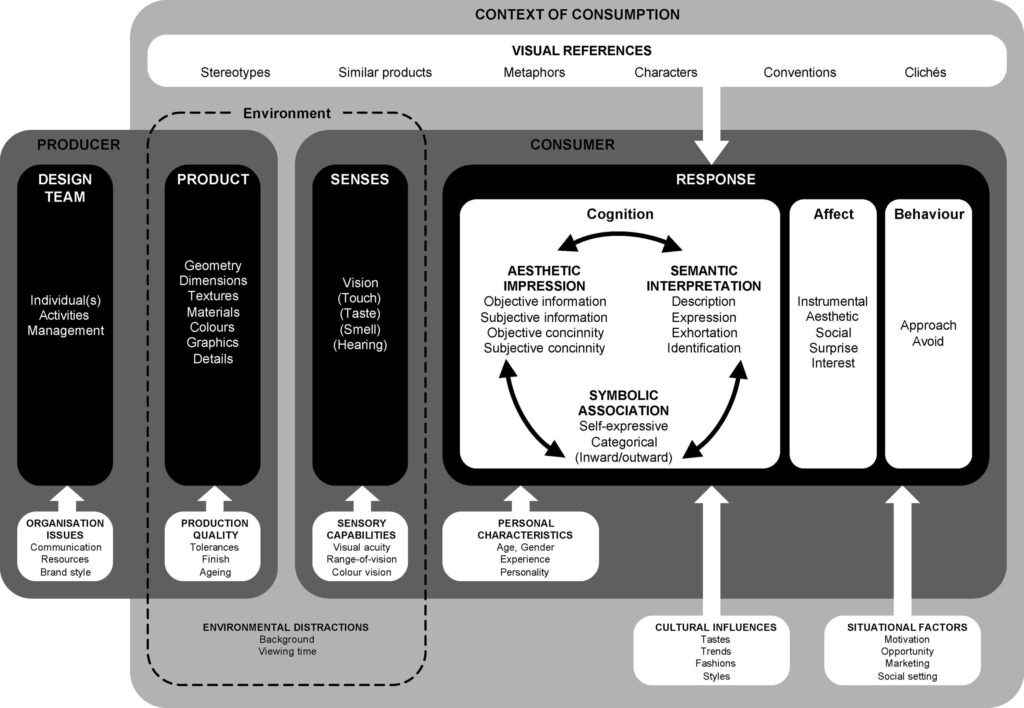
This paper discusses consumer response to product visual form within the context of an integrated conceptual framework. Emphasis is placed on the aesthetic, semantic and symbolic aspects of cognitive response to design. The accompanying affective and behavioural responses are also discussed and the interaction between cognitive and affective response is considered. All aspects of response are presented as the final stage in a process of communication between the design team and the consumer. The role of external visual references is examined and the effects of moderating influences at each stage in the process of communication are discussed. In particular, the personal, situational and cultural factors that moderate response are considered. In concluding the paper, implications for design practice and design research are presented.