Tag Archives: Sao Paulo

Empty space sparks creativity

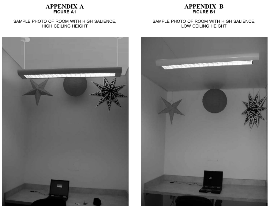
Space matters when we need creativity. According to research, when a ceiling is high, people become creative because a high (vs. low) ceiling primes the concept of freedom (vs. confinement). Similarly, Jump Associates has various types of cubicles for designers; “garage” cubicles are widely open for those who want to be creative, whereas “Zen rooms” are tiny small cubicles. Interestingly, Dev Patnaik, the founder of the Jump Associates, mentioned that US people prefer garage offices whereas Japanese clients like Zen rooms.

When I visited the design department at the University of Sao Paulo, one of the best universities in Brazil, I was shocked by its building. It has a huge empty space in the middle and has tons of bright, natural lights. I learned that empty space not only increases the perceived value of a product inside. It boosts the creativity of the people inside.

Inside the building, the walls allow people to write and erase easily, which also may enhance creativity.

Meyers-Levy, J., & Zhu, R. (Juliet). (2007). The Influence of Ceiling Height: The Effect of Priming on the Type of Processing That People Use. Journal of Consumer Research, 34(2), 174–186.

This article demonstrates that variations in ceiling height can prime concepts that, in turn, affect how consumers process information. We theorized that when reasonably salient, a high versus low ceiling can prime the concepts of freedom versus confinement, respectively. These concepts, in turn, can prompt consumers’ use of predominately relational versus item-specific processing. Three studies found support for this theorizing. On a variety of measures, ceiling height–induced relational or item-specific processing was indicated by people’s reliance on integrated and abstract versus discrete and concrete ideation. Hence, this research sheds light on when and how ceiling height can affect consumers’ responses.
Color marries between buttons and bulbs

We often write down something on the surface. For instance, a window says “this is a window” or a pedestrian crossing says “Look Right.” However, written, verbal information is easy to be ignored. Compared to verbal information, visual information attracts attention better.

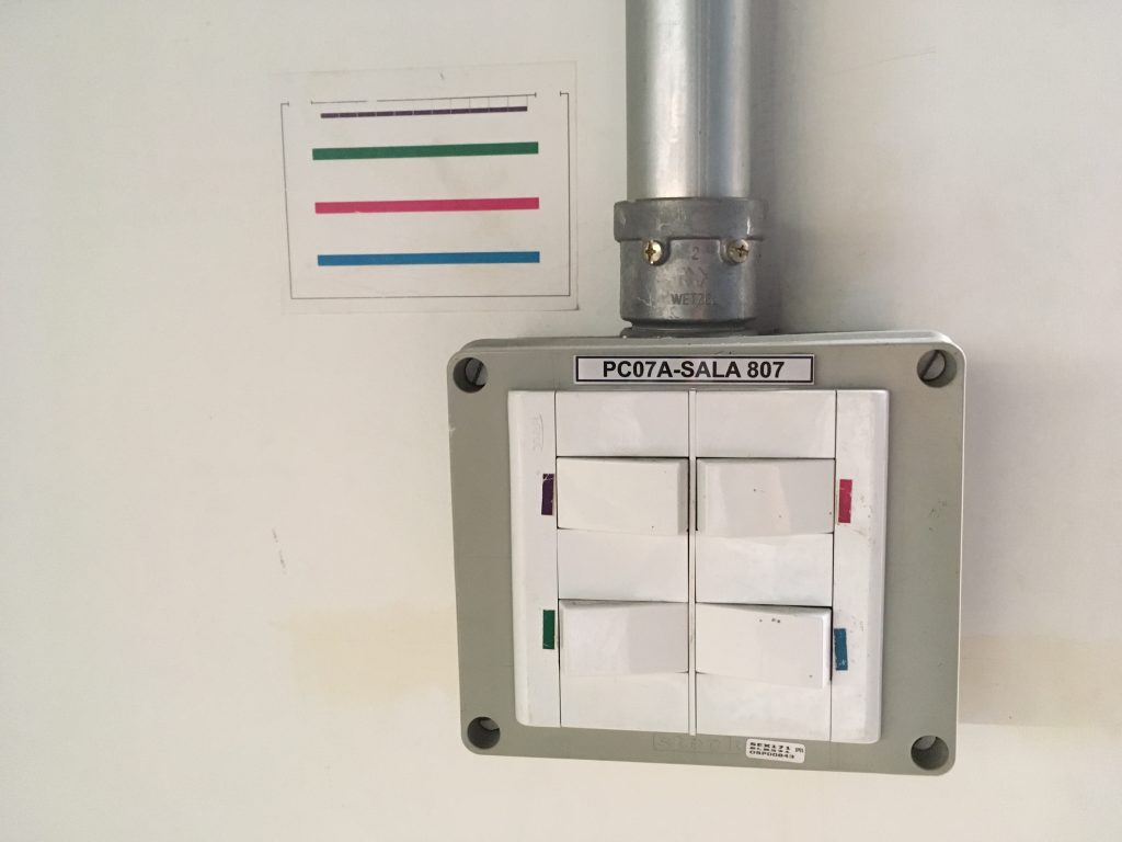
When I visited the design department at the University of Sao Paulo, one of the best universities in Brazil, I found a clever and clear, visual information in a classroom. The wide classroom has four lines of bulbs on the ceiling from the front row to the back end. Although there are four bulb buttons on the wall, the way buttons are placed does not align with the way bulbs are on the ceiling. Instead of writing down “the first row, … the last row,” they match buttons and bulbs through color.

Lurie, N. H., & Mason, C. H. (2007). Visual Representation: Implications for Decision Making. Journal of Marketing, 71(1), 160–177.

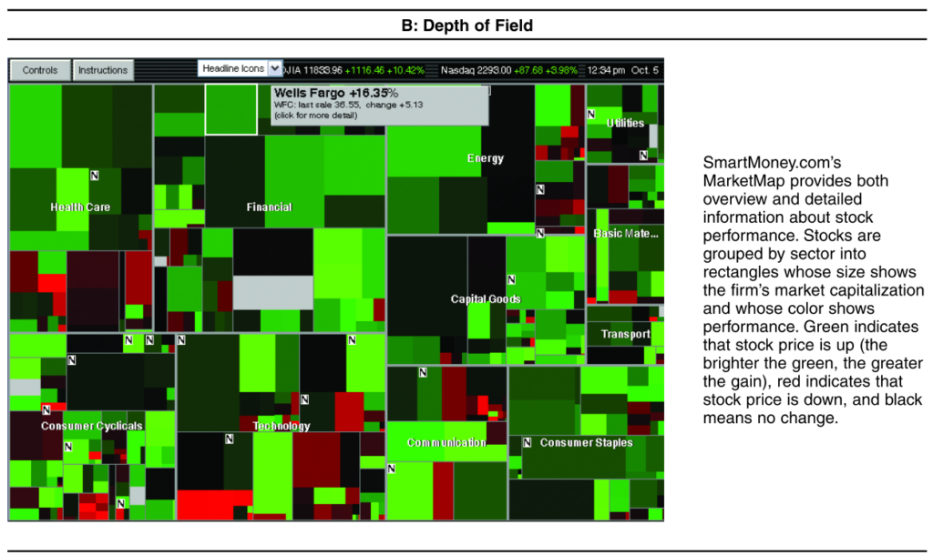
A large number of visualization tools have been created to help decision makers understand increasingly rich databases of product, customer, sales force, and other types of marketing information. This article presents a framework for thinking about how visual representations are likely to affect the decision processes or tasks that marketing managers and consumers commonly face, particularly those that involve the analysis or synthesis of substantial amounts of data. From this framework, the authors derive a set of testable propositions that serve as an agenda for further research. Although visual representations are likely to improve marketing manager efficiency, offer new insights, and increase customer satisfaction and loyalty, they may also bias decisions by focusing attention on a limited set of alternatives, increasing the salience and evaluability of less diagnostic information, and encouraging inaccurate comparisons. Given this, marketing managers are advised to subject insights from visual representations to more formal analysis.

Why do we doodle?

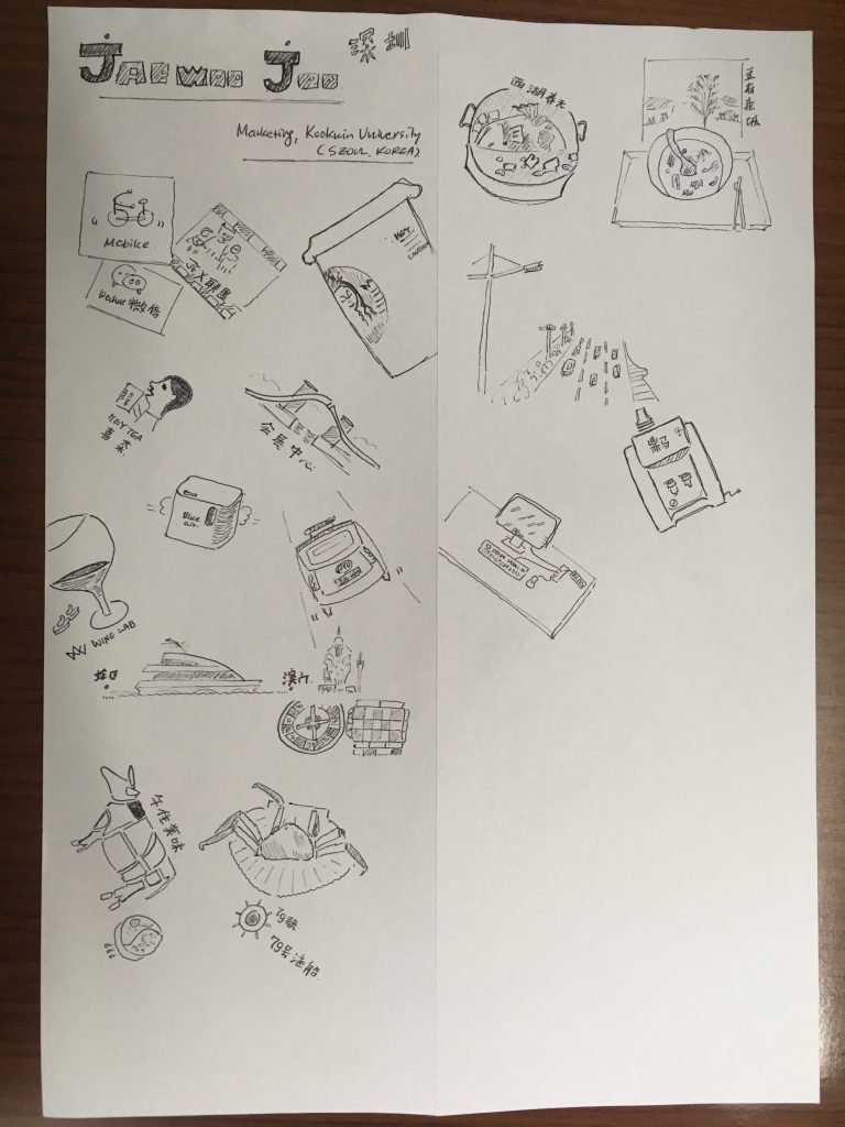
According to Wikipedia, doodles are simple drawings that can have concrete representational meaning or may just be composed of random and abstract lines. However, all doodles are not same. Some doodles are hedonic and others are utilitarian.

Hedonic doodles are personal. They are drawings about interpretation of subjective experience, mostly for fun. For instance, I doodled below to remember what I enjoyed while I stayed in Shenzhen, China. I used Mobike, drank HeyTea and wine, took a BYD electronic taxi, visited Macau by ferry, and ate beef, crab, sea food, and noodle each in different places. Its road was wide and its hot water dispenser attracted my attention.

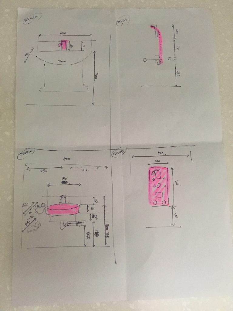
Different from hedonic doodles, utilitarian doodles have practical purposes. They are drawings about objective information, mostly for effective communications with others. For instance, I drew the facet, the shower head, the top bowl, and the shower booth in my bathroom with their sizes and heights when I wanted to replace them with new ones (below).

I like doodling, but I am often intimidated when doodling because of the pressure that I should doodle perfectly. However, I recently learned that if I clarified the purpose of doodling and choose either hedonic or utilitarian, I was not intimidated. Probably, I am not the only one who has a mixed feeling about doodling. Who knows if I keep doodling now and draw a professional graffiti like the one I met in Sao Paulo, Brazil? 🙂

Reference

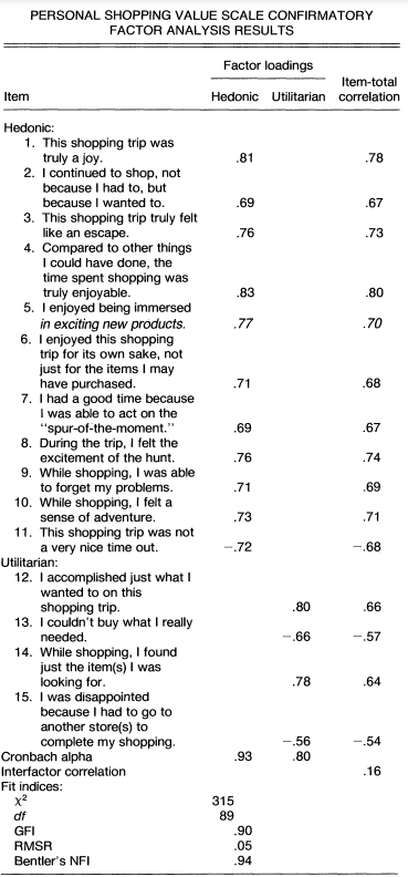
Babin, B.J., Darden, W.R. and Griffin, M. (1994) Work and/or Fun: Measuring Hedonic and Utilitarian Shopping Value. Journal of Consumer Research, 20, 644-656.

Consumer researchers’ growing interest in consumer experiences has revealed that many consumption activities produce both hedonic and utilitarian outcomes. Thus, there is an increasing need for scales to assess consumer perceptions of both hedonic and utilitarian values. This article describes the development of a scale measuring both values obtained from the pervasive consumption experience of shopping. The authors develop and validate the scale using a multistep process. The results demonstrate that distinct hedonic and utilitarian shopping value dimensions exist and are related to a number of important consumption variables. Implications for further applications of the scale are discussed