Tag Archives: space

Vintage speakers that do not play: The art of deception in cafe design

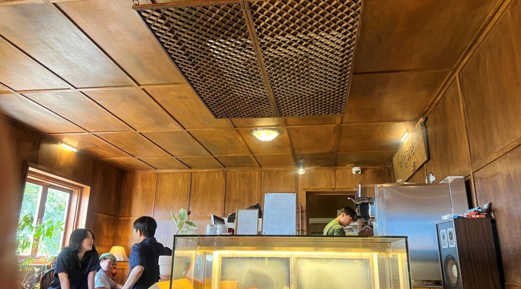
Salon de Jungui Lee is a cafe in Jeju island. With minimal construction and a commitment to preserving its essence, the owner of the old house transformed it into a cafe that embodies her philosophy of refined simplicity.
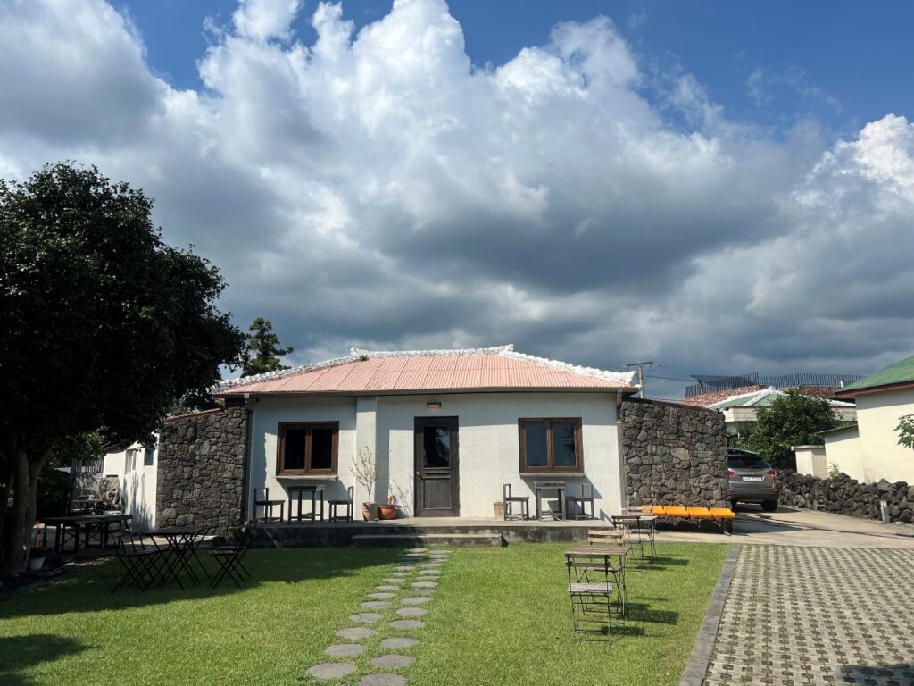
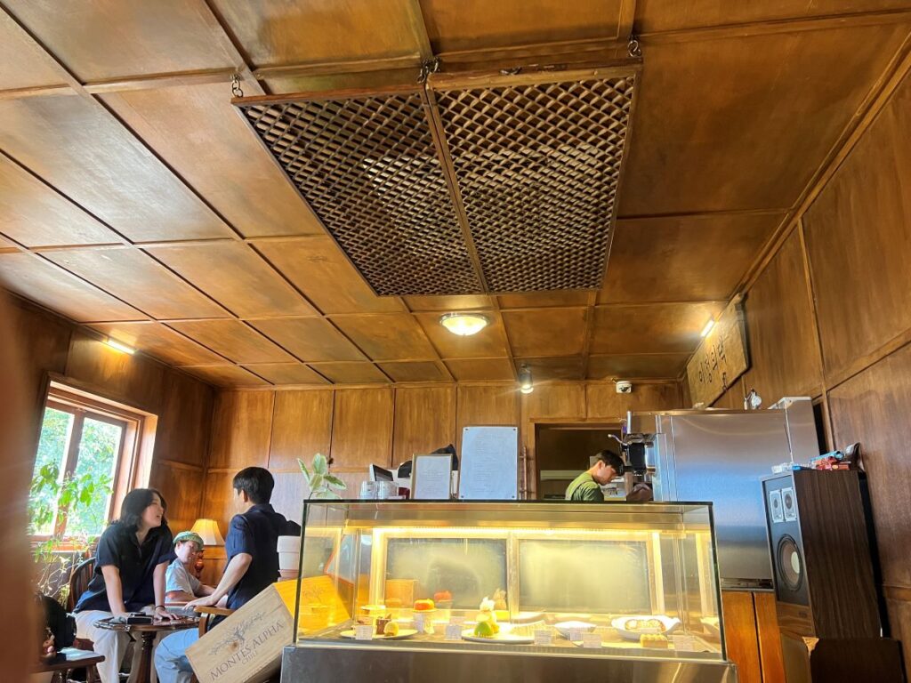
This cafe is a popular destination among Korean coffee lovers. Coffee is excellent, but its desserts are not overly sweet, not sticky, nor heavy treats. To me, each bite was a carefully orchestrated symphony of taste and texture.

Beyond taste, its atmosphere was unique. The pinnacle was the air conditioner vent. Instead of a tasteless plastic vent, a repurposed traditional Korean window frame was hanging on the ceiling. It was functional, beautiful, and deeply rooted in cultural heritage.
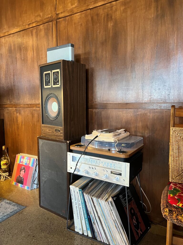
While enjoying coffee, dessert, and unique air conditioner vent, I naturally assumed that the vintage speaker pumped out the tunes. However, it was actually a cleverly disguised modern Bose system connected to an iPhone.
Salon de Jungui Lee taught me a valuable lesson about experience. It is not just about the individual components – the coffee, the desserts, or the décor. It is about how these elements come together to create something greater than the sum of its parts.

***

Reference

Hogarth, R. M. (2005). Deciding analytically or trusting your intuition? The advantages and disadvantages of analytic and intuitive thought. In The Routines of Decision Making (pp. 67–82).

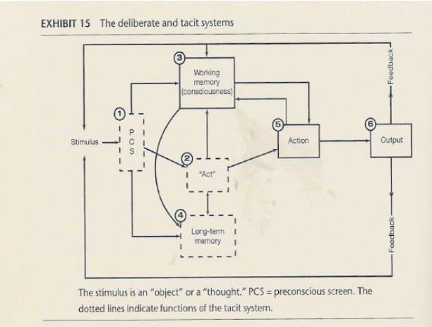
Recent research has highlighted the notion that people can make judgments and choices by means of two systems that are labeled here tacit (or intuitive) and deliberate (or analytic). Whereas most decisions typically involve both systems, this chapter examines the conditions under which each system is liable to be more effective. This aims to illuminate the age-old issue of whether and when people should trust “intuition” or “analysis.” To do this, a framework is presented to understand how the tacit and deliberate systems work in tandem. Distinctions are also made between the types of information typically used by both systems as well as the characteristics of environments that facilitate or hinder accurate learning by the tacit system. Next, several experiments that have contrasted “intuitive” and “analytic” modes on the same tasks are reviewed. Together, the theoretical framework and experimental evidence leads to specifying the trade-off that characterizes their relative effectiveness. Tacit system responses can be subject to biases. In making deliberate system responses, however, people might not be aware of the “correct rule” to deal with the task they are facing and/or make errors in executing it. Whether tacit or deliberate responses are more valid in particular circumstances requires assessing this trade-off. In this, the probability of making errors in deliberate thought is postulated to be a function of the analytical complexity of the task as perceived by the person. Thus the trade-off is one of bias (in implicit responses) versus analytical complexity (when tasks are handled in deliberate mode). Finally, it is noted that whereas much attention has been paid in the past to helping people make decisions in deliberate mode, efforts should also be directed toward improving ability to make decisions in tacit mode since the effectiveness of decisions clearly depends on both. This therefore represents an important frontier for research.
Empty space sparks creativity

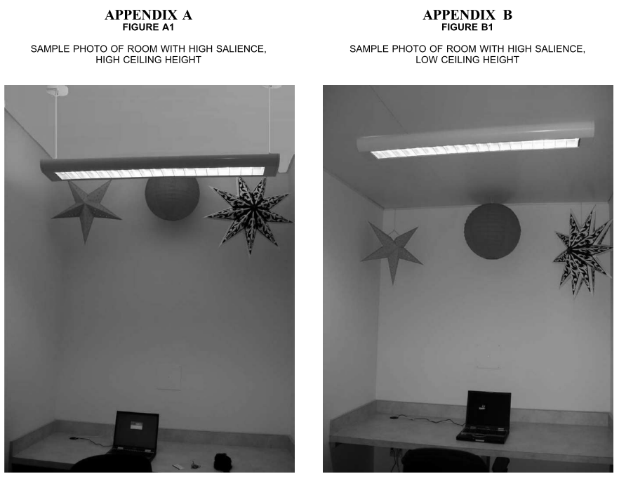
Space matters when we need creativity. According to research, when a ceiling is high, people become creative because a high (vs. low) ceiling primes the concept of freedom (vs. confinement). Similarly, Jump Associates has various types of cubicles for designers; “garage” cubicles are widely open for those who want to be creative, whereas “Zen rooms” are tiny small cubicles. Interestingly, Dev Patnaik, the founder of the Jump Associates, mentioned that US people prefer garage offices whereas Japanese clients like Zen rooms.

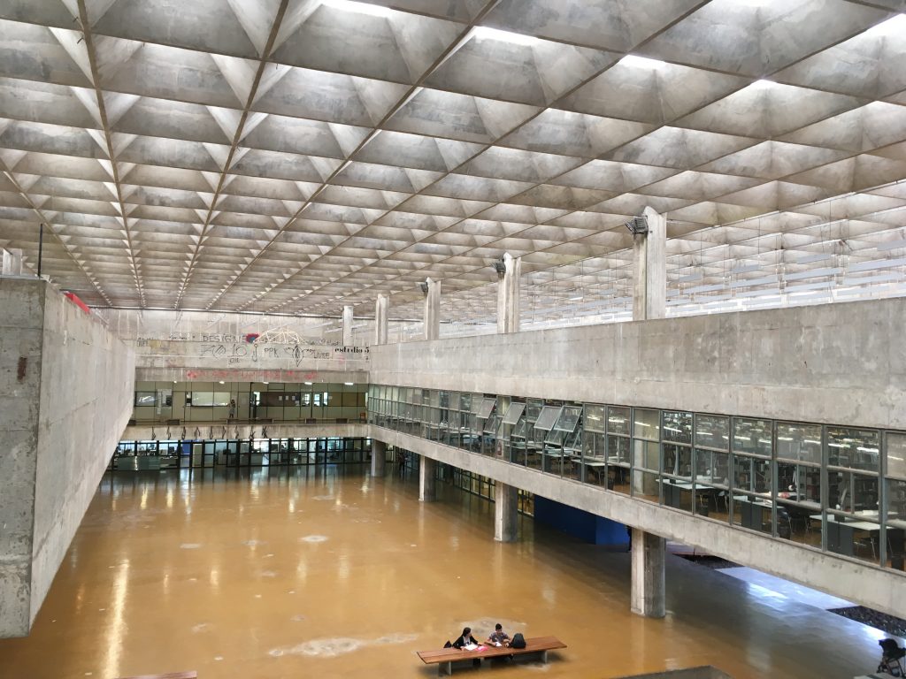
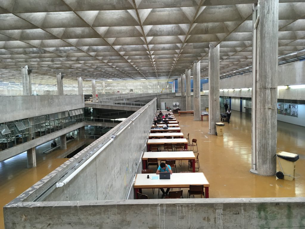
When I visited the design department at the University of Sao Paulo, one of the best universities in Brazil, I was shocked by its building. It has a huge empty space in the middle and has tons of bright, natural lights. I learned that empty space not only increases the perceived value of a product inside. It boosts the creativity of the people inside.

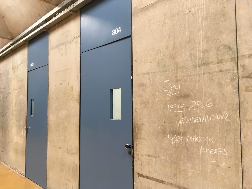
Inside the building, the walls allow people to write and erase easily, which also may enhance creativity.

Meyers-Levy, J., & Zhu, R. (Juliet). (2007). The Influence of Ceiling Height: The Effect of Priming on the Type of Processing That People Use. Journal of Consumer Research, 34(2), 174–186.

This article demonstrates that variations in ceiling height can prime concepts that, in turn, affect how consumers process information. We theorized that when reasonably salient, a high versus low ceiling can prime the concepts of freedom versus confinement, respectively. These concepts, in turn, can prompt consumers’ use of predominately relational versus item-specific processing. Three studies found support for this theorizing. On a variety of measures, ceiling height–induced relational or item-specific processing was indicated by people’s reliance on integrated and abstract versus discrete and concrete ideation. Hence, this research sheds light on when and how ceiling height can affect consumers’ responses.

Could we use a single commercial space for multiple purposes?

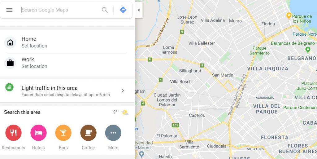
Each commercial space has its own purpose. At a restaurant, we eat food. At a bar, we drink beer. At a cafe, we take a coffee. We rarely drink beer at cafes and we do not ask for coffee at bars. As Google Map shows, cafes are not listed when we search for bars. Similarly, bars do not appear when cafes are searched for.

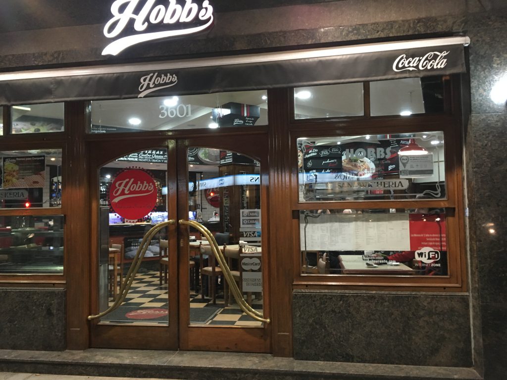
However, some commercial spaces in Buenos Aires, Argentina serve more than one purpose. For instance, Hobbs Palermo looks like a restaurant. However I ordered a bottle of alcoholic beverage late night and, at a day time, I noticed a person who drank only a bottle of Coca Cola. It is a restaurant, bar, and cafe.

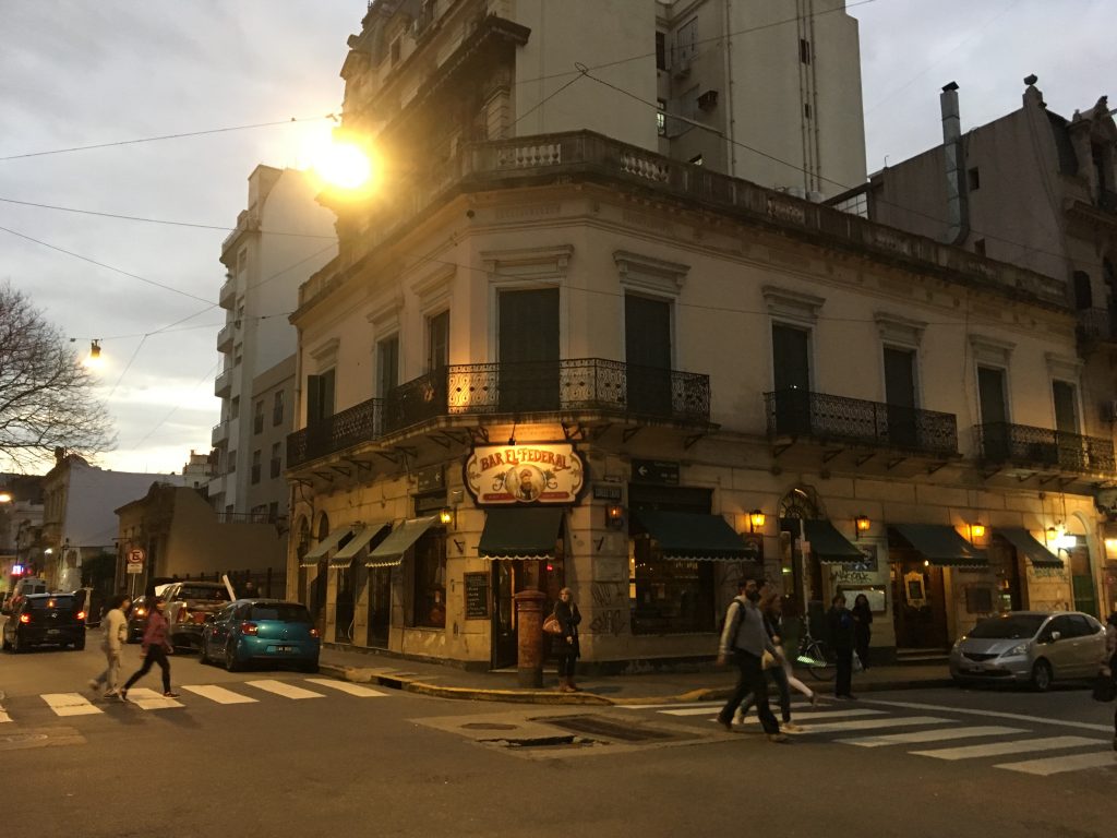
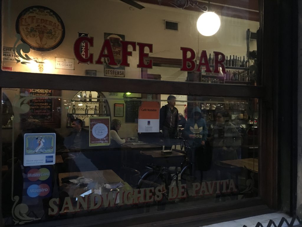
Bar El Federal (or the Federal Bar) is even called as cafe bar. Located in the old downtown of Buenos Aires, it is an authentic pub with wooden interiors and antique bottles. However, some people eat sandwich, others drink beers and even the others read books under the dim light.

We can eat pizza at Starbucks. We can drink coffee at Michelin restaurants. If we overcome the thought that one space should be used only for a single purpose, we will be able to use space creatively.

How crowded is crowded?

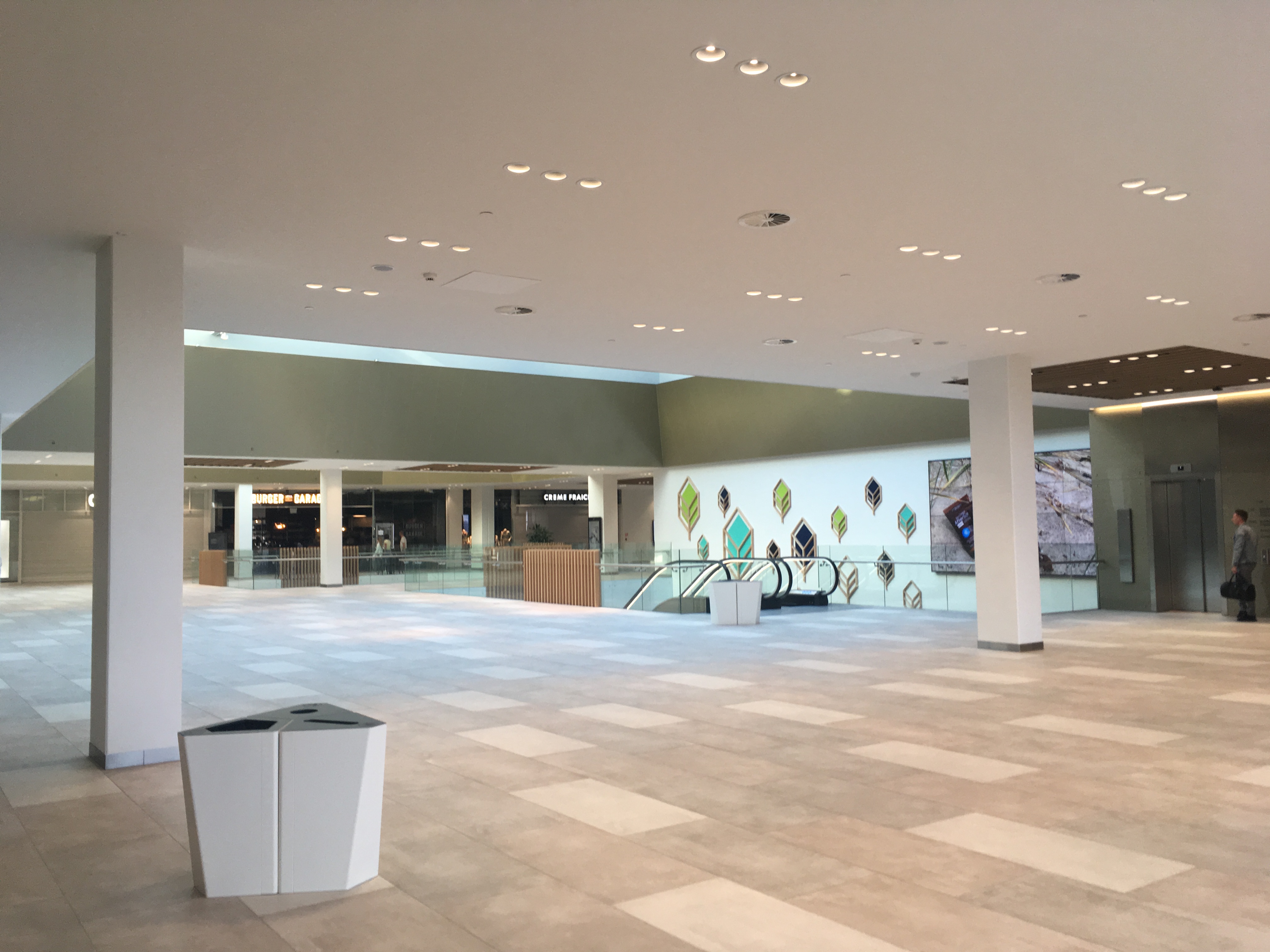
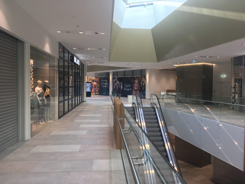
Copenhagen differs from Seoul. In Copenhagen, I have ample opportunities to feel emptiness. When I go to a shopping mall (Kronen Vanlose) at 5PM on a weekday, it is literally vacant. Only few are spotted.


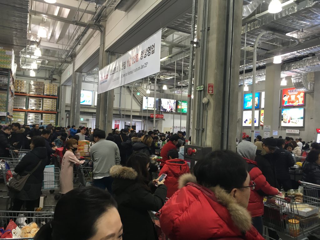
In Seoul, people constantly bump into people on street. By default, I feel crowdedness. When I go to Costco Wholesale at 8PM on any weekday, I should stand in line more than 10 minutes to meet cashiers.


Feeling emptiness or feeling crowdedness affects us. According to marketing research, social density shapes how we value products in a space. I find this research interesting and insightful, but it does not say much about how (objectively) crowded is (subjectively) crowded. While Koreans find a store or mall empty, Danes may find the same space crowded.


This article is about social space and material objects for sale within that space. We draw primarily on Goffman’s (1971) concepts of use space and possession territories to predict that as the social density of a given space increases, inferences of the subjective social class and income of people in that space fall. Eight studies confirm that this is indeed the case, with the result holding even for stick figures, thus controlling for typical visual indicators of social class such as clothing or jewelry. Furthermore, these social class inferences mediate a relationship between social density and product valuation, with individuals assessing both higher prices and a greater willingness to pay for products presented in less crowded contexts. This effect of inferred class on product valuation is explained by status-motivated individuals’ desire to associate with higher-status people. To the best of our knowledge, this research is the first to reveal the link between social density, status inferences, and object valuations. As such, it makes a novel contribution to what has come to be known in sociology as the topological turn: a renewed focus on social space.


DDP, a controversial architecture

20140506_Ran Joo @ DDP (2)

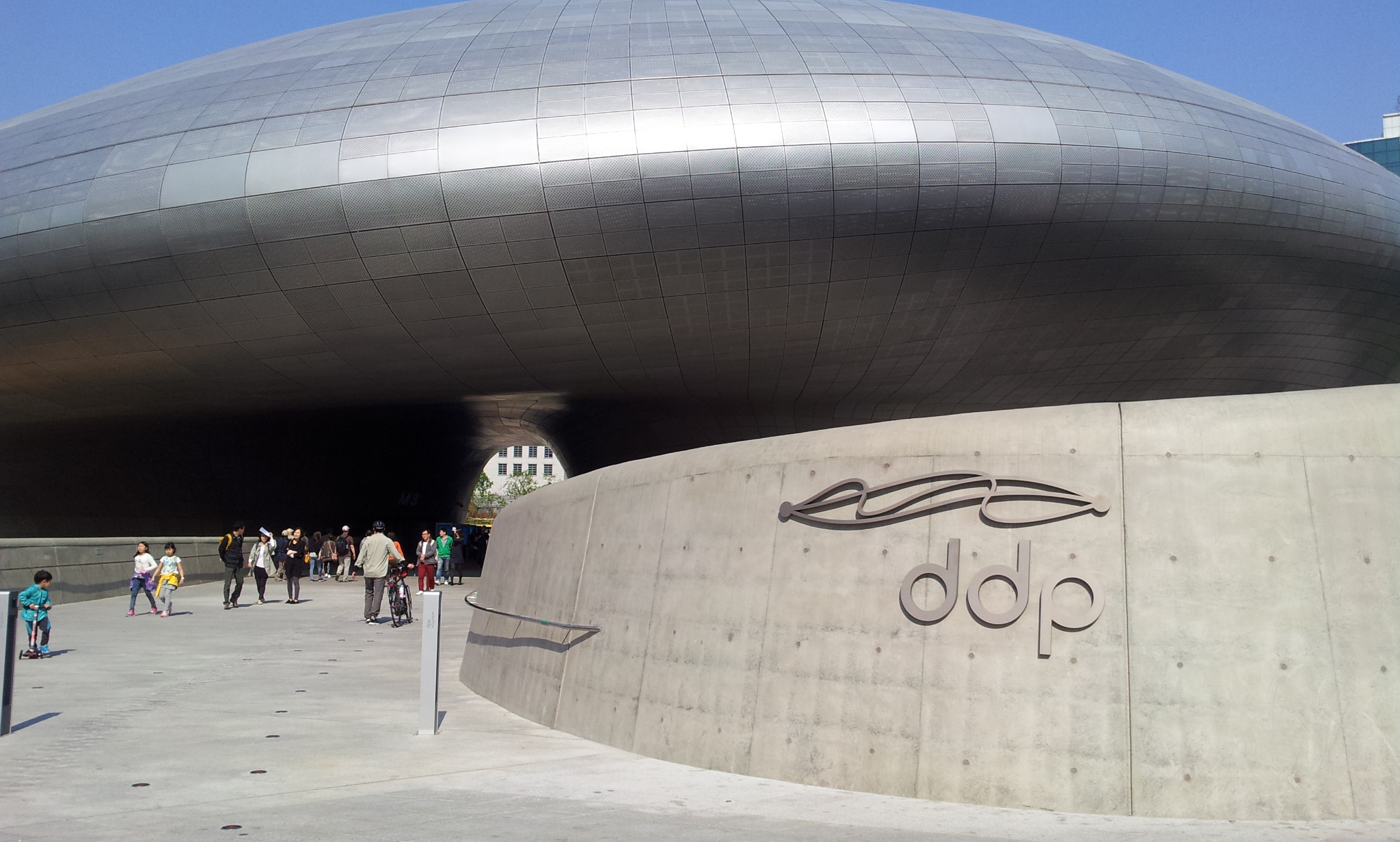
DDP (Dongdaemun Design Park plaza), designed by Zaha Hadid, is an extremely controversial architecture in Seoul, Korea. Some argue that it is neither functional inside nor goes well with neighbors; they view it as a dead space next to a naturally dynamic communities. Others, however, argue that this building cannot be judged by the contemporary perspective; they believe it become the landmark of the city in the future, just as Eiffel Tower.

Here is the introduction on the Zaha Hadid’s website:

“The DDP has been designed as a cultural hub at the centre of Dongdaemun, an historic district of Seoul that is now renowned for its 24-hour shopping and cafes. DDP is a place for people of all ages; a catalyst for the instigation and exchange of ideas and for new technologies and media to be explored. The variety of public spaces within DDP include Art/Exhibition Halls, Conference Hall, Design Museum/Exhibition Hall/Pathway, Design Labs & Academy Hall, Media Centre, Seminar Rooms and Designers Lounge, Design Market open 24 hours a day; enabling DDP to present the widest diversity of exhibitions and events that feed the cultural vitality of the city.”

For now, a wide variety of shops run their own businesses in the building. They sell design products and books. It is worth a visit.

20140506_Ran Joo @ DDP (14)

20140506_Ran Joo @ DDP (25)

20140506_Ran Joo @ DDP (11)

Classroom for empathy, creativity and cooperation

20130503_@ NEXT (1)

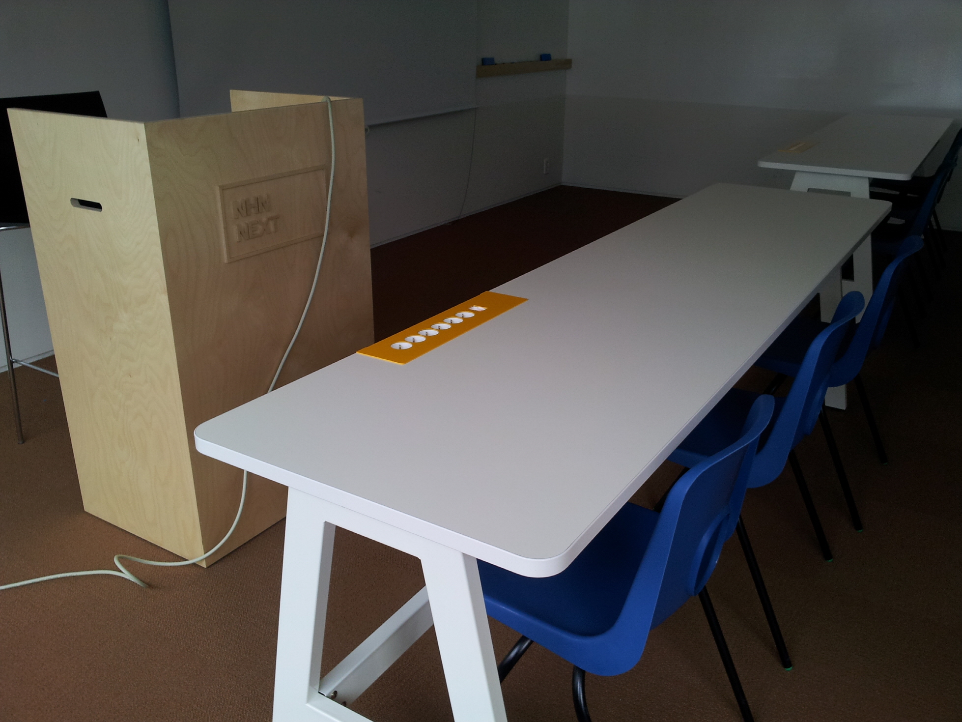
Although classrooms are used by students, they are not student-friendly. NHN NEXT, however, provides its students with the carefully designed spaces so that its students listen to the lectures, do their group projects, read some books, and even take some rests conveniently and comfortably. Teaching public software developers (e.g., portal sites, games, and social network services), NHN NEXT was found in 2012 by NHN, the Korean version of Google.

In this educational institution, students learn how to understand users deeply, how to develop new programs, and how to work with other developers harmoniously. Therefore, its classrooms are designed to encourage its students to be empathic, creative, and cooperative. For instance, desks in the classroom have 6 power outlets, providing 2 power outlets for each student. The wall in the group study room is painted white, which allows students to write/draw/erase their thoughts and ideas freely. The library has multiple shelves in which faculty members leave their books so that students read the books that their favorite professors recommend. Finally, several game rooms are placed in the public space, allowing students to play console games to get excited or relaxed.

20130503_@ NEXT (2)

20130503_@ NEXT (4)

20130503_@ NEXT (3)