Tag Archives: visual

Color marries between buttons and bulbs

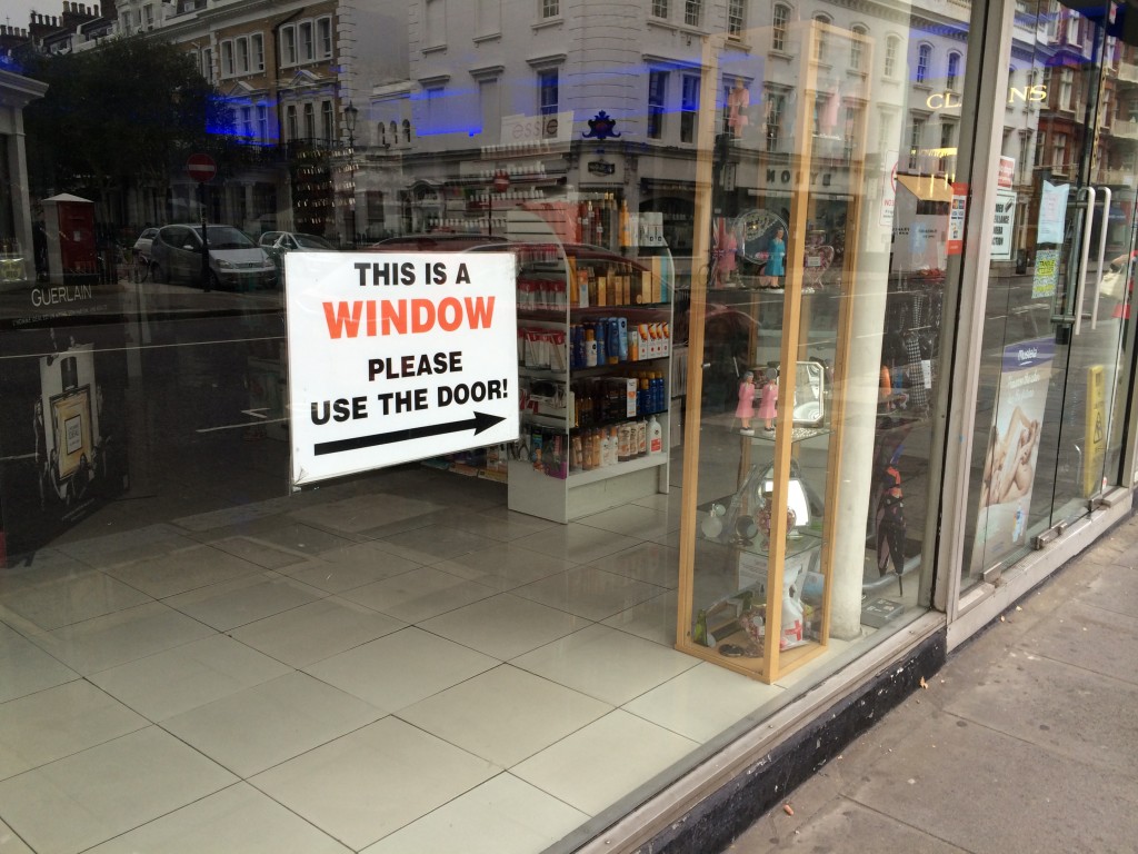
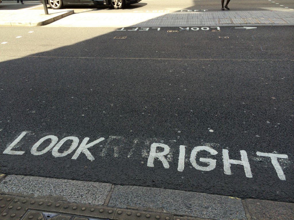
We often write down something on the surface. For instance, a window says “this is a window” or a pedestrian crossing says “Look Right.” However, written, verbal information is easy to be ignored. Compared to verbal information, visual information attracts attention better.

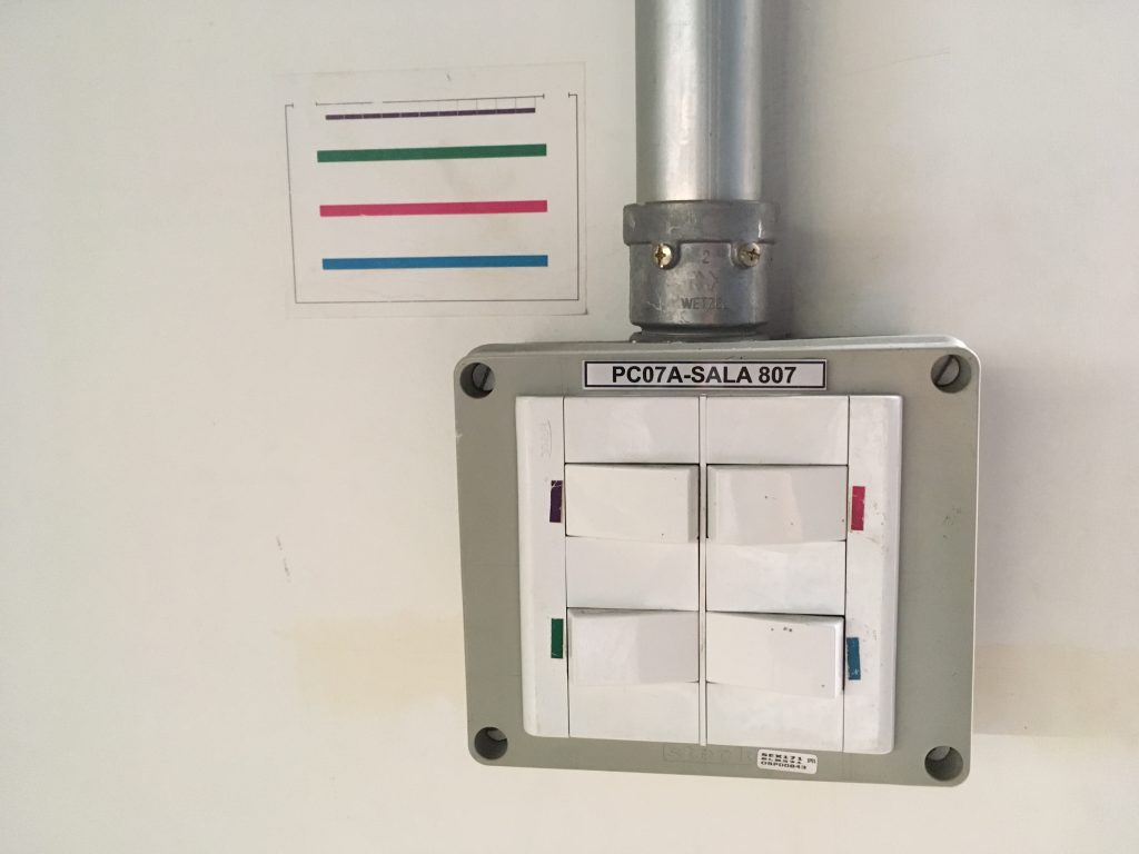
When I visited the design department at the University of Sao Paulo, one of the best universities in Brazil, I found a clever and clear, visual information in a classroom. The wide classroom has four lines of bulbs on the ceiling from the front row to the back end. Although there are four bulb buttons on the wall, the way buttons are placed does not align with the way bulbs are on the ceiling. Instead of writing down “the first row, … the last row,” they match buttons and bulbs through color.

Lurie, N. H., & Mason, C. H. (2007). Visual Representation: Implications for Decision Making. Journal of Marketing, 71(1), 160–177.

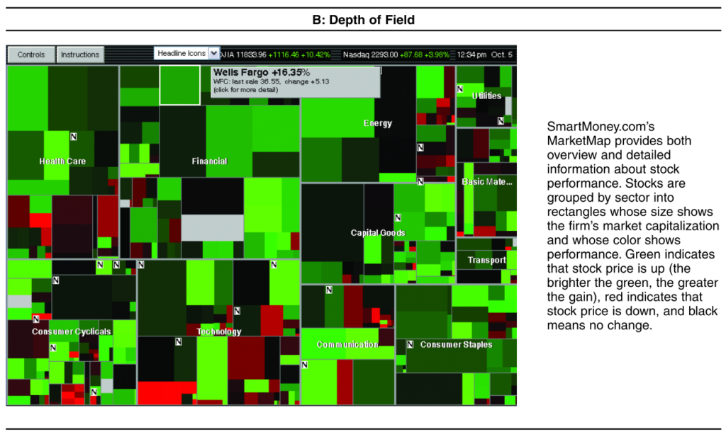
A large number of visualization tools have been created to help decision makers understand increasingly rich databases of product, customer, sales force, and other types of marketing information. This article presents a framework for thinking about how visual representations are likely to affect the decision processes or tasks that marketing managers and consumers commonly face, particularly those that involve the analysis or synthesis of substantial amounts of data. From this framework, the authors derive a set of testable propositions that serve as an agenda for further research. Although visual representations are likely to improve marketing manager efficiency, offer new insights, and increase customer satisfaction and loyalty, they may also bias decisions by focusing attention on a limited set of alternatives, increasing the salience and evaluability of less diagnostic information, and encouraging inaccurate comparisons. Given this, marketing managers are advised to subject insights from visual representations to more formal analysis.
IDEO method cards do not benefit visual designers


Abstract

Although a wide variety of design methods are used, two questions have been little investigated: whether using many methods improves the outcome quality and who benefits more from using them. We conducted a quasi-experiment in a classroom employing a 2 (Design Method: More vs. Fewer) x 2 (Style of Processing: Verbalizer vs. Visualizer) between-subjects design. We obtained two findings from the data. First, the students using more design methods generated better outcomes than those using fewer design method. Secondly, verbal-oriented students generated better outcomes than visual-oriented students. Our obtained two findings will be discussed in the context of design process.

Keywords

Design methodsdesign qualitystyle of processingverbalvisual


An answer why designers get a seat at the CEO table


Woowa brothers… This company (Woowa Brothers (woowa is Korean for “elegance”) developed a mobile application (app) for food delivery services in 2010. Interestingly, the CEO of this company was trained as a designer and worked as a designer for several Web consultancies and an Internet search-engine company… Woowa Brothers achieved 77.3% brand awareness at a total cost of $74,000, whereas similar services spent approximately $4 million and only reached 38.8%. This app achieved 10 million downloads for the first time in the Korean app history. Goldman Sachs decided to invest 40 billion Korean won (U.S. $33.1 million) into the company in 2014.


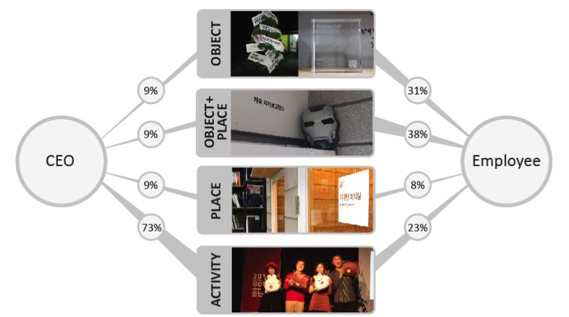
Woowa Brothers(1)… We collected leadership cues from two parties, the CEO and employees, and then mapped them onto Brunswik’s Lens Model, a psychological framework often used in Social Judgment Theory. Our newly adopted research framework helps us better understand the designer’s unique leadership style; unlike non-design business CEOs, the design CEO or DEO (Design Executive Officer) used a wide variety of visual cues… the DEO tacitly communicates visual (tangible) cues with employees for reward and authorization. In particular, the DEO is good at incorporating a tangible benefit and infusing a live and vivid characteristic into an environment. We found that the DEO utilizes visual cues effectively when communicating leadership.
 

Verbal instructions do not work

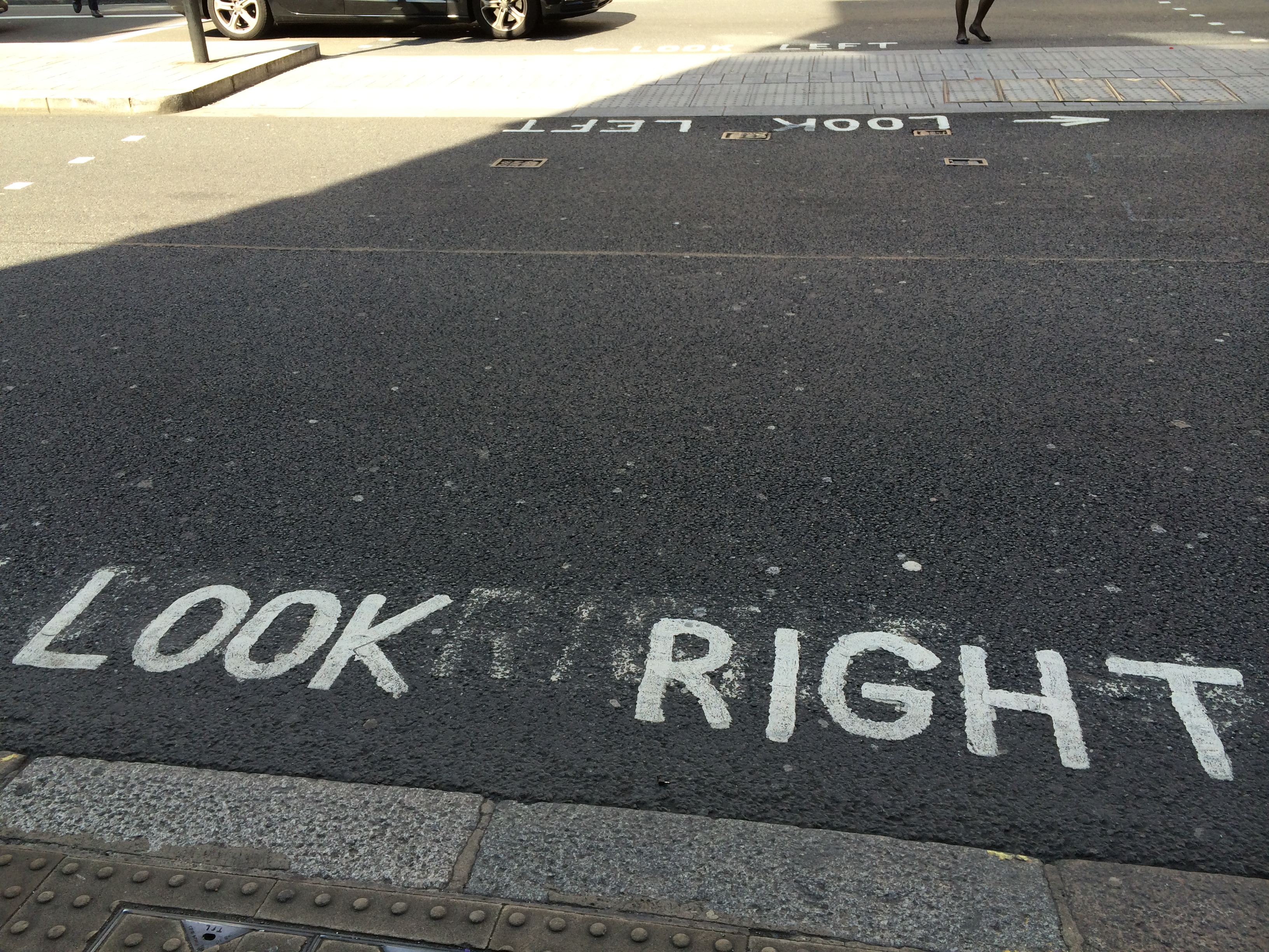
People often use verbal signs to give instructions to others. The store owner posts a sign on the window saying, “This is a window, please use the door.” Government officers paint “Look Right” at the pedestrian crossing. However, I have observed numerous store visitors and pedestrians mistakenly push or slide the window and look left before crossing the road. In these cases, a visual signage might work better to attract their attention and guide their behavior.

DML_London_Glass

DML_London_Road

Two Different Ways to Play with Words

University of Toronto has two interesting institutes: Martin Prosperity Institute and Best Institute. The former is an academic place for the global-scale prosperity and inequality. Its research papers discuss the creative classes and cities (Richard Florida), the integrative thinking and strategies (Roger Martin), and the global crowdsourcing for problem solving (Don Tapscott). The latter is a relatively practical space where the start-up companies focusing on health-care products and services run their offices.

While visiting them, I found there are two different ways to play with words. At the Martin Prosperity Institute, a visual art piece hangs on the wall saying PROSPERITY. At the Best Institute, a verbal notice posts on the door saying “Come to the Dark Side. We have cookies.” I find these two pieces are very creative but in different ways: the former changes the visual aspect of the word, whereas the latter changes the verbal (meaning) aspect of the word.

DesignMarketingLab

DesignMarketingLab

Ground level traffic lights help pedestrians be safe

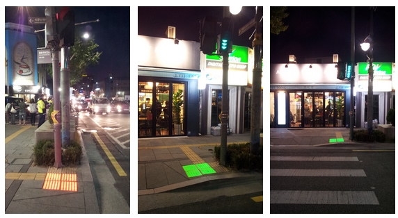
Tactile paving is a system of textured ground surface indicators. It aims to assist pedestrians who are blind or visually impaired (see Wikipedia) and is also called truncated domes, detectable warnings, Tactile Ground Surface Indicators, or detectable warning surface. In Seoul, Korea, some of the tactile pavings light up at night. Interestingly, its color turns the same color with the traffic light; it turns red when the traffic light is red, and it is green when the traffic light is green.

DML_tactitle paving 01   DML_tactitle paving 02   DML_tactitle paving 03

This lighting system will not only benefit visually impaired pedestrians; it will also enhance the safety of the pedestrians who are distracted by their own tasks (e.g., listening music by earphones or sending text messages by their smart phones)!