[youtube=http://www.youtube.com/watch?v=bpm_LIyMtMY]
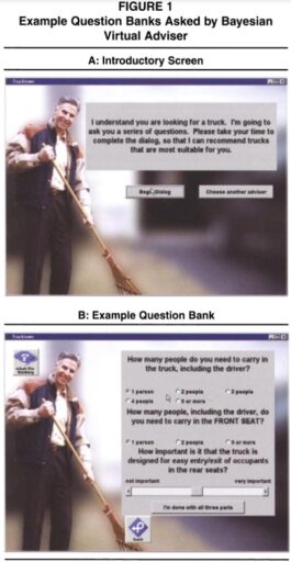
Although many people want their offices similar to the Pixar’s office or the Google’s New York office, only few had them. Adam Alter, Assistant Professor of Marketing at New York University, wrote a piece of article on this issue at U99 (How to build a collaborative office space like Pixar and Google). In this article, he argues four key features of a collaborative office space.
- An open plan and other design features (e.g., high-traffic staircases) that encourage accidental interactions.
- More common areas than are strictly necessary—multiple cafeterias, other places to read and work that encourage workers to leave confined offices.
- Emphasis on areas that hold two or more people, rather than single-occupancy offices.
- Purpose-free generic “thinking” areas in open-plan spaces, which encourage workers to do their thinking in the presence of other people, rather than alone.
**
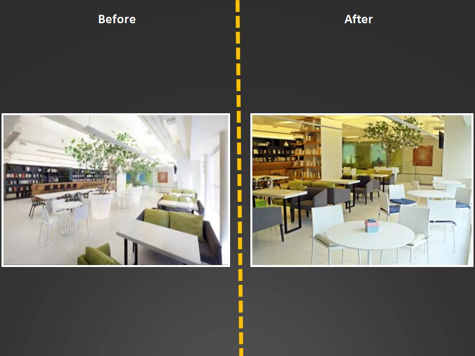
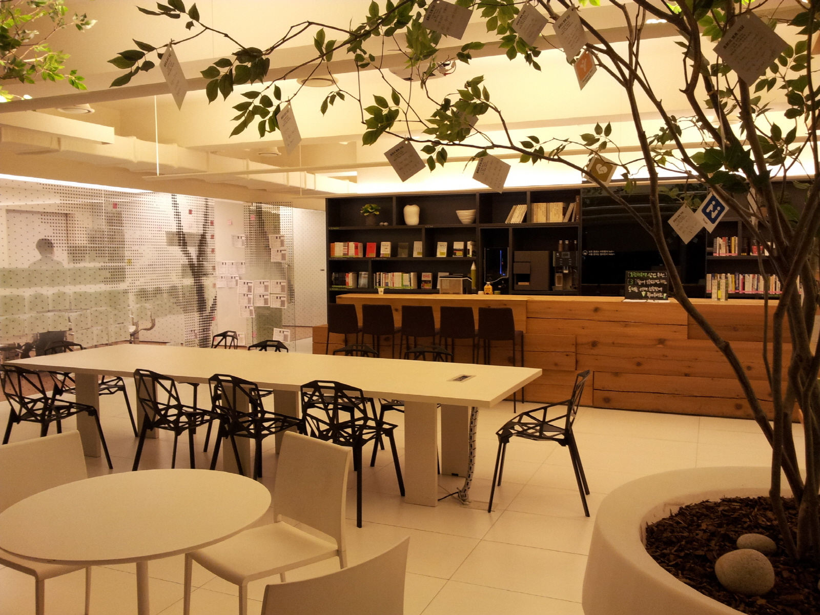
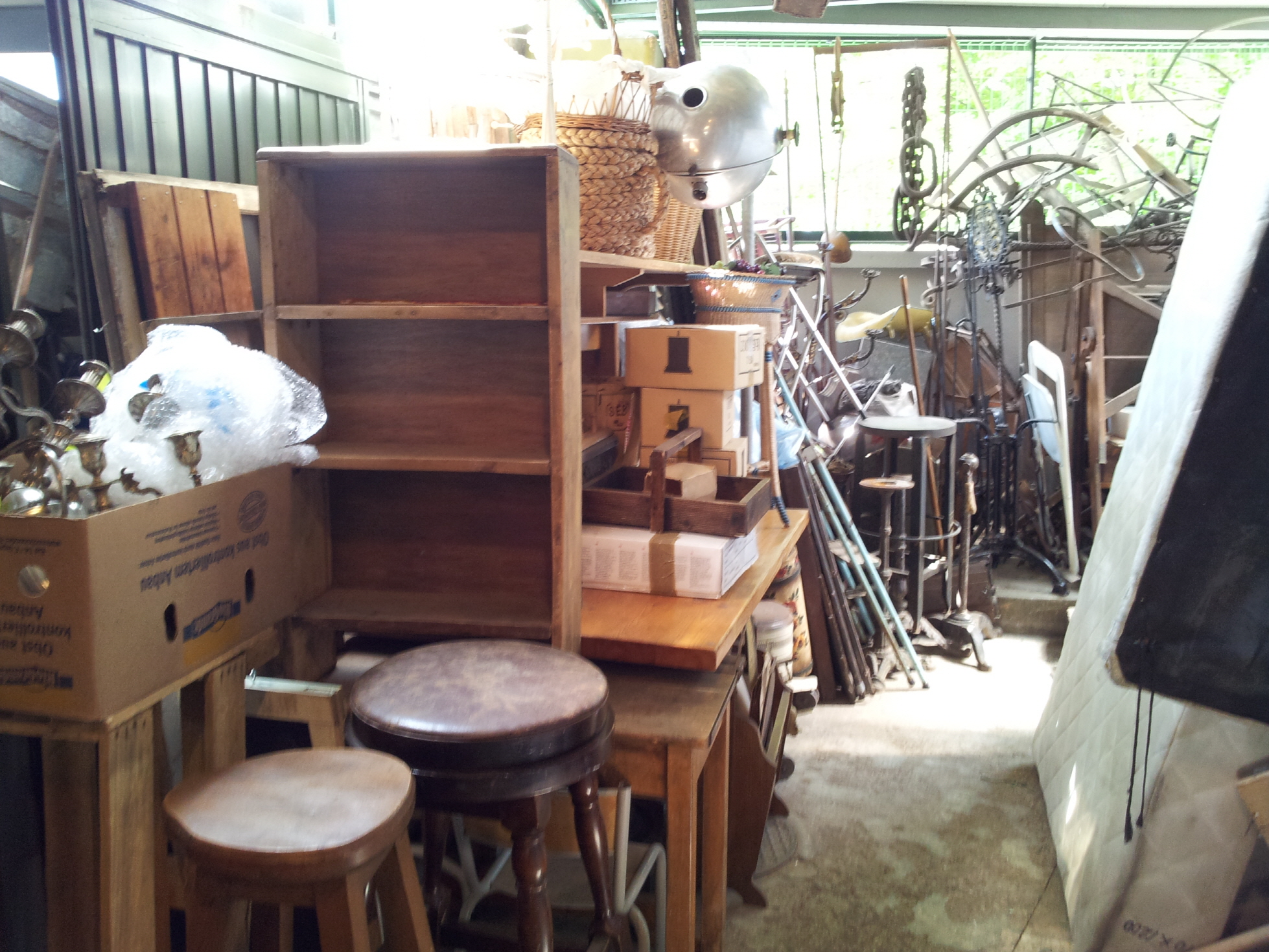
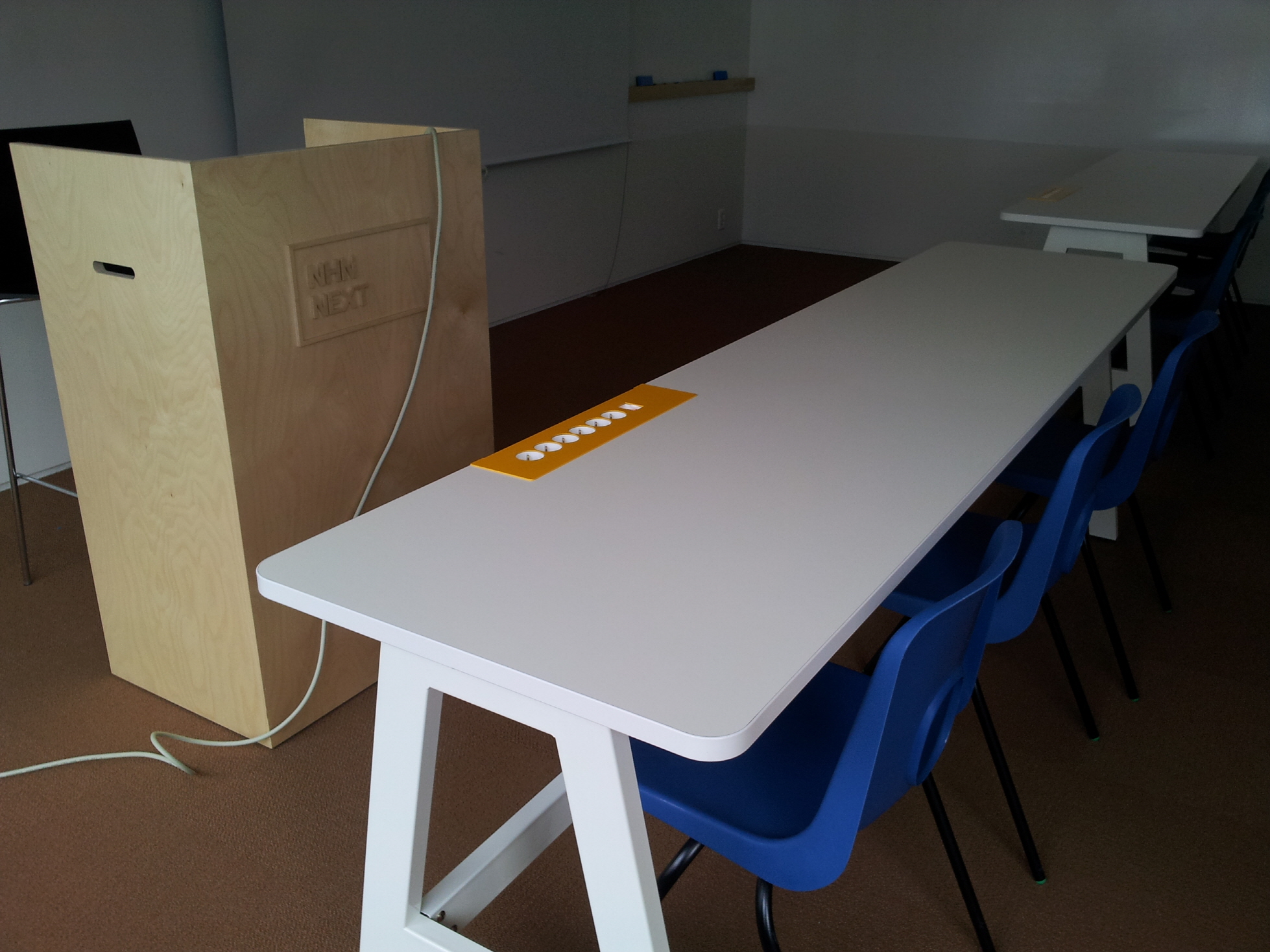
Dongwha holdings, a company selling interior items and dealing used cars based in Seoul, opened a space called Green Lounge in 2010. This space was dedicated to encourage collaboration among employees. It was equipped with sofas and tables, designer chairs, upscale coffee machines, and a plenty of casual books, etc.

This open space, however, was mostly empty. Very different from Californians and New Yorkers, people in Seoul avoided mingle with strangers and thus accidental interactions did not occur. Instead, they stopped by this space with their colleagues and picked up free coffee and left. Alternatively, they occupied meeting rooms for chatting with friends or keeping focused on their own businesses.
In order to revitalize this open space, a team of employees conducted research; they performed deep interviews with others, video recorded others’ behaviors, and collected and analyzed the flow in the open space. This research revealed two issues and the team decided to attack one of those issues by conducting several experiments.
> Go to Experiment for collaborative office space in Seoul (2)