The Korean art scene has seen dynamic shifts in recent years. This change is tied to the rise of “Hallyu” or the Korean Wave, which has popularized Korean music (BTS), drama (Squid Game), and food (Kimbop).
Hallyu has pushed even non-Korean artists to explore personal themes in their work. This is seen in the exhibition currently on display at the Asian Art Museum, San Francisco. Japanese artist, Etsu Egami, collaborated with a K-pop celebrity, Lee Byung-hun. Her work showcases how art transcends language barriers. It also shows Korean art works are now reaching wider audiences, challenging the boundaries of conventional art forms.
As Korea continues to celebrate its artistic innovation, it opens doors for cross-cultural exchanges.
Anthropomorphism works. When a car has a human schema (e.g., smiley face), people evaluate it positively (Aggarwal and McGill 2007). When a garbage bin has a human message (e.g., “feed me”), people follow it (Ahn, Kim, Aggarwal 2013). When an AR speaker has eyes or when an instruction manual depicts it like a baby, people become generous about its malfunction (Park and Joo 2018).
Historically, an object was anthropomorphize in one of two ways. On one hand, designers add the parts of the human body such as eyes and arms to an inanimate object. For instance, a tip jar has a smiley face, two arms, and two legs. On the other hand, marketers add a phrase describing that the object behaves like a human being. For instance, a garbage bin eats food or a mobile phone becomes stupid.
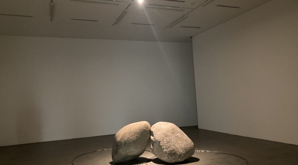
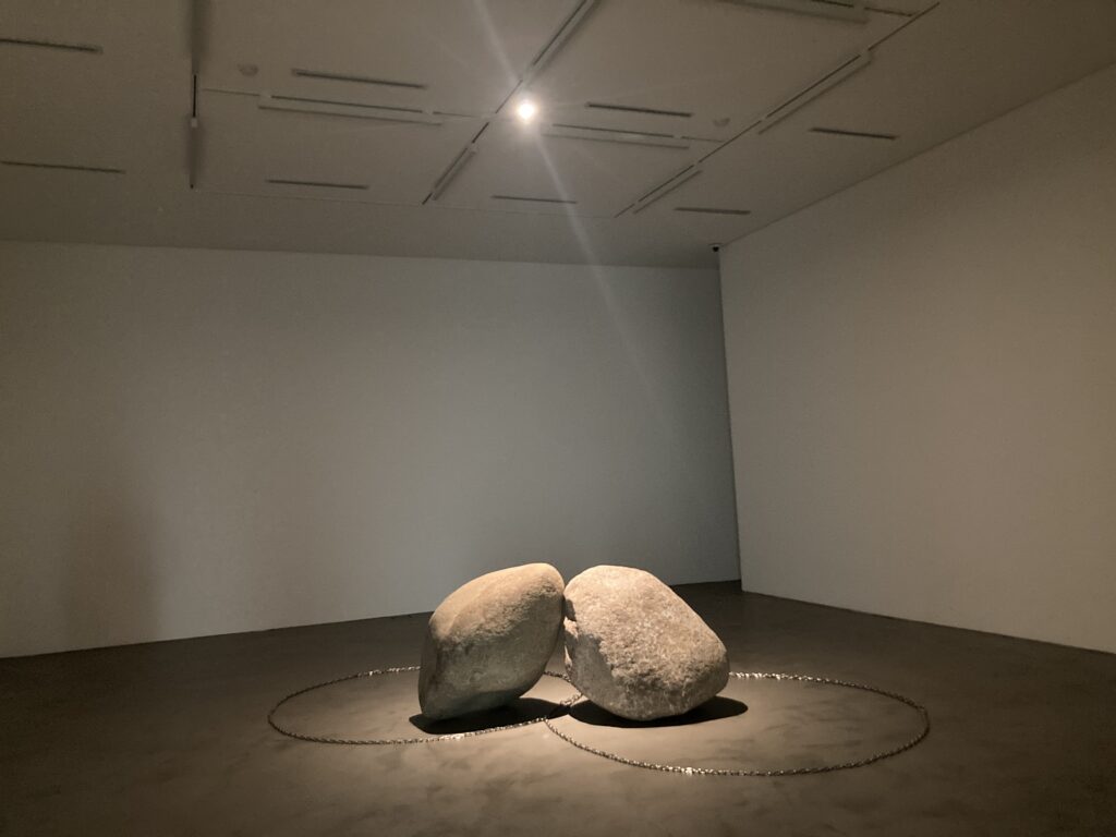
Today, I noticed another way to anthropomorphize an object, which can be employed by artists. They do not add something to an inanimate object directly; instead they ask us to actively imagine that inanimate objects animate. This is well demonstrated by the artwork, Relatum – The Kiss (2023) by Lee Ufan. We imagine two stones are two people and they are kissing each other.
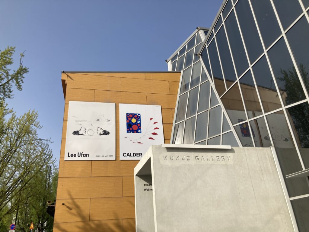
Kukje Gallery is pleased to present a solo exhibition of Lee Ufan on view from April 4 to May 28, 2023. Lee titles all his scultures Relatum and often provides subtitles to hint possible associations without giving a clear interpretation. Relatum signifies a relation that is different from a readily definable term, relationship, but one that explores the artist’s interest in how individual elements of a work are in a fluid relationship. In this way, the viewer, who directly intervenes in the space of the work as a relatum-along with factors such as the stone representing nature and the steel plate representing industrial society-feels a part of the conversation between the two objects or is led to reflect on the idea of co-presence by observing their conversation.
Lee employes an anthropomorphic metaphor in Relatum – The Kiss (2023), capturing a moment of encounter. As can be inferred by its subtitle, two stones are making a point of encounter as if they are kissing, while two individual chains surrounding them overlap and cross each other, thereby creating a point of intersection. The center of the cirucualr chians leading toward the position of each stone evokes a strong sense of motion…
People assume that constraint-free activities such as doodling help them become creative. However, psychological researchers suggest a different story, that is, constraints are actually the power house of creativity. Studies showed that people used a given product creatively, enjoyed creative experience, and developed creative toys and when they were provided with a time/input/resource constraint and then overcame it.
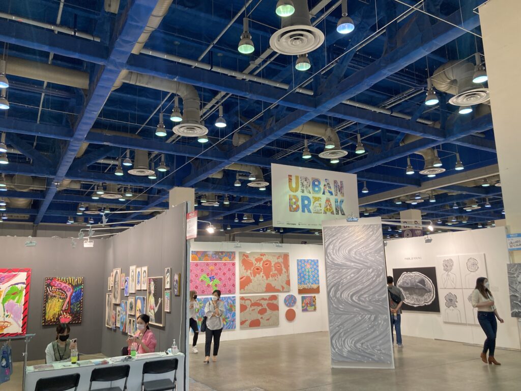
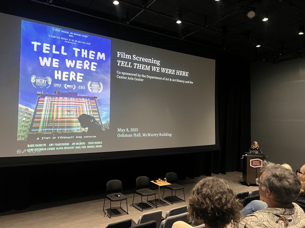
Similar to psychological creativity, constraints may contribute to art creativity. I found evidence at the Urban Break 2021, the largest urban and street art fair in Asia.
The Urban Break 2021 proposes the broadened spectrum of the art fair, trying the new contemporary art genre, combined the urban art and the street culture. The urban art is pioneering a new flow, becoming a mainstream icon in the art market. Urban Break is aimed at cultural convergence and extension by embracing native and foreign street artists, galleries and lifestyle brands.
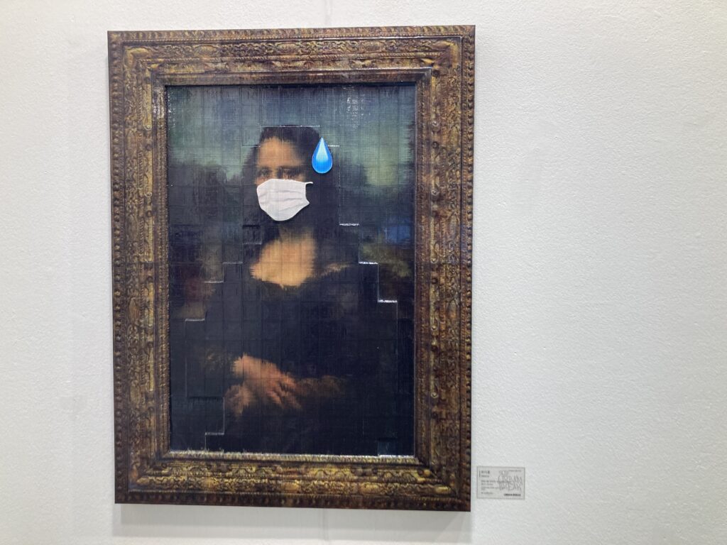
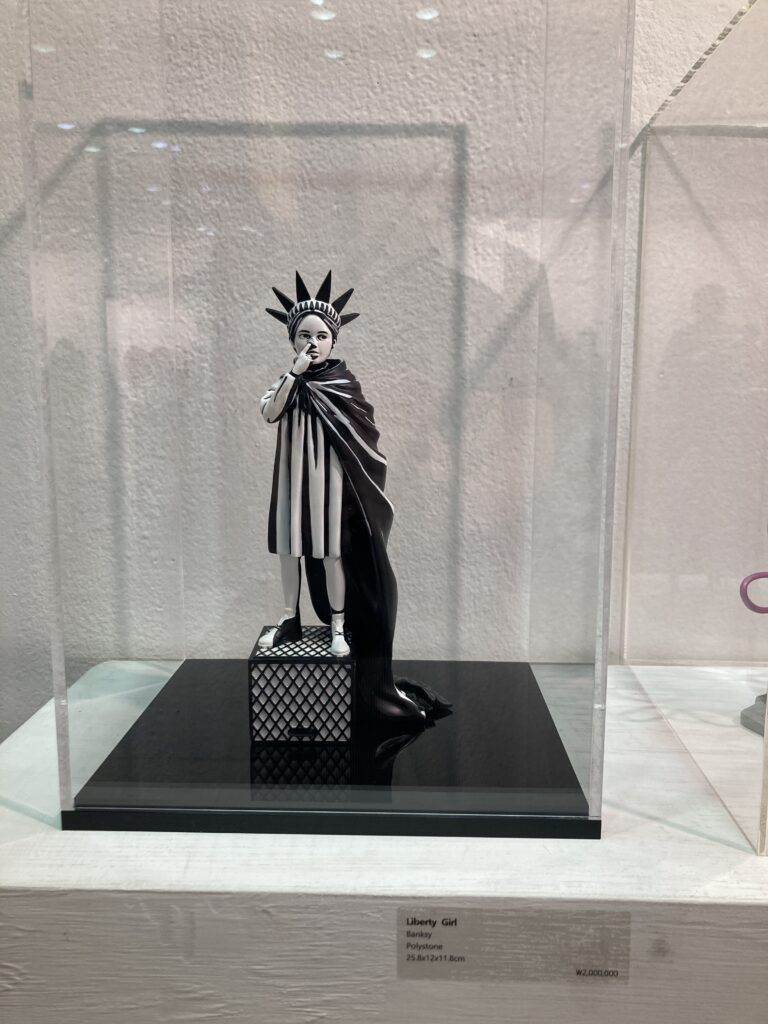
In this art fair, numerous paintings and sculptures made me nervous and confused because I do not understand most of them. Only when I meet the art pieces that look familiar but slightly different, I was able to understand the intentions of the artists, enjoying them. To me, artwork looks creative when its artist communicated with me through something I am familiar with. It does not look creative when its artist communicated with me something I have never seen before.
This suggests that constraint plays a key role to shape creative experience. When artists work with constraints (e.g., something visitors are familiar with such as Mona Lisa painting, David sculpture, or Statue of Liberty), visitors enjoy their paintings and sculptures better and more creatively.
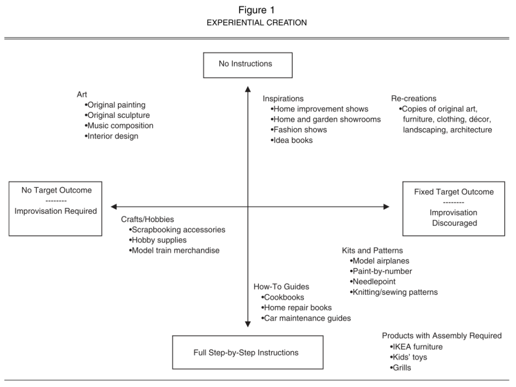
From cooking kits to home improvement shows, consumers are increasingly seeking out products that are designed to help them be creative. In this research, the authors examine why consumers participate in creative activities and under what conditions these experiences are the most enjoyable. A qualitative study explores the diverse motivations for undertaking creative tasks and identifies the role of constraints in such endeavors. Then, the authors conduct two experimental studies to understand the importance of constraints (e.g., instructional guidance, target outcomes) in facilitating a balance between perceived competence and autonomy for consumers involved in a creative task. When consumers engage in creative activities with a sense of both autonomy and competence, they enjoy the experience more. The authors discuss implications for managers and provide opportunities for further research.
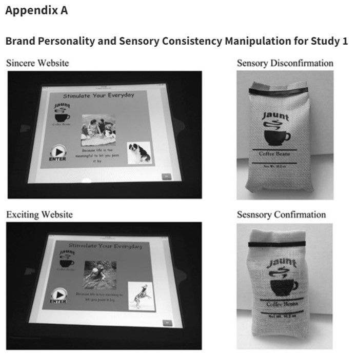
We sometimes experience sensory disconfirmation, meaning we expect to feel A but actually feel B. For instance, iPhone looks like a product with light plastic but it is made by heavy metal. In particular, disconfirmation between visual and haptic information (or mismatch between look and feel) is critical for business.
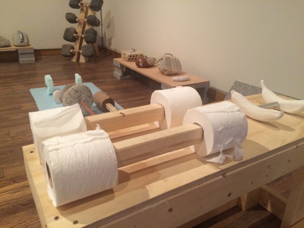
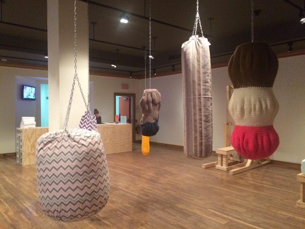
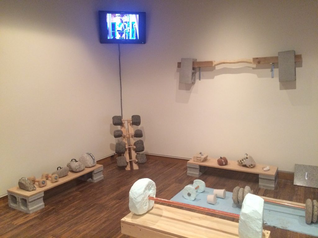
Showroom (Curated by Sarah Robayo Sheridan, January 21 – March 5, 2016)
“How do Toronto artists perceive new social and visual orders brought about by a decade of rapid urban development?”
Commonly, a showroom is intended to present a generic ideal of living, devoid of the nuances of lives as they are lived. The artists in this exhibition, however, turn our attention to the influence of lifestyle marketing in constructing the form and texture of the cityscape. By turns, critical, comedic and formal, the works deepen given knowledge of architecture, place, and the social order.
Fitness equipment looks heavy and rough. However, some artists challenge our intuition: dumbbells are light and sandbags are soft in the exhibition. According to research, when negative sensory disconfirmation is introduced, the source of disconfirmation can sometimes be perceived positively. To go further, the more our intuitions are challenged by look-and-feel mismatch, the more we may become creative.
Across four studies, the authors demonstrate that consumers intuitively link disconfirmation, specifically sensory disconfirmation (when touch disconfirms expectations by sight), to a brand’s personality. Negative disconfirmation is often associated with negative posttrial evaluations. However, the authors find that when negative sensory disconfirmation is introduced by an exciting brand, the source of disconfirmation can sometimes be perceived positively. This occurs because consumers intuitively view disconfirmation as more authentic of an exciting personality. Similarly, despite the wealth of literature linking positive disconfirmation to positive posttrial evaluations, the authors find that sensory confirmation is more preferred for sincere brands because consumers intuitively view confirmation as more authentic of a sincere personality. The authors conclude by demonstrating the intuitive nature of this phenomenon by showing that the lay belief linking brand personality to disconfirmation does not activate in a context where sensory disconfirmation encourages a more deliberative assessment of the product.
Modern art paintings are the best way to portray the unseen on the canvas. It is about the expression of emotions and feelings on and is not what you see at the very first glance. It can have many interpretations when seen through different angles. If you want to know more about modern art, then you can also read “Why is the New Art So Hard to understand”. It is a book written by Theodor Adorno, a German social theorist who shed more highlight on this concept that why Modern art paintings are so hard to understand modern art. Although the book was written in 1931, it is still relevant in today’s era.
How could we lower its difficulty and help visitors enjoy the modern art better? One solution is to allow visitors not to understand the artists’ intentions correctly. Instead, if visitors are allowed to misunderstand artists’ intentions and even disagree with artists’ opinions, if any, they will be relieved to fail.
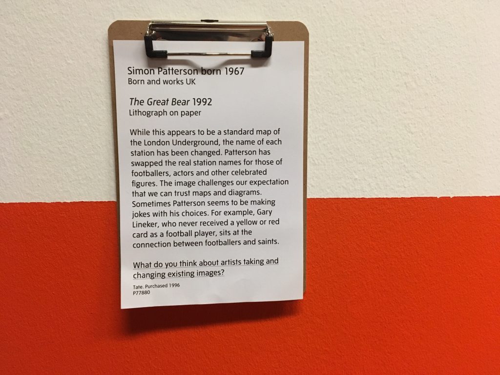
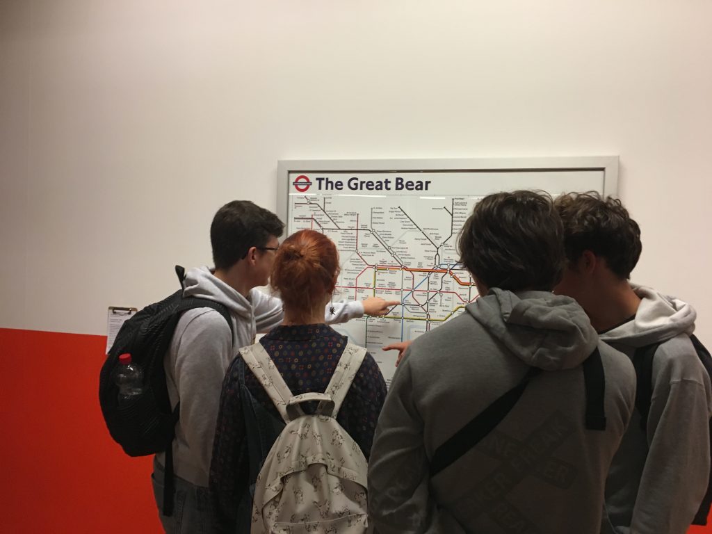
A great example is the underlined sentence under the modern artwork named The Great Bear by Simon Patternson in 1992. This sentence was added by a curator working at the Tate Liverpool, UK. Indeed, several students stood in front of this artwork and casually discussed to answer the question.
Simon Patterson born 1967 (Born and work UK) / The Great Bear 1992 (Lithograph on paper)
While this appears to be a standard map of the London Underground, the name of each station has been changed. Patterson has swapped the real station names for those of footballers, actors, and other celebrated figures. The image challenges our expectation that we can trust maps and diagrams. Sometimes Patterson seems to be making jokes with his choices. For example, Gary Lineker, who never received a yellow or red card as a football player, sits at the connection between footballers and saints.
What do you think about artists taking and changing existing images?
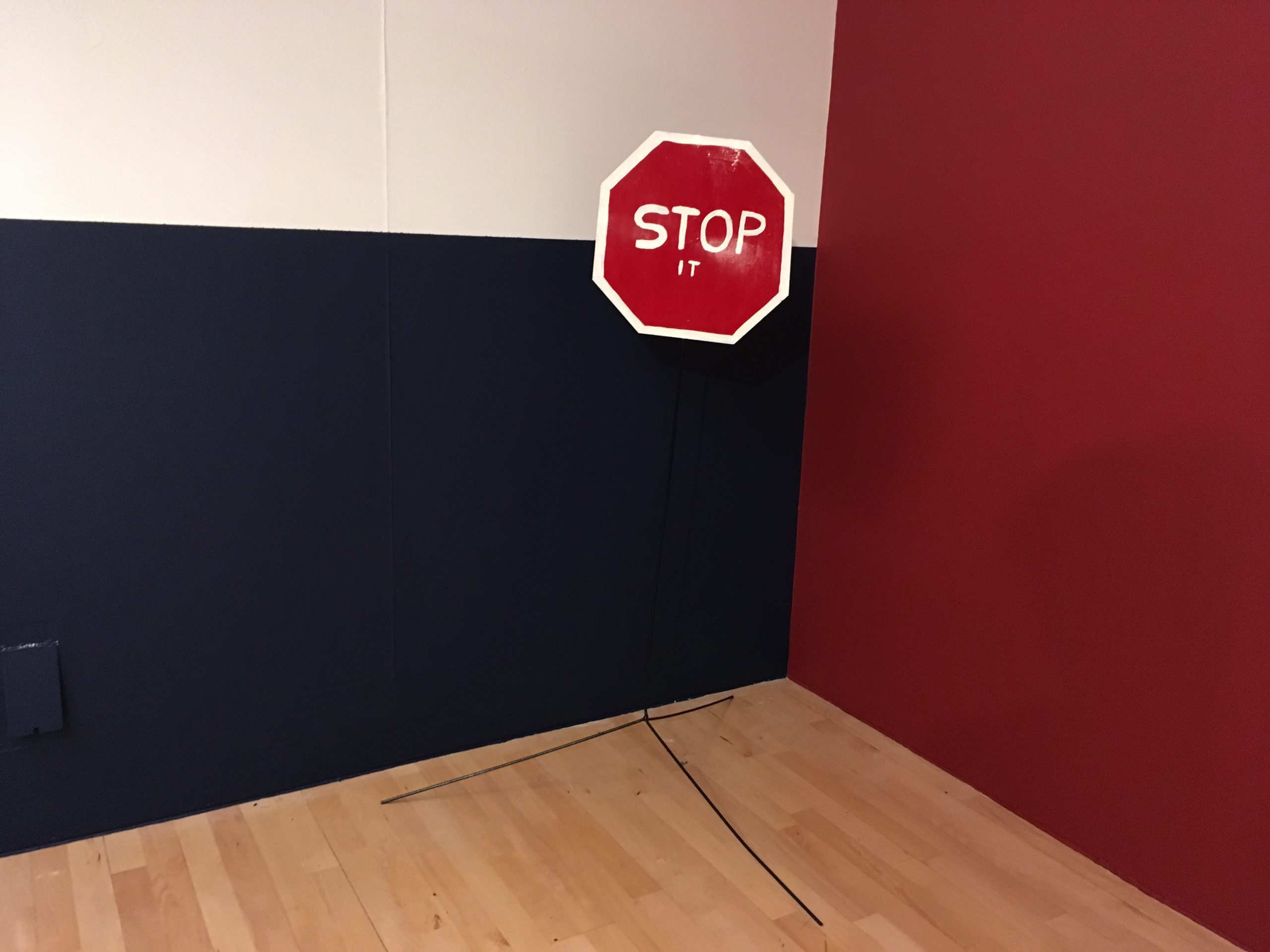
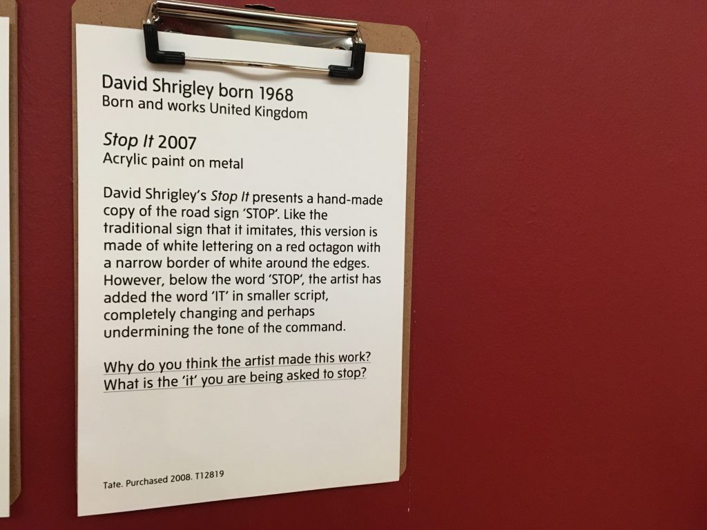
A similar sentence was found under another artwork (see below). Reading just one more sentence under the artwork made this Tate Modern museum more friendly and more approachable.
Why do you think the artist made this work? What is the ‘it’ you are being asked to stop?
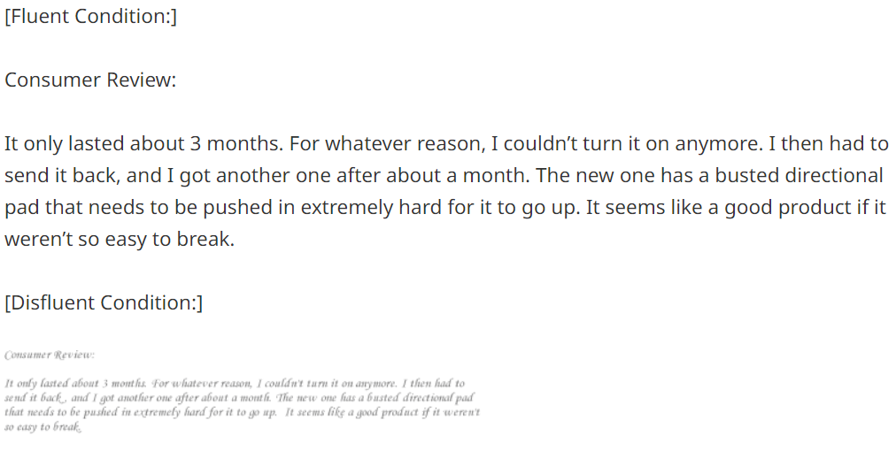
Behaivoral scientists argue that people find information important when it is easy to process (called fluent). Since modern art is difficult, people often avoid and even ignore it. When curators make the modern art easier to process, people will enjoy it.
We propose that people weight fluent, or easy to process, information more heavily than disfluent information when making judgments. Cue fluency was manipulated independent of objective cue validity in three studies, the findings from which support our hypothesis. In Experiment 1, participants weighted a consumer review more heavily when it was written in a clear font than in a less clear font. In Experiment 2, participants placed more weight on information when it was in focus than when it was blurry. In Experiment 3, participants placed more weight on financial information from brokerage firms with easy to pronounce names than those with hard to pronounce names. These studies demonstrate that fluency affects cue weighting independent of objective cue validity.
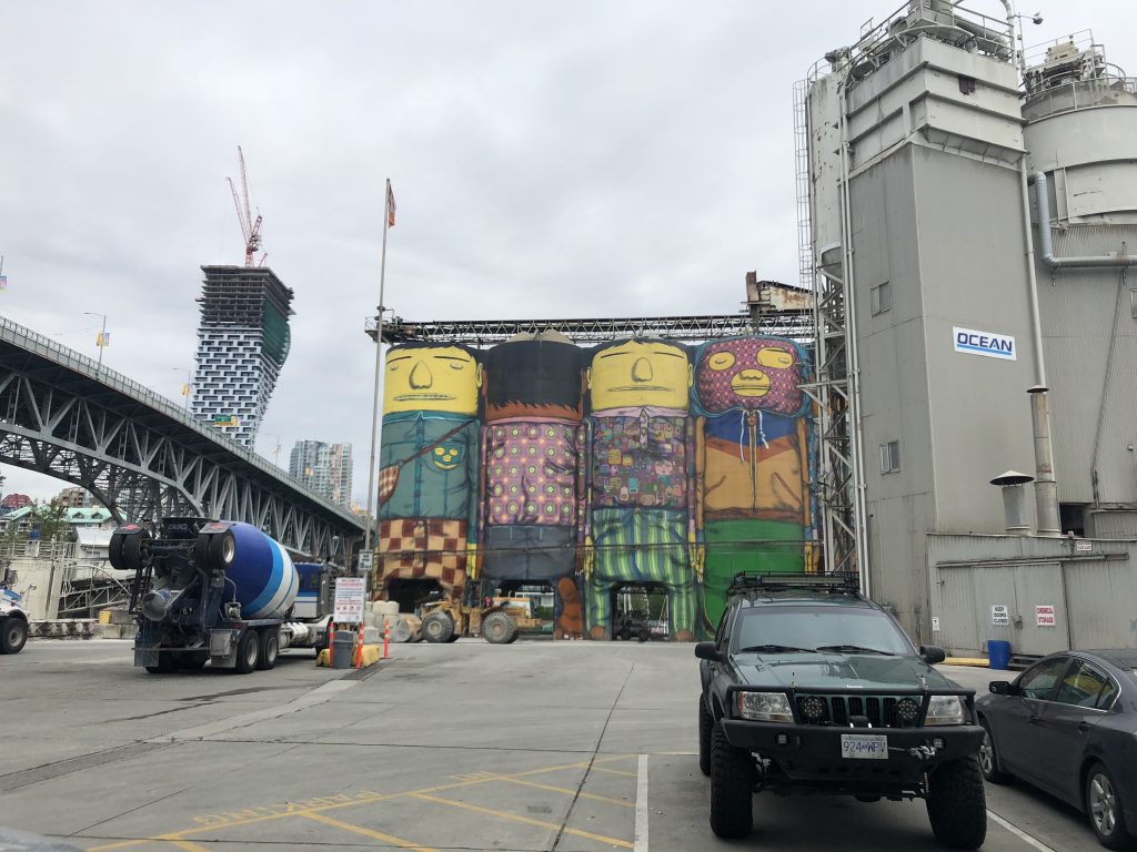
Granville Island is a tourist spot in Vancouver, Canada. It is a farmer’s market with shopping stores, food and beverage places, and art centers. In the middle of the island, gigantic factory facilities were painted like four mischievous boys. I found them artwork.
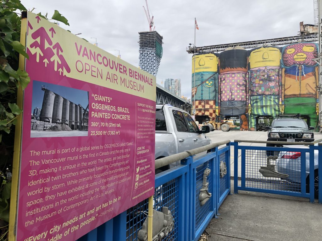
The name of these artworks are Giants. As the name suggests, these painted concretes are 70 ft (21m) tall.
The mural is part of a global series by OSGEMEOS called “Giants.” The Vancouver Mural is the first in Canada and the only one in 3D, making it unique in the world. The artists are two Brazilian identical twin brothers who have taken the Contemporary art world by storm. While primarily focused on transforming public space, they have exhibited at some of the most prestigious art institutions in the world including the Tate Modern in London and the Museum of the Contemporary Art in Los Angeles.
The Brazilian artists said “every city needs art and art has to be in the middle of the people.” Marketing researchers have also paid attention to how people move through museum spaces and experience art.
This article focuses on somatic experience–not just the process of thinking bodily but how the body informs the logic of thinking about art. We examine the links between embodiment, movement, and multisensory experience insofar as they help to elucidate the contours of art appreciation in a museum. We argue that embodiment can be identified at two levels: the phenomenological and the cognitive unconscious. At the first level, individuals are conscious of their feelings and actions while, at the second level, sensorimotor and other bodily oriented inference mechanisms inform their processes of abstract thought and reasoning. We analyze the consumption stories of 30 museum goers in order to understand how people move through museum spaces and feel, touch, hear, smell, and taste art. Further, through an analysis of metaphors and the use of conceptual blending, we tap into the participants’ unconscious minds, gleaning important embodiment processes that shape their reasoning.
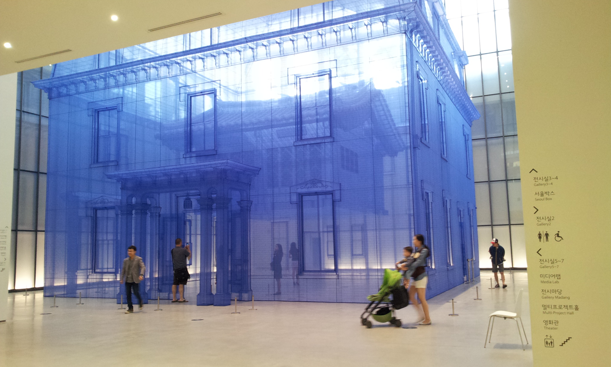
MMCA (national Museum of Modern and Contemporary Art) is a representative museum located in the center of Seoul, Korea. In the museum stood an eye-popping art piece. It is “Home within Home within Home within Home within Home” and sponsored by Hanjin Shipping, the 8th biggest shipping company following Maersk, MSC, and CMA-CGM. Probably, it will take ages for a shipping company to obtain some artistic flavor. However, its effort will be paid off in the long run. Even a financial company such as Hyundai Card goes with musicians and support creative talents.
… Hanjin Shipping The Box Project is an MMCA’s ambitious project through which Seoul Box is accoutered with artists’ ingenious and stimulating ideas. MMCA has selected Do Ho Suh (1962- ) as the protagonist for the Project’s first chapter held in celebration of the historic opening of National Museum of Modern and Contemporary Art, Korea’s Seoul Branch…
This huge fabric installation of Suh entitled ‘Home Within Home Within Home Within Home Within Home’ is specially created to epitomize the vital spatial property of Seoul Box that can be undeniably characterized by its abundant natural light coming through its glass walls and the historical attribute of the Seoul branch’s compound in which traditional, modern and contemporary buildings embrace each other…
This work is comprised of a life-size (12 meters in height, 15 meters in width) replica of the three-story town house at Providence, Rhode Island, which was the artist’s first residence where he lived as a student in the United States in 1991 and ‘Seoul Home,’ a reproduction of his family’s traditional-style Korean house in Seoul, hanging in the middle of the former…
As one can infer from the title, the work elucidates and conjures the ever-expanding concept of space: traditional Korean house within Western-style house; Western-style house with Seoul Box; Seoul Box within the Seoul branch; the Seoul branch within Seoul… (written by Chuyoung Lee, Associate Curator. Click here for the complete introduction)
University of Toronto has two interesting institutes: Martin Prosperity Institute and Best Institute. The former is an academic place for the global-scale prosperity and inequality. Its research papers discuss the creative classes and cities (Richard Florida), the integrative thinking and strategies (Roger Martin), and the global crowdsourcing for problem solving (Don Tapscott). The latter is a relatively practical space where the start-up companies focusing on health-care products and services run their offices.
While visiting them, I found there are two different ways to play with words. At the Martin Prosperity Institute, a visual art piece hangs on the wall saying PROSPERITY. At the Best Institute, a verbal notice posts on the door saying “Come to the Dark Side. We have cookies.” I find these two pieces are very creative but in different ways: the former changes the visual aspect of the word, whereas the latter changes the verbal (meaning) aspect of the word.
While I stayed in Boston for the conference, I visited Museum of Fine Arts (MFA), Boston and met an intriguing decision-making question. I took a picture of a panel titled Making Choices which says,
Every gallery represents a long series of choices. Who decides which works go on view and how they should be arranged? What factors go into making that decision? Does the Museum have consistent guidelines about what should be on view — or do the rules change from gallery to gallery?
Ultimately, the MFA’s curators are responsible for deciding what you see in the galleries, for making choices from the Museum’s rich collections that do justice to the art and engage the viewer. Context is key — what is the story to be told? Should the gallery be a survey of a whole period or should it showcase just a few artists in depth? Should it provide variety or set up close comparisons? Re-create a sense of a historical period, focus on a specific style, or feature that character of individual objects? Curators work with a team of designers and educators in considering these issues and making these decisions.
And finally there is the question of quality. Which works are the most compelling? In which are the artist’s skills most effectively employed? Where are materials used with the greatest sophistication or technical ability? And what about condition: does the work still represent the artist’s intent at the time it was made?
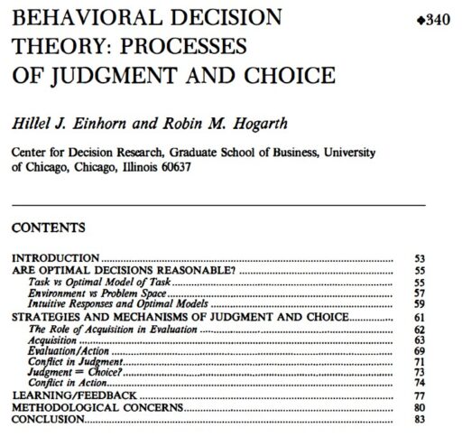
Indeed, curators face a decision-making task regarding how to display an artifact. Do they complete the artifact to restore its original appearance (e.g., sofa with hypothetical cushions) or do they remain the artifact as-is for further studies (e.g., sofa frame only)? Unfortunately, there is no right answer for this question. I wish some behavioral decision theory researchers discuss this issue seriously.