Tag Archives: Museum

How salon-style displays enrich the art viewing experience

On a recent visit to the Huntington Library, Art Museum, and Botanical Gardens in Los Angeles, I was struck by the “salon style” display of paintings—a densely arranged presentation that contrasts with today’s minimalistic museum trend.
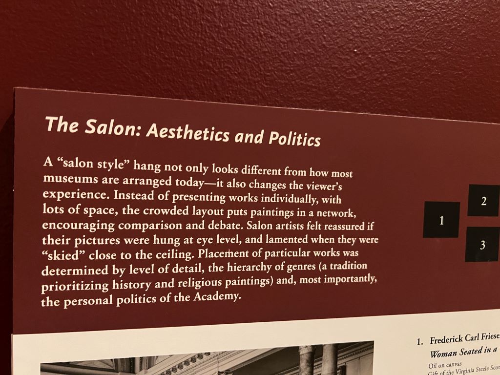
A “salon style” hang not only looks different from how most museums are arranged today-it also changes the viewer’s experience. Instead of presenting works individually, with lots of space, the crowded layout puts paintings in a network, encouraging comparison and debate. Salon artists felt reaccured if their pictures were hung at eye level, and lamented when they were “skied” close to the ceiling. Placement of particular works was determined by level of detail, the hierarchy of genres (a tradition prioritizing history and religious paintings) and, most importantly, the personal politicis of the Academy.
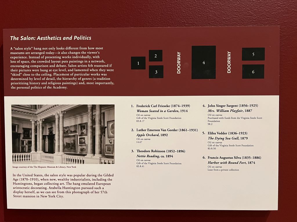
Unlike the single-piece-focused, widely spaced approach seen in contemporary galleries, salon-style hanging places artworks in close clusters, prompting viewers to think differently. Psychologically, this arrangement affects perception in two ways.
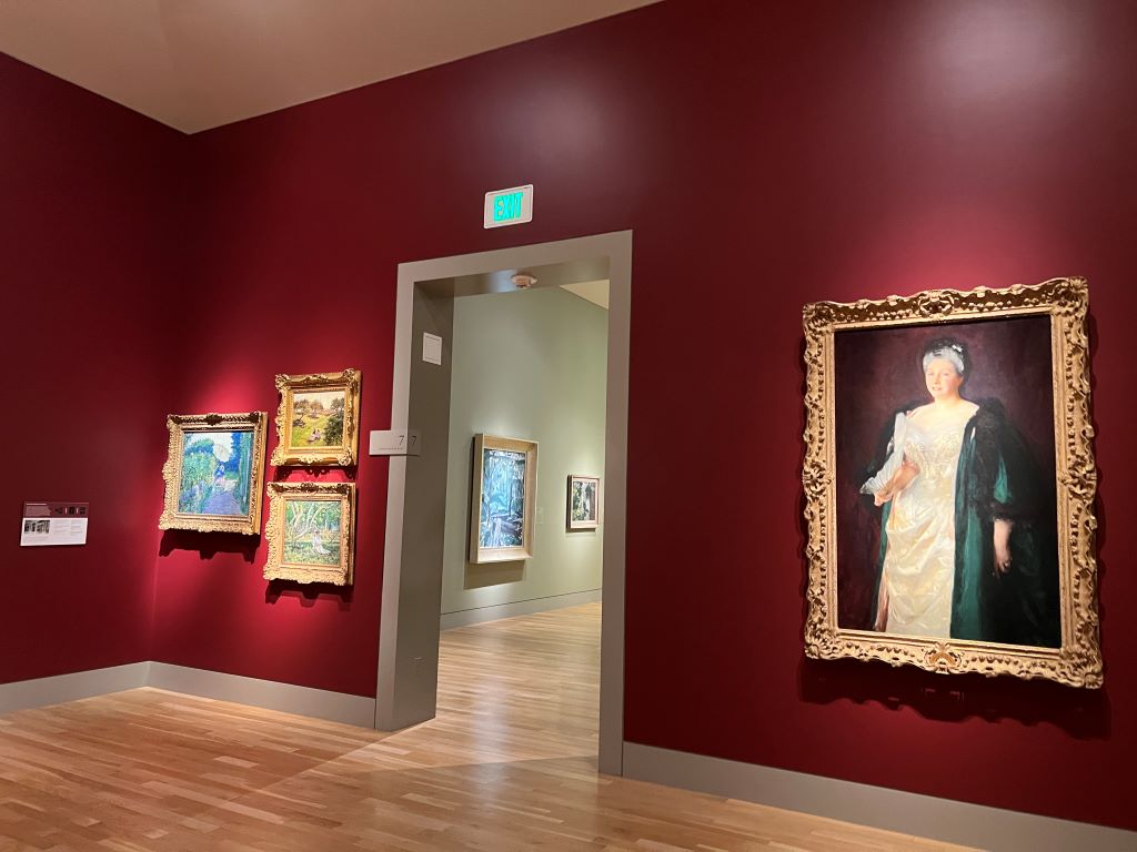
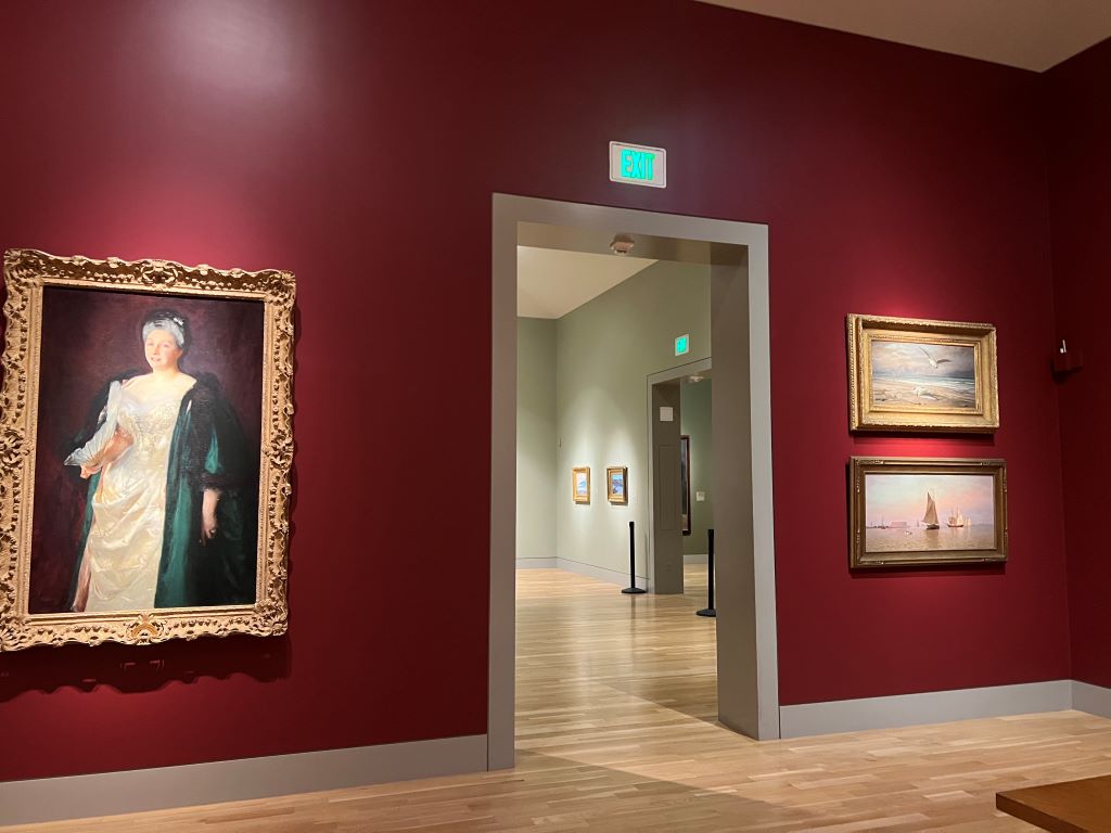
First, works displayed at eye level attract more attention—a phenomenon known as “eye level, buy level.” It is well known that eye-level placement in retail settings drives choices. Similarly, artists historically loved this prime placement, aiming to capture viewers’ gaze.

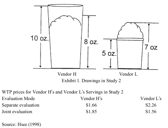
Second and more importantly, viewers are inclined to compare artworks side by side. This phenomenon aligns with Hsee’s research on “joint evaluation (JE) versus separate evaluation (SE). When items are displayed jointly, people place greater emphasis on attributes that may otherwise be hard to assess, fostering a richer, multi-dimensional engagement with items. In historical salons, this might have encouraged viewers to notice intricate qualities in each painting, which might go overlooked today when artworks are displayed individually in modern galleries.

Building on these insights with another pieces of insights found ten years ago at the Museum of Fine Arts (MFA), Boston, museum directors must carefully consider how presentation contexts shape visitor experiences. Museum visitors, like consumers, are influenced by cognitive biases and contextual cues, making behavioral economics principles crucial for optimizing the museum experience.”

***

Reference

Hsee, C. K. (1998). Less is better: When low‐value options are valued more highly than high‐value options. Journal of Behavioral Decision Making, 11(2), 107-121.

This research demonstrates a less-is-better effect in three contexts: (1) a person giving a $45 scarf as a gift was perceived to be more generous than one giving a $55 coat; (2) an overfilled ice cream serving with 7 oz of ice cream was valued more than an underfilled serving with 8 oz of ice cream; (3) a dinnerware set with 24 intact pieces was judged more favourably than one with 31 intact pieces (including the same 24) plus a few broken ones. This less-is-better effect occurred only when the options were evaluated separately, and reversed itself when the options were juxtaposed. These results are explained in terms of the evaluability hypothesis, which states that separate evaluations of objects are often infuenced by attributes which are easy to evaluate rather than by those which are important.
How could we enjoy difficult modern art easier?

Modern art work is difficult to understand. Someone posted at Quora that modern art paintings are difficult to understand because…

Modern art paintings are the best way to portray the unseen on the canvas. It is about the expression of emotions and feelings on and is not what you see at the very first glance. It can have many interpretations when seen through different angles. If you want to know more about modern art, then you can also read “Why is the New Art So Hard to understand”. It is a book written by Theodor Adorno, a German social theorist who shed more highlight on this concept that why Modern art paintings are so hard to understand modern art. Although the book was written in 1931, it is still relevant in today’s era.

How could we lower its difficulty and help visitors enjoy the modern art better? One solution is to allow visitors not to understand the artists’ intentions correctly. Instead, if visitors are allowed to misunderstand artists’ intentions and even disagree with artists’ opinions, if any, they will be relieved to fail.

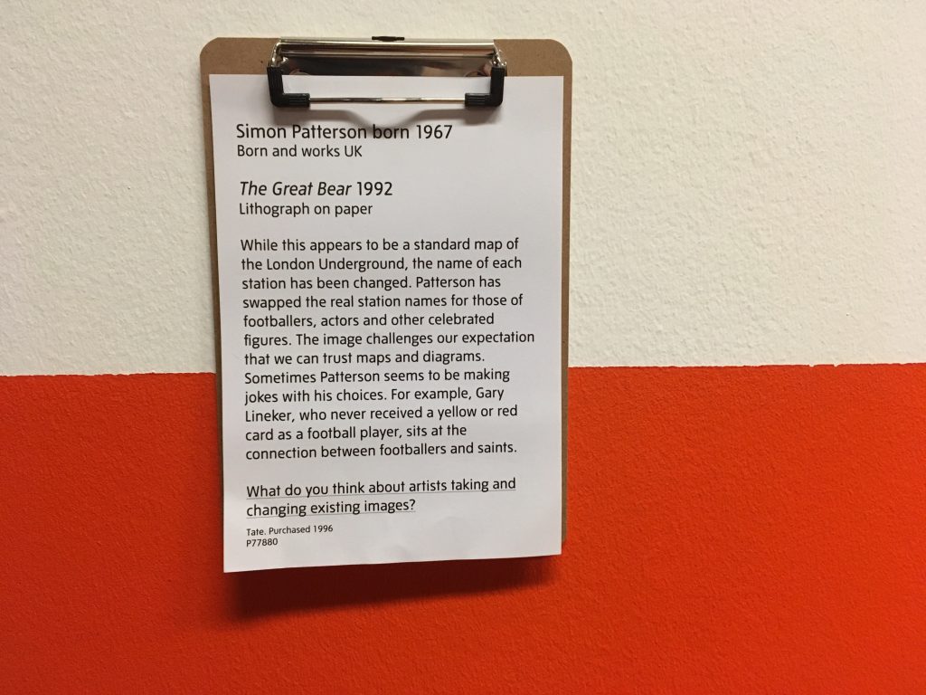
A great example is the underlined sentence under the modern artwork named The Great Bear by Simon Patternson in 1992. This sentence was added by a curator working at the Tate Liverpool, UK. Indeed, several students stood in front of this artwork and casually discussed to answer the question.

Simon Patterson born 1967 (Born and work UK) / The Great Bear 1992 (Lithograph on paper)

While this appears to be a standard map of the London Underground, the name of each station has been changed. Patterson has swapped the real station names for those of footballers, actors, and other celebrated figures. The image challenges our expectation that we can trust maps and diagrams. Sometimes Patterson seems to be making jokes with his choices. For example, Gary Lineker, who never received a yellow or red card as a football player, sits at the connection between footballers and saints.

  • What do you think about artists taking and changing existing images?

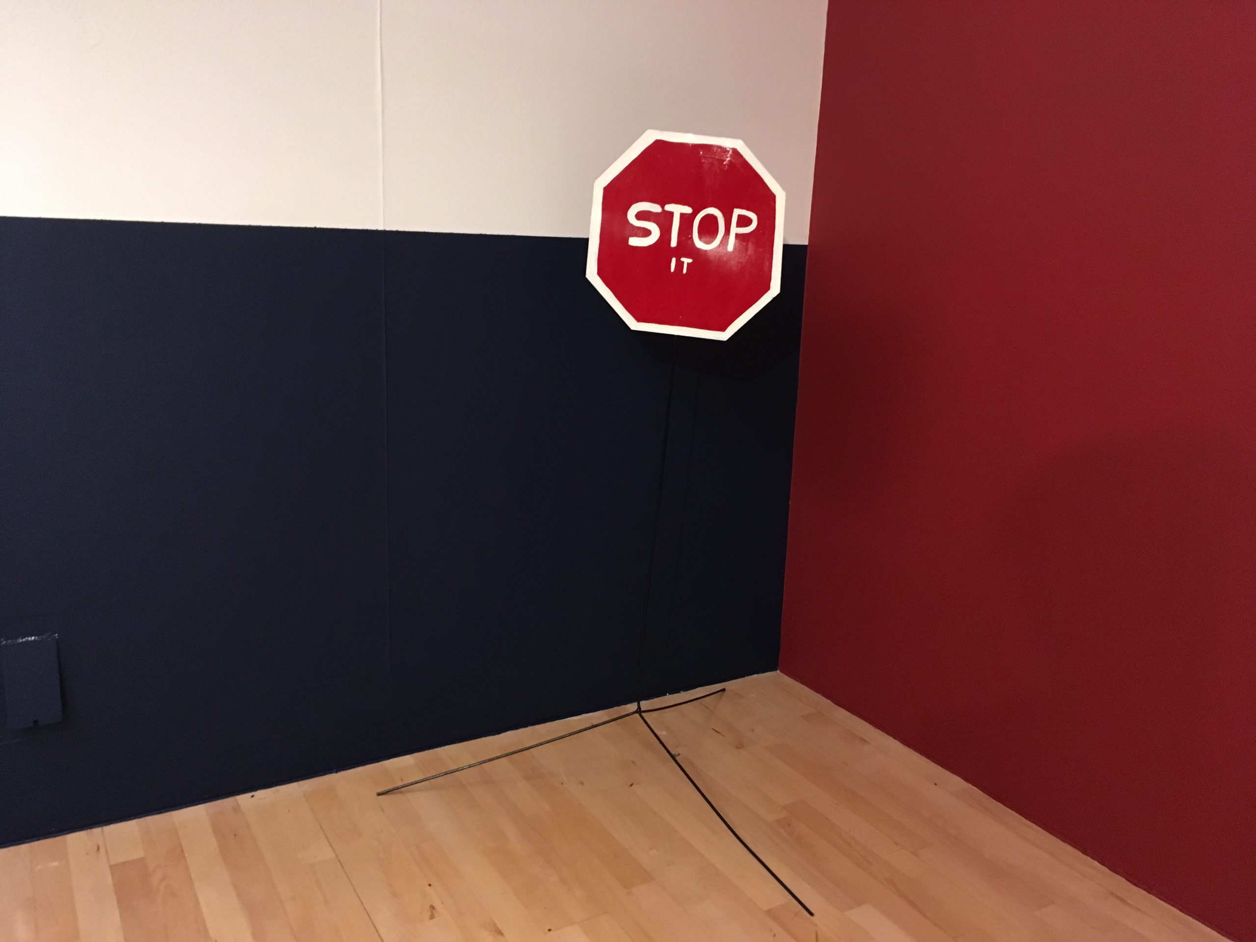
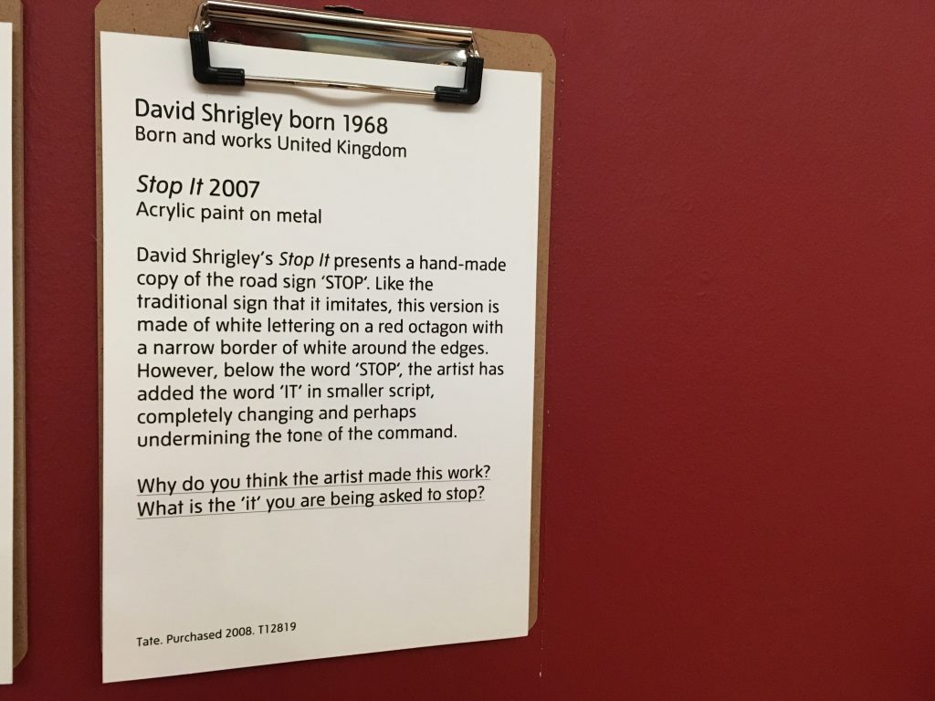
A similar sentence was found under another artwork (see below). Reading just one more sentence under the artwork made this Tate Modern museum more friendly and more approachable.

  • Why do you think the artist made this work? What is the ‘it’ you are being asked to stop?

Behaivoral scientists argue that people find information important when it is easy to process (called fluent). Since modern art is difficult, people often avoid and even ignore it. When curators make the modern art easier to process, people will enjoy it.

**

Reference

Shah, A. K., & Oppenheimer, D. M. (2007). Easy does it: The role of fluency in cue weighting. Judgment and Decision Making, 2(6), 371–379.

We propose that people weight fluent, or easy to process, information more heavily than disfluent information when making judgments. Cue fluency was manipulated independent of objective cue validity in three studies, the findings from which support our hypothesis. In Experiment 1, participants weighted a consumer review more heavily when it was written in a clear font than in a less clear font. In Experiment 2, participants placed more weight on information when it was in focus than when it was blurry. In Experiment 3, participants placed more weight on financial information from brokerage firms with easy to pronounce names than those with hard to pronounce names. These studies demonstrate that fluency affects cue weighting independent of objective cue validity.

What is the right choice for museum curators?

DML_Boston

While I stayed in Boston for the conference, I visited Museum of Fine Arts (MFA), Boston and met an intriguing decision-making question. I took a picture of a panel titled Making Choices which says,

Every gallery represents a long series of choices. Who decides which works go on view and how they should be arranged? What factors go into making that decision? Does the Museum have consistent guidelines about what should be on view — or do the rules change from gallery to gallery?

Ultimately, the MFA’s curators are responsible for deciding what you see in the galleries, for making choices from the Museum’s rich collections that do justice to the art and engage the viewer. Context is key — what is the story to be told? Should the gallery be a survey of a whole period or should it showcase just a few artists in depth? Should it provide variety or set up close comparisons? Re-create a sense of a historical period, focus on a specific style, or feature that character of individual objects? Curators work with a team of designers and educators in considering these issues and making these decisions.

And finally there is the question of quality. Which works are the most compelling? In which are the artist’s skills most effectively employed? Where are materials used with the greatest sophistication or technical ability? And what about condition: does the work still represent the artist’s intent at the time it was made?

Indeed, curators face a decision-making task regarding how to display an artifact. Do they complete the artifact to restore its original appearance (e.g., sofa with hypothetical cushions) or do they remain the artifact as-is for further studies (e.g., sofa frame only)? Unfortunately, there is no right answer for this question. I wish some behavioral decision theory researchers discuss this issue seriously.

***

Reference

Einhorn, H. J., & Hogarth, R. M. (1981). Behavioral decision theory: Processes of judgement and choiceAnnual review of psychology32(1), 53-88.