Tag Archives: Consumer behaivor

We humanize machine behavior and mechanize human behavior

In order to spice up our daily communication, we often humanize what electronic devices do. For instance, we say, our mobile phone is “stupid” or our storage space “gains weight.” This “anthropomorphism” is defined as the attribution of human traits, emotions, or intentions to non-human entities. According to Wikipedia, it has ancient roots as storytelling and artistic devices, and most cultures have traditional fables with anthropomorphized animals as characters.

However, there is another way to spice up our daily communication. We can mechanize what humans do. For instance, we say, we need to “upgrade” our brains or we want to go to bed to “recharge.” This “mechanomorphism” is a conception of something (as the universe or a living creature) as operating mechanically or to be fully accounted for according to the laws of physical science. Differently from anthropomorphism, mechanomorphism seems to be more popular among tech-savvy younger generation.

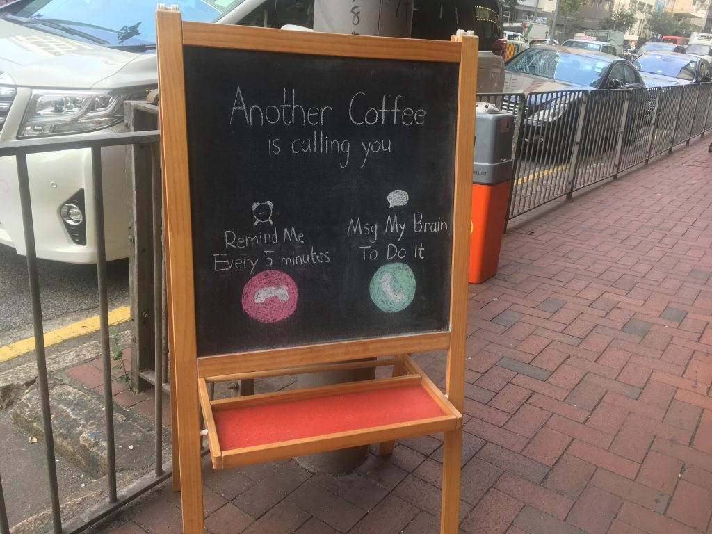
In Hong Kong, I met an excellent example of mechanomorphism. A chalkboard sign outside a coffee shop says “Another coffee is calling you.” Then there are two options: “Remind me every 5 minutes” or “Msg my brain to do it.”

Caporael, L.R. (1986), Anthropomorphism and mechanomorphism: Two faces of the human machine, Computers in Human Behavior, 2 (3), 215-234.

This paper explores the ambiguity of the “human machine”. It suggests that anthropomorphism results from a “default schema” applied to phenomena, including machines, that a perceiver finds otherwise inexplicable. Mechanomorphism, the attribution of machine characteristics to humans, is a culturally derived metaphor that presently dominates cognitive science. The relationships between anthropomorphism and mechanomorphism pose a special difficulty for the question, “Can machines think?” Does a positive response reflect a cognitive bias on the part of the perceiver or a genuine attribute of the computer? The problem is illustrated for Turing’s “imitation game” for thinking machines, and a strategy for constraining anthropomorphic attributions is proposed.

People do not prefer crowded restaurants over empty ones

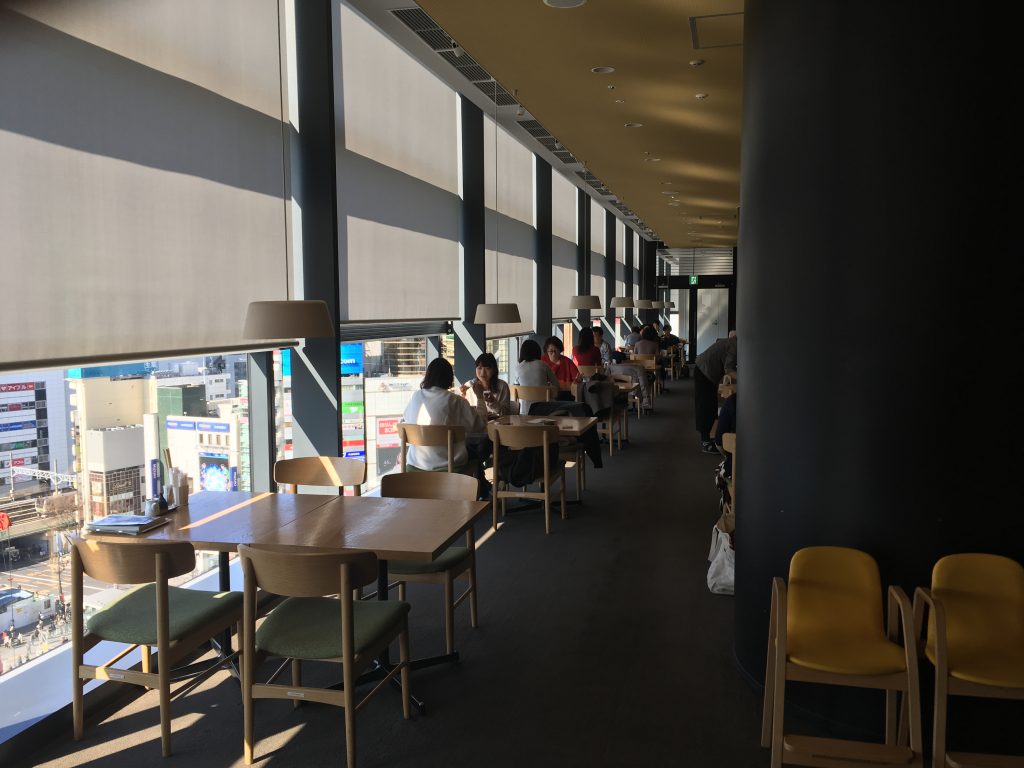
About 36 million people live in Tokyo and its neighboring cities. Most restaurants well known to foreigners are heavily crowded. Therefore, when I dine out in Tokyo, I have to wait for a table for a decent amount of time. The fact that many local people are waiting for their tables relieves my concern that I might have chosen a wrong restaurant. Although crowdedness plays a role as social proof when I “choose” a restaurant, I think I may enjoy dish more if I have a breathing room or enough empty space inside when I “experience” a restaurant.

My thought was supported when I had a lunch at a restaurant run by D&Department in Tokyo. D&Department project is a store-style activist proposed by Nagaoka Kenmei, a Japanese designer, in 2000, with a theme of a “long-life design.” It introduces design products for our daily lives such as eating, drinking, publishing and traveling. It aims to spread all over the country the products excavated in local regions. Therefore, the design products introduced by D&Department are the durable items that should be used for a long time and regional items that each specific region of Japan uniquely identifies. Therefore, serving local, authentic dish at a restaurant made sense to me.

Going beyond design items and local dish, this restaurant provided sufficient empty space to each guest, which was rare in Tokyo. This restaurant limited the number of guests entering the space. Therefore, people focused on their own dish inside while a huge crowd of people waited for their tables outside. This space was quiet and well organized and guests were not visually distracted.

Do we like crowdedness or emptiness at restaurants? Marketing scientists have studied this issue. Some argue that crowdedness plays a role as a social proof while others argue that emptiness signals social class. We may like crowdedness when buying mass products or visiting casual restaurants, whereas we pursue emptiness when searching for luxury goods or dining out at Michelin starred restaurants.

***

Reference

O’Guinn, T. C., Tanner, R. J., & Maeng, A. (2015). Turning to space: Social density, social class, and the value of things in stores. Journal of Consumer Research, 42(2), 196–213.

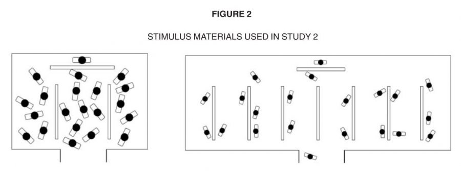
This article is about social space and material objects for sale within that space. We draw primarily on Goffman’s (1971) concepts of use space and possession territories to predict that as the social density of a given space increases, inferences of the subjective social class and income of people in that space fall. Eight studies confirm that this is indeed the case, with the result holding even for stick figures, thus controlling for typical visual indicators of social class such as clothing or jewelry. Furthermore, these social class inferences mediate a relationship between social density and product valuation, with individuals assessing both higher prices and a greater willingness to pay for products presented in less crowded contexts. This effect of inferred class on product valuation is explained by status-motivated individuals’ desire to associate with higher-status people. To the best of our knowledge, this research is the first to reveal the link between social density, status inferences, and object valuations. As such, it makes a novel contribution to what has come to be known in sociology as the topological turn: a renewed focus on social space.

What happens when the men’s room sign is pink?

20130315_Washroom @ Ewha Women University (2)

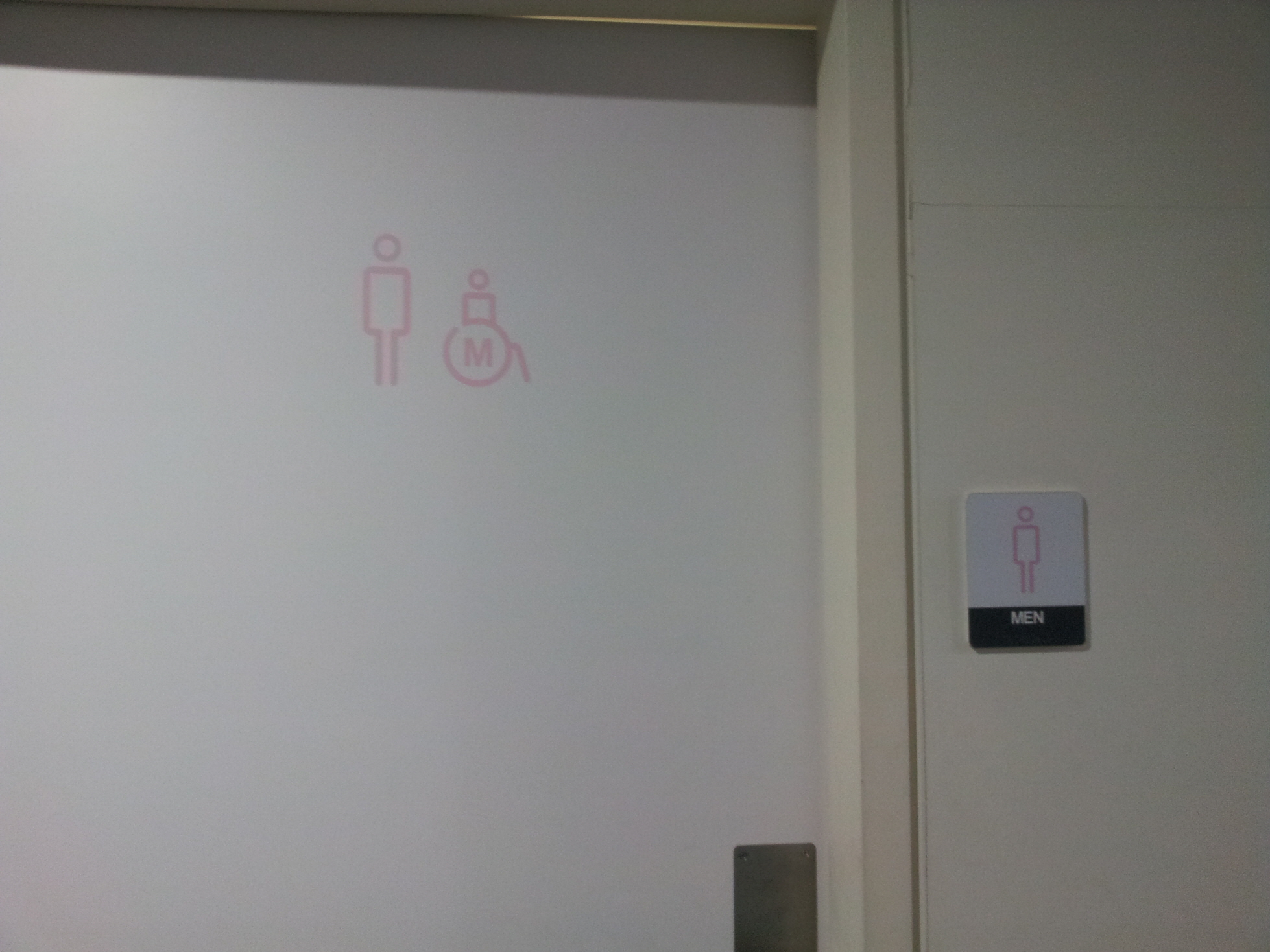
Blue is for boys and pink is for girls. This color-gender association is strongly established in many countries. In a women’s university in Korea, however, signs for men’s rooms and for ladies’ rooms are both colored in pink. My friend said that they use the same color to avoid any possible gender discrimination. Interestingly however, pink signs confuse men when searching for men’s room. Indeed, “men” needs to be written down on the door of men’s room.

20130315_Washroom @ Ewha Women University (3)

This raises a series of interesting questions.

  • First, does the different colors discriminate different genders?
  • Second, if this is the case, should we sacrifice our color-based convenience in order to promote social justice?
  • Third, if color-based convenience needs to be replaced with other coding systems, what are the other ways that do not discriminate gender? For instance, if the shape-gender association is a good candidate (below), how could we UN-learn the color-gender association and then learn the shape-gender association?
20130315_Washroom @ Ewha Women University (1)

Reference

Scarpina, F., & Tagini, S. (2017). The stroop color and word testFrontiers in psychology8, 557.

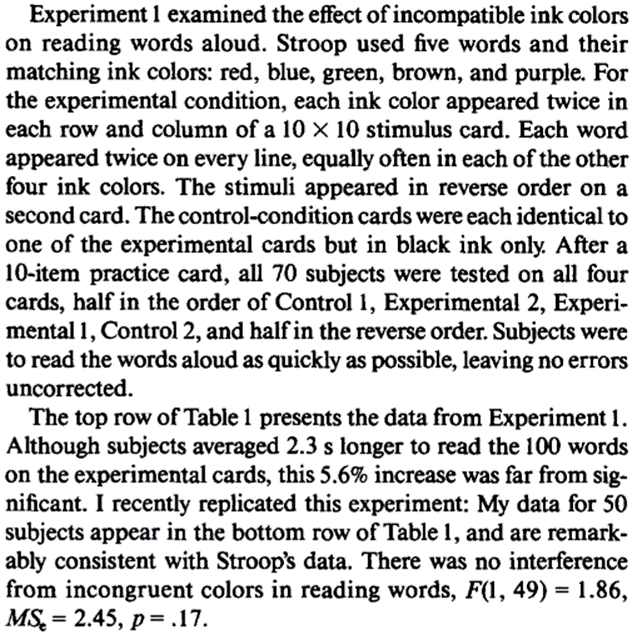
The literature on interference in the Stroop Color and Word Test, covering over 50 yrs and some 400 studies, is organized and reviewed. In so doing, a set of 18 reliable empirical findings is isolated that must be captured by any successful theory of the Stroop effect. Existing theoretical positions are summarized and evaluated in view of this critical evidence and the 2 major candidate theories, relative speed of processing and automaticity of reading, are found to be wanting. It is concluded that recent theories placing the explanatory weight on parallel processing of the irrelevant and the relevant dimensions are likely to be more successful than are earlier theories attempting to locate a single bottleneck in attention.