In cafes in Copenhagen, Denmark, customers are often asked to create their own meals by combining foods. I succeeded in this creative task in one cafe but did not in the other. Two cafes have slightly different menus.
I enjoyed the meal in the Mad & Kaffes (Food & Coffee). Foods were divided into six categories on the menu (green, dairy, bakery, meat and fish, and treat). I decided how many categories to go (3, 5, or 7) and then selected one food in each category.
I did not enjoy the meal in the Moller Kaffe and Kokken (Moller Coffee and Kitchen). Although individual foods were excellent, they were listed under one category. I could not figure out which foods to choose.
Since I knew little about Danish cuisine, categories relieved my burden and helped me create a meal. A similar logic was discovered ten years ago by marketing researchers who showed why kids need to follow instructions to assemble Lego bricks. To reach a creative outcome, we may need decision supporters such as categories, instructions, or even constraints.
From cooking kits to home improvement shows, consumers are increasingly seeking out products that are designed to help them be creative. In this research, the authors examine why consumers participate in creative activities and under what conditions these experiences are the most enjoyable. A qualitative study explores the diverse motivations for undertaking creative tasks and identifies the role of constraints in such endeavors. Then, the authors conduct two experimental studies to understand the importance of constraints (e.g., instructional guidance, target outcomes) in facilitating a balance between perceived competence and autonomy for consumers involved in a creative task. When consumers engage in creative activities with a sense of both autonomy and competence, they enjoy the experience more. The authors discuss implications for managers and provide opportunities for further research.
Habit. If a bus has two doors it is actually more efficient for passengers to exit by the back door as any new passengers enter through the front door. However, most people use the front door when exiting out of habit, sometimes even walking the full length of the bus to do so.
I do it for two reasons. First: I do it because I may be transferring to another bus. And believe me, getting out the back door vs. the front can make the difference between making your next bus and missing it. It happens sometimes, and i never know which time it will be. Second: I do it so I can thank the driver personally. They have a tough job. Lots of people abuse them. I like to treat them well.
Because it is safer. Using a back door bears the risk that the bus driver won’t see you and could slam the door on you or depart while you are in mid-air. It has happened to me on more than one occasion.
I do so mostly out of habit but also so that I can thank the driver. These women and men sometimes cop abuse that is quite unwarranted in my view. They deserve the same courtesy as everyone else and for getting me to my destination safely and comfortably.
Maybe they were closer to the front than rear. Maybe they did not feel like walking to the rear. Maybe they were unsure if the rear is crowded. Maybe they were absent-minded and accidentally took the front. Maybe they figured it doesn’t matter. There could be many ‘maybes’, all with their own reasons, only way to be sure is to ask.
Handicapped people find it easier to use the front. The driver can pull closer to the curb and “kneel” the bus to make it easier for cane-users. Wheelchair-users need the ramp in the front of the bus.
If they are sitting right at the front of the bus it is the closest door. It is normal to just exit at the closest door.
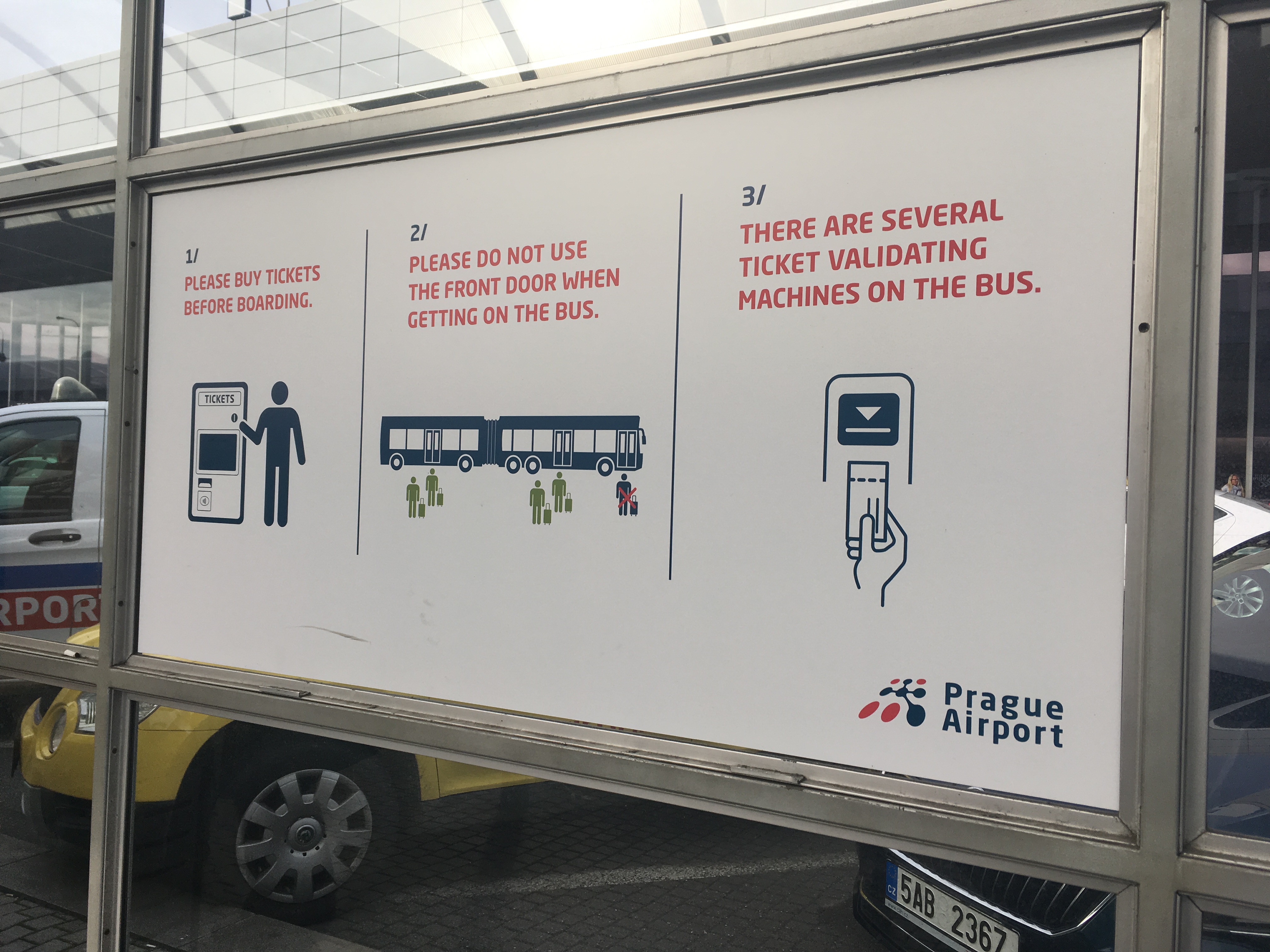
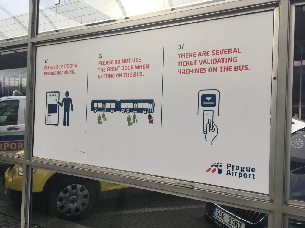
All the answers were based on the assumption that people should enter the bus at the front door. I used to have the same thought before I went to Prague and Nagasaki where the front door of the bus was designed differently.
At these two cities, passengers get off the bus at the front door. In other words, at Prague and Nagasaki, people exit the bus at the front door not because of habit or convenience but because they are educated and trained. Something that was taken for granted to me was not to them.
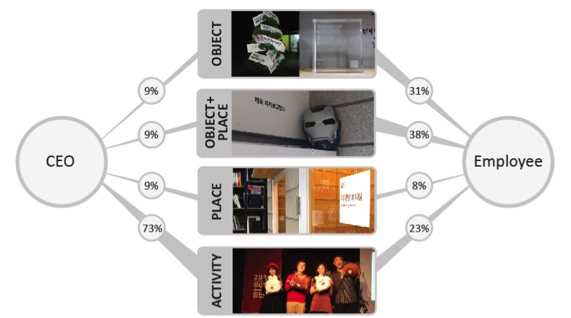
Macau has many tourist spots including Senado Square and Ruins of St. Pauls. However, I enjoyed a shopping district at The Venetian Macau the most. As the name suggests, a man-made Italian city exists in the hotel.
When I first entered this district, something unnatural grabbed my attention; canal is narrow, floor is shiny, and lights are bright. These are clearly different from what I saw or expected in Venice.
However, about 30 minutes later, I saw myself paying attention to something good: cool air, blue sky, and sailor’s singing a song. Then, it did not take more than an hour to feel like I was in Venice. I was surprised by how soon I became immersed with a fake world or, more precisely, a human-made store environment (probably because some people took a ride on the gondola?).
As many of us live in cities, we are often surrounded by human-made environments. What if our thoughts and behaviors are dictated by artificial environment?
Chinese government tries hard to reduce plastic waste. Recently, it banned plastic waste import. According to financial times, half of the UK plastic waste need to find alternative places desperately.
In contrast, Chinese people seem to overuse plastics. In Shenzhen, for instance, plates are often wrapped with plastic packages. We should tear it down and throw it away. Sometimes, plastic gloves are provided at the restaurants. We wear the gloves when eating bread.
I suspect Chinese people are addicted to plastics probably because they consider plastics cleaner and safer than water or napkins. If we aim to reduce plastic consumption in China, we should consider the Chinese psychology about plastics seriously.
… This company (Woowa Brothers (woowa is Korean for “elegance”) developed a mobile application (app) for food delivery services in 2010. Interestingly, the CEO of this company was trained as a designer and worked as a designer for several Web consultancies and an Internet search-engine company… Woowa Brothers achieved 77.3% brand awareness at a total cost of $74,000, whereas similar services spent approximately $4 million and only reached 38.8%. This app achieved 10 million downloads for the first time in the Korean app history. Goldman Sachs decided to invest 40 billion Korean won (U.S. $33.1 million) into the company in 2014.
… We collected leadership cues from two parties, the CEO and employees, and then mapped them onto Brunswik’s Lens Model, a psychological framework often used in Social Judgment Theory. Our newly adopted research framework helps us better understand the designer’s unique leadership style; unlike non-design business CEOs, the design CEO or DEO (Design Executive Officer) used a wide variety of visual cues… the DEO tacitly communicates visual (tangible) cues with employees for reward and authorization. In particular, the DEO is good at incorporating a tangible benefit and infusing a live and vivid characteristic into an environment. We found that the DEO utilizes visual cues effectively when communicating leadership.
We want to voluntarily participate in recycling but do so only when it is easy. Here are the two bin boxes available at a university in Seoul. Unfortunately, their colors and their names are not matched: the left one has a blue cover and its green panel says “recycled” whereas the right one has a green cover and a blue panel says “disposable.” The mismatch among name, cover color, and panel color led me to give up choosing one for my empty coffee can. Instead, I threw it away somewhere else. Indeed, behaving in a sustainable way requires huge mental resources. Therefore, things need to be designed carefully in advance.
**
Reference
White, K., Hardisty, D. J., & Habib, R. (2019). The elusive green consumer. Harvard Business Review, 11(1), 124-133.
People say they want sustainable products, but they don’t tend to buy them. Here’s how to change that.
Stellan Ohlsson, Professor in Psychology at University of Illinois at Chicago visited COGENG (Cognitive Engineering Lab) at SKKU and gave a speech on skill acquisition. He introduced his own work of learning from errors in which he argues that, in order to acquire or specializes in a certain skill (e.g., changing a lane to the left while driving), people should not only perform a certain task (e.g., turning the steering wheel to the left) but also detect and correct errors (e.g., turning the steering wheel to the left only when a car behind approaches). According to his constraint based approach, a skill is acquired only when a certain action with a negative outcome is unlearned (e.g., turning the steering wheel to the left slowly so that being hit by the car behind).
Certainly, there are many more ways to acquire skills. According to his review paper published in 2008, there are at least nine different ways of how people acquire skills.
Blue is for boys and pink is for girls. This color-gender association is strongly established in many countries. In a women’s university in Korea, however, signs for men’s rooms and for ladies’ rooms are both colored in pink. My friend said that they use the same color to avoid any possible gender discrimination. Interestingly however, pink signs confuse men when searching for men’s room. Indeed, “men” needs to be written down on the door of men’s room.
This raises a series of interesting questions.
First, does the different colors discriminate different genders?
Second, if this is the case, should we sacrifice our color-based convenience in order to promote social justice?
Third, if color-based convenience needs to be replaced with other coding systems, what are the other ways that do not discriminate gender? For instance, if the shape-gender association is a good candidate (below), how could we UN-learn the color-gender association and then learn the shape-gender association?
The literature on interference in the Stroop Color and Word Test, covering over 50 yrs and some 400 studies, is organized and reviewed. In so doing, a set of 18 reliable empirical findings is isolated that must be captured by any successful theory of the Stroop effect. Existing theoretical positions are summarized and evaluated in view of this critical evidence and the 2 major candidate theories, relative speed of processing and automaticity of reading, are found to be wanting. It is concluded that recent theories placing the explanatory weight on parallel processing of the irrelevant and the relevant dimensions are likely to be more successful than are earlier theories attempting to locate a single bottleneck in attention.
We often meet a product with a unique form and find it difficult to guess how it works. Examples include a donut-looking tape by 3M, a burger/fries/coke-looking USB key by Burger King, or a chocolate-looking mirror by Meiji, a Japanese chocolate manufacturer. One of my Japanese friends even pointed me a website in which a designer keeps posting his/her design prototypes (Prototype 1000).
I wonder whether consumers like a product more when its form and function are inconsistent than when they are consistent.
Marketers struggle with how best to position innovative products that are incongruent with consumer expectations. Compounding the issue, many incongruent products are the result of innovative changes in product form intended to increase hedonic appeal. Crossing various product categories with various positioning tactics in a single meta-analytic framework, the authors find that positioning plays an important role in how consumers evaluate incongruent form. The results demonstrate that when a product is positioned on functional dimensions, consumers show more preferential evaluations for moderately incongruent form than for congruent form. However, when a product is positioned on experiential dimensions, consumers show more preferential evaluations for congruent form than for moderately incongruent form. Importantly, an increase in perceived hedonic benefits mediates the former, whereas a decrease in perceived utilitarian benefits mediates the latter. The mediation effects are consistent with the view that consumers must first understand a product’s functionality before engaging in hedonic consumption.
One of the most distinctive current design trends is minimalism. Examples are ranging from electronics such as Apple’s iPod, LG’s chocolate phone, and B&O’s BeoSound system to interior accessories such as Muji’s fan and the humidifier at Plus Minus Zero (by Naoto Fukasawa). Since some of those minimally designed products made a huge commercial success, we need to understand how consumers respond to minimalist products, the products with the minimum number of design features such as colors, shapes and buttons.
Simplicity has been discussed in various areas. For instance, John Maeda (2007), a computer scientist and graphic designer argues in his book, The Laws of Simplicity that simplicity needs to be accomplished in graphic design as well as in organizations, business, and technology. Wallace (2006) also attributes the success of Apple and Google to their simplicity, urging marketers to deliver selective distinctive benefits in today’s visually overloaded environment. However, it is also true that many European designers complain that, mostly US, consumers are not ready to embrace the value of simplicity. Don Norman in his blog argues that simplicity is highly overrated. Then, when functionality is not sacrificed, does minimalism truly increase consumer preference?
Although designers aim at “less for more” when developing a product, they struggle with how to achieve simplicity and why making a product simple improves the commercial value of the product. To answer the two questions, we performed one experimental study. In the study, we searched for which of the six different types of lowering visual complexity is effective and examined whether authenticity mediates the effect of visual complexity on commercial value. Results show that three out of six types of lowering visual complexity (e.g., irregularity of arrangement, amount of material, incongruity) deemed to be more commercial value. Results also show that decreasing the amount of material is the only way to enhance authenticity, which in turn increases the commercial value of the product.