Tag Archives: experiment

Standing desk: New way to work

I suffered from minor shoulder – and wrist pain for a long time. In order to lessen the pain, I decided to train my left hand for using the computer mouse a few years back.

Certainly, using mouse with my left hand was very challenging in the first couple of years. However, 3-year of intensive practice paid me off. I could click, drag, and drop icons using my left hand without noticing that I did so with my left hand.

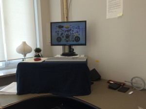
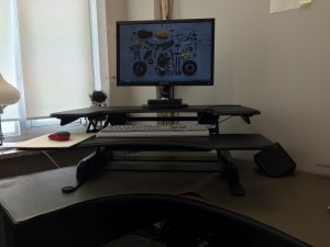
After having succeeded this “experiment,” I made another decision recently to relieve back pain; standing up while working. I first searched for standing desks or stand-up desks, then read online posts (e.g., reviews by Mark Luckch and Alan Henry), and then created my own standing desk by putting together empty paper boxes.

My DIY practice showed the effect Instantly. I became free from back pain, paid more attention to my tasks, and most importantly, became exhausted at evening as I “exercised” all day long. In short, I was tired at day and slept well at night. Finally, I bought a height-adjustable table from Varidesk. 🙂

20150408_Desk(2) 20150408_Desk(4)


Behavior change requires time

Changing behavior is important but challenging. Thus, it attracts huge attention among practitioners as well as researchers. For instance, Charles Duhigg introduced various examples in his book, The Power of Habit: Why We Do What We Do in Life and Business. Professor BJ Fogg at Stanford University proposed a behavior change model at the Persuasive Technology Lab. Designers graduating from the ID, Illinois Institute of Technology summarized the mechanisms and tools on their website, Brains Behavior and Design Group. Most recently, Professor Dilip Soman at University of Toronto teaches Behavioral Economics in Action at his online course.

DesignMarketingLab_Behavioral Economics in Action

For me, I have long wished to be ambidextrous. In Asia, however, using left hand to do something (e.g., eating, writing, pointing, etc.) is not viewed appropriate and I had no chance to practice my left hand. Therefore, I have experimented myself since when I left for Canada whether I can practice my left hand so that it performs as well as my right hand does.

Brushing teeth with my left hand was relatively easy at night. However, doing so in the morning was extremely challenging. Although I have brushed teeth with my left hand for the past 10 years, I often find myself brushing teeth with my right hand when I am sleepy or tired, which is often the case in the morning. Indeed, ten-year is not sufficient to master brushing teeth with my left hand probably because I did not stop brushing teeth with my right hand.

I had different experience regarding controlling the computer mouse. Certainly, using mouse with my left hand was very challenging in the first couple of years. However, 3-year of intensive practice paid me off. I could click, drag, and drop icons using my left hand without noticing that I did so with my left hand. This habit relieves the shoulder pain and I can work longer than before. Three-year was sufficient to master using the mouse with my left hand probably because I completely stopped using the mouse with my right hand.

DesignMarketingLab_Left handed mouse

I plan to start sketching/drawing with my left hand this year. Different from brushing teeth or controlling computer mouse, I have not drawn before. In other words, I have no habit to unlearn but need to develop a new habit only. I hope skipping the unlearning stage takes me less time/effort to master sketching with my left hand.
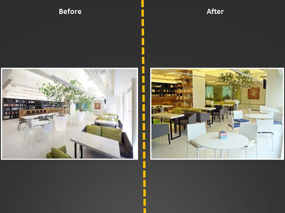
Experiment for collaborative office space in Seoul (2)

> Continued from Experiment for collaborative office space in Seoul (1)

The team discovered two issues for building a collaborative office space in Seoul.

  • First, people have a double standard. They generally use the open space for serious reasons such as discussing business issues or having meetings with clients. However, when they notice others occupying the space, the others “seem to” chat over a cup of coffee, read casual books, or just have fun. This unnecessary strictness of others inhibits them from visiting the open space.
  • Second, people prefer the sofas located next to the window over the white table located in the middle. This skewed flow does not allow accidental interactions.

The team decided not to attack the first, psychological issue but to attack the second, technical issue and then conducted a few experiments to smooth the flow with a hope to make the whole space more vital. For example, the sofas and the round tables with chairs switched each other. As shown below, many people followed the sofas and while doing so, they made some accidental interactions, which is a key feature for collaborative office spaces (see Adam Alter’s post).

Space design (1)Space design (3)

This project shows that a minor change in an office space determines the flow, which in turn makes the space where collaboration can happen.

Experiment for collaborative office space in Seoul (1)

[youtube=http://www.youtube.com/watch?v=bpm_LIyMtMY]

Although many people want their offices similar to the Pixar’s office or the Google’s New York office, only few had them. Adam Alter, Assistant Professor of Marketing at New York University, wrote a piece of article on this issue at U99 (How to build a collaborative office space like Pixar and Google). In this article, he argues four key features of a collaborative office space.

  • An open plan and other design features (e.g., high-traffic staircases) that encourage accidental interactions.
  • More common areas than are strictly necessary—multiple cafeterias, other places to read and work that encourage workers to leave confined offices.
  • Emphasis on areas that hold two or more people, rather than single-occupancy offices.
  • Purpose-free generic “thinking” areas in open-plan spaces, which encourage workers to do their thinking in the presence of other people, rather than alone.

**

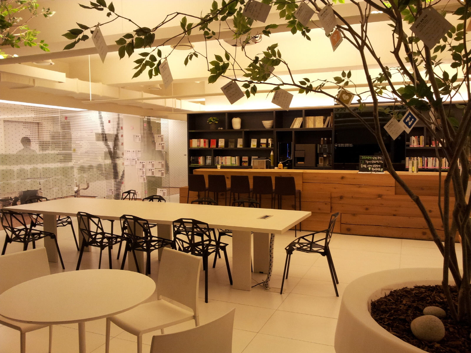
Dongwha holdings, a company selling interior items and dealing used cars based in Seoul, opened a space called Green Lounge in 2010. This space was dedicated to encourage collaboration among employees. It was equipped with sofas and tables, designer chairs, upscale coffee machines, and a plenty of casual books, etc.

20130306_Action Learning @ Dongwha (6)

This open space, however, was mostly empty. Very different from Californians and New Yorkers, people in Seoul avoided mingle with strangers and thus accidental interactions did not occur. Instead, they stopped by this space with their colleagues and picked up free coffee and left. Alternatively, they occupied meeting rooms for chatting with friends or keeping focused on their own businesses.

In order to revitalize this open space, a team of employees conducted research; they performed deep interviews with others, video recorded others’ behaviors, and collected and analyzed the flow in the open space. This research revealed two issues and the team decided to attack one of those issues by conducting several experiments.

> Go to Experiment for collaborative office space in Seoul (2)

How to make a minimalist product?

 Samsung Multi function printer

One of the most distinctive current design trends is minimalism. Examples are ranging from electronics such as Apple’s iPod, LG’s chocolate phone, and B&O’s BeoSound system to interior accessories such as Muji’s fan and the humidifier at Plus Minus Zero (by Naoto Fukasawa). Since some of those minimally designed products made a huge commercial success, we need to understand how consumers respond to minimalist products, the products with the minimum number of design features such as colors, shapes and buttons. 

Bang & Olufson speaker

Simplicity has been discussed in various areas. For instance, John Maeda (2007), a computer scientist and graphic designer argues in his book, The Laws of Simplicity that simplicity needs to be accomplished in graphic design as well as in organizations, business, and technology. Wallace (2006) also attributes the success of Apple and Google to their simplicity, urging marketers to deliver selective distinctive benefits in today’s visually overloaded environment. However, it is also true that many European designers complain that, mostly US, consumers are not ready to embrace the value of simplicity. Don Norman in his blog argues that simplicity is highly overrated. Then, when functionality is not sacrificed, does minimalism truly increase consumer preference?

Shin and Joo (2019), “Less for more, but how & why? – Number of elements as key determinant of visual complexity,” International Association of Societies of Design Research 2019, Manchester:UK. 

Although designers aim at “less for more” when developing a product, they struggle with how to achieve simplicity and why making a product simple improves the commercial value of the product. To answer the two questions, we performed one experimental study. In the study, we searched for which of the six different types of lowering visual complexity is effective and examined whether authenticity mediates the effect of visual complexity on commercial value. Results show that three out of six types of lowering visual complexity (e.g., irregularity of arrangement, amount of material, incongruity) deemed to be more commercial value. Results also show that decreasing the amount of material is the only way to enhance authenticity, which in turn increases the commercial value of the product.