Tag Archives: psychology

How many items should be displayed in a store?

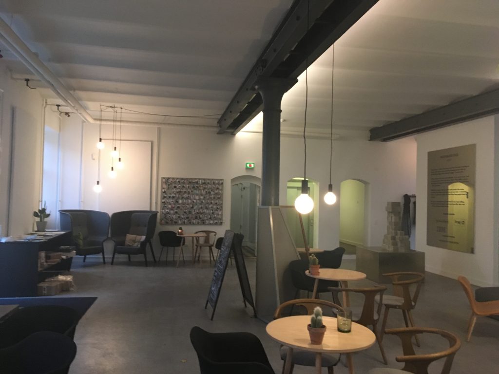
When we are curious about value of an unknown object, we often consider how many people surround it. If it is alone, we believe it is expensive. If it is surrounded by many others, we believe it is cheap. This is because, according to O’Guinn’s et al. (2015), as the social density of a given space increases, “inference of the subjective social class and income of people in that space” fall. Although we like different degrees of crowdedness (D&Department in Tokyo) and even view the same degree of crowdedness differently (Kronen Vanlose in Copenhagen), crowdedness decreases the value of a product.

O’Guinn, T. C., Tanner, R. J., & Maeng, A. (2015). Turning to space: Social density, social class, and the value of things in stores. Journal of Consumer Research, 42(2), 196-213.

This article is about social space and material objects for sale within that space. We draw primarily on Goffman’s (1971) concepts of use space and possession territories to predict that as the social density of a given space increases, inferences of the subjective social class and income of people in that space fall. Eight studies confirm that this is indeed the case, with the result holding even for stick figures, thus controlling for typical visual indicators of social class such as clothing or jewelry. Furthermore, these social class inferences mediate a relationship between social density and product valuation, with individuals assessing both higher prices and a greater willingness to pay for products presented in less crowded contexts. This effect of inferred class on product valuation is explained by status-motivated individuals’ desire to associate with higher-status people. To the best of our knowledge, this research is the first to reveal the link between social density, status inferences, and object valuations. As such, it makes a novel contribution to what has come to be known in sociology as the topological turn: a renewed focus on social space.

Then, could we apply the same logic to stores where products are surrounded by other products? In other words, does “product crowdedness” decrease product value as well? This is an important question as stores display items in different ways.

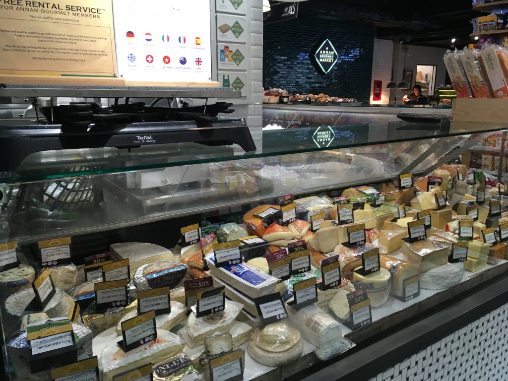
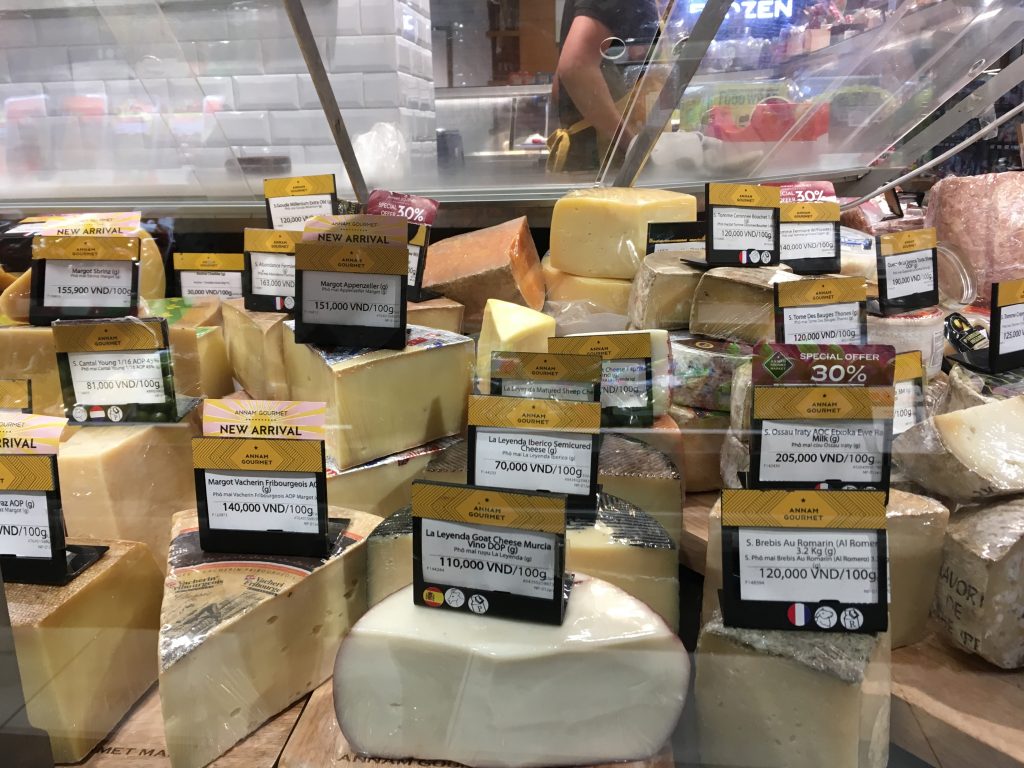
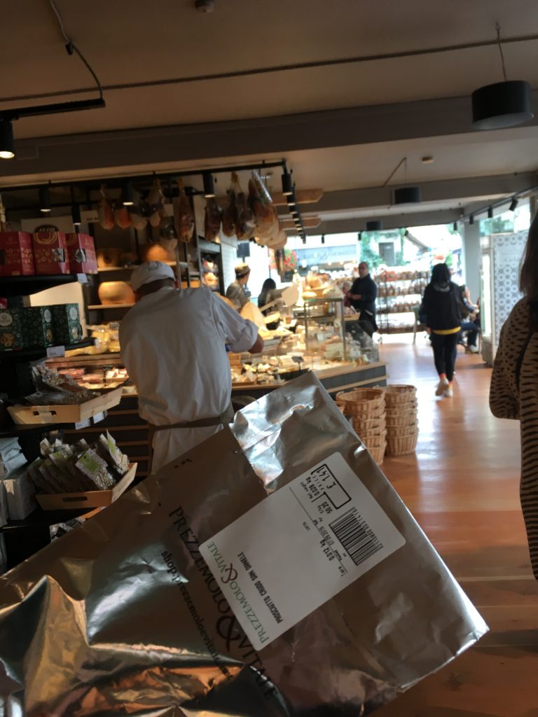
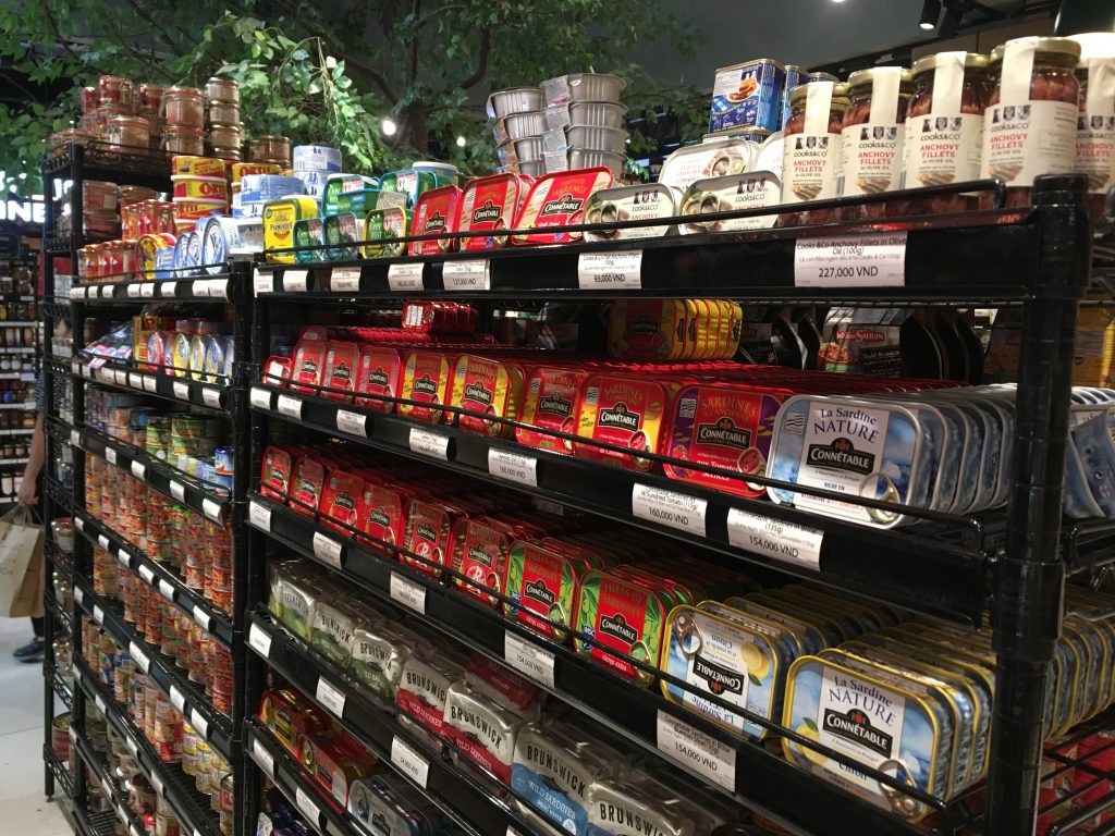
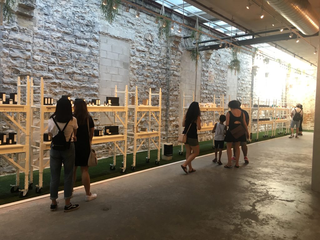
Some stores display various items with a lot of stocks. For instance, at Annam Gourmet, Ho Chi Minh, only a few cans of sea food are on the shelf space with multiple stocks.

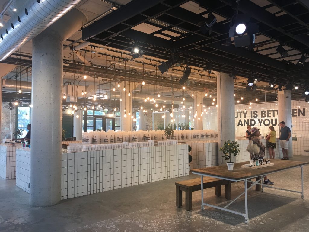
Other stores display only few items with few stocks. For instance, Decium, a Canadian cosmetic company introduces a few items without showing their stocks.  

Two contrasting examples show that stocks determine the perceived value of products. Designers and marketers should decrease the number of products displayed in the store to increase their perceived value. There is a 8-minute video about an inside look at Decium to see how the company has managed to find success in the highly competitive, the multi-billion-dollar world of skin care.

Why do we doodle?

According to Wikipedia, doodles are simple drawings that can have concrete representational meaning or may just be composed of random and abstract lines. However, all doodles are not same. Some doodles are hedonic and others are utilitarian.

Hedonic doodles are personal. They are drawings about interpretation of subjective experience, mostly for fun. For instance, I doodled below to remember what I enjoyed while I stayed in Shenzhen, China. I used Mobike, drank HeyTea and wine, took a BYD electronic taxi, visited Macau by ferry, and ate beef, crab, sea food, and noodle each in different places. Its road was wide and its hot water dispenser attracted my attention.

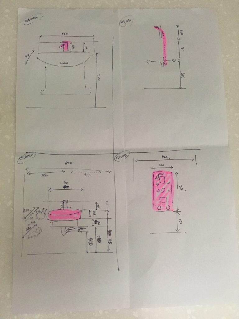
Different from hedonic doodles, utilitarian doodles have practical purposes. They are drawings about objective information, mostly for effective communications with others. For instance, I drew the facet, the shower head, the top bowl, and the shower booth in my bathroom with their sizes and heights when I wanted to replace them with new ones (below).

I like doodling, but I am often intimidated when doodling because of the pressure that I should doodle perfectly. However, I recently learned that if I clarified the purpose of doodling and choose either hedonic or utilitarian, I was not intimidated. Probably, I am not the only one who has a mixed feeling about doodling. Who knows if I keep doodling now and draw a professional graffiti like the one I met in Sao Paulo, Brazil? 🙂

Reference

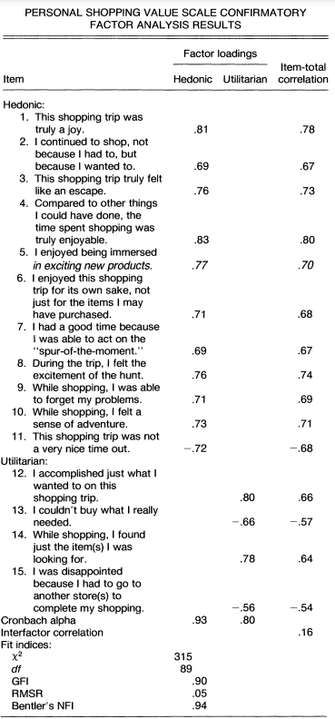
Babin, B.J., Darden, W.R. and Griffin, M. (1994) Work and/or Fun: Measuring Hedonic and Utilitarian Shopping Value. Journal of Consumer Research, 20, 644-656.

Consumer researchers’ growing interest in consumer experiences has revealed that many consumption activities produce both hedonic and utilitarian outcomes. Thus, there is an increasing need for scales to assess consumer perceptions of both hedonic and utilitarian values. This article describes the development of a scale measuring both values obtained from the pervasive consumption experience of shopping. The authors develop and validate the scale using a multistep process. The results demonstrate that distinct hedonic and utilitarian shopping value dimensions exist and are related to a number of important consumption variables. Implications for further applications of the scale are discussed

Street signs for kids

Most street signs ask someone NOT to do something. For instance, they ask pedestrians not to run fast or they ask drivers not to drive fast.

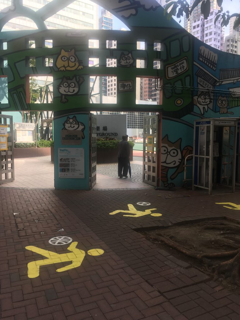
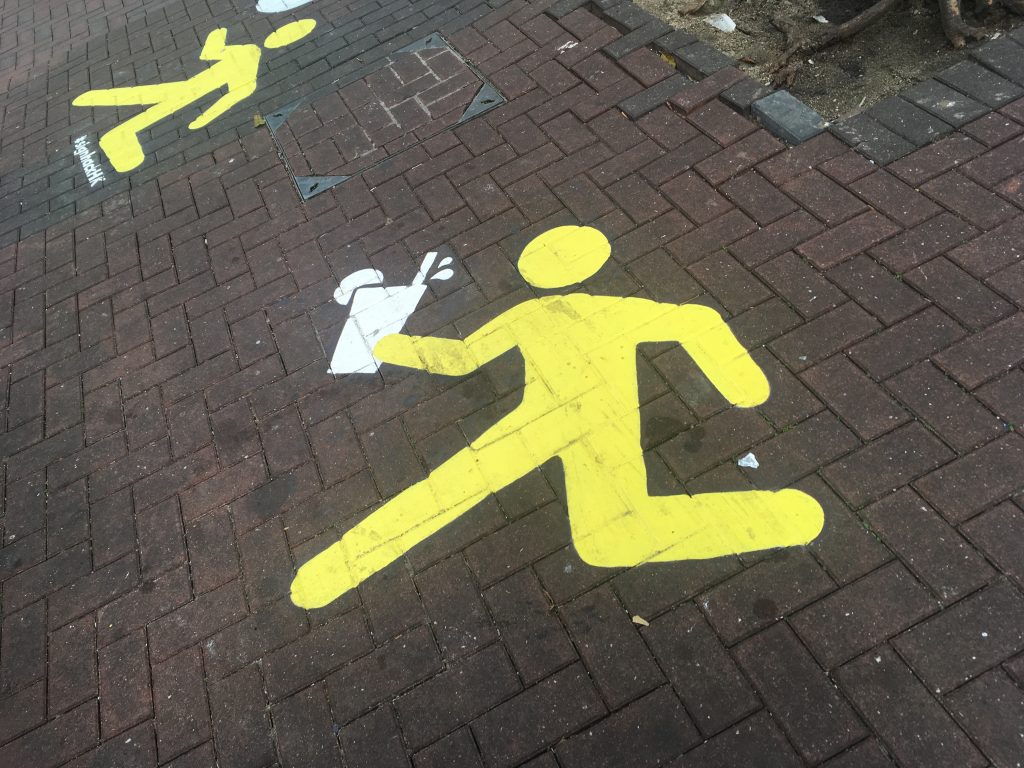
However, at a school in Hong Kong, I finally met different street signs designed for students. They encourage students to DO something. Several yellow students were painted on a street surrounding a tree. They are encouraged or at least allowed to carry different items such as basketball, football, soda, and noodle (?).

Research suggests that we behave differently when we are in a promotion-focused mode than in a prevention-focused mode. If we see promotion-focused street signs more on the road, we behave differently (e.g., please fly drone here or please use mobile phone here).

Trope, Y., & Liberman, N. (2010). Construal-Level Theory of Psychological Distance. Psychological Review, 117(2), 440–463.

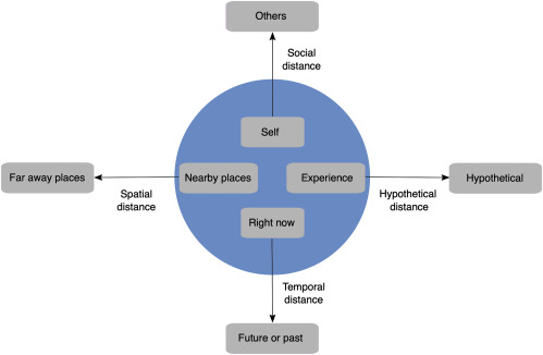
People are capable of thinking about the future, the past, remote locations, another person’s perspective, and counterfactual alternatives. Without denying the uniqueness of each process, it is proposed that they constitute different forms of traversing psychological distance. Psychological distance is egocentric: Its reference point is the self in the here and now, and the different ways in which an object might be removed from that point—in time, in space, in social distance, and in hypotheticality—constitute different distance dimensions. Transcending the self in the here and now entails mental construal, and the farther removed an object is from direct experience, the higher (more abstract) the level of construal of that object. Supporting this analysis, research shows (a) that the various distances are cognitively related to each other, (b) that they similarly influence and are influenced by level of mental construal, and (c) that they similarly affect prediction, preference, and action.

Foreigners form impressions instantly about countries

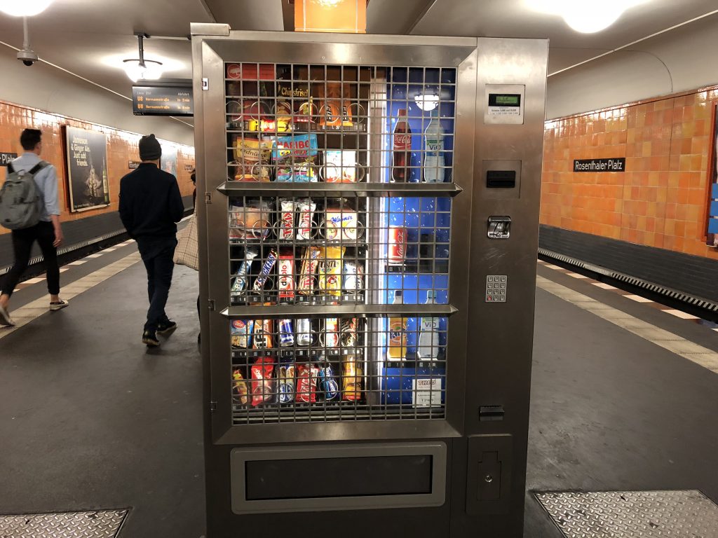
In Berlin, Germany, I met a vending machine in a steel cage. Covering the machine with a cage surprised me because it was inside one of downtown subway stations. My friend told me the machine could be damaged at night by drunken people. I formed an impression that Germany was unsafe; juvenile vandalism, an action involving deliberate destruction of or damage to public or private property, was popular in this country.


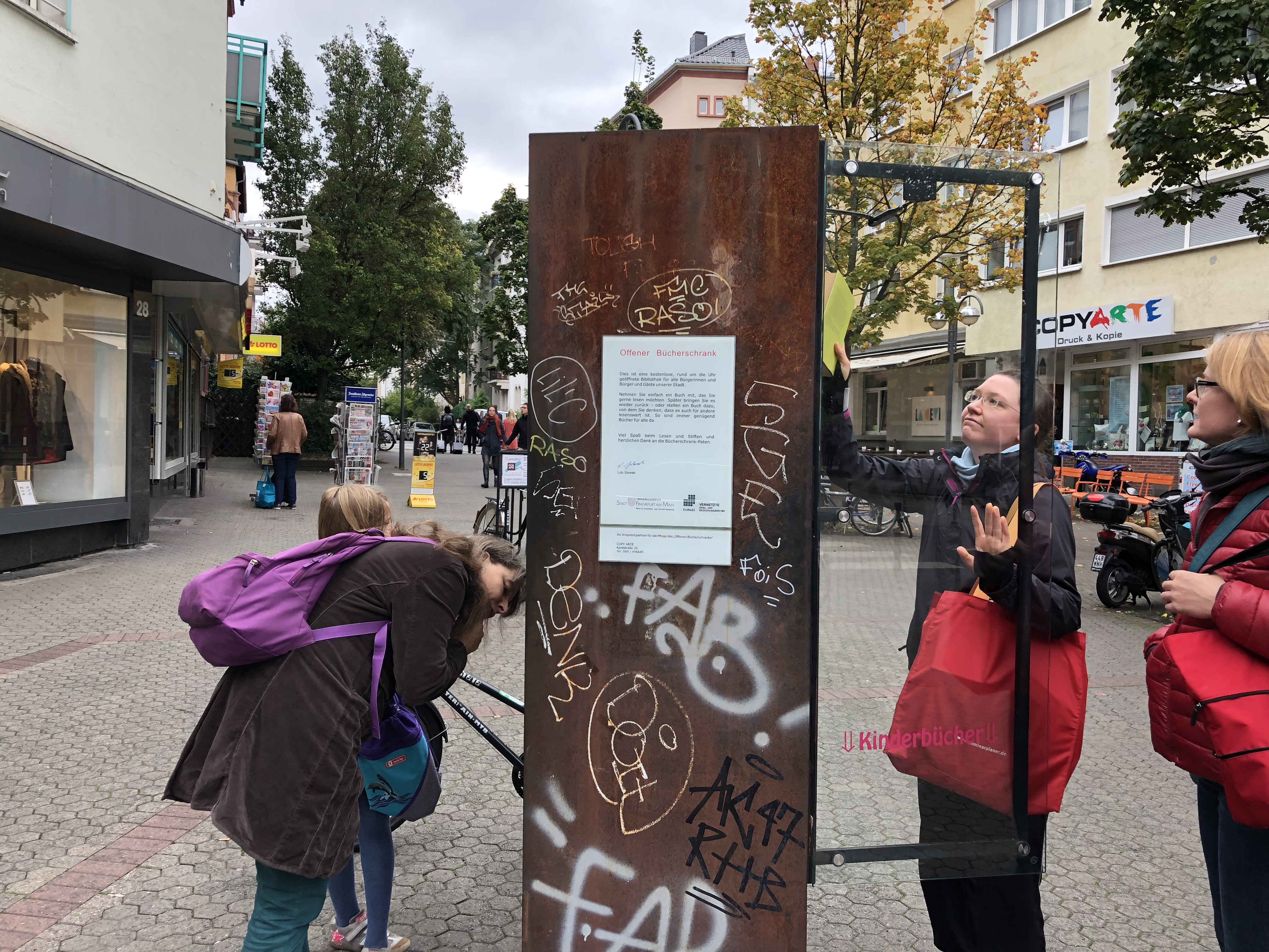
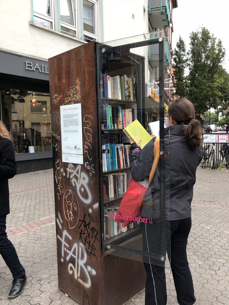
A few days later, I met a public book shelf in another city. At a market in Frankfurt, people freely opened the window and picked up as many books to read as they wanted. Then, I corrected my impression and thought Germany is safe.


I find myself using trivial cues to quickly form an impression about a city or a country. A steel cage led me to think Germany was dangerous for tourists. However, as Brunswik suggested in his Les Model research, the first impression fails to reflect the truth. Soon after, leaning occurs. A book shelf changed my viewpoint about Germany; this country is safe for travel. I expect same things happen to foreigners. When Europeans come to an Asian country, they probably use a trivial cue to form an impression and use other cues to correct it. Learning should occur to understand different cities, countries, and culture correctly.


Brunswik, E. (1955). Representative design and probabilistic theory in a functional psychology. Psychological Review, 62(3), 193-217.

This is the core or basic paper in a symposium on the probability approach in psychology. The paper expands on earlier contentions of this author that the environment to which an organism must adjust is semi erratic and that therefore all functional psychology is inherently probabilistic, demanding a representative research design of its own, and leading to a special type of high-complexity, descriptive theory. “The expansions beyond the earlier publications… concern mainly the use of a behavioral example… ; the brief consideration of such semi representative policies as ‘canvassing’; certain comparisons with factorial design and the analysis of variance, as well as with non-functionalistic uses of probability in psychology; and a discussion of actual and potential applications to the clinical-social area and to related domains.”


Opt in vs. Opt out: Different defaults in different cities

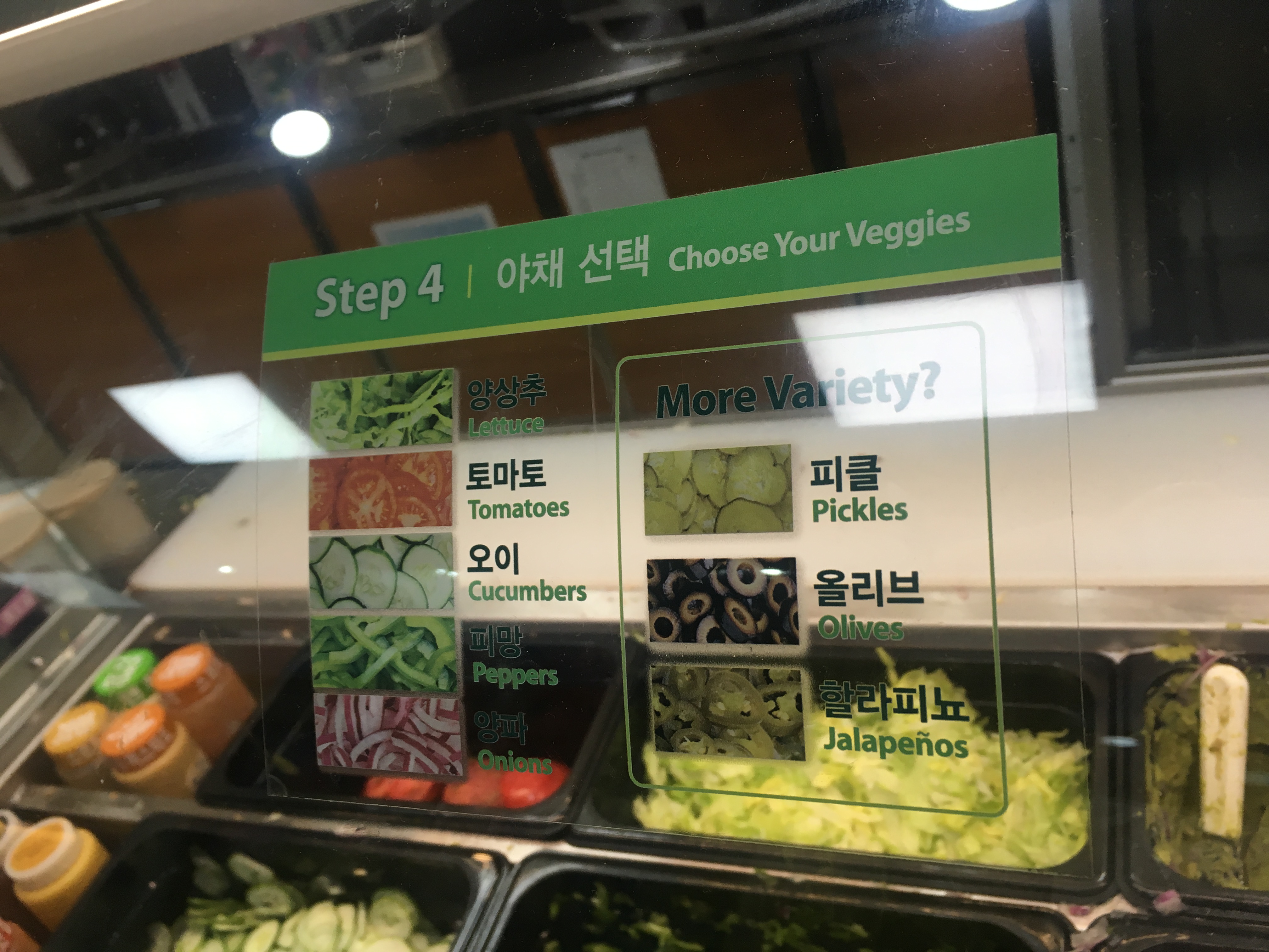
I used to order the same sandwich at the Subway in Toronto (turkey-breast on a six inch, honey oat bread with lettuce, tomatoes, onions, and black olives). Subway opened a store recently in my campus in Seoul. 

I ordered the same meat and the same bread. Then, I said to a server the same vegetables, “lettuce, tomatoes, onions, and black olives.” She added cucumbers and peppers. I asked her why. She answered “I pull out the vegetables customers say.”

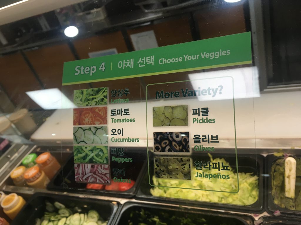
I noticed that most customers said nothing about vegetables. They considered the five vegetables on the window as the opt out, default options. Only few customers said “everything but…”

For the people who do not usually make a series of choices for a single meal, opt out default vegetables may relieve their burden. I expect choosing from meats and breads to vegetables and dressings are demanding for most Asians. For them, choosing which vegetables to add are additionally demanding. When they skip choosing vegetables, they may enjoy meals more even though they do not like to eat more vegetables.

Scheibehenne, B., Greifeneder, R., & Todd, P. M. (2010). Can There Ever Be Too Many Options? A Meta-Analytic Review of Choice Overload. Journal of Consumer Research, 37(3), 409–425.

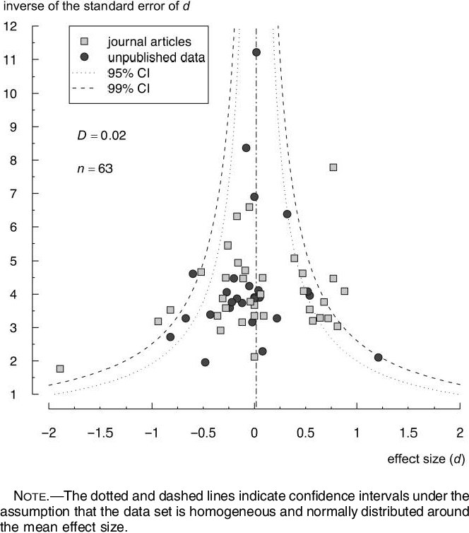
The choice overload hypothesis states that an increase in the number of options to choose from may lead to adverse consequences such as a decrease in the motivation to choose or the satisfaction with the finally chosen option. A number of studies found strong instances of choice overload in the lab and in the field, but others found no such effects or found that more choices may instead facilitate choice and increase satisfaction. In a meta-analysis of 63 conditions from 50 published and unpublished experiments (N = 5,036), we found a mean effect size of virtually zero but considerable variance between studies. While further analyses indicated several potentially important preconditions for choice overload, no sufficient conditions could be identified. However, some idiosyncratic moderators proposed in single studies may still explain when and why choice overload reliably occurs; we review these studies and identify possible directions for future research.

Do we enjoy brunch more if we combine foods to create it?

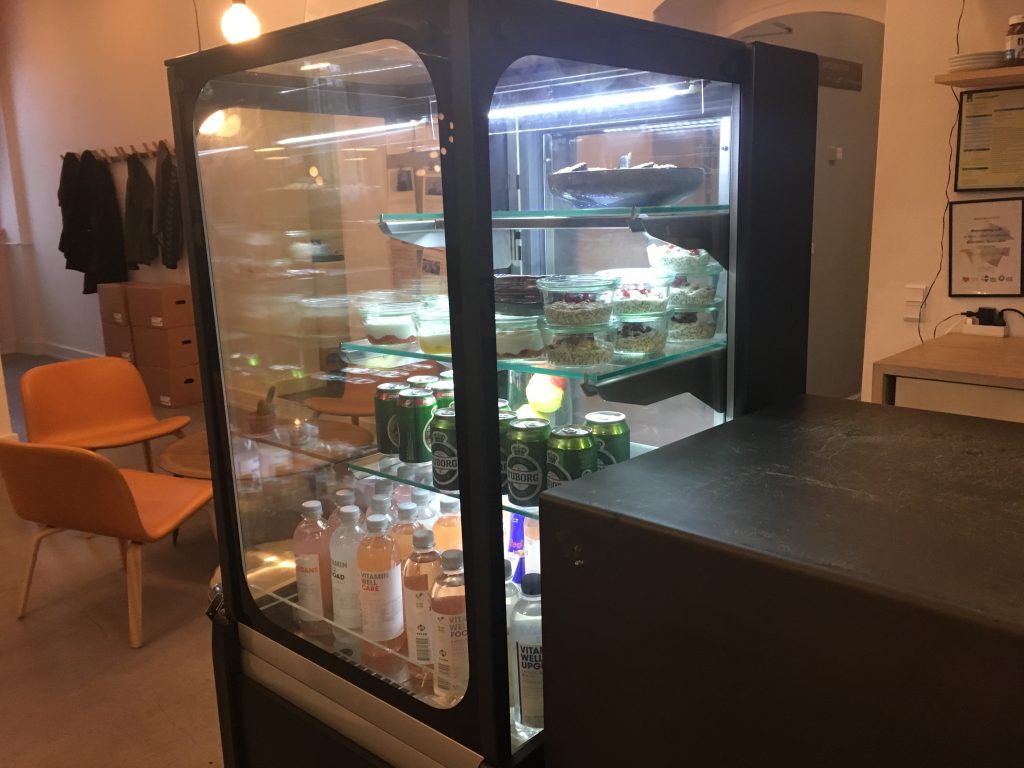
In cafes in Copenhagen, Denmark, customers are often asked to create their own meals by combining foods. I succeeded in this creative task in one cafe but did not in the other. Two cafes have slightly different menus.

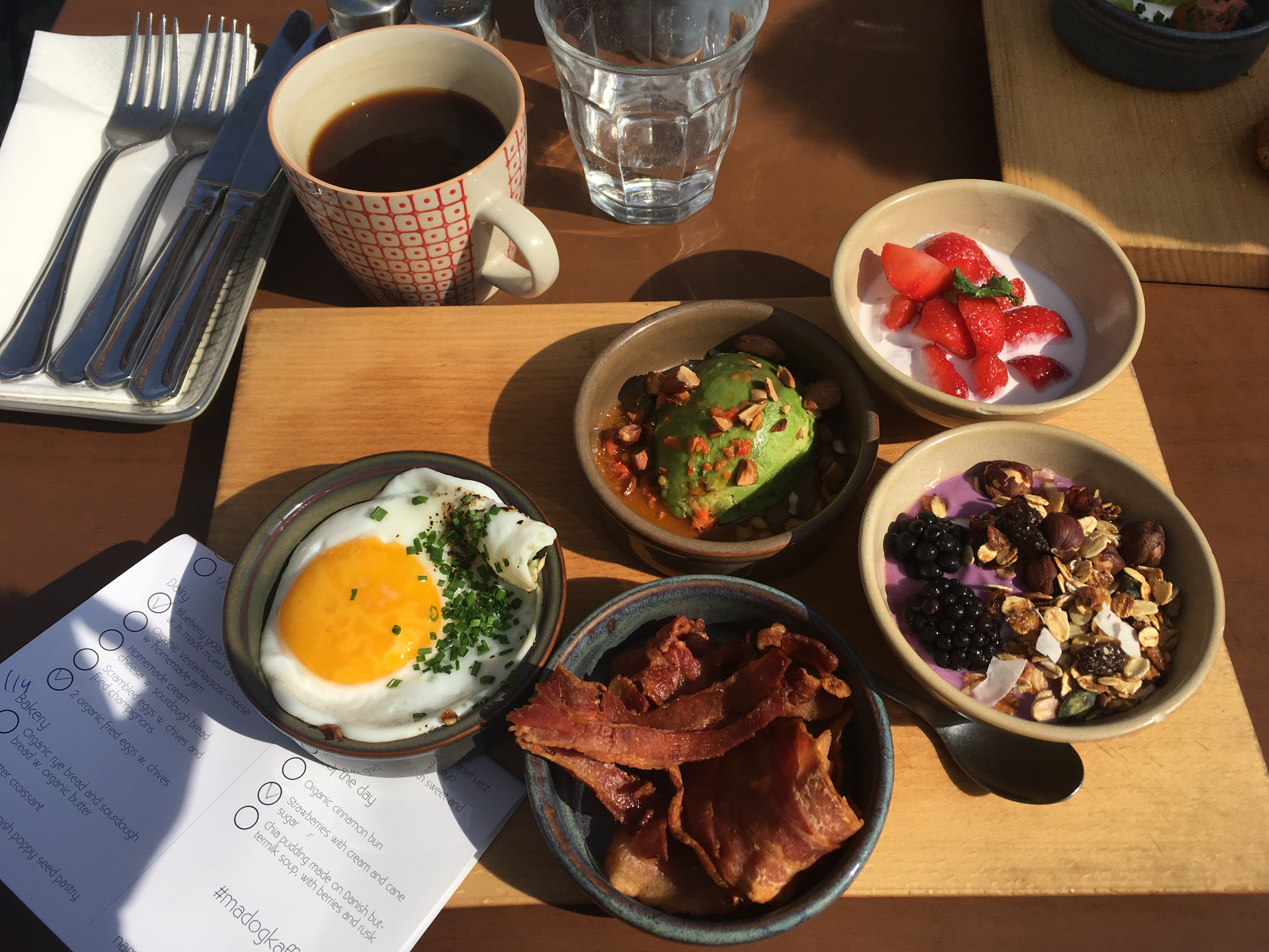
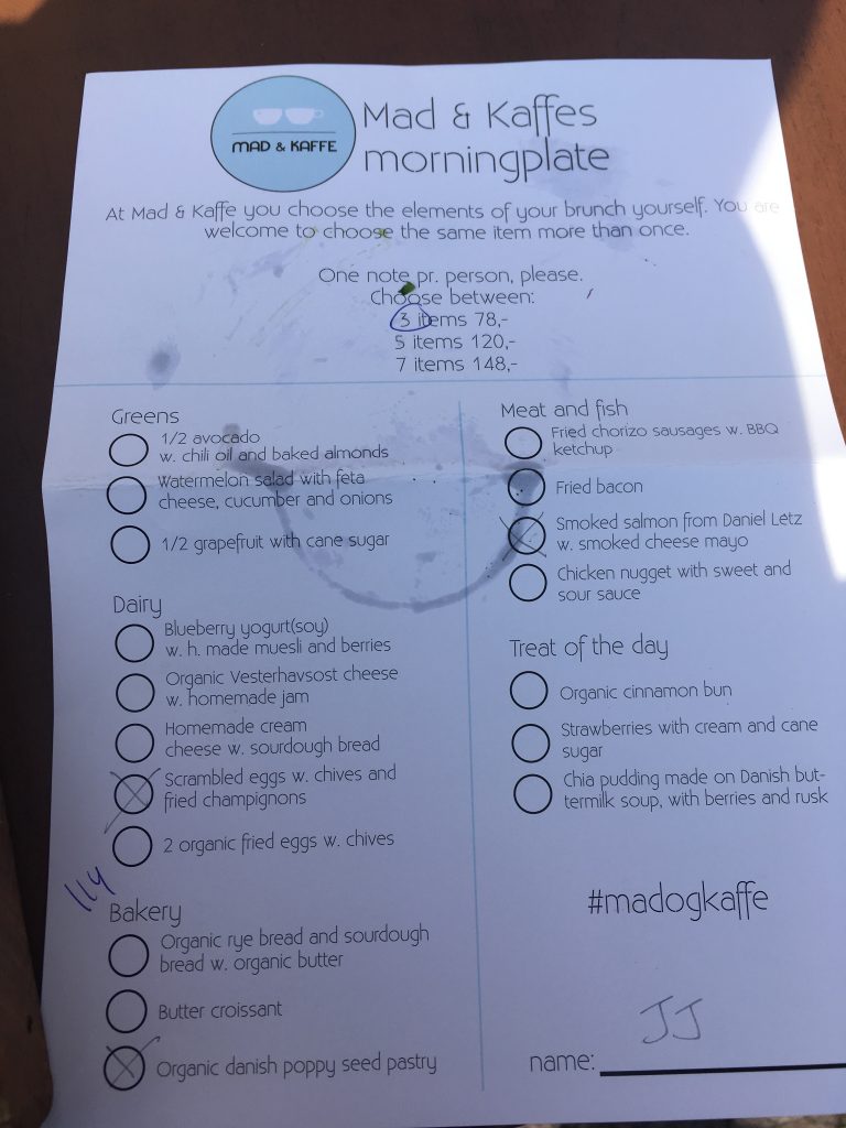
I enjoyed the meal in the Mad & Kaffes (Food & Coffee). Foods were divided into six categories on the menu (green, dairy, bakery, meat and fish, and treat). I decided how many categories to go (3, 5, or 7) and then selected one food in each category.

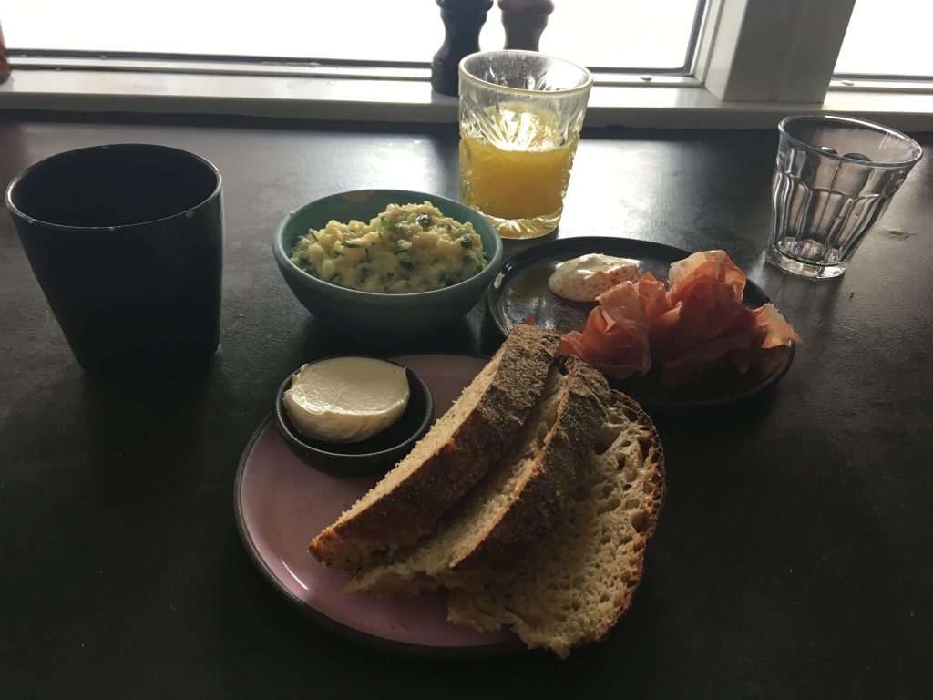
I did not enjoy the meal in the Moller Kaffe and Kokken (Moller Coffee and Kitchen). Although individual foods were excellent, they were listed under one category. I could not figure out which foods to choose.

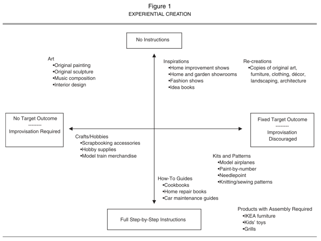
Since I knew little about Danish cuisine, categories relieved my burden and helped me create a meal. A similar logic was discovered ten years ago by marketing researchers who showed why kids need to follow instructions to assemble Lego bricks. To reach a creative outcome, we may need decision supporters such as categories, instructions, or even constraints.

***

Reference

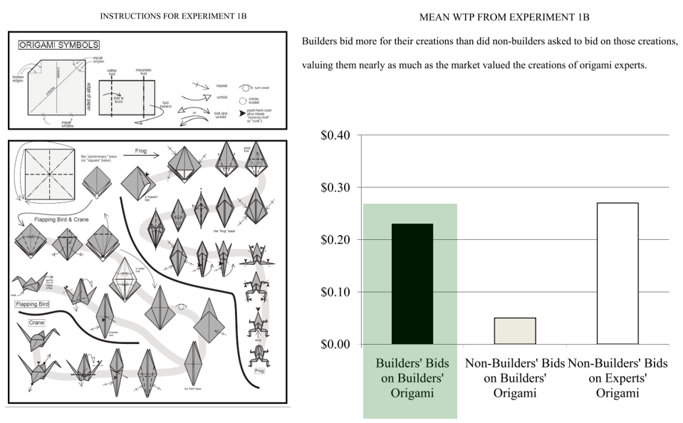
Dahl, D. W., & Moreau, C. P. (2007). Thinking Inside the Box: Why Consumers Enjoy Constrained Creative Experiences. Journal of Marketing Research, 44(3), 357–369.

From cooking kits to home improvement shows, consumers are increasingly seeking out products that are designed to help them be creative. In this research, the authors examine why consumers participate in creative activities and under what conditions these experiences are the most enjoyable. A qualitative study explores the diverse motivations for undertaking creative tasks and identifies the role of constraints in such endeavors. Then, the authors conduct two experimental studies to understand the importance of constraints (e.g., instructional guidance, target outcomes) in facilitating a balance between perceived competence and autonomy for consumers involved in a creative task. When consumers engage in creative activities with a sense of both autonomy and competence, they enjoy the experience more. The authors discuss implications for managers and provide opportunities for further research.

Why do people exit the bus at the front door?

At Quora, someone asked “Why do people exit the bus at the front door even when it’s not crowded?” It received seven answers.  


  1. Habit. If a bus has two doors it is actually more efficient for passengers to exit by the back door as any new passengers enter through the front door. However, most people use the front door when exiting out of habit, sometimes even walking the full length of the bus to do so.
  2. I do it for two reasons. First: I do it because I may be transferring to another bus. And believe me, getting out the back door vs. the front can make the difference between making your next bus and missing it. It happens sometimes, and i never know which time it will be. Second: I do it so I can thank the driver personally. They have a tough job. Lots of people abuse them. I like to treat them well.
  3. Because it is safer. Using a back door bears the risk that the bus driver won’t see you and could slam the door on you or depart while you are in mid-air. It has happened to me on more than one occasion.
  4. I do so mostly out of habit but also so that I can thank the driver. These women and men sometimes cop abuse that is quite unwarranted in my view. They deserve the same courtesy as everyone else and for getting me to my destination safely and comfortably. 
  5. Maybe they were closer to the front than rear. Maybe they did not feel like walking to the rear. Maybe they were unsure if the rear is crowded. Maybe they were absent-minded and accidentally took the front. Maybe they figured it doesn’t matter. There could be many ‘maybes’, all with their own reasons, only way to be sure is to ask.
  6. Handicapped people find it easier to use the front. The driver can pull closer to the curb and “kneel” the bus to make it easier for cane-users. Wheelchair-users need the ramp in the front of the bus.
  7. If they are sitting right at the front of the bus it is the closest door. It is normal to just exit at the closest door.


All the answers were based on the assumption that people should enter the bus at the front door. I used to have the same thought before I went to Prague and Nagasaki where the front door of the bus was designed differently.  


At these two cities, passengers get off the bus at the front door. In other words, at Prague and Nagasaki, people exit the bus at the front door not because of habit or convenience but because they are educated and trained. Something that was taken for granted to me was not to them.


Man-made sky – Do you feel like you are in Italy?

Macau has many tourist spots including Senado Square and Ruins of St. Pauls. However, I enjoyed a shopping district at The Venetian Macau the most. As the name suggests, a man-made Italian city exists in the hotel.


When I first entered this district, something unnatural grabbed my attention; canal is narrow, floor is shiny, and lights are bright. These are clearly different from what I saw or expected in Venice.

However, about 30 minutes later, I saw myself paying attention to something good: cool air, blue sky, and sailor’s singing a song. Then, it did not take more than an hour to feel like I was in Venice. I was surprised by how soon I became immersed with a fake world or, more precisely, a human-made store environment (probably because some people took a ride on the gondola?).


As many of us live in cities, we are often surrounded by human-made environments. What if our thoughts and behaviors are dictated by artificial environment?


Chinese love plastic

Chinese government tries hard to reduce plastic waste. Recently, it banned plastic waste import. According to financial times, half of the UK plastic waste need to find alternative places desperately.

In contrast, Chinese people seem to overuse plastics. In Shenzhen, for instance, plates are often wrapped with plastic packages. We should tear it down and throw it away. Sometimes, plastic gloves are provided at the restaurants. We wear the gloves when eating bread.

I suspect Chinese people are addicted to plastics probably because they consider plastics cleaner and safer than water or napkins. If we aim to reduce plastic consumption in China, we should consider the Chinese psychology about plastics seriously.

An answer why designers get a seat at the CEO table


Woowa brothers… This company (Woowa Brothers (woowa is Korean for “elegance”) developed a mobile application (app) for food delivery services in 2010. Interestingly, the CEO of this company was trained as a designer and worked as a designer for several Web consultancies and an Internet search-engine company… Woowa Brothers achieved 77.3% brand awareness at a total cost of $74,000, whereas similar services spent approximately $4 million and only reached 38.8%. This app achieved 10 million downloads for the first time in the Korean app history. Goldman Sachs decided to invest 40 billion Korean won (U.S. $33.1 million) into the company in 2014.


Woowa Brothers(1)… We collected leadership cues from two parties, the CEO and employees, and then mapped them onto Brunswik’s Lens Model, a psychological framework often used in Social Judgment Theory. Our newly adopted research framework helps us better understand the designer’s unique leadership style; unlike non-design business CEOs, the design CEO or DEO (Design Executive Officer) used a wide variety of visual cues… the DEO tacitly communicates visual (tangible) cues with employees for reward and authorization. In particular, the DEO is good at incorporating a tangible benefit and infusing a live and vivid characteristic into an environment. We found that the DEO utilizes visual cues effectively when communicating leadership.