Mental illness has always been an important issue for young adults. Moreover, initiatives resulting from the outbreak of COVID‐19 have had an even greater impact on the mental health of young adults. This study sought to examine the effect of gamification on whether young adults adopt in‐person counseling. One hundred twenty young adults (42 males and 78 females) with an average age of 29 years participated in our experiment. In the experiment, a 2 (Gamification: no vs. yes) × 2 (Vividness: low vs. high) between‐subjects design was employed. In the “yes” gamification condition, participants decided whether or not to read introductory material about in‐person counseling, and also whether or not to adopt in‐person counseling in the future. The results of the study show that: (1) gamification increased adoption, (2) participants’ perception of subjective usability of in‐person counseling mediated the effect of gamification to adoption, and (3) vividness of presentation moderated subjective usability. Our study demonstrated that gamification nudges young adults to adopt in‐person counseling while subjective usability mediates the relationship, and vividness moderates the relationship between gamification and subjective usability. Our findings provide counselors fresh insights into motivating people to access counseling services.
“… gamification has the primary purpose of promoting human motivation and performance in a particular activity. The importance of gamification has been thoroughly discussed theoretically and practically in an increasing number of research studies for health professions education (Van Nuland et al. 2015; Verkuyl et al. 2017;Buttetal. 2018). Ourexperimental study found that gamification does have a positive effect on people adopting in-person counselling” (pg. 1360).
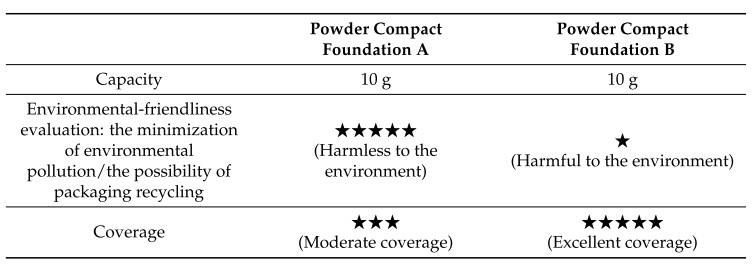
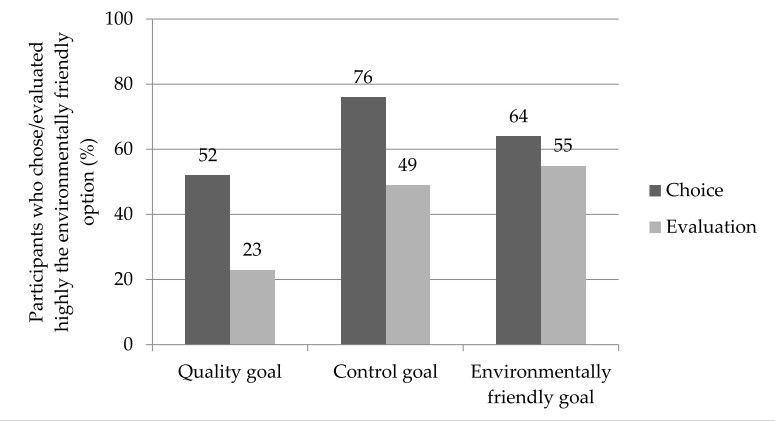
In the past, researchers focusing on environmentally friendly consumption have devoted attention to the intention–action gap, suggesting that consumers have positive attitudes toward an environmentally friendly product even though they are not willing to buy it. In the present study, we borrow insights from the behavioral decision making literature on preference reversal to introduce an opposite phenomenon—that is, consumers buying an environmentally friendly product even though they do not evaluate it highly. We further rely on the research on goals to hypothesize that choice–evaluation discrepancies disappear when consumers pursue an environmentally friendly goal. A two (Mode: Choice vs. Evaluation) by three (Goal: Control vs. Quality vs. Environmentally friendly) between-subjects experimental design was used to test the proposed hypotheses. Our findings obtained from 165 undergraduate students in Korea showed that, first, 76% of the participants chose an environmentally friendly cosmetic product whereas only 49% of the participants ranked it higher than a competing product, and, second, when participants read the sentence “You are now buying one of the two compact foundations in order to minimize the waste of buying new foundations,” the discrepancy disappeared (64% vs. 55%). Our experimental findings advance academic discussions of green consumption and the choice–evaluation discrepancy and have practical implications for eco-friendly marketing.
In this paper, we study the online consumer review generation process by analyzing 37.12 million online reviews across nineteen product categories obtained from Amazon.com. This study revealed that the discrepancy between ratings by others and consumers’ post-purchasing evaluations significantly influenced both the valence and quantity of the reviews that consumers generated. Specifically, a negative discrepancy (‘worse than what I read’) significantly accelerates consumers to write negative reviews (19/19 categories supported), while a positive discrepancy (‘better than what I read’) accelerates consumers to write positive reviews (16/19 categories supported). This implies that others’ ratings play an important role in influencing the review generation process by consumers. More interestingly, we found that this discrepancy significantly influences consumers’ neutral review generation, which is known to amplify the effect of positive or negative reviews by affecting consumers’ search behavior or the credibility of the information. However, this effect is asymmetric. While negative discrepancies lead consumers to write more neutral reviews, positive discrepancies help reduce neutral review generation. Furthermore, our findings provide important implications for marketers who tend to generate fake reviews or selectively generate reviews favorable to their products to increase sales. Doing so may backfire on firms because negative discrepancies can accelerate the generation of objective or negative reviews.
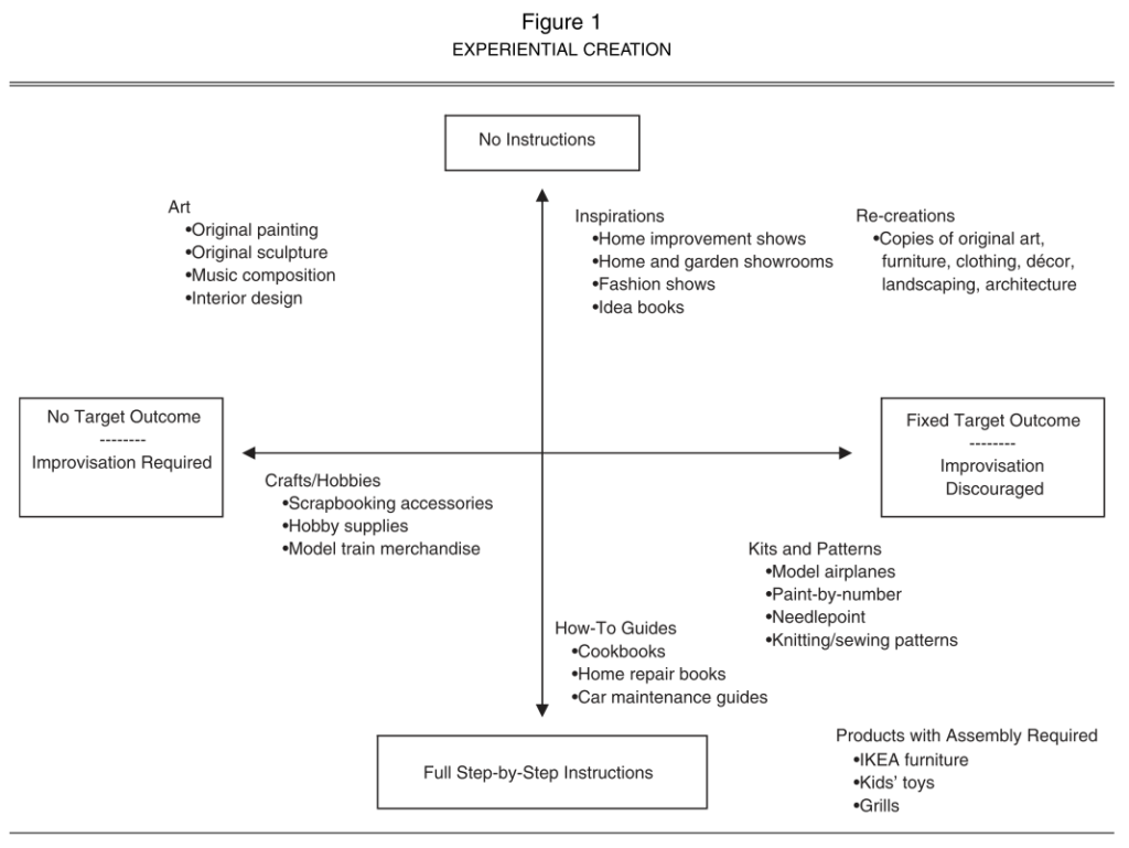
People assume that constraint-free activities such as doodling help them become creative. However, psychological researchers suggest a different story, that is, constraints are actually the power house of creativity. Studies showed that people used a given product creatively, enjoyed creative experience, and developed creative toys and when they were provided with a time/input/resource constraint and then overcame it.
Similar to psychological creativity, constraints may contribute to art creativity. I found evidence at the Urban Break 2021, the largest urban and street art fair in Asia.
The Urban Break 2021 proposes the broadened spectrum of the art fair, trying the new contemporary art genre, combined the urban art and the street culture. The urban art is pioneering a new flow, becoming a mainstream icon in the art market. Urban Break is aimed at cultural convergence and extension by embracing native and foreign street artists, galleries and lifestyle brands.
In this art fair, numerous paintings and sculptures made me nervous and confused because I do not understand most of them. Only when I meet the art pieces that look familiar but slightly different, I was able to understand the intentions of the artists, enjoying them. To me, artwork looks creative when its artist communicated with me through something I am familiar with. It does not look creative when its artist communicated with me something I have never seen before.
This suggests that constraint plays a key role to shape creative experience. When artists work with constraints (e.g., something visitors are familiar with such as Mona Lisa painting, David sculpture, or Statue of Liberty), visitors enjoy their paintings and sculptures better and more creatively.
From cooking kits to home improvement shows, consumers are increasingly seeking out products that are designed to help them be creative. In this research, the authors examine why consumers participate in creative activities and under what conditions these experiences are the most enjoyable. A qualitative study explores the diverse motivations for undertaking creative tasks and identifies the role of constraints in such endeavors. Then, the authors conduct two experimental studies to understand the importance of constraints (e.g., instructional guidance, target outcomes) in facilitating a balance between perceived competence and autonomy for consumers involved in a creative task. When consumers engage in creative activities with a sense of both autonomy and competence, they enjoy the experience more. The authors discuss implications for managers and provide opportunities for further research.
I find myself reading books challenging. Most books are too long to start and I am too busy to finish reading book. Therefore, I have applied numerous insights obtained from behavioral research to force myself to read books.
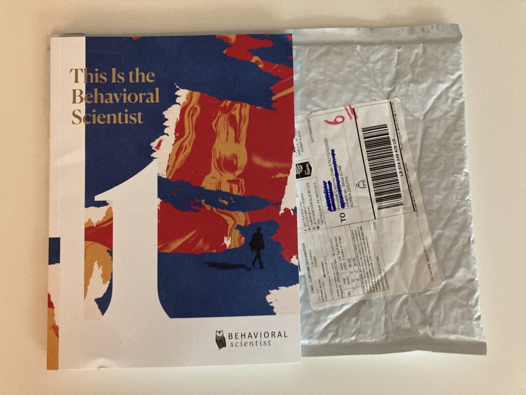
So far, the most effective method is to buy a physical book. This is particularly effective when the book is not available at a local book store and it needs to be delivered to me in the mail. My intention to finish reading the book *irrationally* increases because it has a physical form and I do not want to waste, interestingly, its delivery cost.
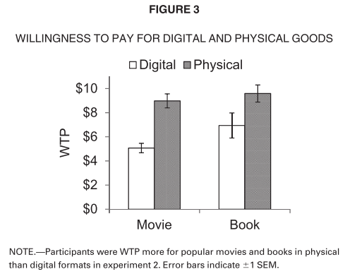
Digital goods are, in many cases, substantive innovations relative to their physical counterparts. Yet, in five experiments, people ascribed less value to digital than to physical versions of the same good. Research participants paid more for, were willing to pay more for, and were more likely to purchase physical goods than equivalent digital goods, including souvenir photographs, books (fiction and nonfiction), and films. Participants valued physical goods more than digital goods whether their value was elicited in an incentive compatible pay-what-you-want paradigm, with willingness to pay, or purchase intention. Greater capacity for physical than digital goods to garner an association with the self (i.e., psychological ownership), underlies the greater value ascribed to physical goods. Differences in psychological ownership for physical and digital goods mediated the difference in their value. Experimentally manipulating antecedents and consequents of psychological ownership (i.e., expected ownership, identity-relevance, perceived control) bounded this effect, and moderated the mediating role of psychological ownership. The findings show how features of objects influence their capacity to garner psychological ownership before they are acquired, and provide theoretical and practical insights for the marketing, psychology, and economics of digital and physical goods.
The second most effective method is to bookmark with sticky notes after briefly reading the table of contents. I often stick only three notes on the pages I want to read to relieve burden. When I see them, I *mistakenly* think I already started reading the book.
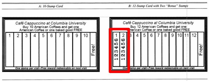
The goal-gradient hypothesis denotes the classic finding from behaviorism that animals expend more effort as they approach a reward. Building on this hypothesis, the authors generate new propositions for the human psychology of rewards. They test these propositions using field experiments, secondary customer data, paper-and-pencil problems, and Tobit and logit models. The key findings indicate that (1) participants in a real café reward program purchase coffee more frequently the closer they are to earning a free coffee; (2) Internet users who rate songs in return for reward certificates visit the rating Web site more often, rate more songs per visit, and persist longer in the rating effort as they approach the reward goal; (3) the illusion of progress toward the goal induces purchase acceleration (e.g., customers who receive a 12-stamp coffee card with 2 preexisting “bonus” stamps complete the 10 required purchases faster than customers who receive a “regular” 10-stamp card); and (4) a stronger tendency to accelerate toward the goal predicts greater retention and faster reengagement in the program. The conceptualization and empirical findings are captured by a parsimonious goal-distance model, in which effort investment is a function of the proportion of original distance remaining to the goal. In addition, using statistical and experimental controls, the authors rule out alternative explanations for the observed goal gradients. They discuss the theoretical significance of their findings and the managerial implications for incentive systems, promotions, and customer retention.
Certainly, I want to read more books without these tricks. However, I have insufficient self control resources and frequently mispredict my available time. I wish these tricks drive me to start as well as complete reading books.
At Nicolai Bergmann, a flower shop in Seoul, I noticed two preserved flower arrangements.
One was overfilled with blooms, spilling out of its display.
The other was neatly arranged inside a square box.
The overfilled one caught my attention first, but after looking at both, I chose the boxed arrangement. Why? When comparing them side by side, I started thinking about something that was harder to judge—the actual amount of flowers. The boxed one felt more balanced, structured, and perhaps even more valuable. I imagine many other visitors would come to the same conclusion
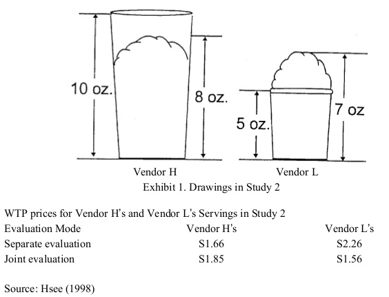
This reminds me of a study by Chris Hsee. In his experiment, people preferred the look of an overfilled ice cream cup with 7 ounces of ice cream over an underfilled one with 8 ounces. But when asked how much they would pay, they were willing to spend more on the underfilled cup ($1.85 vs. $1.56). Why? When evaluating the ice cream separately, they focused on an easy-to-judge factor—whether it looked full or not. But when comparing them together, they paid attention to the harder-to-judge factor—the actual amount of ice cream.
When making choices, we might be drawn to what looks impressive at first glance. But when we take a moment to compare, we start to value things differently.
This research demonstrates a less-is-better effect in three contexts: (1) a person giving a $45 scarf as a gift was perceived to be more generous than one giving a $55 coat; (2) an overfilled ice cream serving with 7 oz of ice cream was valued more than an underfilled serving with 8 oz of ice cream; (3) a dinnerware set with 24 intact pieces was judged more favourably than one with 31 intact pieces (including the same 24) plus a few broken ones. This less-is-better effect occurred only when the options were evaluated separately, and reversed itself when the options were juxtaposed. These results are explained in terms of the evaluability hypothesis, which states that separate evaluations of objects are often infuenced by attributes which are easy to evaluate rather than by those which are important.
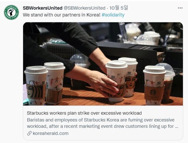
Starbucks Coffee Korea recently launched a set of limited edition Playmobil toy figures. Customers get one of six tall-size beverages with an accompanying Playmobil figure for $12.
Today at a nearby Starbucks, I found several customers paid extra to have a barista figure. Another Starbucks was crowded even though customers have to leave store shortly due to social distancing regulations. It suggests this campaign increases offline store traffic.
Why do adults like Starbucks toys? Although brand power and scarcity play key roles, a more deeply rooted reason is that Playmobil figures are whimsically cute. “Cute products (e.g., an ice-cream scoop shaped like a miniature person or a dress with tropical colors and pink flamingos) can have whimsical nature, which is associated with capricious humor and playful disposition. Whimsical cuteness is … associated with fun and playfulness.” (Nenkov and Scott 2014, pg. 327).
Interestingly, whimsically cute products do not necessarily appeal when they are designed for kids. Contrary to our belief, whimsical cuteness attracts adults. This argument is supported by the experimental findings obtained from a marketing paper.
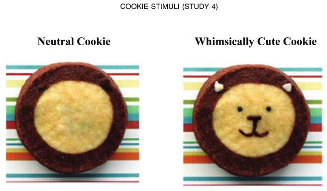
This article examines the extent to which consumers engage in more indulgent consumption when they are exposed to whimsically cute products and explores the process by which such products affect indulgence. Prior research on kindchenschema (baby schema) has found that exposure to cute babies or baby animals leads to more careful behavior (see the study by Sherman, Haidt, and Coan), suggesting restraint. The present research uncovers the opposite: consumers become more indulgent in their behavior after exposure to whimsically cute products. Drawing from research on cognitive priming, kindchenschema, anthropomorphization, indulgence, and regulatory focus, this research posits that exposure to whimsically cute products primes mental representations of fun, increasing consumers’ focus on approaching self-rewards and making consumers more likely to choose indulgent options. These effects do not emerge for kindchenschema cute stimuli, since they prime mental representations of vulnerability and caretaking. Four empirical studies provide evidence for the proposed effects and their underlying process.
When two cookies were presented under “The Cookie Shop,” participants indicated significantly weaker preference for the healthy entree when they had earlier viewed the whimsically cute cookie than when they had viewed the neutral cookie. However, no such differences occurred when two cookies were presented under “The Kid’s Cookie Shop.”
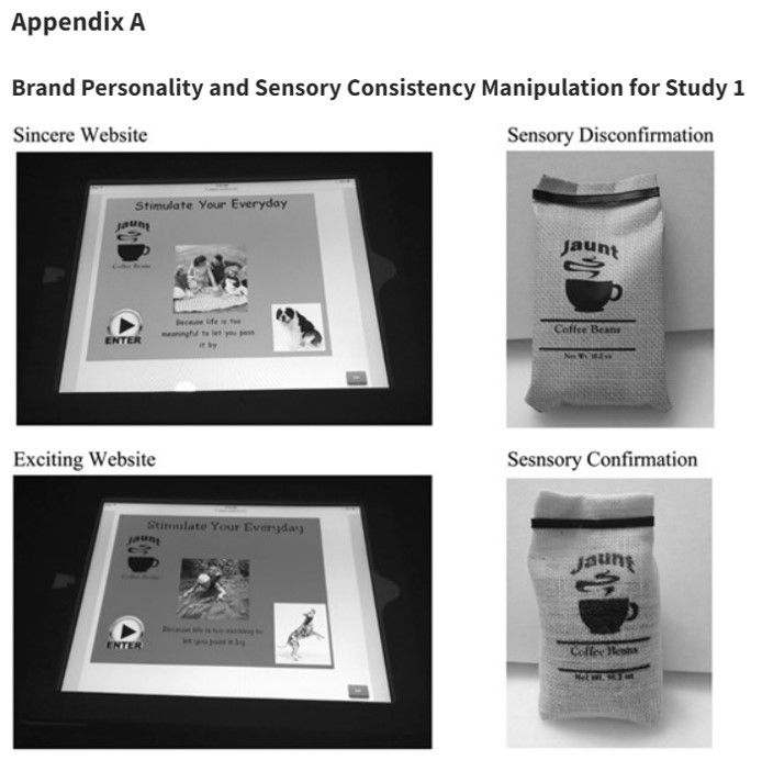
We sometimes experience sensory disconfirmation, meaning we expect to feel A but actually feel B. For instance, iPhone looks like a product with light plastic but it is made by heavy metal. In particular, disconfirmation between visual and haptic information (or mismatch between look and feel) is critical for business.
Showroom (Curated by Sarah Robayo Sheridan, January 21 – March 5, 2016)
“How do Toronto artists perceive new social and visual orders brought about by a decade of rapid urban development?”
Commonly, a showroom is intended to present a generic ideal of living, devoid of the nuances of lives as they are lived. The artists in this exhibition, however, turn our attention to the influence of lifestyle marketing in constructing the form and texture of the cityscape. By turns, critical, comedic and formal, the works deepen given knowledge of architecture, place, and the social order.
Fitness equipment looks heavy and rough. However, some artists challenge our intuition: dumbbells are light and sandbags are soft in the exhibition. According to research, when negative sensory disconfirmation is introduced, the source of disconfirmation can sometimes be perceived positively. To go further, the more our intuitions are challenged by look-and-feel mismatch, the more we may become creative.
Across four studies, the authors demonstrate that consumers intuitively link disconfirmation, specifically sensory disconfirmation (when touch disconfirms expectations by sight), to a brand’s personality. Negative disconfirmation is often associated with negative posttrial evaluations. However, the authors find that when negative sensory disconfirmation is introduced by an exciting brand, the source of disconfirmation can sometimes be perceived positively. This occurs because consumers intuitively view disconfirmation as more authentic of an exciting personality. Similarly, despite the wealth of literature linking positive disconfirmation to positive posttrial evaluations, the authors find that sensory confirmation is more preferred for sincere brands because consumers intuitively view confirmation as more authentic of a sincere personality. The authors conclude by demonstrating the intuitive nature of this phenomenon by showing that the lay belief linking brand personality to disconfirmation does not activate in a context where sensory disconfirmation encourages a more deliberative assessment of the product.
Modern art paintings are the best way to portray the unseen on the canvas. It is about the expression of emotions and feelings on and is not what you see at the very first glance. It can have many interpretations when seen through different angles. If you want to know more about modern art, then you can also read “Why is the New Art So Hard to understand”. It is a book written by Theodor Adorno, a German social theorist who shed more highlight on this concept that why Modern art paintings are so hard to understand modern art. Although the book was written in 1931, it is still relevant in today’s era.
How could we lower its difficulty and help visitors enjoy the modern art better? One solution is to allow visitors not to understand the artists’ intentions correctly. Instead, if visitors are allowed to misunderstand artists’ intentions and even disagree with artists’ opinions, if any, they will be relieved to fail.
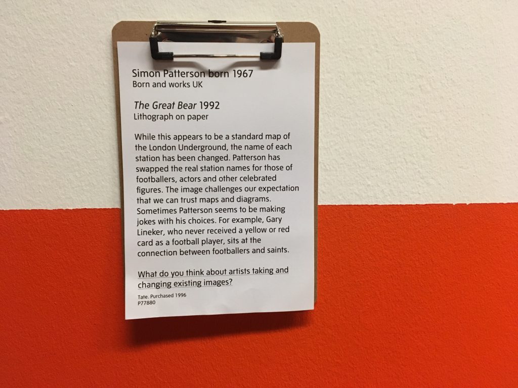
A great example is the underlined sentence under the modern artwork named The Great Bear by Simon Patternson in 1992. This sentence was added by a curator working at the Tate Liverpool, UK. Indeed, several students stood in front of this artwork and casually discussed to answer the question.
Simon Patterson born 1967 (Born and work UK) / The Great Bear 1992 (Lithograph on paper)
While this appears to be a standard map of the London Underground, the name of each station has been changed. Patterson has swapped the real station names for those of footballers, actors, and other celebrated figures. The image challenges our expectation that we can trust maps and diagrams. Sometimes Patterson seems to be making jokes with his choices. For example, Gary Lineker, who never received a yellow or red card as a football player, sits at the connection between footballers and saints.
What do you think about artists taking and changing existing images?
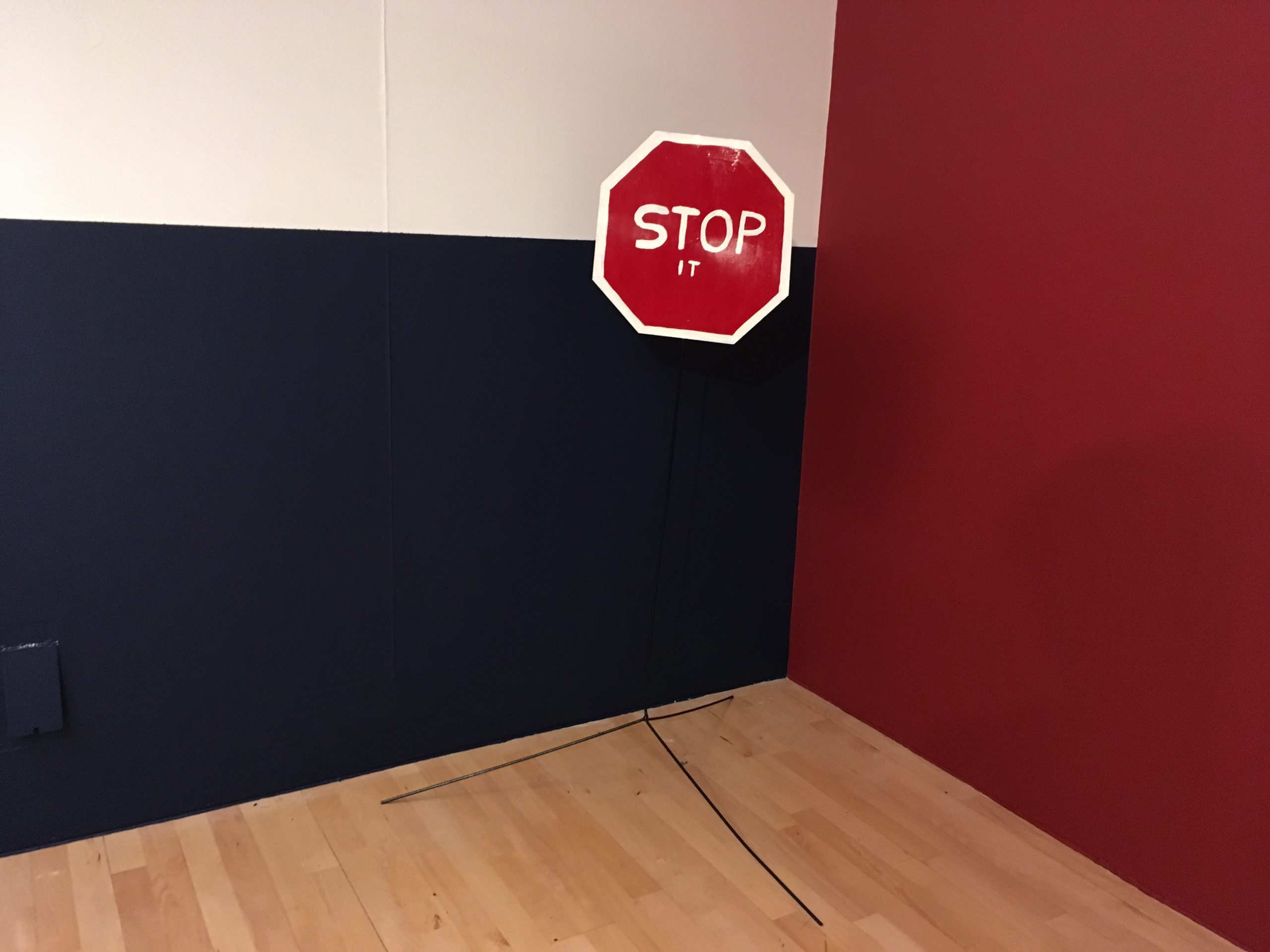
A similar sentence was found under another artwork (see below). Reading just one more sentence under the artwork made this Tate Modern museum more friendly and more approachable.
Why do you think the artist made this work? What is the ‘it’ you are being asked to stop?
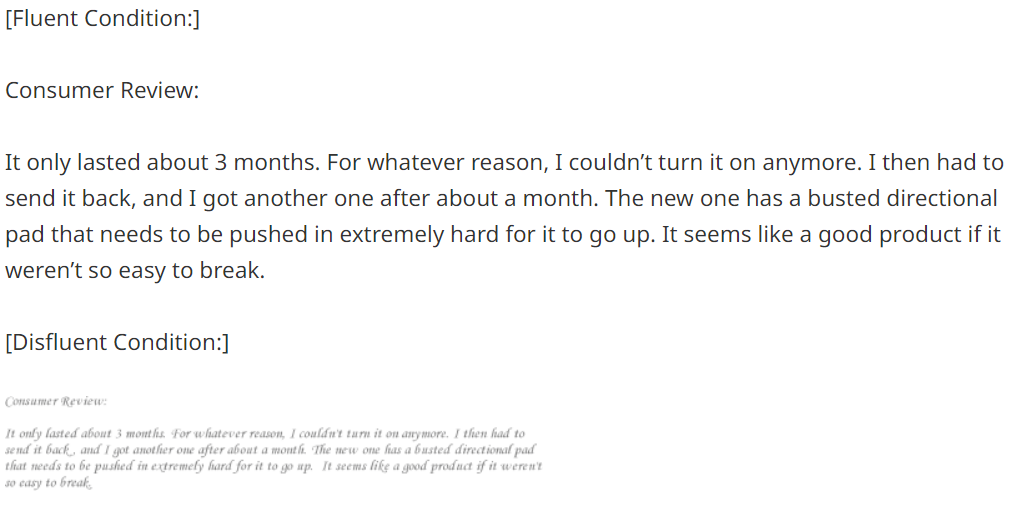
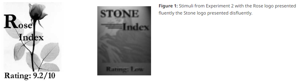
Behaivoral scientists argue that people find information important when it is easy to process (called fluent). Since modern art is difficult, people often avoid and even ignore it. When curators make the modern art easier to process, people will enjoy it.
We propose that people weight fluent, or easy to process, information more heavily than disfluent information when making judgments. Cue fluency was manipulated independent of objective cue validity in three studies, the findings from which support our hypothesis. In Experiment 1, participants weighted a consumer review more heavily when it was written in a clear font than in a less clear font. In Experiment 2, participants placed more weight on information when it was in focus than when it was blurry. In Experiment 3, participants placed more weight on financial information from brokerage firms with easy to pronounce names than those with hard to pronounce names. These studies demonstrate that fluency affects cue weighting independent of objective cue validity.
Pinla3D scans its customers in-store and then gives them a choice of 3D model sizes. A 25cm (9.8-inch) figure costs RMB 3,580 (US$580), according to the store’s site. Three generations of one family can be immortalized in plastic at 1:9 scale for RMB 8,997 (US$1,470). That’s cheaper than we’ve seen it done by a Japanese startup site – with the added bonus that going in-person to the store will make the mini-me more accurate than submitting a bunch of photos to a website.
However, my belief was corrected when I visited Tianzifang in Shanghai, China. A series of mini-mes displayed outside a store cost only RMB 480 (US$ 68). I wondered how and why they are inexpensive.
The mystery was solved when I entered the store. These mini-mes were not produced by 3D printers. Instead, two people made mini-mes out of clay.
We tend to assign greater value to a product when it is made by human than when made by machine. It is called as “handmade effect.” Then, why did I observe a reverse handmade effect, that it, hand-crafted mini-mes are cheaper than the ones printed by 3D printers? I suspect the handmade effect is observed only when the people who make a product is clearly associated with the final product. If the association is not established so that buyers do not know who produce their purchased products, handmade effect disappears and buyers are not willing to pay more. If I come back to Shanghai, I suggest two mini-me makers to give their own name cards and personal stories to buyers!
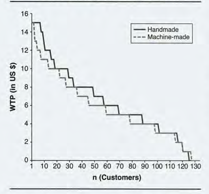
Despite the popularity and high quality of machine-made products, handmade products have not disappeared, even in product categories in which machinal production is common. The authors present the first systematic set of studies exploring whether and how stated production mode (handmade vs. machine-made) affects product attractiveness. Four studies provide evidence for the existence of a positive handmade effect on product attractiveness. This effect is, to an important extent, driven by perceptions that handmade products symbolically “contain love.” The authors validate this love account by controlling for alternative value drivers of handmade production (effort, product quality, uniqueness, authenticity, and pride). The handmade effect is moderated by two factors that affect the value of love. Specifically, consumers indicate stronger purchase intentions for handmade than machine-made products when buying gifts for their loved ones but not for more distant gift recipients, and they pay more for handmade gifts when purchased to convey love than simply to acquire the best-performing product.