Tag Archives: Canada

The authenticity challenge: Tim Hortons’ misstep in Korea

Tim Hortons, a Canadian coffee brand, is as iconic to Canada as maple syrup and hockey. It offers free coffee to police officers, making these stores a safe places for night snack lovers. Its reach even extends beyond borders; there was a store in Afghanistan, serving coffee and Timbits to Canadian soldiers who long for a taste of home.

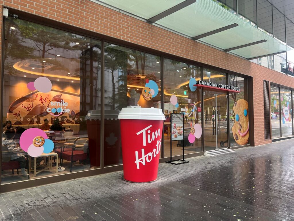
Recently, Tim Hortons expanded into Korea. It successfully kept many core offerings including the most popular coffee called Double Double. However, the chain overlooked the importance of sugar, a key ingredient of coffee, running into some challenges with brand authenticity.
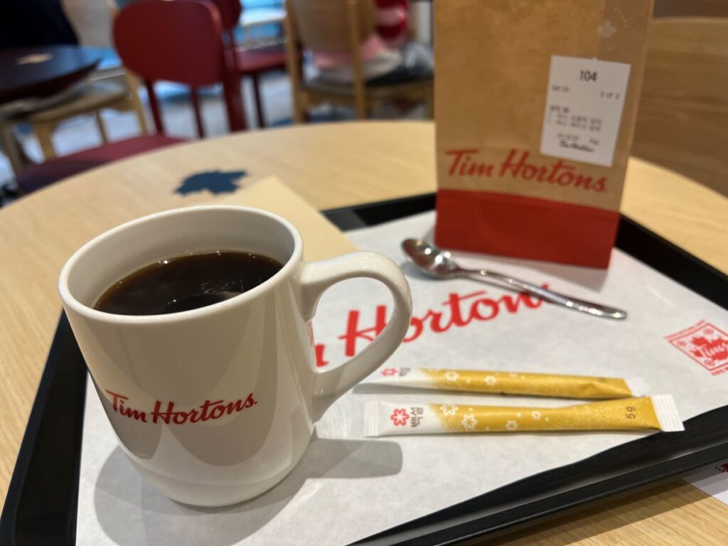
When I ordered my once favorite “a black coffee with two sugars” at a freshly opened store in Korea, I was served coffee with two Korean sugar packets. Unfortunately, they differ from the familiar Canadian sugars that are part of the authentic Tim Hortons experience. This seemingly minor change impacts the unique experience that loyal Tim Hortons customers like me expect.
Brands should consistently deliver on their promises to maintain authenticity (Schallehn et al. 2014). For global brands like Tim Hortons, preserving even the smallest elements of their identity is key. Deviations from established brand expectations—such as using different ingredients or local adaptation—can diminish consumer trust and loyalty, even if those changes seem insignificant.

***

Reference

Schallehn, M., Burmann, C., & Riley, N. (2014). Brand authenticity: Model development and empirical testing. Journal of Product & Brand Management, 23(3), 192-199.

Purpose
The purpose of this paper is to develop a model of brand authenticity and analyze the antecedents and effects of the construct. Although there is no doubt about the relevance of authenticity in personal relationships, published research has yet not thoroughly explored the concept’s meaning in reference to brands.

Design/methodology/approach
Based on socio-psychological attribution theories and grounding on the identity-based brand management approach, a causal model of brand authenticity is developed. The hypothesized relationships are analyzed using the partial-least-squares approach. The primary data are based on an online survey conducted in Germany (n = 600). The respondents were asked about fast-food and beer brands.

Findings
The data show that brand authenticity positively impacts on brand trust. Furthermore, the key antecedents in the model (consistency, continuity and individuality of a brand) drive the perception of brand authenticity as hypothesized.

Research limitations/implications
The model should be tested in further product categories and moderators should be integrated.

Originality/value
The findings suggest that authenticity is perceived when a brand is consistent, continuous and individual in its behavior. Nevertheless, the empirical results indicate that the factor individuality has the lowest influence on perceived brand authenticity. This is an interesting finding, as being “unique” is commonly regarded as an important success factor in branding. Although the study’s findings confirm its relevancy, they relativize its importance: being consistent, meaning that a brand fulfills its brand promise at every brand-touch point, and being continuous, meaning that the brand promise reflects the essential core of the brand, are of major importance.
Look and feel mismatch: Looking heavy but feeling light

We sometimes experience sensory disconfirmation, meaning we expect to feel A but actually feel B. For instance, iPhone looks like a product with light plastic but it is made by heavy metal. In particular, disconfirmation between visual and haptic information (or mismatch between look and feel) is critical for business.

Showroom (Curated by Sarah Robayo Sheridan, January 21 – March 5, 2016)

“How do Toronto artists perceive new social and visual orders brought about by a decade of rapid urban development?”

Commonly, a showroom is intended to present a generic ideal of living, devoid of the nuances of lives as they are lived. The artists in this exhibition, however, turn our attention to the influence of lifestyle marketing in constructing the form and texture of the cityscape. By turns, critical, comedic and formal, the works deepen given knowledge of architecture, place, and the social order.

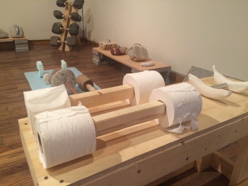
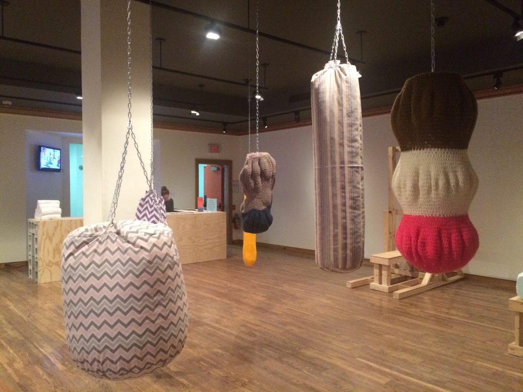
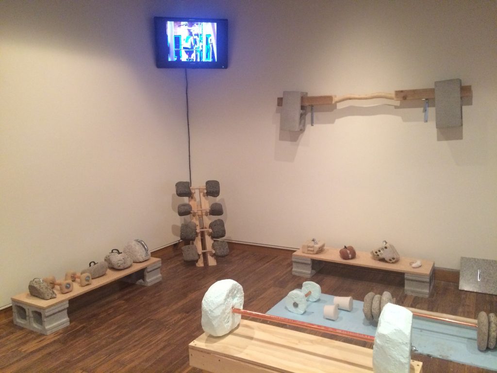
Fitness equipment looks heavy and rough. However, some artists challenge our intuition: dumbbells are light and sandbags are soft in the exhibition. According to research, when negative sensory disconfirmation is introduced, the source of disconfirmation can sometimes be perceived positively. To go further, the more our intuitions are challenged by look-and-feel mismatch, the more we may become creative.

**

Reference

Sundar, A., & Noseworthy, T. J. (2016). Too Exciting to Fail, Too Sincere to Succeed: The Effects of Brand Personality on Sensory Disconfirmation. Journal of Consumer Research, 43(1), 44–67.

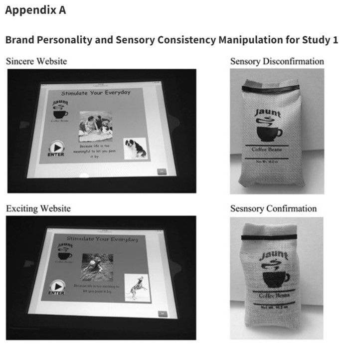
Across four studies, the authors demonstrate that consumers intuitively link disconfirmation, specifically sensory disconfirmation (when touch disconfirms expectations by sight), to a brand’s personality. Negative disconfirmation is often associated with negative posttrial evaluations. However, the authors find that when negative sensory disconfirmation is introduced by an exciting brand, the source of disconfirmation can sometimes be perceived positively. This occurs because consumers intuitively view disconfirmation as more authentic of an exciting personality. Similarly, despite the wealth of literature linking positive disconfirmation to positive posttrial evaluations, the authors find that sensory confirmation is more preferred for sincere brands because consumers intuitively view confirmation as more authentic of a sincere personality. The authors conclude by demonstrating the intuitive nature of this phenomenon by showing that the lay belief linking brand personality to disconfirmation does not activate in a context where sensory disconfirmation encourages a more deliberative assessment of the product.

How many items should be displayed in a store?

When we are curious about value of an unknown object, we often consider how many people surround it. If it is alone, we believe it is expensive. If it is surrounded by many others, we believe it is cheap. This is because, according to O’Guinn’s et al. (2015), as the social density of a given space increases, “inference of the subjective social class and income of people in that space” fall. Although we like different degrees of crowdedness (D&Department in Tokyo) and even view the same degree of crowdedness differently (Kronen Vanlose in Copenhagen), crowdedness decreases the value of a product.

O’Guinn, T. C., Tanner, R. J., & Maeng, A. (2015). Turning to space: Social density, social class, and the value of things in stores. Journal of Consumer Research, 42(2), 196-213.

This article is about social space and material objects for sale within that space. We draw primarily on Goffman’s (1971) concepts of use space and possession territories to predict that as the social density of a given space increases, inferences of the subjective social class and income of people in that space fall. Eight studies confirm that this is indeed the case, with the result holding even for stick figures, thus controlling for typical visual indicators of social class such as clothing or jewelry. Furthermore, these social class inferences mediate a relationship between social density and product valuation, with individuals assessing both higher prices and a greater willingness to pay for products presented in less crowded contexts. This effect of inferred class on product valuation is explained by status-motivated individuals’ desire to associate with higher-status people. To the best of our knowledge, this research is the first to reveal the link between social density, status inferences, and object valuations. As such, it makes a novel contribution to what has come to be known in sociology as the topological turn: a renewed focus on social space.

Then, could we apply the same logic to stores where products are surrounded by other products? In other words, does “product crowdedness” decrease product value as well? This is an important question as stores display items in different ways.

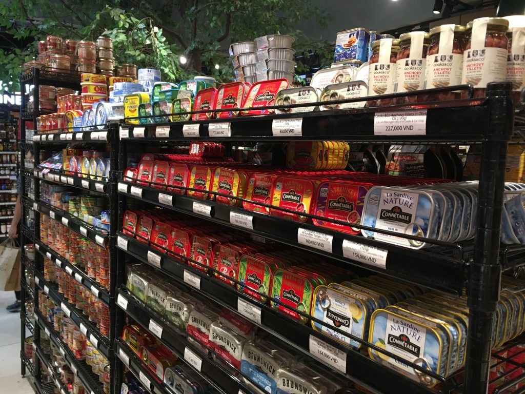
Some stores display various items with a lot of stocks. For instance, at Annam Gourmet, Ho Chi Minh, only a few cans of sea food are on the shelf space with multiple stocks.

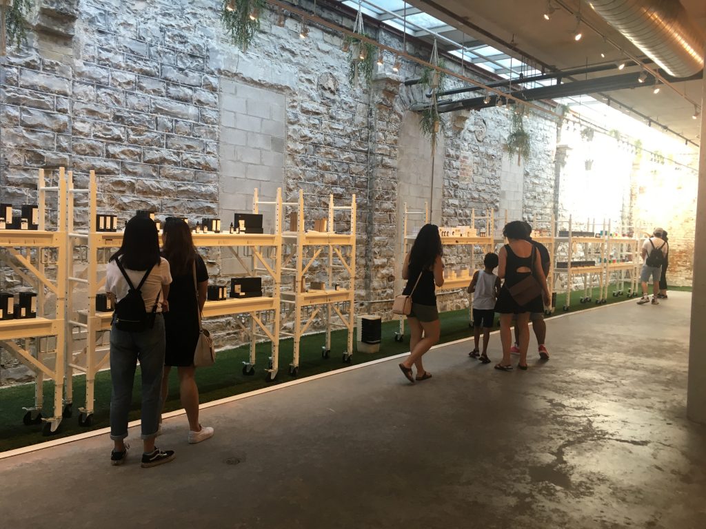
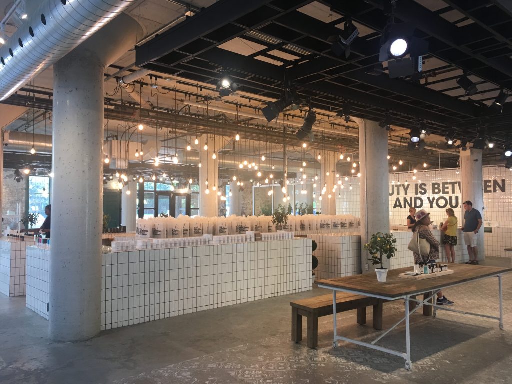
Other stores display only few items with few stocks. For instance, Decium, a Canadian cosmetic company introduces a few items without showing their stocks.  

Two contrasting examples show that stocks determine the perceived value of products. Designers and marketers should decrease the number of products displayed in the store to increase their perceived value. There is a 8-minute video about an inside look at Decium to see how the company has managed to find success in the highly competitive, the multi-billion-dollar world of skin care.

K-Beauty items in Canada

The Face Shop is a skincare and cosmetic manufacturer, retailer, and a franchise business. It is a subsidiary of LG Household and Health Care of LG Corporation.

DML_Faceshop(1)


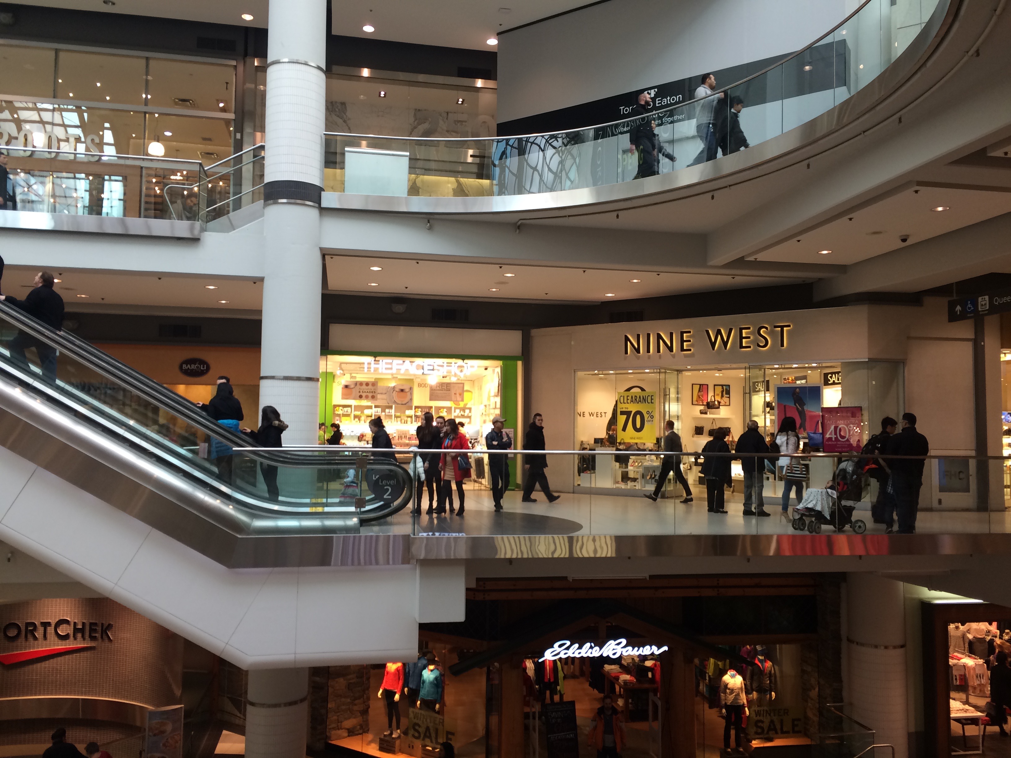
The Face Shop had its store inside one of the biggest shopping malls in Toronto, CF Toronto Eaton Centre. Similar to the stores located in Seoul, a lot of young, Chinese female customers browsed items. However, this store differs from the stores in Seoul in a few ways; it carries fewer items and its visitors show virtually no interest in mask packs, probably one of the best selling items.


DML_Faceshop(2)


My companies added their opinions. First, Face Shop sells inexpensive cosmetic items in Korea but it cannot help but charge more in Canada because of transportation cost and tax. Second, Face Shop store has no clear message. Just around the corner, Aveda sell environmentally friendly items and other luxury brands sell upscale items. Finally, this brand has no name in Canada; running its own stores is risky even for global electronics players. In sum, Face Shop needs to learn the fact that other Korean or Asian skincare and cosmetic companies enter Canadian market more easily by introducing their items to Chinese customers at more established Chinese grocery stores such as T&T super market.


Green package design: Boxed water stands out from the crowd

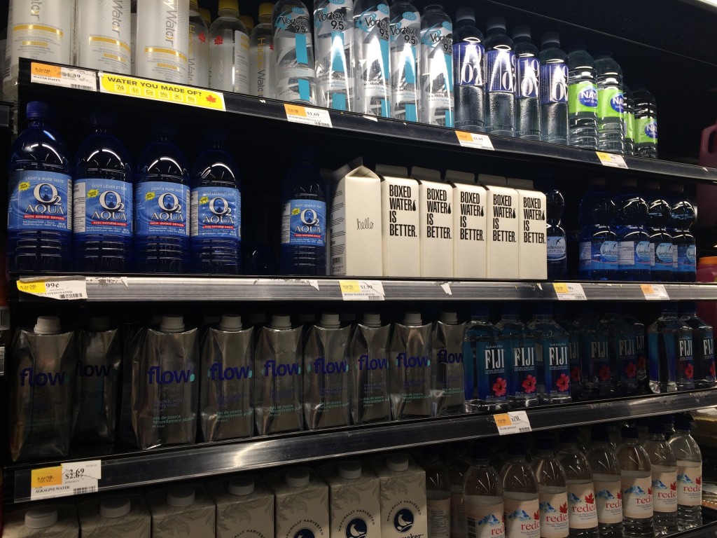
Many people are now buying water in bottles rather than drink straight from the tap because bottled water has been perceived to be safer and of higher quality than tap water, and it was viewed as a healthful alternative beverage to soft drinks or alcohol. Although purity marketing successfully increases sales of bottled water, it failed to address that plastic water bottles waste our environment.


DML_Boxed water is better(1)


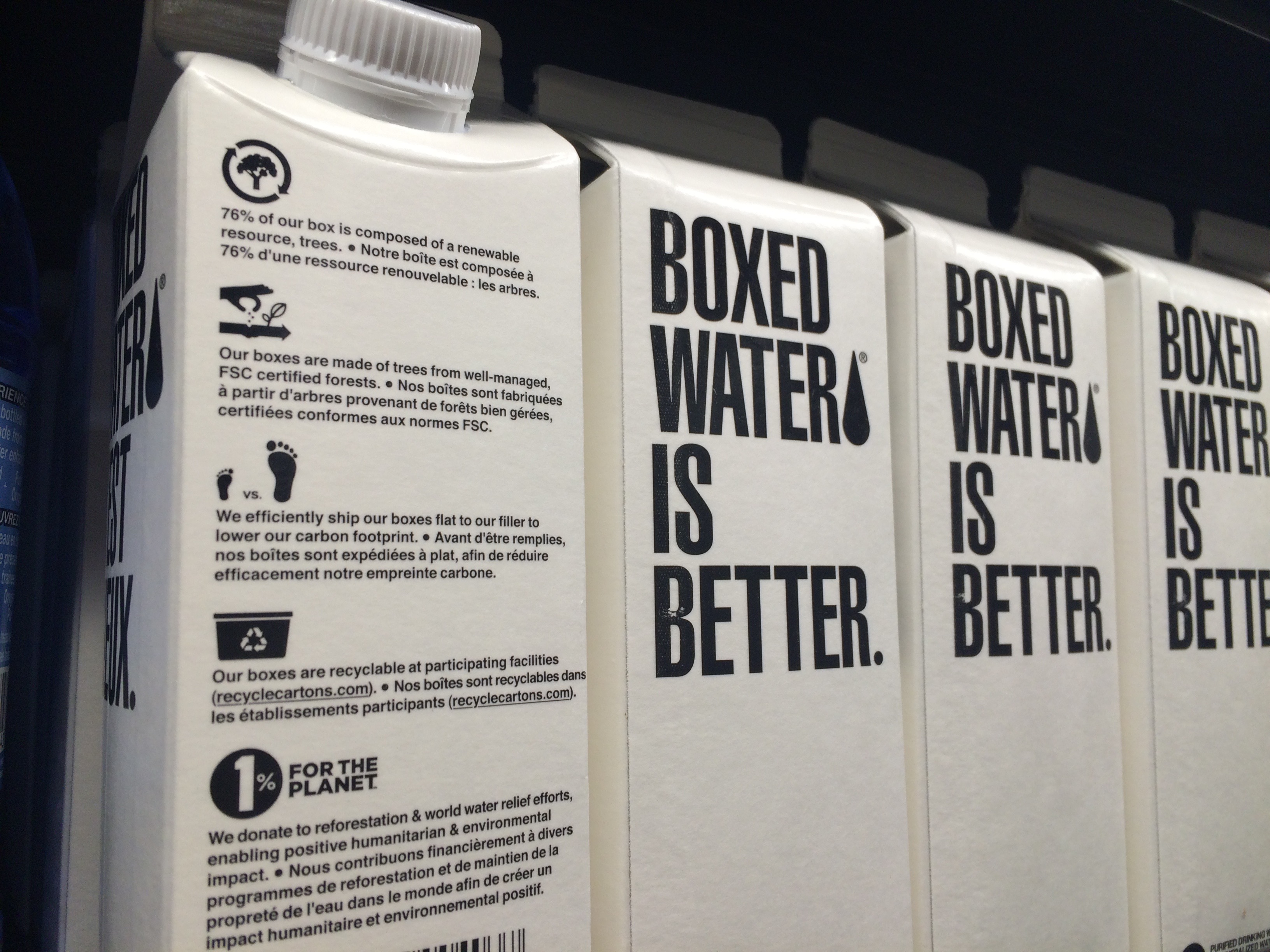
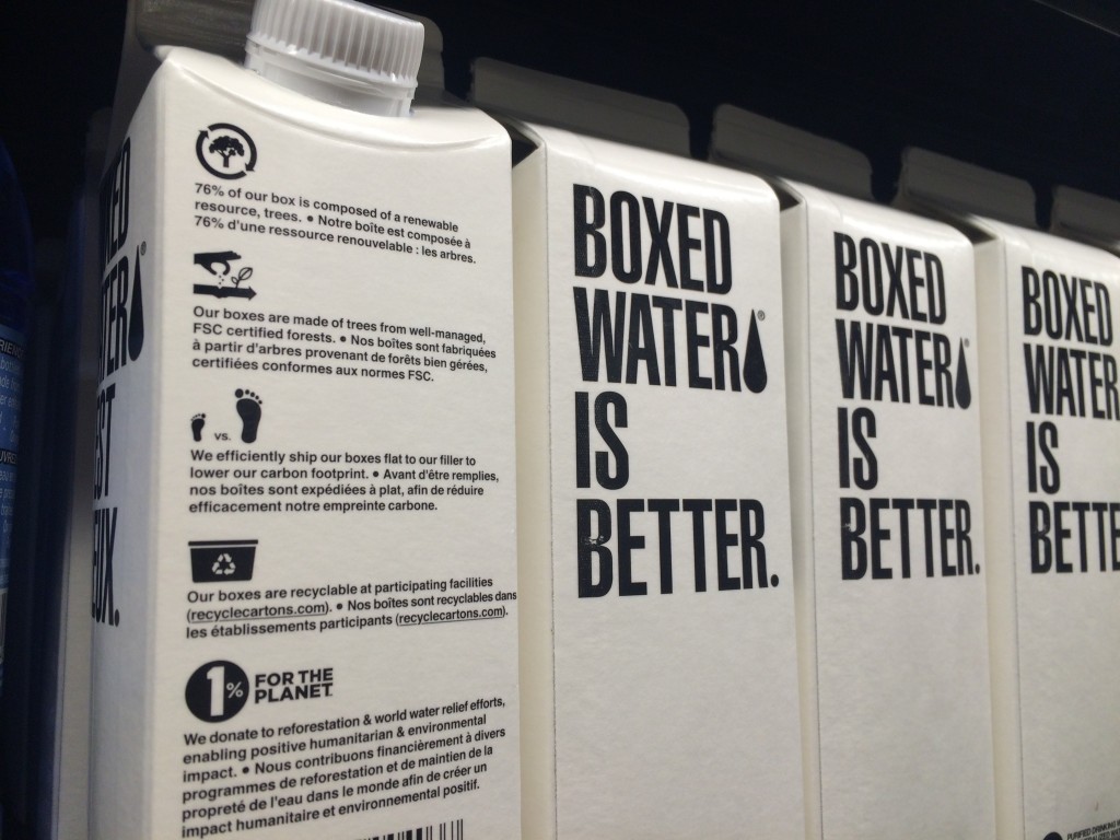
One company takes a bold and interesting step forward. Water is in paper boxes and its brand name is “Boxed Water Is Better.” The package says boxes are better than plastic bottles for several reasons.

  • 76% of our box is composed of a renewable resource.
  • Our boxes are made of trees from well-managed, FSC certified forests.
  • We efficiently ship our boxes flat to our filler to lower our carbon foot print.
  • Our boxes are recyclable at participating facilities.


DML_Boxed water is better(2)

Empathic story-telling print ad in Canada

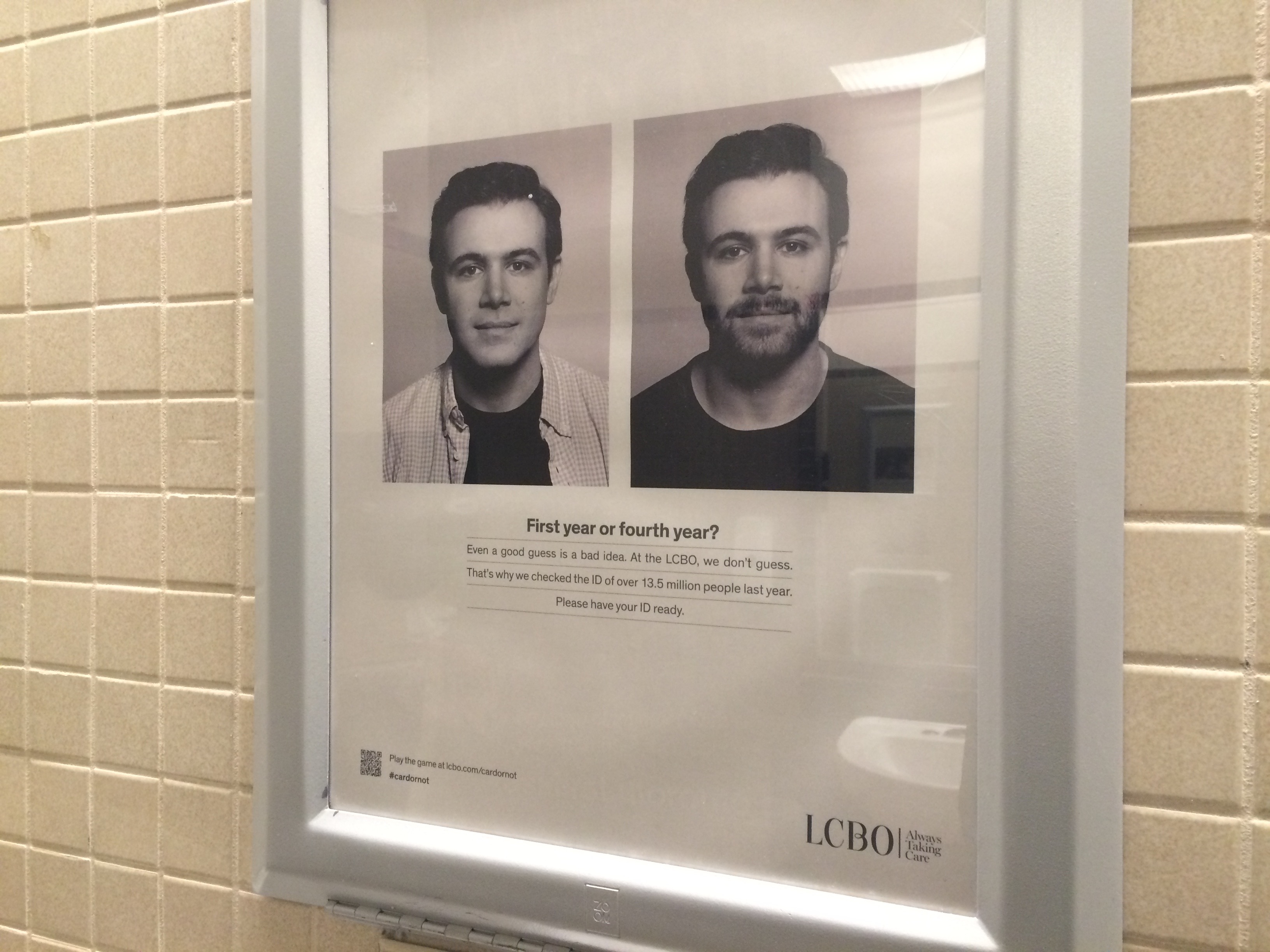
Canadians living in Ontario buy wines at LCBO (Liquor Control Board of Ontario). People working at this place often check photo-ID (e.g., driver license) to verify whether the buyer is old enough to drink alcohol. These carefully-managed and highly safe liquor stores sometimes make their customers unhappy, in particular, those who forget to bring their IDs.


DML_LCBO


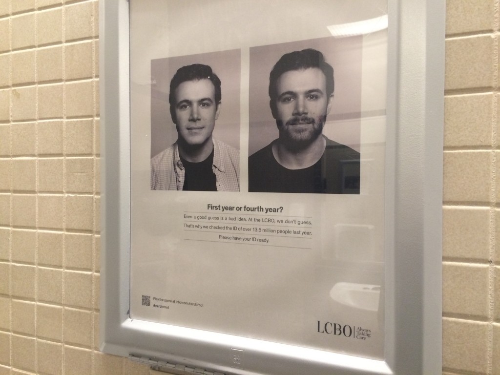
Therefore, LCBO needs to educate their potential customers to always present their IDs to the employees at LCBO. Instead of forcing us to do something, it tell a gentle story that people can easily empathise with. Inside the toilette of one of the University of Toronto buildings, a black-and-white print advertisement is placed on the wall. It shows two photos with a sentence, “First year or fourth year?” This advertisement nicely associates what we find it difficult in our daily school life (e.g., guessing someone’s year) with what they find it difficult in their workplaces (e.g., guessing buyer’s age). Empathic story-telling works for advertisement.

Japanese pork and Canadian chicken?

Soup is a liquid food, generally served warm, that is made by combining ingredients such as meat and vegetables with stock, juice, water, or another liquid, according to Wikipedia. Warm soups are popular as a type of comfort food in the world.


DML_Soul food


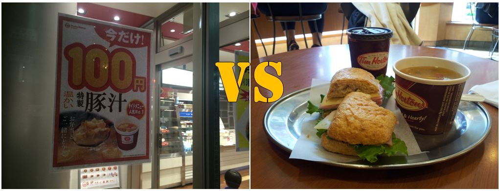
People have their own favourite ingredients for soups, and different meats are welcomed in different countries. For instance, in Japan, I have seen many flyers promoting 100-yen ($1) “pork” soup. In Canada, “chicken” soups are highly common. Is this because different meats are priced differently in different countries? Or, more importantly, do Japanese people actually like pork although they are perceived to like fish, and Canadians actually like chicken although they are viewed to like beef? We *might* have developed a wrong belief what ingredients make dishes from different cultures distinctive. 🙂


Umbra, Toronto-based global design company

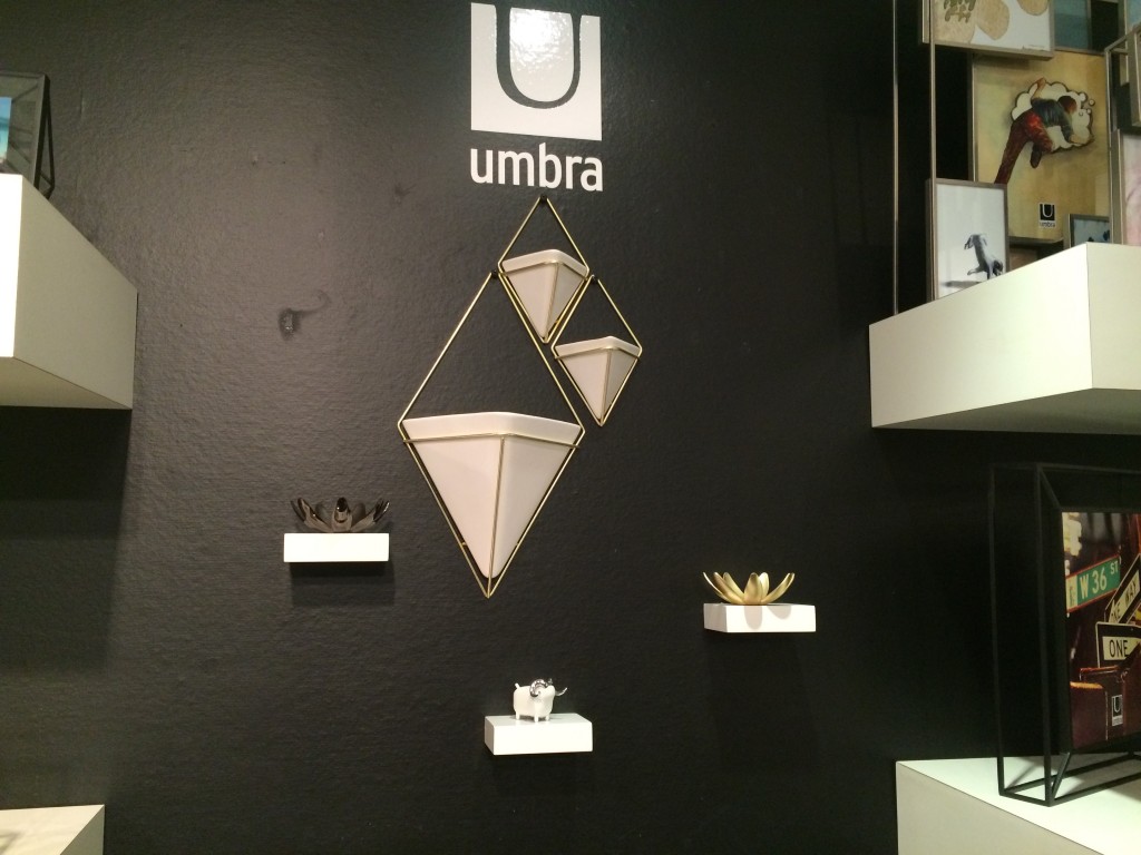
Umbra is a Canadian design company. I have bought a few home decorative items including its signature garbage cans (Later I learned it is called Skinny Can and was designed by Karim Rashid and David Quan). Interestingly, Umbra is not an expensive brand. Its affordable price allowed me to try several products. The products I have tried satisfied me. The website says,

We are a Toronto-based homeware design company born over 30 years ago when graphic designer, Paul Rowan, couldn’t find a nice window shade to hang in his apartment window. So, he made one and people liked it. He soon teamed up with childhood friend, Les Mandelbaum, and Umbra (in Latin, “shade”) was born. Les and Paul began reimagining everyday items into modern ware.

Today, Umbra is recognized all over the world for bringing intelligent design to everyday items. An in-house team of international designers allows us to come up with original design that speaks universally and personally to a broad customer base. The journey that started in Toronto continues—our designs can be found in over 120 countries.

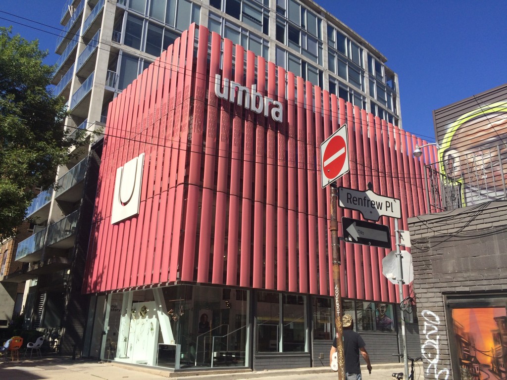
Recently, I had a chance to pay visit to its flagship store located in downtown Toronto. This store welcomed visitors to enjoy Umbra items. In particular, I had a brief meeting with Paul Rowan, one of the co-founders of Umbra. He is approachable, funny, and lively. We discussed a design competition held in 2014 in Seoul. He also introduced me a Korean designer who is currently working at the in-house team of international designers.

With a lot of curiosity, I visited the Umbra design studio located in Scarborough the next day. I met with Sung Wook Park. He graduated from OCAD (Ontario College of Art and Design) University and joined Umbra about 4 years ago. He is now a creative lead for jewelry, photodisplay, and wall decor items. He explained to me the overall history of Umbra and kindly taught me the trend, the popular material in the next couple of years, and several counter-intuitive international sales patterns regarding photo frames and wall decor items (e.g., Canada vs. US vs. Japan). I have asked any business issues his design team faces as well while introducing numerous successful design items to the global market. Meeting with Paul and Sung Wook gave me a glimpse into the life of the North American designers.

Expert Products, Novice Consumers

DesignMarketingLab

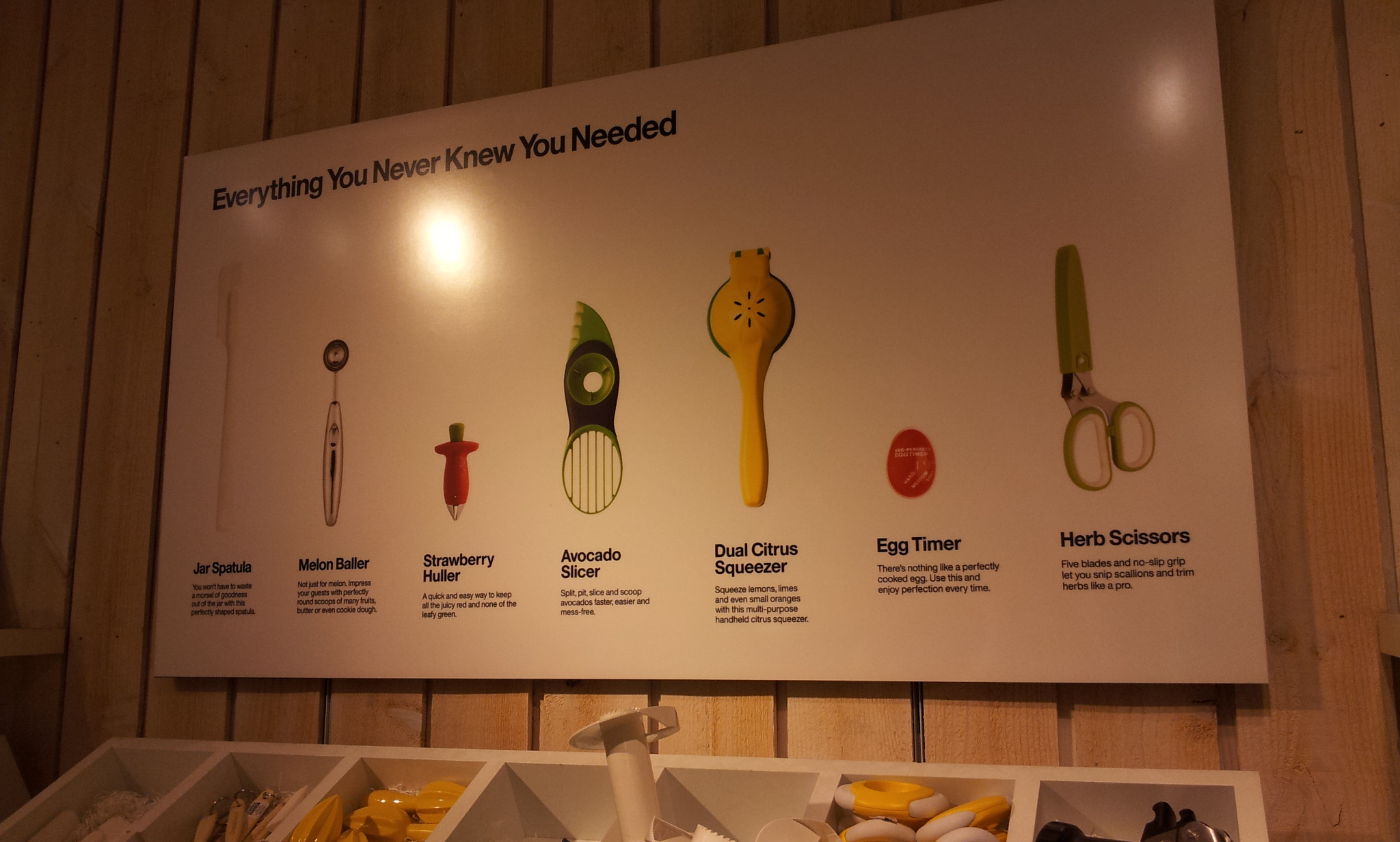
Crate and Barrel, one of my favorite stores following Pottery Barn and Williams and Sonoma, has a section called “Everything You Never Knew You Needed.” It introduces highly specialized kitchen utensils including jar spatula, melon baller, strawberry huller, avocado slicer, dual citrus squeezer, egg timer, and herb scissors.

At first, they look useless for many who do not cook often. Even if they do so, they can slice avocados and trim herbs using existing kitchen utensils. However, it is true that people often fell in love with a product only after they experience it. For example, I love the salad spinner by OXO, Panini grill by Breville, and wine decanter by Spiegelau. Although I am able to dry vegetables, grill sandwiches, and oxygenate wines without using these products, they make my cooking experience enjoyable. Indeed, I believe most smart kitchen products are the nice marriage of careful observation of people’s behavior in the kitchen with just a bit of technological flavor. If I should slice many avocados and trim a lot of herbs all the time, I may need a slicer and a pair of scissors designed exclusively for them to enjoy my cooking experience.

This leads us to a series of critical questions about new product development. Should designers and marketers ignore the novices’ voices (e.g., I am fine with an existing slicer) but listen to the experts’ voices more carefully (e.g., I need a better slicer for avocados)? If so, how do designers and marketers confirm that there will be a market for highly specialized expert products (e.g., avocado slicer)? Alternatively, how should designers and marketers “educate” novices when launching highly specialized products so that the newly developed products are appealing to novices ?

DesignMarketingLab