Tag Archives: Store

How thick is 2cm-thick steak?

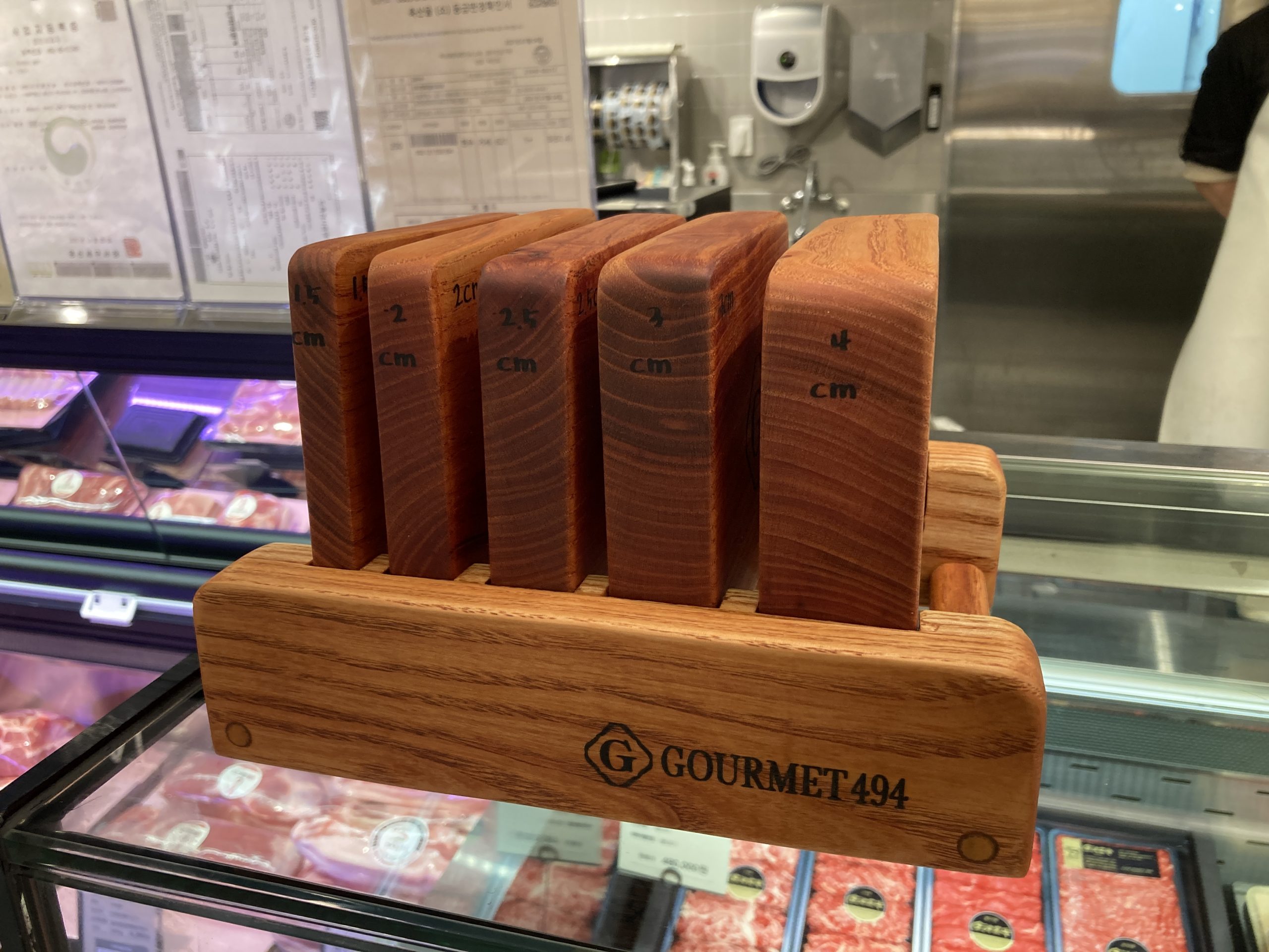
Thickness matters when cooking steak. A rule of thumb is to cook a 2cm-thick piece of steak for 2 minutes for rare, 4 minutes for medium, and 6 minutes for well-done. However, we struggle with guessing how thick a piece of steak is. Seven years ago, I met a clever solution for this problem at a grocery store where there was a manually carved wood plank. Since it shows how professional providers empathize with novice customers, I have shared it with many planers and designers. Recently, I met a similar but more carefully designed wood plank at a different grocery store in Seoul, Korea. According to the website, Gourmet 494 is

a space for food, entertainment and communication, built on the concept of “grocerant” (grocery + restaurant) for the first time in Korea where groceries (food ingredients) and restaurants (food and beverages) come together in one place

Wood plank tells that thickness is difficult for people to evaluate. A specific value (e.g., 2 cm) is hard to tell another value (e.g., 3 cm) because we are not sensitive about it. About this issue, a group of psychologists introduced a concept of General Evaluability Theory about 10 years ago.

**

Reference

Hsee, C. K., & Zhang, J. (2010). General evaluability theory. Perspectives on Psychological Science5(4), 343-355.

A central question in psychology and economics is the determination of whether individuals react differently to different values of a cared-about attribute (e.g., different income levels, different gas prices, and different ambient temperatures). Building on and significantly extending our earlier work on preference reversals between joint and separate evaluations, we propose a general evaluability theory (GET) that specifies when people are value sensitive and when people mispredict their own or others’ value sensitivity. The GET can explain and unify many seemingly unrelated findings, ranging from duration neglect to affective forecasting errors and can generate many new research directions on topics ranging from temporal discounting to subjective well-being.

In the section of Nature, the authors wrote the following. According to them, human beings do not seem to have an innate or stable scale to evaluate values on thickness.

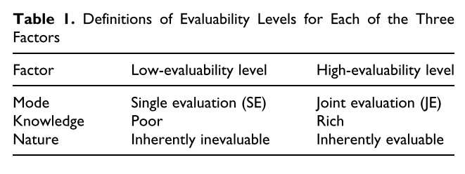
Nature refers to whether human beings have an innate and stable physiological or psychological “scale” (reference system) to evaluate values on an attribute. The attribute is inherently evaluable if they do or inherently inevaluable if they do not. Ambient temperature is an example of an inherently evaluable attribute; even without learning or social comparison, we can tell what temperature makes us comfortable and happy and what does not. Other examples include amount of sleep, social isolation, or connectedness. The size of a diamond and the power of a car are examples of inherently inevaluable attributes; without learning or comparison, we would not know how to assess such variables. Of course, some people know how to evaluate diamond size and car power, but such knowledge is learned, not innate. Because people possess innate reference systems for inherently evaluable attributes but not for inherently inevaluable attributes, value sensitivity (without learning or comparison) is higher for inherently evaluable attributes (H1.3). More precisely, people in SE are more sensitive to differences on an inherently evaluable attribute than to differences on an inherently inevaluable attribute, holding their sensitivity to the two types of differences in JE constant; see our discussion of the Mode × Value × Nature interaction later in this article.

It should be noted that classifying a variable as inherently evaluable does not mean that it is immune to the influence of external reference information (such as social comparison); instead, it means that people can evaluate the variable even without such information. Also, inherently evaluable variables are not always associated with basic biological needs—they also include socio-psychological variables, such as loneliness, depression, and sense of achievement. (For details, see Hsee, Yang, Li, & Shen, 2009.)
How could we enjoy difficult modern art easier?

Modern art work is difficult to understand. Someone posted at Quora that modern art paintings are difficult to understand because…

Modern art paintings are the best way to portray the unseen on the canvas. It is about the expression of emotions and feelings on and is not what you see at the very first glance. It can have many interpretations when seen through different angles. If you want to know more about modern art, then you can also read “Why is the New Art So Hard to understand”. It is a book written by Theodor Adorno, a German social theorist who shed more highlight on this concept that why Modern art paintings are so hard to understand modern art. Although the book was written in 1931, it is still relevant in today’s era.

How could we lower its difficulty and help visitors enjoy the modern art better? One solution is to allow visitors not to understand the artists’ intentions correctly. Instead, if visitors are allowed to misunderstand artists’ intentions and even disagree with artists’ opinions, if any, they will be relieved to fail.

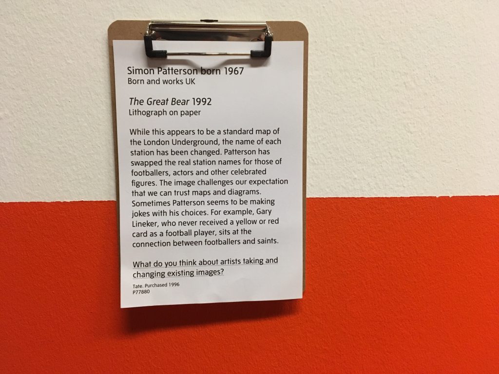
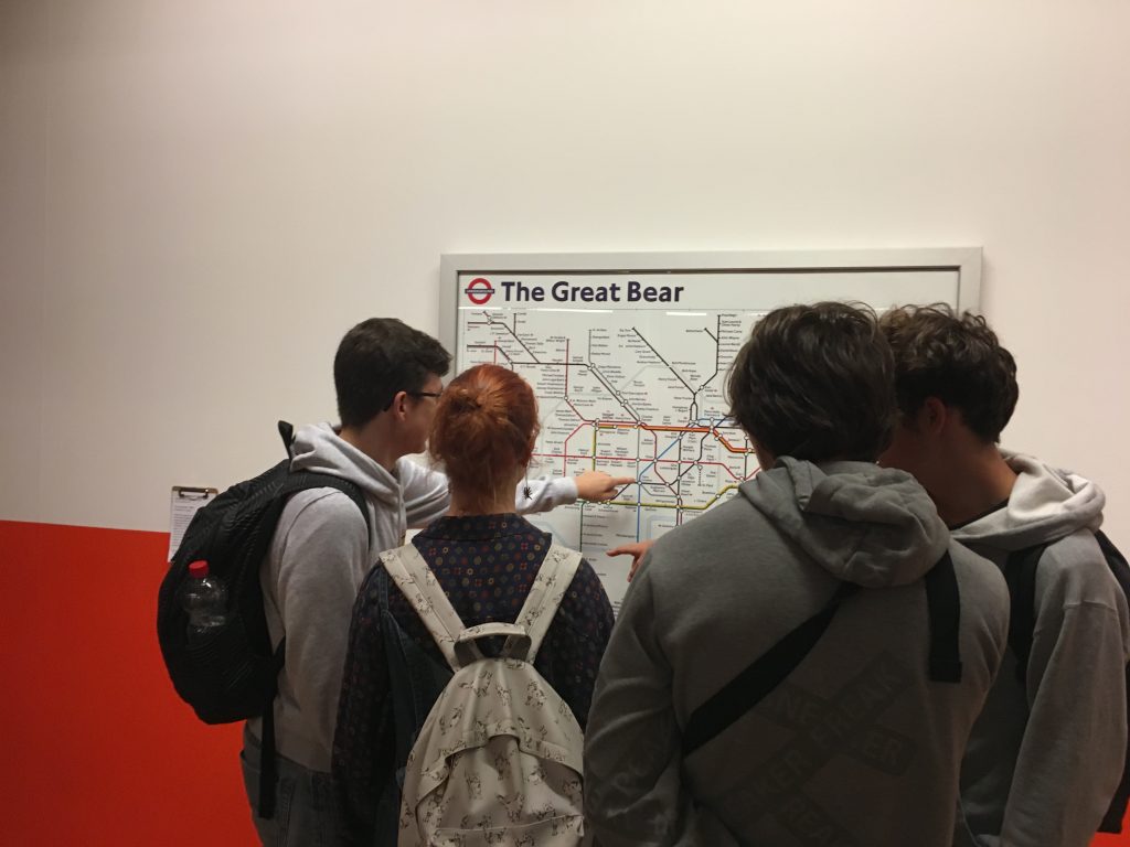
A great example is the underlined sentence under the modern artwork named The Great Bear by Simon Patternson in 1992. This sentence was added by a curator working at the Tate Liverpool, UK. Indeed, several students stood in front of this artwork and casually discussed to answer the question.

Simon Patterson born 1967 (Born and work UK) / The Great Bear 1992 (Lithograph on paper)

While this appears to be a standard map of the London Underground, the name of each station has been changed. Patterson has swapped the real station names for those of footballers, actors, and other celebrated figures. The image challenges our expectation that we can trust maps and diagrams. Sometimes Patterson seems to be making jokes with his choices. For example, Gary Lineker, who never received a yellow or red card as a football player, sits at the connection between footballers and saints.

  • What do you think about artists taking and changing existing images?

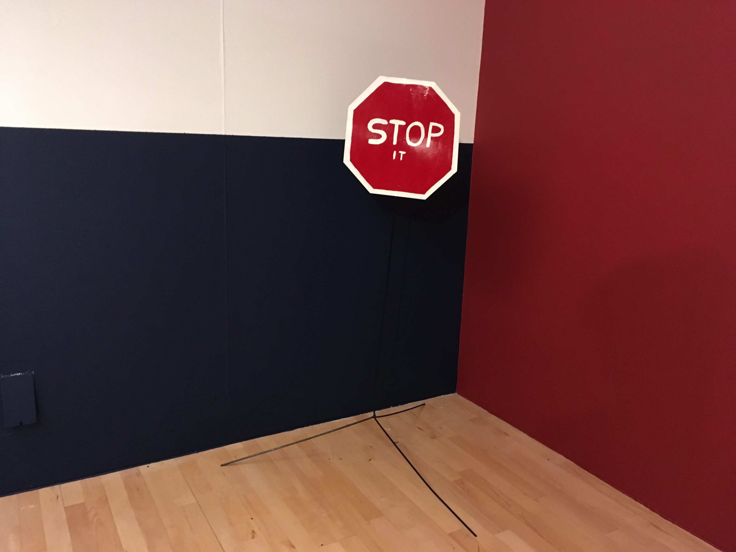
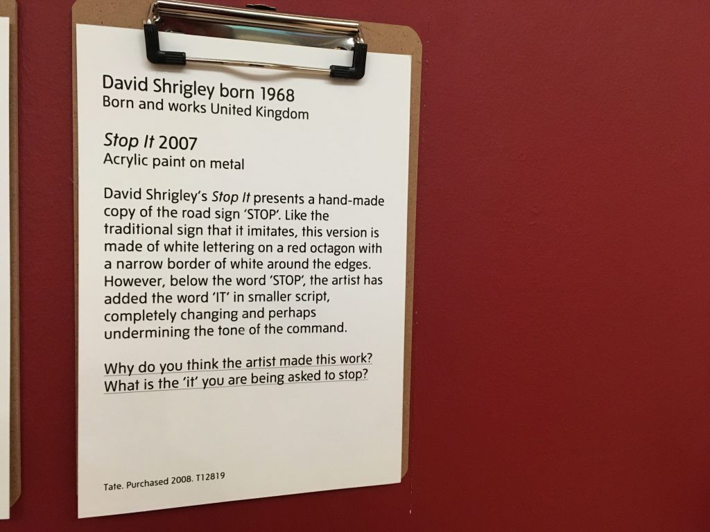
A similar sentence was found under another artwork (see below). Reading just one more sentence under the artwork made this Tate Modern museum more friendly and more approachable.

  • Why do you think the artist made this work? What is the ‘it’ you are being asked to stop?

Behaivoral scientists argue that people find information important when it is easy to process (called fluent). Since modern art is difficult, people often avoid and even ignore it. When curators make the modern art easier to process, people will enjoy it.

**

Reference

Shah, A. K., & Oppenheimer, D. M. (2007). Easy does it: The role of fluency in cue weighting. Judgment and Decision Making, 2(6), 371–379.

We propose that people weight fluent, or easy to process, information more heavily than disfluent information when making judgments. Cue fluency was manipulated independent of objective cue validity in three studies, the findings from which support our hypothesis. In Experiment 1, participants weighted a consumer review more heavily when it was written in a clear font than in a less clear font. In Experiment 2, participants placed more weight on information when it was in focus than when it was blurry. In Experiment 3, participants placed more weight on financial information from brokerage firms with easy to pronounce names than those with hard to pronounce names. These studies demonstrate that fluency affects cue weighting independent of objective cue validity.

How many items should be displayed in a store?

When we are curious about value of an unknown object, we often consider how many people surround it. If it is alone, we believe it is expensive. If it is surrounded by many others, we believe it is cheap. This is because, according to O’Guinn’s et al. (2015), as the social density of a given space increases, “inference of the subjective social class and income of people in that space” fall. Although we like different degrees of crowdedness (D&Department in Tokyo) and even view the same degree of crowdedness differently (Kronen Vanlose in Copenhagen), crowdedness decreases the value of a product.

O’Guinn, T. C., Tanner, R. J., & Maeng, A. (2015). Turning to space: Social density, social class, and the value of things in stores. Journal of Consumer Research, 42(2), 196-213.

This article is about social space and material objects for sale within that space. We draw primarily on Goffman’s (1971) concepts of use space and possession territories to predict that as the social density of a given space increases, inferences of the subjective social class and income of people in that space fall. Eight studies confirm that this is indeed the case, with the result holding even for stick figures, thus controlling for typical visual indicators of social class such as clothing or jewelry. Furthermore, these social class inferences mediate a relationship between social density and product valuation, with individuals assessing both higher prices and a greater willingness to pay for products presented in less crowded contexts. This effect of inferred class on product valuation is explained by status-motivated individuals’ desire to associate with higher-status people. To the best of our knowledge, this research is the first to reveal the link between social density, status inferences, and object valuations. As such, it makes a novel contribution to what has come to be known in sociology as the topological turn: a renewed focus on social space.

Then, could we apply the same logic to stores where products are surrounded by other products? In other words, does “product crowdedness” decrease product value as well? This is an important question as stores display items in different ways.

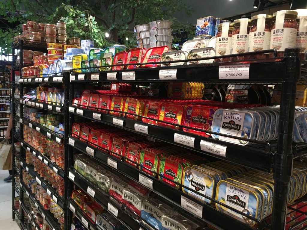
Some stores display various items with a lot of stocks. For instance, at Annam Gourmet, Ho Chi Minh, only a few cans of sea food are on the shelf space with multiple stocks.

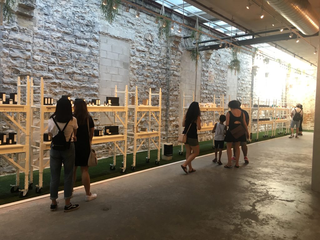
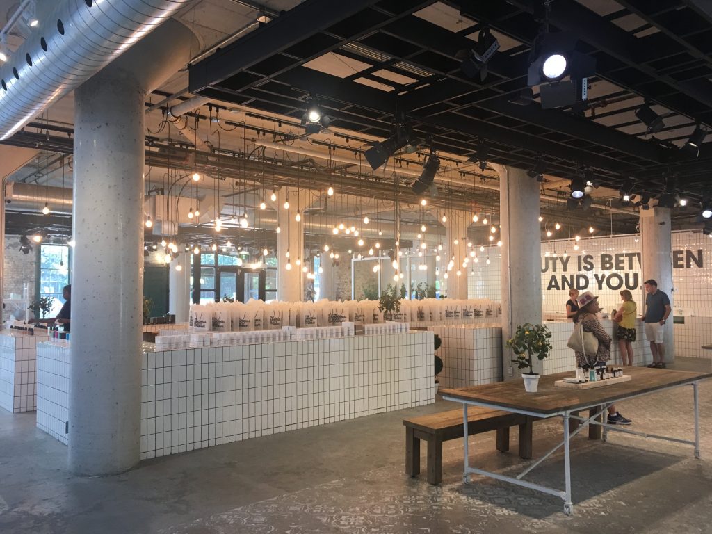
Other stores display only few items with few stocks. For instance, Decium, a Canadian cosmetic company introduces a few items without showing their stocks.  

Two contrasting examples show that stocks determine the perceived value of products. Designers and marketers should decrease the number of products displayed in the store to increase their perceived value. There is a 8-minute video about an inside look at Decium to see how the company has managed to find success in the highly competitive, the multi-billion-dollar world of skin care.

How crowded is crowded?

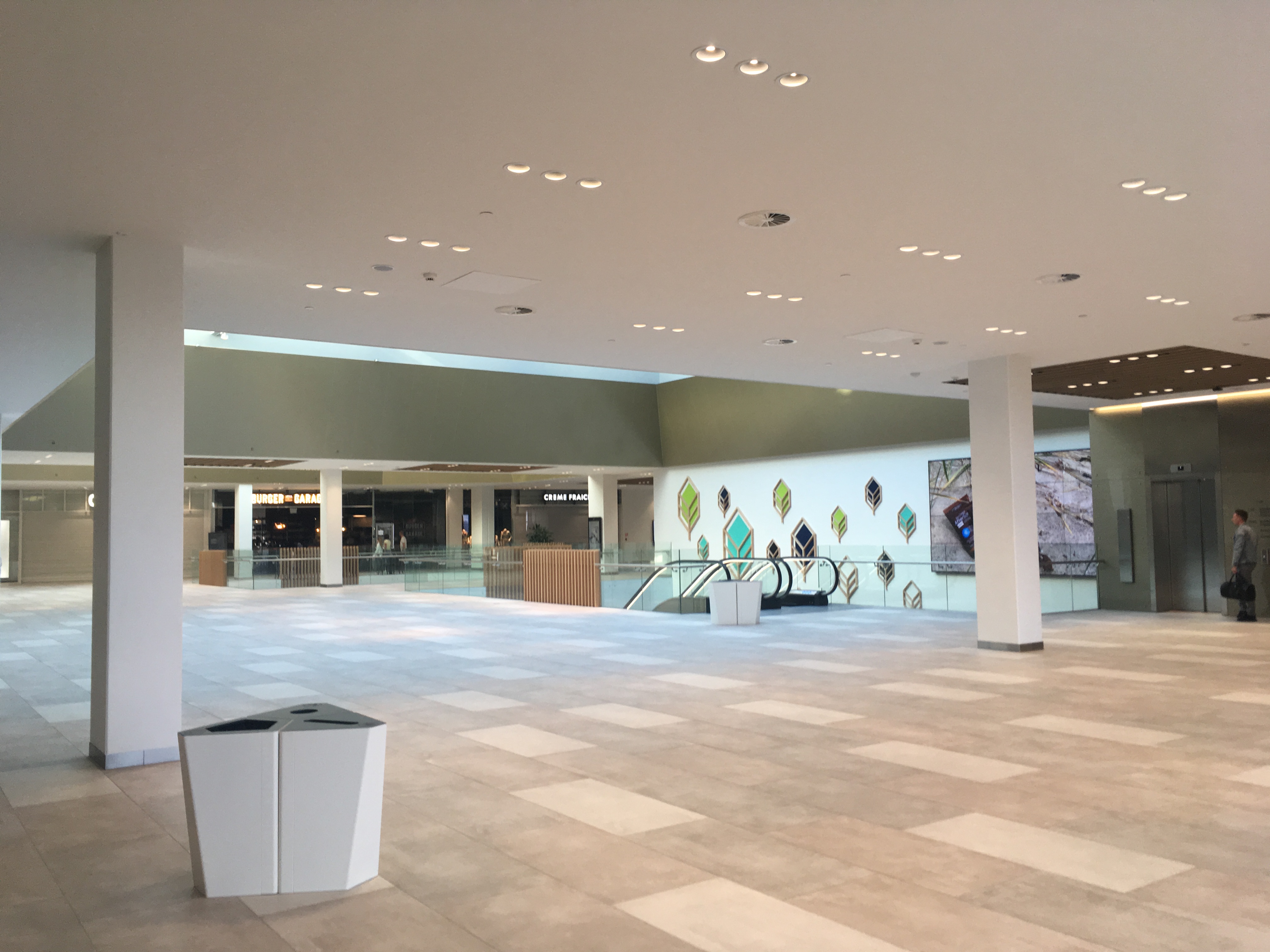
Copenhagen differs from Seoul. In Copenhagen, I have ample opportunities to feel emptiness. When I go to a shopping mall (Kronen Vanlose) at 5PM on a weekday, it is literally vacant. Only few are spotted.


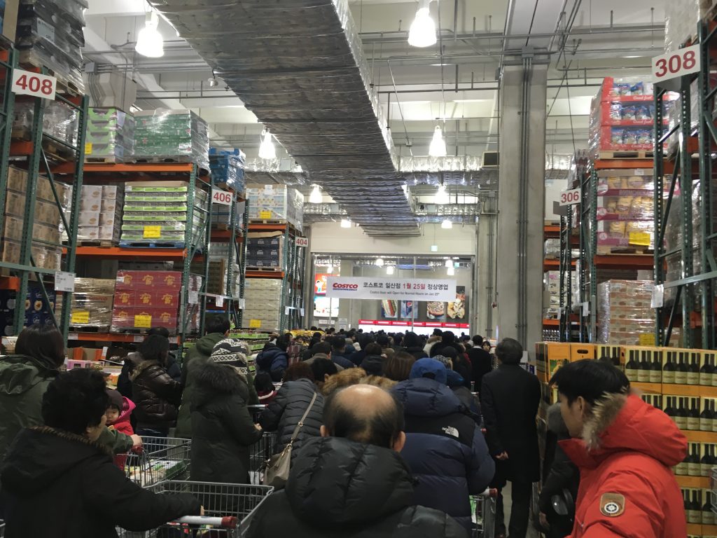
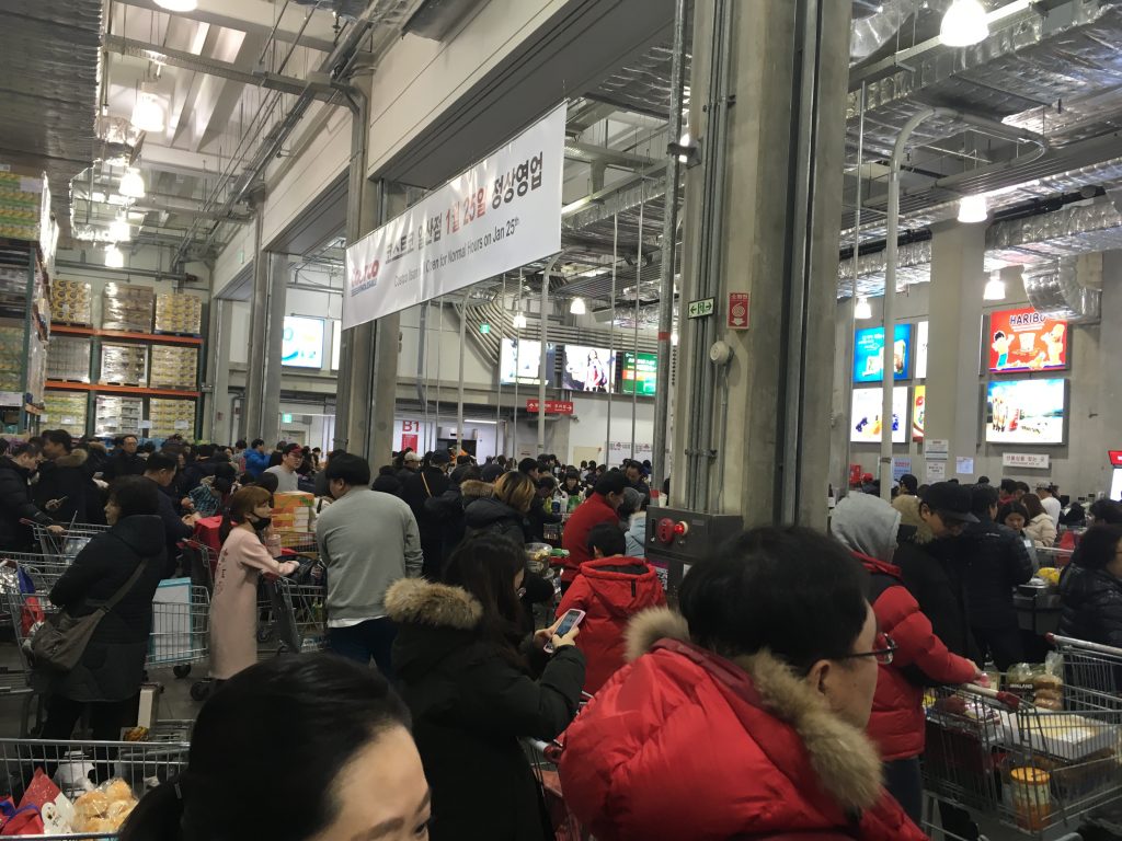
In Seoul, people constantly bump into people on street. By default, I feel crowdedness. When I go to Costco Wholesale at 8PM on any weekday, I should stand in line more than 10 minutes to meet cashiers.


Feeling emptiness or feeling crowdedness affects us. According to marketing research, social density shapes how we value products in a space. I find this research interesting and insightful, but it does not say much about how (objectively) crowded is (subjectively) crowded. While Koreans find a store or mall empty, Danes may find the same space crowded.


This article is about social space and material objects for sale within that space. We draw primarily on Goffman’s (1971) concepts of use space and possession territories to predict that as the social density of a given space increases, inferences of the subjective social class and income of people in that space fall. Eight studies confirm that this is indeed the case, with the result holding even for stick figures, thus controlling for typical visual indicators of social class such as clothing or jewelry. Furthermore, these social class inferences mediate a relationship between social density and product valuation, with individuals assessing both higher prices and a greater willingness to pay for products presented in less crowded contexts. This effect of inferred class on product valuation is explained by status-motivated individuals’ desire to associate with higher-status people. To the best of our knowledge, this research is the first to reveal the link between social density, status inferences, and object valuations. As such, it makes a novel contribution to what has come to be known in sociology as the topological turn: a renewed focus on social space.


From Samsung 2013 to Huawei 2016

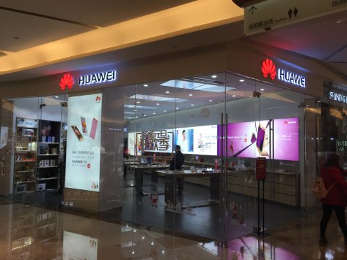
Although smartphone market is slowing down, smartphone manufacturers constantly open their stores. While I was staying in Shenzhen, China, I paid a visit to a nearby shopping mall called Yitian Holiday plaza (9028 Shennan Road, Nanshan District 南山区深南路9028号益田假日广场). As most other shopping malls do, it has a wide variety of shops and restaurants. I visited the same shopping mall 3 years ago.

In the middle of the shopping mall, I noticed that the Samsung store closed in 2013 and the Huawei store opened in 2016 at the same place. This indicates that the Chinese mobile phone manufacturer paid significant resources to massive marketing. According to the Telecom Lead report released in January 2016,

“Melissa Chau, senior research manager with IDC’s Worldwide Quarterly Mobile Phone Tracker, said; “While there is a lot of uncertainty around the economic slowdown in China, Huawei is one of the few brands from China that has successfully diversified worldwide, with almost half of its shipments going outside of China. Huawei is poised to be in a good position to hold onto a strong number 3 over the next year.” Huawei became the fourth mobile phone vendor in history to ship over 100 million smartphones in a year.

Hand print for escalator safety

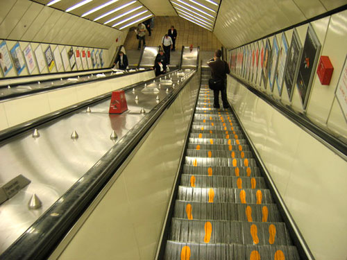
Jenny Xie wrote A Potentially Brilliant Idea to Keep Escalator Obstructors to the Right at the Atlantic Cities. In her article, a London-based designer called Yoni Alter made an interesting proposal to signal “stand on right, walk on left.” Although his idea has not been implemented yet, he proposed to paint two different foot prints on the escalator so that people standing in the right side stay and those standing in the left side walk.

Jenny Xie @ The Atlantic Cities_20130917
By Jenny Xie, The Atlantic Cities, September 17, 2013

Recently, I have met another brilliant idea about escalator. Escalator users are supposed to hold the handrail while using the escalator because, although rarely happens, it might go in reverse, injuring them seriously. This safety instruction, however, is often ignored.

Warning

As escalator accidents increase recently, someone who is not identified but works at the Seoul subway system came up with a brilliant idea: painting hand prints on the handrail. These visible cues nudge people to, at least, place their hands on the handrail.

DesignMarketingLab_Hand print @ Seoul_20130921

Besides improving the safety for public transit, visual cues are used for improving store traffic. When a store is crowded, store visitors are often recommended to enter and leave in a specific way. One store manager painted foot prints to nudge the visitors follow them.

DesignMarketingLab_Foot print @ Seoul_20130921