Category Archives: Cases

Read the clock, literally

Red Dot Design Museum is located in the heart of Singapore’s most iconic location, the Marina Bay. This area is one of the most fun places and interesting destination to visit and for sightseeing in Singapore, with numerous attractions within walk distance from the museum. There is an exhibition space in the museum and exhibitions are curated from the results of the Red Dot Design Award.

In the museum, I met an interesting clock named Qlocktwo (Wall and Table) Clock. It received an award of Honorouble Mention 2010. This clock was manufactured by Biergert & Funk Product GmbH & Co KG, and its in-house design was done by Marco Biergert Andreas Funk.

According to the information, “this clock contains a matrix with symmetrically arranged characters which are illuminated in white light to form words that describe time. The front surface is made of polished acrylic glass; the lacquered wooden body supports it by means of eight magnets. When it is activated, the timer sets itself exact to the second and adjusts the brightness of the characters to ambient light.”

The jury left a statement that “Qlocktwo turns the concept of “reading the clock” into a whole new experience. The time measurement in words is not only original but also practical.”

Three escalating numbers are enough to teach moral behavior

In Singapore, we should pay fine when behaving inappropriately in subway: S$500 when eating or drinking, S$1000 when smoking, and S$5000 when using flammable goods. Interestingly, eating durians is also inappropriate but the fine amount of doing so is not clarified. I suspect that Singapore government seems to know intuitively that people follow rules if they see a set of three escalating numbers.

Glass shaped like milk carton

Most cocktail glasses are designed to hold the unique aroma of the cocktail to maximize its taste. However, some glasses play different roles. While I visited Singapore, my friend recommended me to visit Loof, a rooftop bar. It is located across the famous Raffels Hotel, a colonial-style super luxury hotel in the downtown. According to the website, this bar is

Awarded as Singapore’s best rooftop bar, Loof serves up quality whimsy, fresh nostalgia and unbridled playfulness in an urban garden atop Odeon Towers in downtown CBD. Enjoy carefully crafted Southeast Asian inspired cocktails with bar snacks that have a local twist. Then take a trip down memory lane and purchase little gems of locally-curated nostalgia at The Mama Shop. Bask in the cool shade of Loof’s urban garden and take in the best view of Raffles Hotel. Soak up infectious beats from resident DJs and themed party nights.


I wanted to drink energy booster since I spent a hot and humid daytime outside. I ordered “Milo Cocktail” because Milo is the chocolate malt beverage. Interestingly, this cocktail was served by a milk carton shaped glass. Although this glass did not capture the unique aroma the cocktail, it certainly improved my drinking experience because Milo is often served with milk and thus it tasted like Milo milky cocktail.

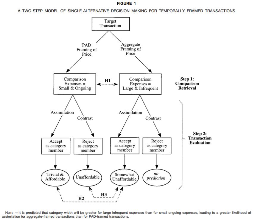
Stephen Hoch and Young-Won Ha proposed in their seminal marketing paper, Consumer Learning: Advertising and the Ambiguity of Product Experience (1986) that experience is a piece of evidence to test a hypothesis and the hypothesis is the advertising message. This cocktail glass led me to think that product design or package can be a hypothesis now. I thought milk was in there! 🙂


Cow shaped cheese board

About 6,700 cheese boards and cutting boards sell on the Amazon.com. Their prices vary between $5 and $370. Majority of them are rectanglular. However, not a few boards interesting shapes. At one of my favorite Canadian stores, West elm, I found a cow-shaped mini cheese board and cutting board. Its price was $22.

I bought this board mainly because it looked interesting to me. However, a board designer cut a significant portion of it to make it look like a cow, it was not useful to cut vegetables and fruits but ok for serving cheese. This is a typical situation that marketing researchers often study: a trade-off relationship between aesthetic appeal and practical utility. Does this trade-off work? Unfortunately, I do not know whether adding design flavor attracts other consumers or helps makers charge more. However, it successfully attracted at least one person who had virtually no interest in boards before. Probably, this funny-looking board will remind me of a Canadian store and bring much to share with my guests.

***

Reference

Joo, J., & Chung, J. (2019). Are consumer design evaluations trustworthy? Archives of Design Research, 32(1), 47–59.

Background Designers often consider consumer design evaluations. However, whether consumer design evaluations are trustworthy has been rarely discussed. We propose that consumers equate the concept of design with the concept of uniqueness, which suggests that their design valuations are context dependent and unstable.

Methods We test our proposition by conducting one pilot study and three main studies. The pilot study examines which criteria consumers consider when evaluating a design. The three main studies test whether consumer design evaluations depend on the situation and unique products.

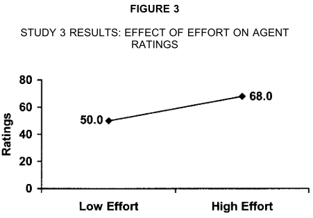
Results The results of the pilot study and three main studies demonstrate that subjects evaluated design using aesthetic and functional attributes and their design evaluations were based on the attributes that are not popular in a specific situation.

Conclusions This study contributes to the academic discussion of whether consumer design evaluations are stable. Our findings demonstrate that consumers construct design evaluations on the spot. Therefore, designers who have accumulated professional experience and knowledge, are recommended to follow their own design evaluations rather than the voice of customers.
Private Karaoke for two people

I have long believed Asians go to Karaoke for team spirit. When a popular song appears on the screen, they show companisonship by standing up and singing all together. When a song is new, they start their own conversations with the next person. Regardless of whether they sing or talk, Karaoke is the place people confirm they are in the same camp.


However, I changed my belief about the function of Karaoke after having met a private Karaoke for two people in ShenZhen, China. This facility named as M-Bar is of the same size with a phone booth. This small place is not designed for comradeship or loyalty. Instead, it is designed for people to become absorbed in their own singing experience, the core feature of Karaoke. Although no one waits outside for their turns, a few passers by silently watch two people singing inside through the transparent windows. This facility shows the power of single households. Alternatively, different from my thoughts based on the Hofstede’s cultural dimension theory, Chinese may not be collectivist but individualist.


Thompson, a Japanese paper clock

Some products are stunningly beautiful. They include Balmuda toaster, Dyson’s hair dryer, and LEGO brick. People sometimes buy these products without thinking much whether the purchased items are useful or needed. They seem to have a desire to posses the aesthetic quality of these products. Interestingly, they often become passionate ambassadors of these products.

Recently, I met a difficult-to-resist product at a Japanese stationary store, Ito-ya, in Tokyo. It is a clock named Thomson. The Thomson Clock is designed to blend in paper and wood. It has engraved indexes (its numbers were punched on the paper), creating the three-dimensional feeling. This clock was designed by Yoichi Nara, who was born in Tokyo in 1977, graduated from construction architecture at the Yokohama National University in 1999, worked at several companies in Italy and graduated from Venice Architecture in 2006, and then returned home to establish his own design studio, Noto Design Office.

This clock is manufactured by the company, Lemnos, which started its business as a Hattori clock factory called Seikosha (currently Seiko clock Inc.). Product designers working for this company have designed several master pieces and have won good design awards in Japan and abroad as they shared the idea that “the clock creates space.” Each product is carefully honed by craftsmanship skills and is not influenced by fads.


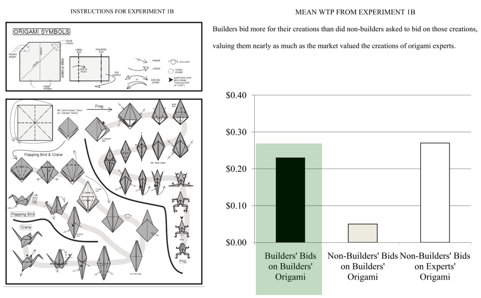
Interestingly, a group of marketing researchers recently argued handmade products symbolically contain love, proposing “handmade effect.” The abstract of this paper says,

Despite the popularity and high quality of machine-made products, handmade products have not disappeared, even in product categories in which machinal production is common. The authors present the first systematic set of studies exploring whether and how stated production mode (handmade vs. machine-made) affects product attractiveness. Four studies provide evidence for the existence of a positive handmade effect on product attractiveness. This effect is, to an important extent, driven by perceptions that handmade products symbolically “contain love.” The authors validate this love account by controlling for alternative value drivers of handmade production (effort, product quality, uniqueness, authenticity, and pride). The handmade effect is moderated by two factors that affect the value of love. Specifically, consumers indicate stronger purchase intentions for handmade than machine-made products when buying gifts for their loved ones but not for more distant gift recipients, and they pay more for handmade gifts when purchased to convey love than simply to acquire the best-performing product.


From Samsung 2013 to Huawei 2016

Although smartphone market is slowing down, smartphone manufacturers constantly open their stores. While I was staying in Shenzhen, China, I paid a visit to a nearby shopping mall called Yitian Holiday plaza (9028 Shennan Road, Nanshan District 南山区深南路9028号益田假日广场). As most other shopping malls do, it has a wide variety of shops and restaurants. I visited the same shopping mall 3 years ago.

In the middle of the shopping mall, I noticed that the Samsung store closed in 2013 and the Huawei store opened in 2016 at the same place. This indicates that the Chinese mobile phone manufacturer paid significant resources to massive marketing. According to the Telecom Lead report released in January 2016,

“Melissa Chau, senior research manager with IDC’s Worldwide Quarterly Mobile Phone Tracker, said; “While there is a lot of uncertainty around the economic slowdown in China, Huawei is one of the few brands from China that has successfully diversified worldwide, with almost half of its shipments going outside of China. Huawei is poised to be in a good position to hold onto a strong number 3 over the next year.” Huawei became the fourth mobile phone vendor in history to ship over 100 million smartphones in a year.

LEGO-like solution for error management in hotel

Today’s travelers are not looking for a just tooth brush. They are looking for an experience, something they can relate to. Whether an environmentally conscious traveler or business traveler, guests are demanding more out of their hotel stays than ever before (see Trends Changing the Way Guests and Hoteliers View Amenities). One of the frequent requests travelers make is that they need a new personal item provided complimentary for use in the bathroom (e.g., razor) after they used one before. However, guests often re-locate many amenities, and therefore whether a specific personal item needs to be replaced with a new one or not is difficult to identify. Put differently, an accident (e.g., a new razor is not available!) can occur when a housekeeper makes an mistake or error (e.g., I thought the guests did not use a razor…). What can we do to prevent this from happening?


The Venice Hotel Shenzhen, China, solved this problem intuitively; personal items are separately packaged in the paper boxes and assembled into a kit like LEGO bricks. Doing this will help housekeepers instantly identify which personal items need to be replaced among a wide variety of items including tooth brush, comb, sanitary bag, vanity kit, sewing kit, shower cap, and razor.


What are the problems of ATM machine?

We use ATM machines to deposit, withdraw, and transfer money. However, strangers unintentionally overlook what we do when they stand behind us or next to us because they stand side by side and people queue behind us. Unfortunately, this issue has not been addressed in Korea yet. Only a tiny, low-resolution mirror is attached on top of each machine.

Differently from Seoul, Shenzhen provides safer and more comfortable experience. A orange-colored bank not only provides sufficient distance between machines but also allows users to get inside the closed space. Therefore, Chinese users feel safe while being “encapsulated.”

In fact, ATM safety is an international issue. Designers address this issue from an innovative perspective. For instance, IDEO designed humanized ATMs for the Spanish bank, BBVA. This concept was introduced in Fastcodesign.

The biggest overhaul, though, has nothing to do with the touchscreen; it’s the position of the machine itself. It’s rotated 90 degrees, forcing people to queue up next to the ATM rather than behind it — a remarkably simple solution to a longstanding problem: the ominous feeling, when you’re taking out cash, that the guy behind you is about to rob you blind.

Another interesting idea is a concept called Magic Carpet proposed by a Polish industrial designer, Judyta Wojciechowska. This concept was introduced at the Behance.

Magic Carpet is a decorative floor covering located on the footway beside an ATM. The carpet design guides ATM users as to where to stand to maintain the privacy of the person using the ATM and also to accommodate pedestrian flow. This visual guidance on the footway indicates the desired direction and distance for the people to form the queue for the ATM. If the ATM user’s private space is invaded then sensors in the carpet detect this movement and activate a vibration system beneath their feet. The vibration alerts the user to respond and the “invader” to step back. This design consequently protects the ATM user from crimes such as shoulder surfing distraction theft and pick-pocketing.

How to avoid long lines for women’s restrooms

Women differ from men. Carol Reiley mentioned in her blog post titled When Bias in Product Design Means Life or Death that “female drivers are 47% more likely to be seriously injured in a car crash” because seat belts were historically designed to be safe for men and thus unsafe for women. When it comes to our everyday lives, I believe we need more women’s restrooms. In an article titled the everyday sexism of women waiting in public toilet line, Soraya Chemaly wrote that “long lines for women’s restrooms are the results of a history that favors men’s bodies.” She said,

Women need to use bathrooms more often and for longer periods of time because: we sit to urinate (urinals effectively double the space in men’s rooms), we menstruate, we are responsible for reproducing the species (which makes us pee more), we continue to have greater responsibility for children (who have to use bathrooms with us), and we breastfeed (frequently in grotty bathroom stalls). Additionally, women tend to wear more binding and cumbersome clothes, whereas men’s clothing provides significantly speedier access. But in a classic example of the difference between surface “equality” and genuine equity, many public restrooms continue to be facilities that are equal in physical space, while favoring men’s bodies, experiences, and needs.

Although I cannot agree with her more, this issue has not been well addressed in most public spaces. Fortunately, I recently found a women-friendly building located in Seoul. It is Stradeum, the building exclusively dedicated to sound-sensitive music lovers. In this building, visitors enjoy listening to a wide variety of music using hand-held devices or stand-alone speakers manufactured by Astell & Kern. This building installed three women’s restrooms and one men’s restroom and, this is probably why there is no line in front of both restrooms.

stradeum-seoul1


stradeum-seoul