Category Archives: Cases

If people avoid meeting with others, do marketers sell products online only?

Nowadays people avoid meeting others. We could buy products through mobile phones and order food at screens inside restaurants. A recent virus outbreak even encourages us to stop shaking hands with strangers.

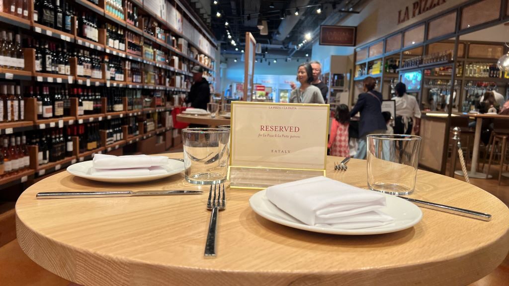
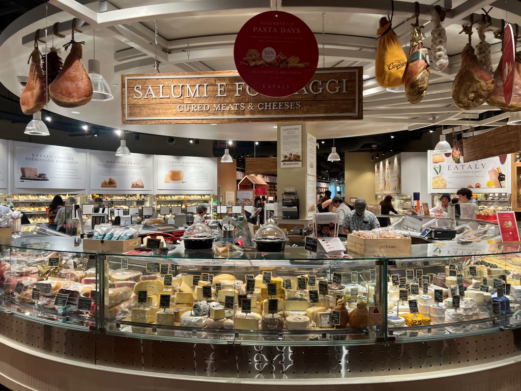
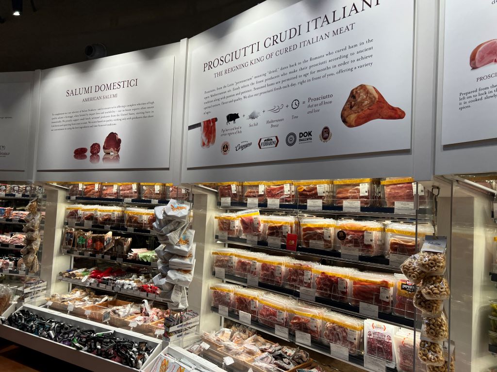
Ironically, the more we avoid meeting others, I believe, the easier others sell their products to us. When I visited Prezzemolo & Vitale, a local grocery store in Notting Hill in London, an employee brought a lump of meat on a board, cut it into thin slices, and passed them over to passers by. Interestingly, most of those who tried samples bought several pieces of different types of meat. I was not exception.

When he looked at me with a slice of meat, I inferred, he made an effort to approach me. This inference is rarely made when I stand in front of machines such as mobile phones or kiosks. I conclude that when we meet people and machines, we may have different inference: people make effort to come close to us whereas machines do not. This inferred effort may play a critical role in determining our next behavior such as buying a product.

***

Reference 1

Morales, A. C. (2005). Giving firms an “E” for effort: Consumer responses to high-effort firms. Journal of Consumer Research, 31(4), 806–812.

This research shows that consumers reward firms for extra effort. More specifically, a series of three laboratory experiments shows that when firms exert extra effort in making or displaying their products, consumers reward them by increasing their willingness to pay, store choice, and overall evaluations, even if the actual quality of the products is not improved. This rewarding process is defined broadly as general reciprocity. Consistent with attribution theory, the rewarding of generally directed effort is mediated by feelings of gratitude. When consumers infer that effort is motivated by persuasion, however, they no longer feel gratitude and do not reward high-effort firms.

Effort not only dictates our behavior. It helps us enjoy what we do.

***

Reference 2

Norton, M. I., Mochon, D., & Ariely, D. (2012). The “IKEA Effect”: When labor leads to love. Journal of Consumer Psychology, 22(3), 453–460.

In four studies in which consumers assembled IKEA boxes, folded origami, and built sets of Legos, we demonstrate and investigate boundary conditions for the IKEA effect-the increase in valuation of self-made products. Participants saw their amateurish creations as similar in value to experts’ creations, and expected others to share their opinions. We show that labor leads to love only when labor results in successful completion of tasks; when participants built and then destroyed their creations, or failed to complete them, the IKEA effect dissipated. Finally, we show that labor increases valuation for both “do-it-yourselfers” and novices.


Why does the amount of Coke differ across bottles?

When I had a lunch at Buenos Aires, Argentina, I ordered four bottles of Coca Cola. Interestingly, bottle sizes differed and the amount of soda in each bottle looked different. I simply thought this was due to the Quality Control failure of the Coca Cola in Argentina.

After coming back from Buenos Aires to Seoul, I met an interesting case about Corona Beer. When this competitive Mexican beer was initially introduced to US in 1980s, American beer companies were concerned about the disruptive competitor. Budweiser soon noticed that, however, the amount of beer differed across bottles. Corona claimed that this reflected the Mexican spirit of leisure. Similar to what Corona did, Coca Cola may want to express its Argentinian spirit of leisure.
One of the most well-known reframing strategies in marketing is PAD (Pennies-a-day) strategy, the temporal reframing of a transaction from an aggregate expense to a series of small daily or ongoing expenses. According to Gourville (1998), it fosters the retrieval and consideration of small ongoing expenses as the standard of comparison, whereas an aggregate framing of that same transaction is shown to foster the retrieval and consideration of large infrequent expenses. This difference in retrieval influences subsequent transaction evaluation and compliance.
**

Reference

Gourville, J. T. (1998). Pennies-a-day: The effect of temporal reframing on transaction evaluationJournal of Consumer Research24(4), 395-408.

To increase transaction compliance, marketers sometimes temporally reframe the cost of a product from an aggregate one-time expense to a series of small ongoing expenses, often in spite of the fact that the physical payments remain aggregated. This temporal reframing is identified in this article as the “pennies-a-day” (PAD) strategy. A two-step consumer decision-making process of (1) comparison retrieval and (2) transaction evaluation is posited to explain the effectiveness of this strategy. In a series of laboratory studies, general support for PAD effectiveness across a range of product categories and specific support for the proposed two-step model was found. The PAD framing of a target transaction is shown to systematically foster the retrieval and consideration of small ongoing expenses as the standard of comparison, whereas an aggregate framing of that same transaction is shown to foster the retrieval and consideration of large infrequent expenses. This difference in retrieval is shown to significantly influence subsequent transaction evaluation and compliance.

Curitiba has a sophisticated taste of design

I had a business trip to Brazil and Argentina with others. We gave lectures, ran workshops, participated in walk-in tours, and made new friends.

I was impressed by the airport in Curitiba, Brazil. When our plan touched down, I noticed a fire extinguisher and two public phones were attached on a grey wall. At first, they looked like desktop icons. Then, I found that a red-and-yellow square box was painted under the fire extinguisher and a phone was placed lower than the other.

I also found that Curitiba uses color to educate and nudge people to recycle trash. Trash cans in public spaces were divided into multiple sections with different colors. Someone in this city seemed to use color, shape, height and arrangement very carefully not for embellishment but for communication.

Crilly, N., Moultrie, J., & Clarkson, P. J. (2004). Seeing things: Consumer response to the visual domain in product design. Design Studies, 25(6), 547–577.

This paper discusses consumer response to product visual form within the context of an integrated conceptual framework. Emphasis is placed on the aesthetic, semantic and symbolic aspects of cognitive response to design. The accompanying affective and behavioural responses are also discussed and the interaction between cognitive and affective response is considered. All aspects of response are presented as the final stage in a process of communication between the design team and the consumer. The role of external visual references is examined and the effects of moderating influences at each stage in the process of communication are discussed. In particular, the personal, situational and cultural factors that moderate response are considered. In concluding the paper, implications for design practice and design research are presented.

Is survey a form of arts?

There are different forms of arts like painting, sculpture, architecture, and photography. However, survey could be a form of arts. I learned this from the exhibition of Korea Artist Prize 2019 at the MMCA (National Museum of Modern Contemporary Art, Korea).

Korea Artist Prize is a prestigious art award and exhibition of Korea. This award follows the path of MMCA’s Artist of the year exhibitions, which was held from 1995 to 2010 and hence it has been reestablished to discover and sponsor artists who have ardently persisted in paving their own way to artistic success, thus providing an avenue for the advancement of Korean contemporary art.

One of the four selected artists in 2019 is Hyesoo Park. Her artwork is to visualize our unconscious perception. She often observes surroundings, gathers data by doing meticulous research, and collaborates with experts in related fields. In other words, she conducts social science research as an artist.

Park’s new work made for this exhibition starts from the question, “who is your ‘we’?” This question invites one to examine individuals’ questions and categorizations of ‘we,’ namely, their understandings of groups. Prior to the production of the work, the artist conducted a survey on one’s perceptions of ‘we’ among a representative sample, and the output of the survey is analyzed by an expert and interpreted by the artist to be reflected in this work.

One piece of artworks surprised me. This artwork is a survey report. She hung survey responses and framed statistical findings.

According to academic research, we are more likely to include unconventional artworks into the category of arts when we think abstractly. This suggests when we think concretely, we are less likely to consider survey a form of arts.

Schimmel, K., & Förster, J. (2008). How Temporal Distance Changes Novices’ Attitudes Towards Unconventional Arts. Psychology of Aesthetics, Creativity, and the Arts, 2(1), 53–60.

The authors suggest that, just like other attitudes, attitudes toward art may be malleable, and may thus also depend on situational factors. In particular, the authors propose that thinking styles vary within the situation and that an abstract versus concrete thinking style has an influence on attitudes toward conventional (e.g., Mona Lisa by da Vinci) versus unconventional (e.g., Fat Corner by Beuys) artworks. Construal Level Theory predicts that when people think about the distant future they automatically start thinking in a more abstract way, relative to when people think about the near future, which is supposed to elicit a concrete thinking style. In an experiment, the authors asked participants to think about their lives a year from now or tomorrow. Afterward, in an allegedly unrelated task, participants were asked to evaluate conventional and unconventional artworks. Results showed that participants that had thought about distant events and presumably thought more abstractly were more likely to include unconventional artworks into the category of arts than participants that had thought about near events, and thus presumably thought in more concrete terms. Implications for applied settings are discussed.

Every city needs art and art has to be in the middle of the people

Granville Island is a tourist spot in Vancouver, Canada. It is a farmer’s market with shopping stores, food and beverage places, and art centers. In the middle of the island, gigantic factory facilities were painted like four mischievous boys. I found them artwork.

The name of these artworks are Giants. As the name suggests, these painted concretes are 70 ft (21m) tall.

The mural is part of a global series by OSGEMEOS called “Giants.” The Vancouver Mural is the first in Canada and the only one in 3D, making it unique in the world. The artists are two Brazilian identical twin brothers who have taken the Contemporary art world by storm. While primarily focused on transforming public space, they have exhibited at some of the most prestigious art institutions in the world including the Tate Modern in London and the Museum of the Contemporary Art in Los Angeles.

The Brazilian artists said “every city needs art and art has to be in the middle of the people.” Marketing researchers have also paid attention to how people move through museum spaces and experience art.

**

Reference

Joy, A., & Sherry, J. F. J. (2003). Speaking of Art as Embodied Imagination: A Multisensory Approach to Understanding Aesthetic Experience. Journal of Consumer Research, 30(2), 259–282.

This article focuses on somatic experience–not just the process of thinking bodily but how the body informs the logic of thinking about art. We examine the links between embodiment, movement, and multisensory experience insofar as they help to elucidate the contours of art appreciation in a museum. We argue that embodiment can be identified at two levels: the phenomenological and the cognitive unconscious. At the first level, individuals are conscious of their feelings and actions while, at the second level, sensorimotor and other bodily oriented inference mechanisms inform their processes of abstract thought and reasoning. We analyze the consumption stories of 30 museum goers in order to understand how people move through museum spaces and feel, touch, hear, smell, and taste art. Further, through an analysis of metaphors and the use of conceptual blending, we tap into the participants’ unconscious minds, gleaning important embodiment processes that shape their reasoning.

Why do people choose beers on the left side of the menu?

One of the most famous pubs in Prague, Czech Republic, is Strahov Monastery Brewery.

Perched atop the city part of the Strahov Monastery compound and the lush surrounding Petrin Hill, the Strahov Brewery is a delightful find in the bustling city of Prague. Just steps from the massive Prague Castle complex, the microbrewery serves about ten variations of St. Norbert beer (3 all year round and 7 seasonally) and the brews are all delicious and fresh with crisp hints of unique flavors.

This brewery has an eye -pleasing beer menu. It introduced five different beers with color, ABV (Alcohol By Volume), IBU (International Bittering Units) scale, description, hops, availability, price, and food pairing. Much like the positioning map beer menu at the Fairmont Chateau Lake Louise, the Strahov Brewery menu eased the burden of my decision-making.

Interestingly, I found that everyone ordered Amber Larger, Dark Larger, or IPA. These three beers were placed on the left side of the menu and each one was supported by its own comment: representing 70% of the production, award winning, or brew master recommended. I noticed that a vertical line in the middle of the menu plays a role of the “visual barrier” and therefore the two beers on the right side did not attract attention. The menu designer used mere categorization effect smartly.

Reference

Mogilner, C., Rudnick, T., & Iyengar, S. S. (2008). The Mere Categorization Effect: How the Presence of Categories Increases Choosers’ Perceptions of Assortment Variety and Outcome Satisfaction. Journal of Consumer Research, 35(2), 202–215.

What is the effect of option categorization on choosers’ satisfaction? A combination of field and laboratory experiments reveals that the mere presence of categories, irrespective of their content, positively influences the satisfaction of choosers who are unfamiliar with the choice domain. This “mere categorization effect” is driven by a greater number of categories signaling greater variety among the available options, which allows for a sense of self‐determination from choosing. This effect, however, is attenuated for choosers who are familiar with the choice domain, who do not rely on the presence of categories to perceive the variety available.

How could we stop cigarette butt litter?

Cigarette butts are the tail ends of the cigarette left over after someone has smoked it. They are under-acknowledged, but widespread, pollutants. At the Quora, someone said the following.

In fact, thanks to the fact that for decades smokers just didn’t care where they threw them, there are very likely cigarette butts in the Amazon rain forest, at the North Pole, and on the fast-disappearing Ross Ice Shelf in Antarctica. Practically the only place they are difficult to find is where they belong – in the trash bin.

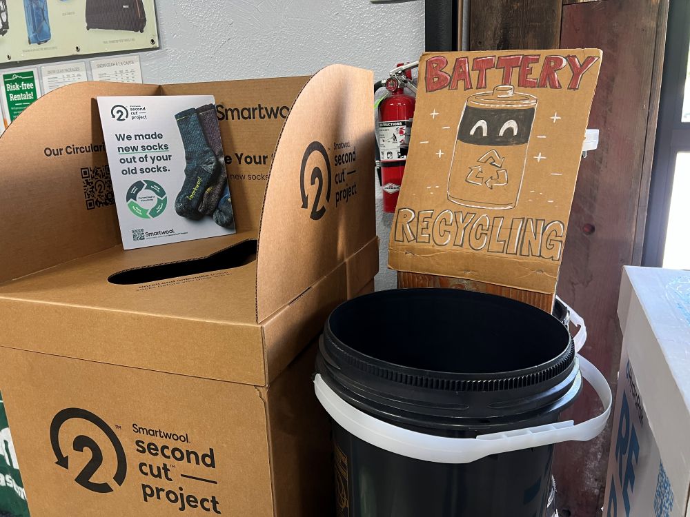
To tackle this issue, various efforts have been suggested. According to Tara Rohan, for instance, posters and videos have been provided to educate people about the environmental impacts of cigarette-butt litter. Alternatively, cans have been installed in select neighborhoods. Most of these efforts aim to nudge smokers to throw cigarette butts in trash bins. Recently, I have noticed an interesting approach in London, UK.

At the Portobello Road market in London, bins are installed for those who want to throw gums and cigarette butts. For an unidentified reason, these bins have baby faces. As research suggests that large, round eyes, high eyebrows, and a small chin yielded the perception of a babyish facial appearance.

Since baby face or Kindchenschema (baby schema) is “related to the vulnerable nature of a living entity, it elicits responses from adults that increase the infant’s chance of survival. These include increased attention to and protection of the helpless infant (Brosch, Sandder, and Scherer 2007; Lorenz 1943) and increased carefulness and caretaking behavior (Sherman, Haidt, and Coan 2009). (Nenkov et al. 2014, pg. 326)”

Nenkov, G. Y., & Scott, M. L. (2014). “So Cute I Could Eat It Up”: Priming Effects of Cute Products on Indulgent Consumption. Journal of Consumer Research, 41(2), 326–341.

Although adding a human face to the tip jar backfires, having a baby face even contributes to the success of high-ranking Black executives. Designing cigarette bins like cute babies must be effective to collect cigarette butts. I wish similar bins are installed in other markets and cities as well to stop cigarette butt litter.

Livingston, R. W., & Pearce, N. A. (2009). The teddy-bear effect: Does having a baby face benefit black chief executive officers?. Psychological science20(10), 1229-1236.

Prior research suggests that having a baby face is negatively correlated with success among White males in high positions of leadership. However, we explored the positive role of such “babyfaceness” in the success of high-ranking Black executives. Two studies revealed that Black chief executive officers (CEOs) were significantly more baby-faced than White CEOs. Black CEOs were also judged as being warmer than White CEOs, even though ordinary Blacks were rated categorically as being less warm than ordinary Whites. In addition, baby-faced Black CEOs tended to lead more prestigious corporations and earned higher salaries than mature-faced Black CEOs; these patterns did not emerge for White CEOs. Taken together, these findings suggest that babyfaceness is a disarming mechanism that facilitates the success of Black leaders by attenuating stereotypical perceptions that Blacks are threatening. Theoretical and practical implications for research on race, gender, and leadership are discussed.

How many items should be displayed in a store?

When we are curious about value of an unknown object, we often consider how many people surround it. If it is alone, we believe it is expensive. If it is surrounded by many others, we believe it is cheap. This is because, according to O’Guinn’s et al. (2015), as the social density of a given space increases, “inference of the subjective social class and income of people in that space” fall. Although we like different degrees of crowdedness (D&Department in Tokyo) and even view the same degree of crowdedness differently (Kronen Vanlose in Copenhagen), crowdedness decreases the value of a product.

O’Guinn, T. C., Tanner, R. J., & Maeng, A. (2015). Turning to space: Social density, social class, and the value of things in stores. Journal of Consumer Research, 42(2), 196-213.

This article is about social space and material objects for sale within that space. We draw primarily on Goffman’s (1971) concepts of use space and possession territories to predict that as the social density of a given space increases, inferences of the subjective social class and income of people in that space fall. Eight studies confirm that this is indeed the case, with the result holding even for stick figures, thus controlling for typical visual indicators of social class such as clothing or jewelry. Furthermore, these social class inferences mediate a relationship between social density and product valuation, with individuals assessing both higher prices and a greater willingness to pay for products presented in less crowded contexts. This effect of inferred class on product valuation is explained by status-motivated individuals’ desire to associate with higher-status people. To the best of our knowledge, this research is the first to reveal the link between social density, status inferences, and object valuations. As such, it makes a novel contribution to what has come to be known in sociology as the topological turn: a renewed focus on social space.

Then, could we apply the same logic to stores where products are surrounded by other products? In other words, does “product crowdedness” decrease product value as well? This is an important question as stores display items in different ways.

Some stores display various items with a lot of stocks. For instance, at Annam Gourmet, Ho Chi Minh, only a few cans of sea food are on the shelf space with multiple stocks.

Other stores display only few items with few stocks. For instance, Decium, a Canadian cosmetic company introduces a few items without showing their stocks.  

Two contrasting examples show that stocks determine the perceived value of products. Designers and marketers should decrease the number of products displayed in the store to increase their perceived value. There is a 8-minute video about an inside look at Decium to see how the company has managed to find success in the highly competitive, the multi-billion-dollar world of skin care.

Why do we doodle?

According to Wikipedia, doodles are simple drawings that can have concrete representational meaning or may just be composed of random and abstract lines. However, all doodles are not same. Some doodles are hedonic and others are utilitarian.

Hedonic doodles are personal. They are drawings about interpretation of subjective experience, mostly for fun. For instance, I doodled below to remember what I enjoyed while I stayed in Shenzhen, China. I used Mobike, drank HeyTea and wine, took a BYD electronic taxi, visited Macau by ferry, and ate beef, crab, sea food, and noodle each in different places. Its road was wide and its hot water dispenser attracted my attention.

Different from hedonic doodles, utilitarian doodles have practical purposes. They are drawings about objective information, mostly for effective communications with others. For instance, I drew the facet, the shower head, the top bowl, and the shower booth in my bathroom with their sizes and heights when I wanted to replace them with new ones (below).

I like doodling, but I am often intimidated when doodling because of the pressure that I should doodle perfectly. However, I recently learned that if I clarified the purpose of doodling and choose either hedonic or utilitarian, I was not intimidated. Probably, I am not the only one who has a mixed feeling about doodling. Who knows if I keep doodling now and draw a professional graffiti like the one I met in Sao Paulo, Brazil? 🙂

Reference

Babin, B.J., Darden, W.R. and Griffin, M. (1994) Work and/or Fun: Measuring Hedonic and Utilitarian Shopping Value. Journal of Consumer Research, 20, 644-656.

Consumer researchers’ growing interest in consumer experiences has revealed that many consumption activities produce both hedonic and utilitarian outcomes. Thus, there is an increasing need for scales to assess consumer perceptions of both hedonic and utilitarian values. This article describes the development of a scale measuring both values obtained from the pervasive consumption experience of shopping. The authors develop and validate the scale using a multistep process. The results demonstrate that distinct hedonic and utilitarian shopping value dimensions exist and are related to a number of important consumption variables. Implications for further applications of the scale are discussed

Could we use a single commercial space for multiple purposes?

Each commercial space has its own purpose. At a restaurant, we eat food. At a bar, we drink beer. At a cafe, we take a coffee. We rarely drink beer at cafes and we do not ask for coffee at bars. As Google Map shows, cafes are not listed when we search for bars. Similarly, bars do not appear when cafes are searched for.

However, some commercial spaces in Buenos Aires, Argentina serve more than one purpose. For instance, Hobbs Palermo looks like a restaurant. However I ordered a bottle of alcoholic beverage late night and, at a day time, I noticed a person who drank only a bottle of Coca Cola. It is a restaurant, bar, and cafe.

Bar El Federal (or the Federal Bar) is even called as cafe bar. Located in the old downtown of Buenos Aires, it is an authentic pub with wooden interiors and antique bottles. However, some people eat sandwich, others drink beers and even the others read books under the dim light.

We can eat pizza at Starbucks. We can drink coffee at Michelin restaurants. If we overcome the thought that one space should be used only for a single purpose, we will be able to use space creatively.