Tag Archives: Los Angeles

How knowing the creator enhances the beauty of a design: Frank Lloyd Wright

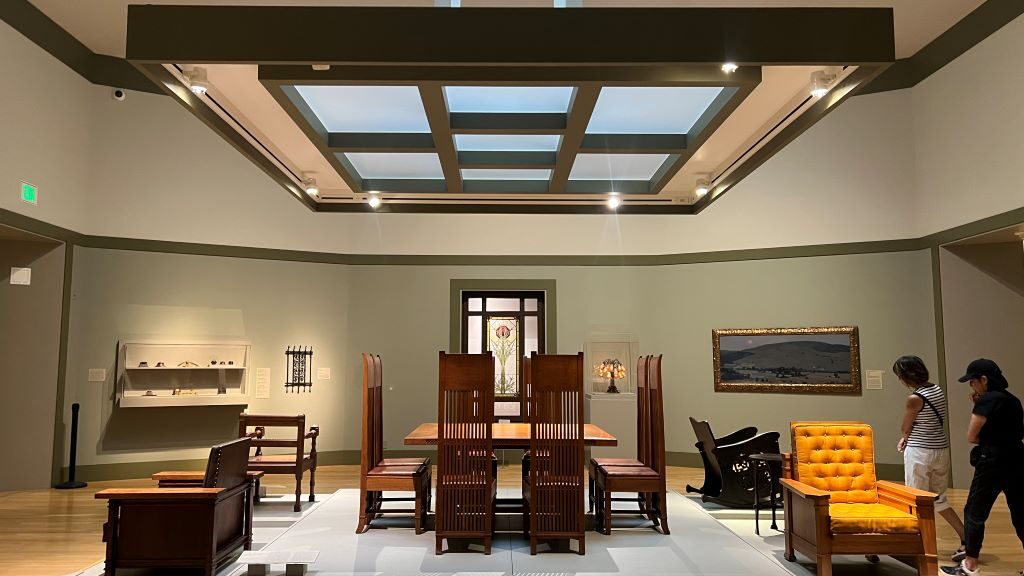
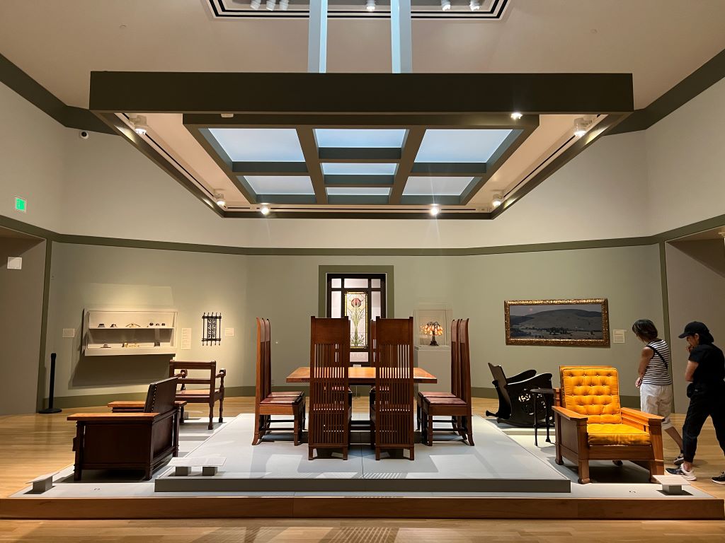
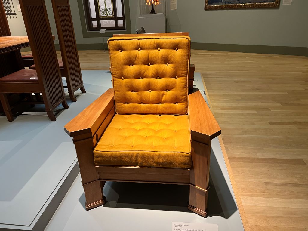
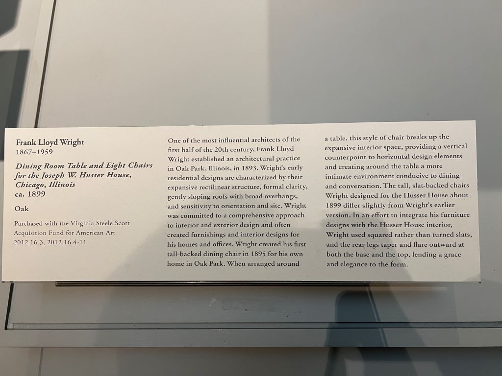
At the Huntington Art Museum in Los Angeles, I was captivated by a dining room table and chairs. They were not vibrant but organized. They were meticulously crafted. I could not take my eyes off these sophisticated colorful items.

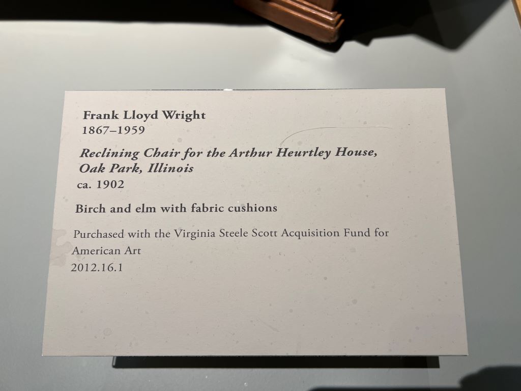
Nearby, a reclining chair caught my attention as well. When I looked closer, I discovered these pieces were designed by Frank Lloyd Wright.

Suddenly, everything made sense to me. His furniture mirrored his architecture—minimalistic, harmonious, and timeless. His work, including the famous Fallingwater, follows these principles.

This experience reminded me of how knowing the creator enhances our appreciation of a product. When we learn who made it, we love it more. This idea was supported by a research about wine, showing that a wine named after the winery founder’s grandfather boosts consumer confidence. Even Apple, under Tim Cook, continues to build on this principle. We are deeply connected to the stories behind the objects.

***

Reference (Fallingwater at Wikipedia)

Fallingwater is, according to Wikipedia, a house designed by the architect Frank Lloyd Wright in 1935. Situated in the Mill Run section of Stewart township, in the Laurel Highlands of southwest Pennsylvania, about 70 miles (110 km) southeast of Pittsburgh in the United States, it is built partly over a waterfall on the Bear Run river. The house was designed to serve as a weekend retreat for Liliane and Edgar J. Kaufmann, the owner of Pittsburgh’s Kaufmann’s Department Store.

After its completion, Time called Fallingwater Wright’s “most beautiful job” and it is listed among Smithsonian’s “Life List of 28 Places to See Before You Die”. The house was designated a National Historic Landmark on May 11, 1976. In 1991, members of the American Institute of Architects named Fallingwater the “best all-time work of American architecture” and, in 2007, ranked Fallingwater 29th on its “America’s Favorite Architecture” list.

Eight of Frank Lloyd Wright’s buildings – Fallingwater, the Guggenheim Museum, the Hollyhock House, the Jacobs House, the Robie House, Taliesin, Taliesin West, and the Unity Temple – were inscribed on the list of UNESCO World Heritage Sites under the title The 20th-century Architecture of Frank Lloyd Wright in July 2019. UNESCO stated that these buildings were “innovative solutions to the needs for housing, worship, work or leisure” and “had a strong impact on the development of modern architecture in Europe.”

How color harmony enhances viewer experience

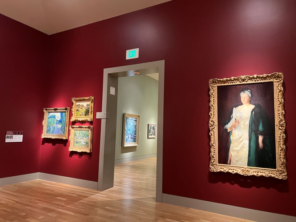
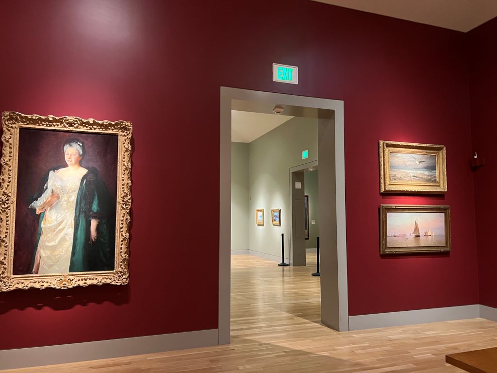
During a recent visit to the Huntington Art Museum in Pasadena, Los Angeles, I noticed an interesting design element: the description of each artwork was displayed on plaques with the exact same color as the background wall. This helped me focus on the text while enhancing the aesthetic harmony of the gallery.

This color choice aligns with the research emphasizing that background color harmony enhances perceived aesthetic appeal as well as comprehension and recall of the associated information. In the research, when the background color complements main objects, it minimizes distractions and creates a seamless viewing experience.

As research suggests, in the Huntington Art museum, I could effortlessly shift my focus between the art and its description. This thoughtful integration of wall and plaque color drew my attention to the content without overpowering the art itself. It shows how a simple design adjustment could enhance the experience of visitors, like me.

***

Reference

Orth, U. R., & Wirtz, J. (2014). Consumer processing of interior service environments: The interplay among visual complexity, processing fluency, and attractivenessJournal of Service Research17(3), 296-309.

Visual appeal is an important consideration in the design of interior service environments because attractiveness influences consumer behavior. Employing both an experiment and a field study, we show that visual complexity reduces a service environment’s attractiveness. Furthermore, we find that the complexity-attractiveness relationship is mediated by processing fluency and its instantaneous affective companion, pleasure. Our findings provide novel insights into the underlying process mechanism involved in channeling the effect of visual complexity on attractiveness. Furthermore, both studies confirm that customers’ field dependence moderates the complexity-fluency relationship and that shopping motivation (i.e., hedonic vs. utilitarian shopping goals) moderates the fluency-pleasure relationship. Our findings suggest that it is generally better to reduce the complexity of interior service environments. To achieve this, service firms should reduce the number of objects in the environment, enhance the visual organization and symmetry of their arrangement, and use fewer colors, textures, and materials.

How salon-style displays enrich the art viewing experience

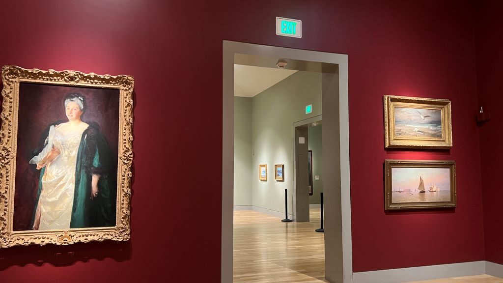
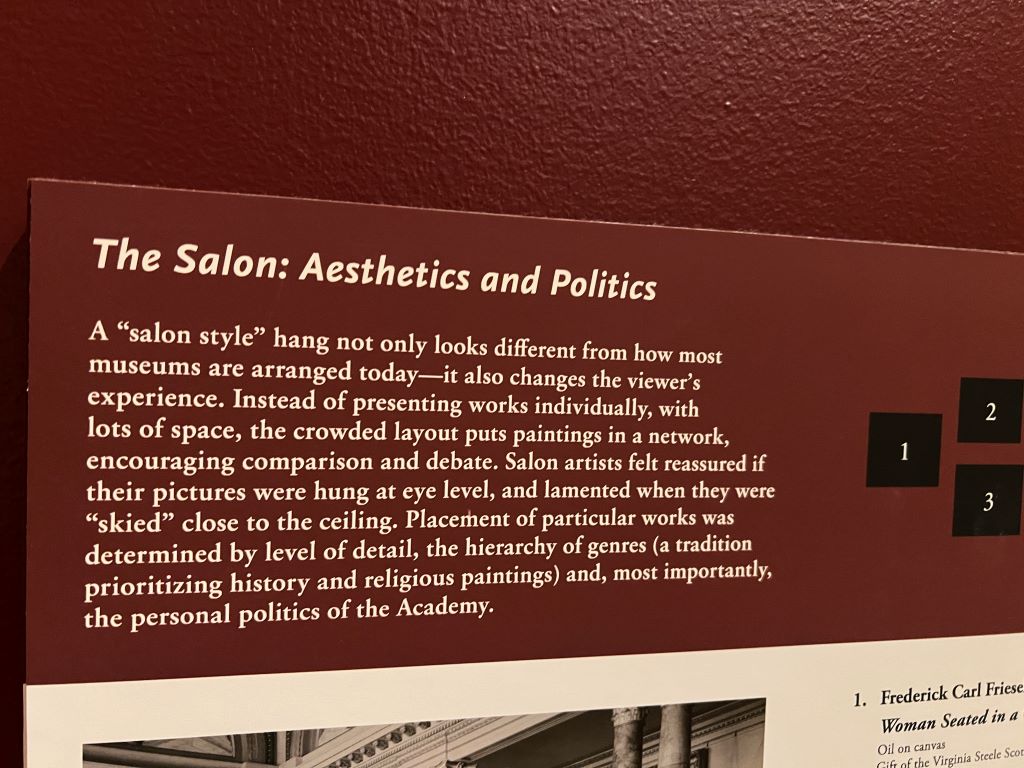
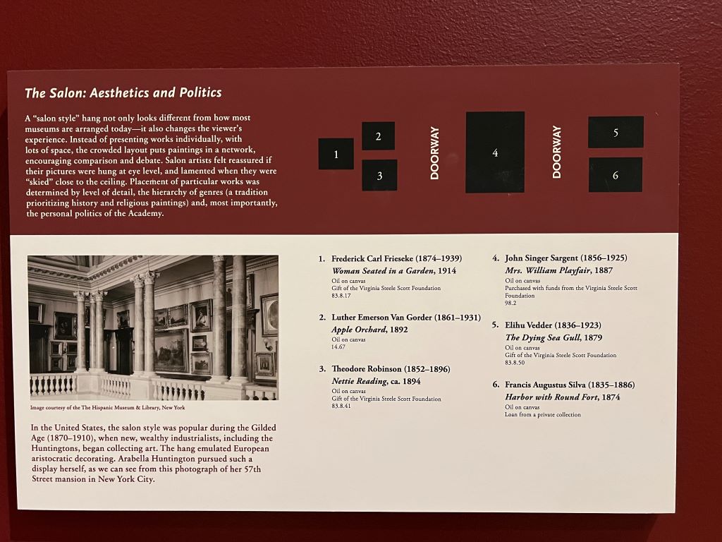
On a recent visit to the Huntington Library, Art Museum, and Botanical Gardens in Los Angeles, I was struck by the “salon style” display of paintings—a densely arranged presentation that contrasts with today’s minimalistic museum trend.

A “salon style” hang not only looks different from how most museums are arranged today-it also changes the viewer’s experience. Instead of presenting works individually, with lots of space, the crowded layout puts paintings in a network, encouraging comparison and debate. Salon artists felt reaccured if their pictures were hung at eye level, and lamented when they were “skied” close to the ceiling. Placement of particular works was determined by level of detail, the hierarchy of genres (a tradition prioritizing history and religious paintings) and, most importantly, the personal politicis of the Academy.

Unlike the single-piece-focused, widely spaced approach seen in contemporary galleries, salon-style hanging places artworks in close clusters, prompting viewers to think differently. Psychologically, this arrangement affects perception in two ways.

First, works displayed at eye level attract more attention—a phenomenon known as “eye level, buy level.” It is well known that eye-level placement in retail settings drives choices. Similarly, artists historically loved this prime placement, aiming to capture viewers’ gaze.

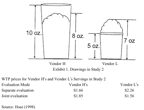
Second and more importantly, viewers are inclined to compare artworks side by side. This phenomenon aligns with Hsee’s research on “joint evaluation (JE) versus separate evaluation (SE). When items are displayed jointly, people place greater emphasis on attributes that may otherwise be hard to assess, fostering a richer, multi-dimensional engagement with items. In historical salons, this might have encouraged viewers to notice intricate qualities in each painting, which might go overlooked today when artworks are displayed individually in modern galleries.

Building on these insights with another pieces of insights found ten years ago at the Museum of Fine Arts (MFA), Boston, museum directors must carefully consider how presentation contexts shape visitor experiences. Museum visitors, like consumers, are influenced by cognitive biases and contextual cues, making behavioral economics principles crucial for optimizing the museum experience.”

***

Reference

Hsee, C. K. (1998). Less is better: When low‐value options are valued more highly than high‐value options. Journal of Behavioral Decision Making, 11(2), 107-121.

This research demonstrates a less-is-better effect in three contexts: (1) a person giving a $45 scarf as a gift was perceived to be more generous than one giving a $55 coat; (2) an overfilled ice cream serving with 7 oz of ice cream was valued more than an underfilled serving with 8 oz of ice cream; (3) a dinnerware set with 24 intact pieces was judged more favourably than one with 31 intact pieces (including the same 24) plus a few broken ones. This less-is-better effect occurred only when the options were evaluated separately, and reversed itself when the options were juxtaposed. These results are explained in terms of the evaluability hypothesis, which states that separate evaluations of objects are often infuenced by attributes which are easy to evaluate rather than by those which are important.

Postcards without stamps: How retailers miss simple customer needs

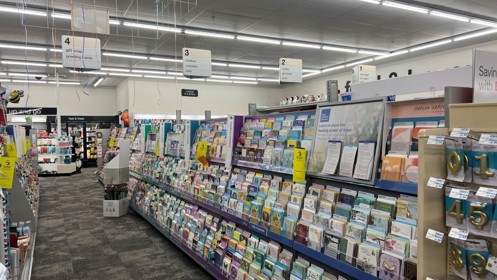
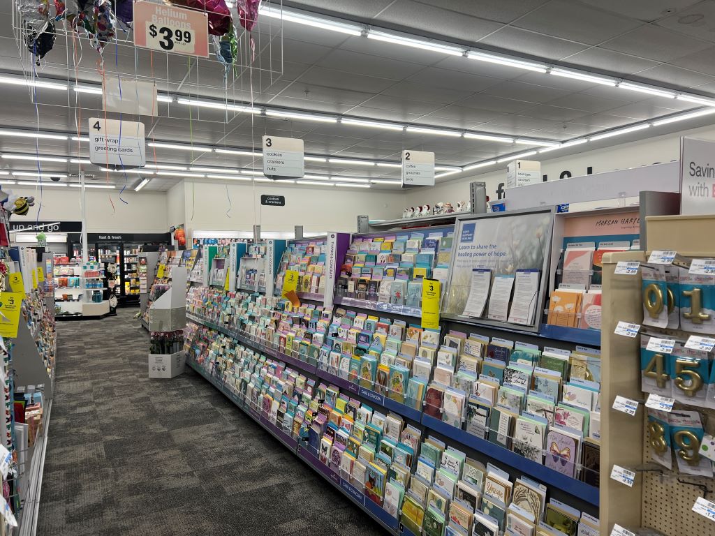
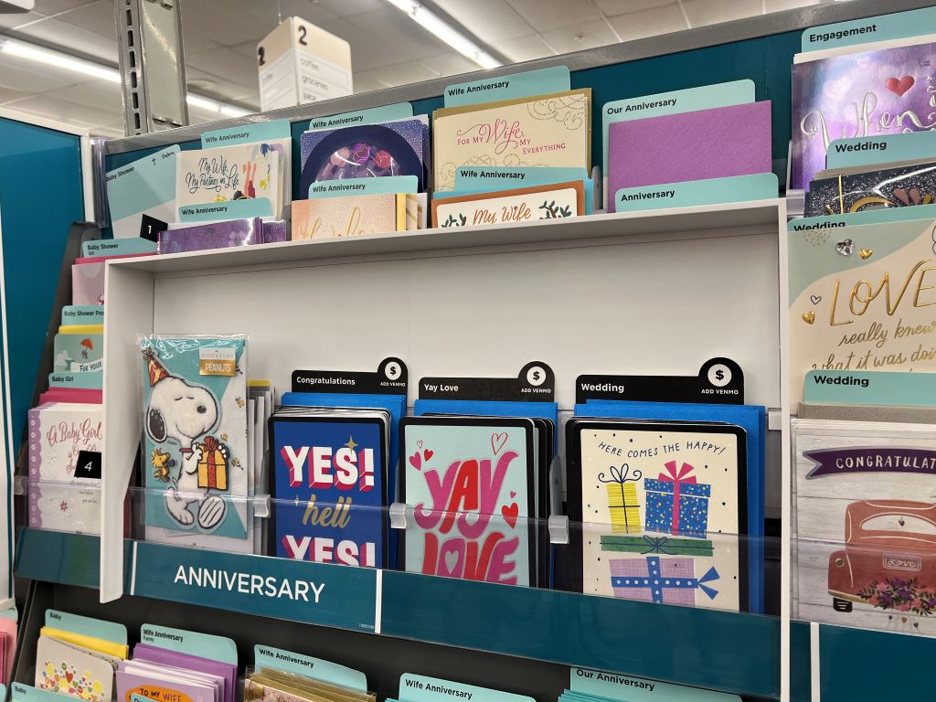
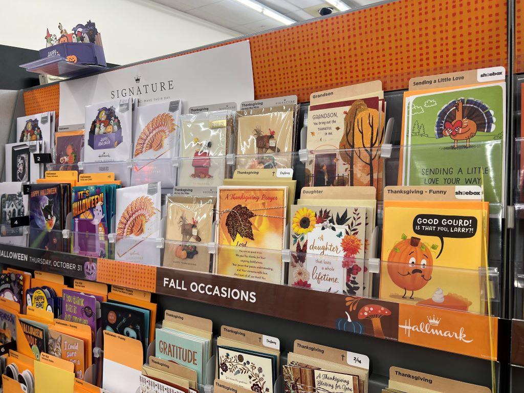
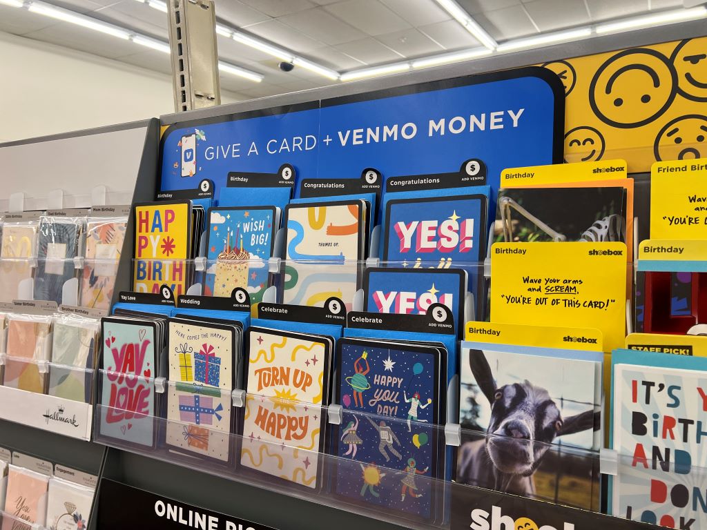
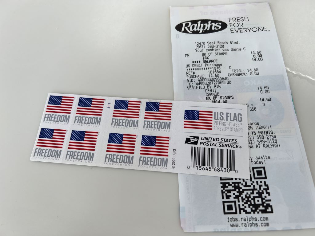
When I recently visited a CVS store in Long Beach, I stood in front of an impressive display of postcards. There were options for every occasion—anniversaries, Halloween, and even postcards designed to send money via Venmo. After choosing a card, I instinctively searched for postal stamps. To my surprise, the store did not sell them. This simple task of sending a postcard turned into a complex process. I had to go to Ralphs store, buy a book of 20 forever stamps for $14.60, and inquire how many were required for international shipping. This endeavor took over two hours. Even finding a post box was a challenge.

This experience echoes findings from Hwang et al. (2022) on goal-based bundling, where understanding consumer goals helps companies like Samsung develop product bundles that address customer needs holistically. If CVS applied a similar approach and emphasized with their shoppers deeply, bundling postcards with stamps could enhance consumer experience. Since the goal of buying a postcard is inherently linked to mailing it, offering both products together would eliminate unnecessary friction, saving time and improving convenience.

Building on this idea, not only retailers like CVS but also postcard makers like Hallmark could improve the postcard experience by launching postcards with pre-attached postal stamps. This would make it easier for customers, especially those who want send mail simply. By making mailing as easy as buying, manufacturers would help meet customer needs directly. This approach could also attract more people to send postcards, creating a new market focused on convenience and simplicity.

***

Reference

Hwang, S., Park, H., Sohn, M., Yoo, D., Han, C., & Joo, J. (2022). Goal based bundling: A behaviorally informed strategy to combine multiple smart products. In G. Bruyns & H. Wei (Eds.), [ _ ] With Design: Reinventing Design Modes (pp. 2888–2901). Singapore: Springer.

Contemporary electronic manufacturers struggle with how to develop attractive bundles by combining their existing smart products. In the present work, we propose Goal Based Bundling (GBB) by drawing on the academic research of goal systems theory (Kruglanski et al., 2018) and shed light on two previously ignored aspects of bundling strategy: service and glue product. We applied our GBB to a collaborative project with Samsung Electronics, whose goal was to develop new product bundles for kids by combining multiple smart home products. We constructed a framework of Samsung Electronics’ smart products and then visualized it on its sales website. A UI design conveying the value of smart products bundle was developed based on GBB structure. We discuss the process and the result of our project to provide insights into the product managers who combine existing smart products to develop a bundle.