Tag Archives: Experience

How color harmony enhances viewer experience

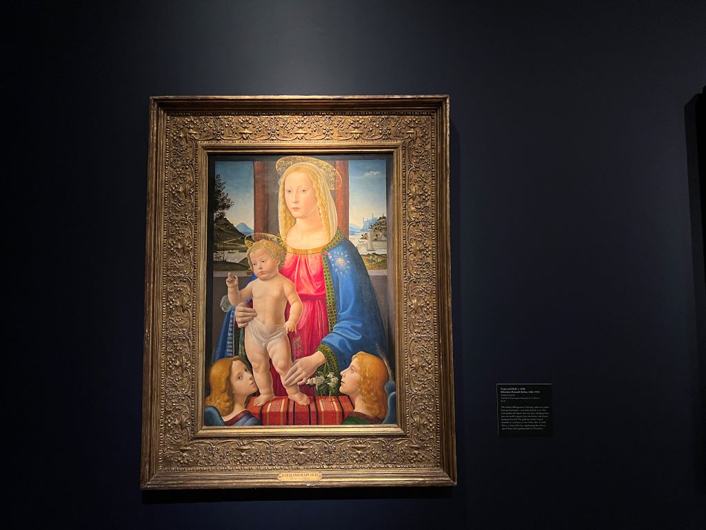
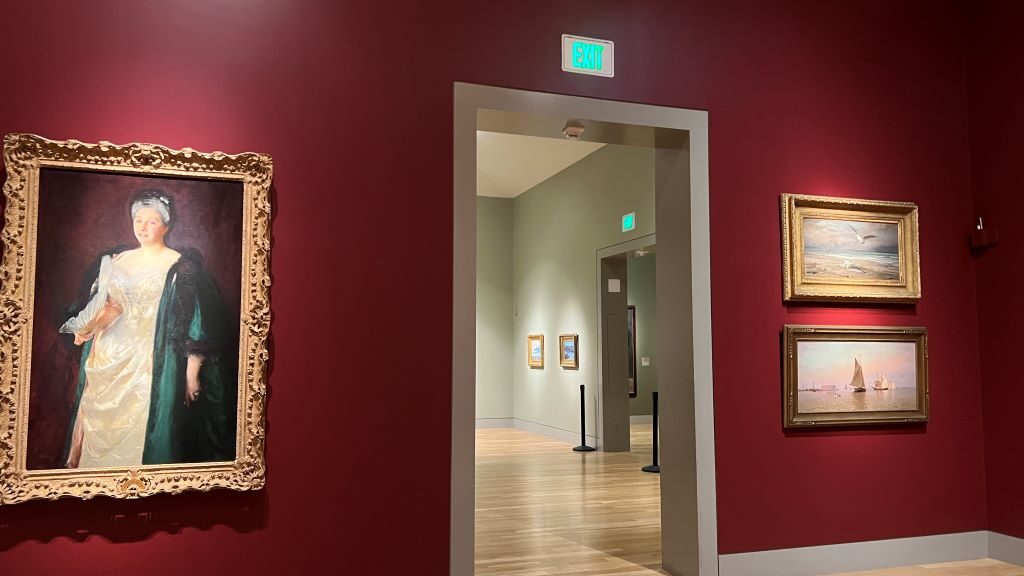
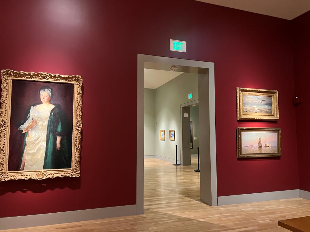
During a recent visit to the Huntington Art Museum in Pasadena, Los Angeles, I noticed an interesting design element: the description of each artwork was displayed on plaques with the exact same color as the background wall. This helped me focus on the text while enhancing the aesthetic harmony of the gallery.

This color choice aligns with the research emphasizing that background color harmony enhances perceived aesthetic appeal as well as comprehension and recall of the associated information. In the research, when the background color complements main objects, it minimizes distractions and creates a seamless viewing experience.
As research suggests, in the Huntington Art museum, I could effortlessly shift my focus between the art and its description. This thoughtful integration of wall and plaque color drew my attention to the content without overpowering the art itself. It shows how a simple design adjustment could enhance the experience of visitors, like me.

***

Reference

Orth, U. R., & Wirtz, J. (2014). Consumer processing of interior service environments: The interplay among visual complexity, processing fluency, and attractivenessJournal of Service Research17(3), 296-309.

Visual appeal is an important consideration in the design of interior service environments because attractiveness influences consumer behavior. Employing both an experiment and a field study, we show that visual complexity reduces a service environment’s attractiveness. Furthermore, we find that the complexity-attractiveness relationship is mediated by processing fluency and its instantaneous affective companion, pleasure. Our findings provide novel insights into the underlying process mechanism involved in channeling the effect of visual complexity on attractiveness. Furthermore, both studies confirm that customers’ field dependence moderates the complexity-fluency relationship and that shopping motivation (i.e., hedonic vs. utilitarian shopping goals) moderates the fluency-pleasure relationship. Our findings suggest that it is generally better to reduce the complexity of interior service environments. To achieve this, service firms should reduce the number of objects in the environment, enhance the visual organization and symmetry of their arrangement, and use fewer colors, textures, and materials.

Rethinking ‘experience’: What my visit to Google Visitor Experience taught me

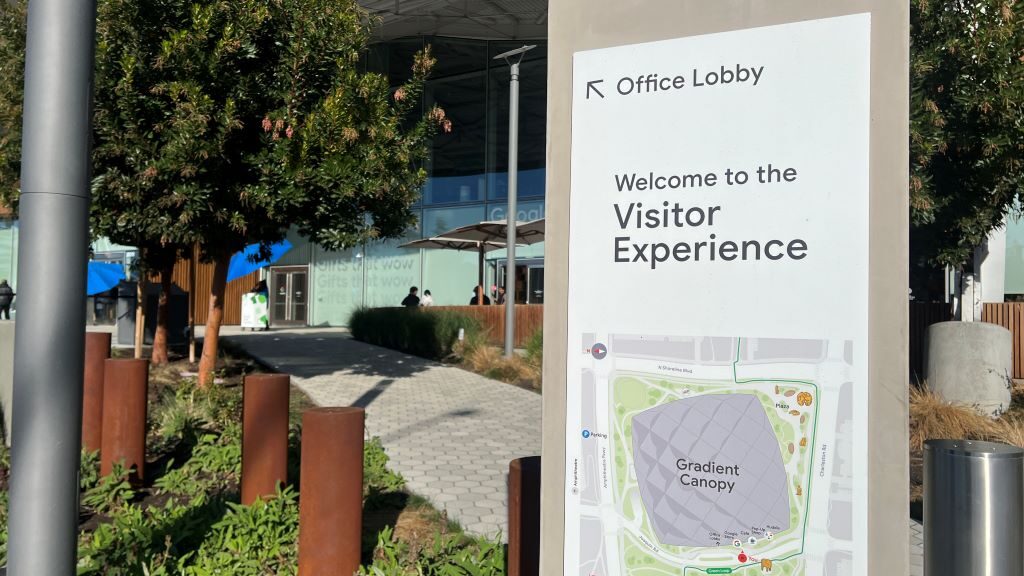
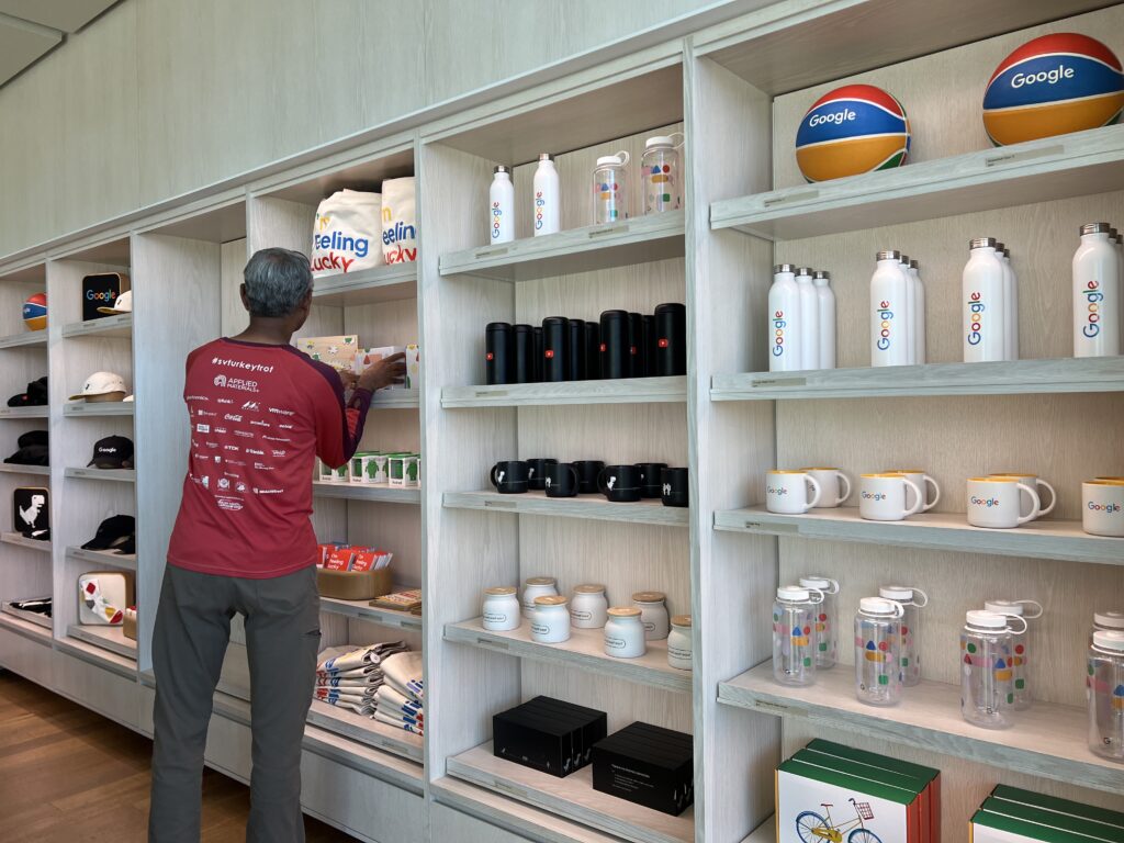
Recently, I visited the Google Visitor Experience at the Googlplex. I went in expecting something amazing—maybe the chance to try out new techonolgy like self driving cars (like Waymo), virtual reality glasses (like Ray-Ban Meta Glasses), or advanced AI assistants (like Open AI). High expectations felt natural—it is Silicon Valley and Google, the place for extraordinary experiences.

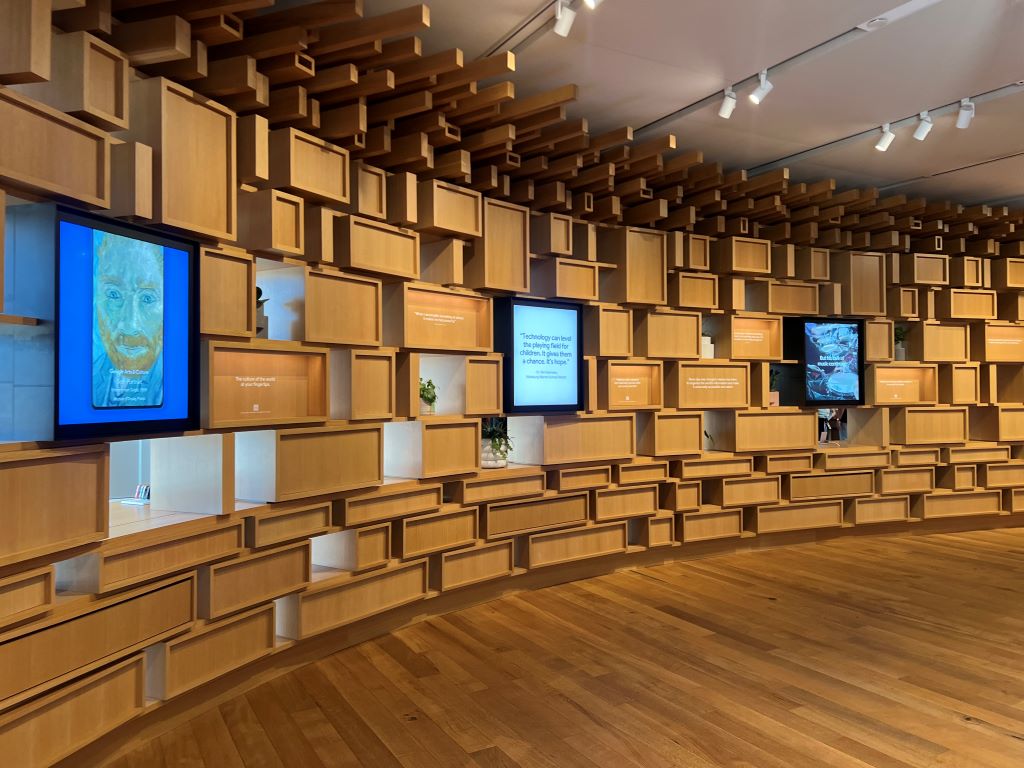
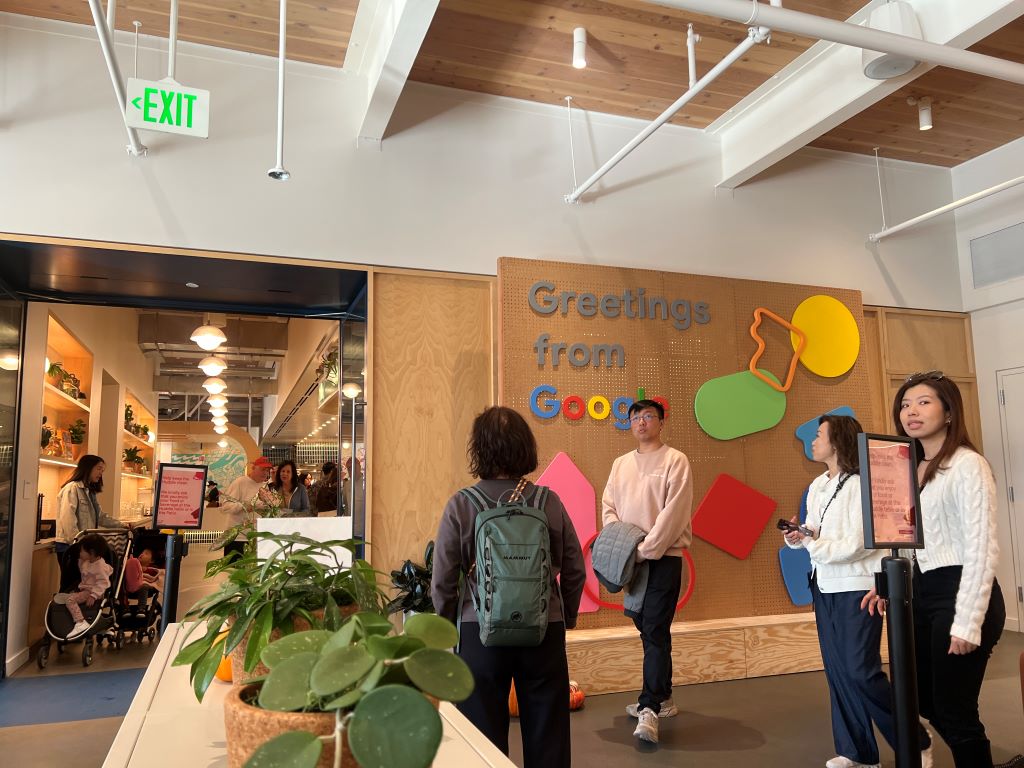
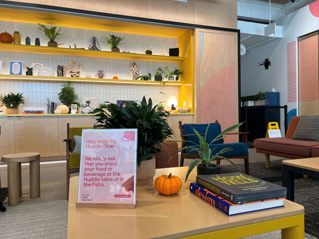
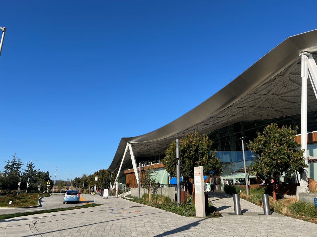
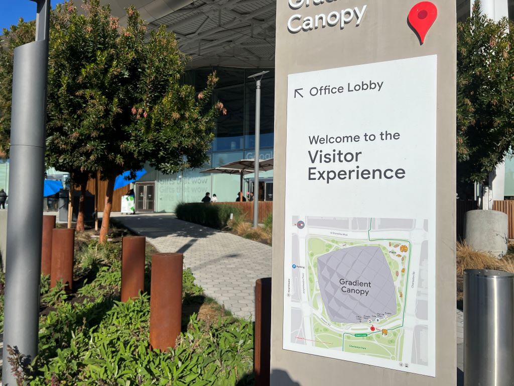
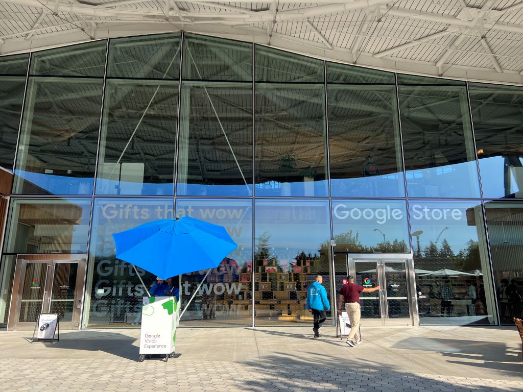
However, the reality was much simpler. The space named as “Google Visitor Experience” revolves around three main activities: browsing Google-branded merchandise in the store, enjoying a coffee at the café, and relaxing in a small public area called “Huddle.”

These activities felt quite ordinary, which was surprising. For me, and probably for many people in Asia, the word “experience” suggests something special—sophisticated and luxurious. But here at Google Visitor Experience, what I found was simplicity instead. This gap between what I expected and what I actually encountered made me think about the meaning of “experience.”

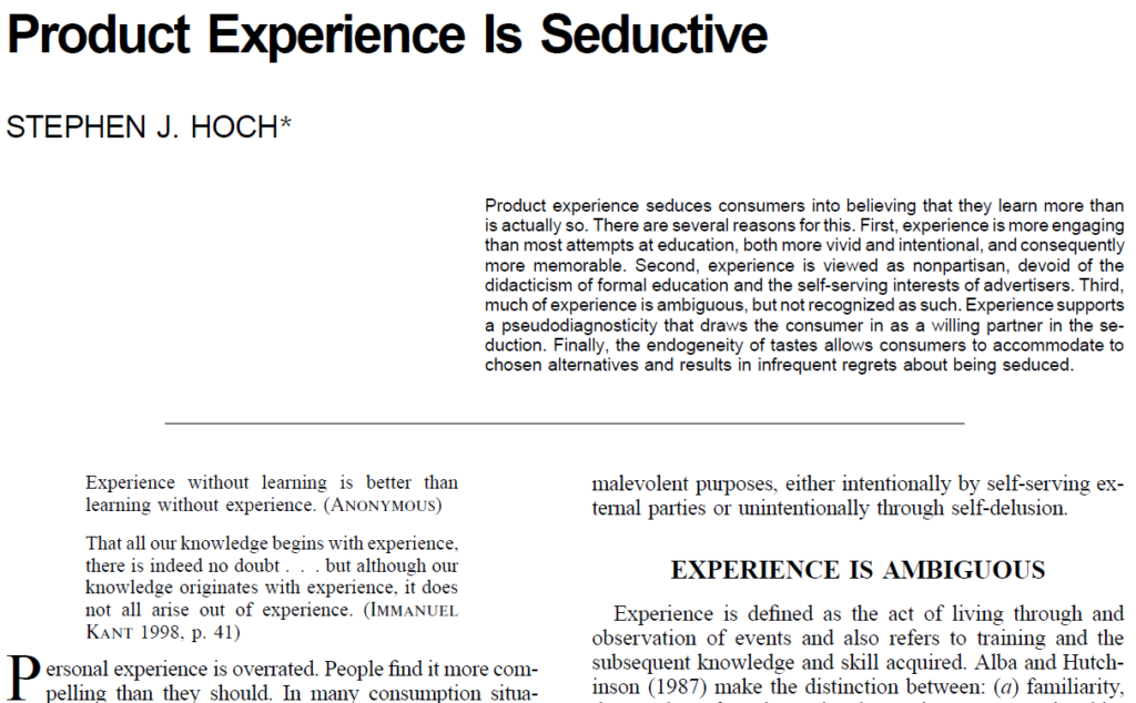
In consumer research, “experience” is hard to define and measure. Hoch (2002) points out that experiences is enticing but tricky to pin down, which often makes studying them less precise. My visit to the Google Visitor Experience reminded me that sometimes our expectations for an “experience” can be bigger than reality. This visit made me think more about how we define experiences.

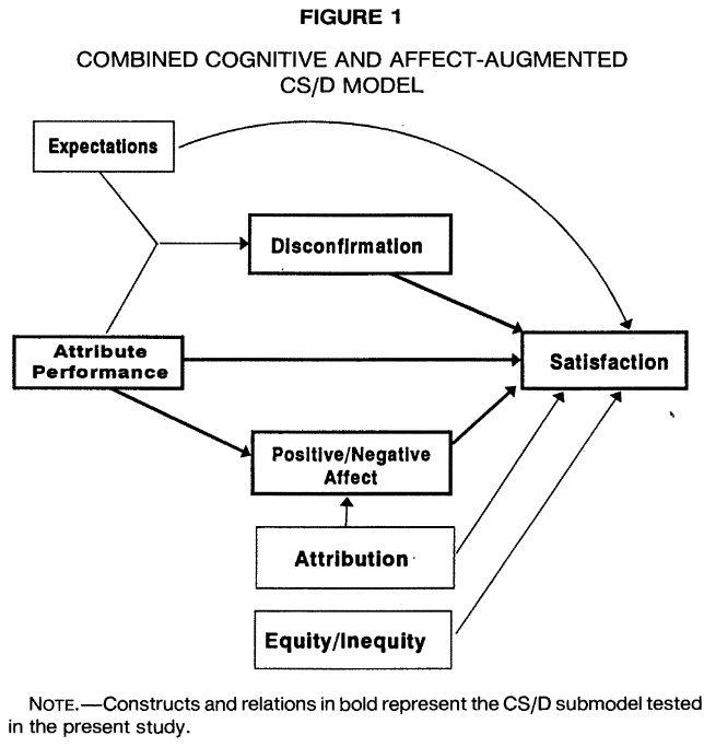
Now may be the time to define “experience” through the lens of satisfaction research suggested by Oliver (2014). Customer satisfaction hinges on the gap between expectation and reality, and experience should be understood in the same way—by studying both the anticipated and actual experience. A key challenge here will be managing experience expectations, similar to how we approach expectation management for satisfaction.
***

Reference

Hoch, S. J. (2002). Product experience is seductiveJournal of consumer research29(3), 448-454.

Product experience seduces consumers into believing that they learn more than is actually so. There are several reasons for this. First, experience is more engaging than most attempts at education, both more vivid and intentional, and consequently more memorable. Second, experience is viewed as nonpartisan, devoid of the didacticism of formal education and the self-serving interests of advertisers. Third, much of experience is ambiguous, but not recognized as such. Experience supports a pseudodiagnosticity that draws the consumer in as a willing partner in the seduction. Finally, the endogeneity of tastes allows consumers to accommodate to chosen alternatives and results in infrequent regrets about being seduced.

***

Reference

Oliver, R. L. (1993). Cognitive, affective, and attribute bases of the satisfaction responseJournal of consumer research20(3), 418-430.

An attempt to extend current thinking on postpurchase response to include attribute satisfaction and dissatisfaction as separate determinants not fully reflected in either cognitive (i.e., expectancy disconfirmation) or affective paradigms is presented. In separate studies of automobile satisfaction and satisfaction with course instruction, respondents provided the nature of emotional experience, disconfirmation perceptions, and separate attribute satisfaction and dissatisfaction judgments. Analysis confirmed the disconfirmation effect and the effects of separate dimensions of positive and negative affect and also suggested a multidimensional structure to the affect dimensions. Additionally, attribute satisfaction and dissatisfaction were significantly related to positive and negative affect, respectively, and to overall satisfaction. It is suggested that all dimensions tested are needed for a full accounting of postpurchase responses in usage.

How salon-style displays enrich the art viewing experience

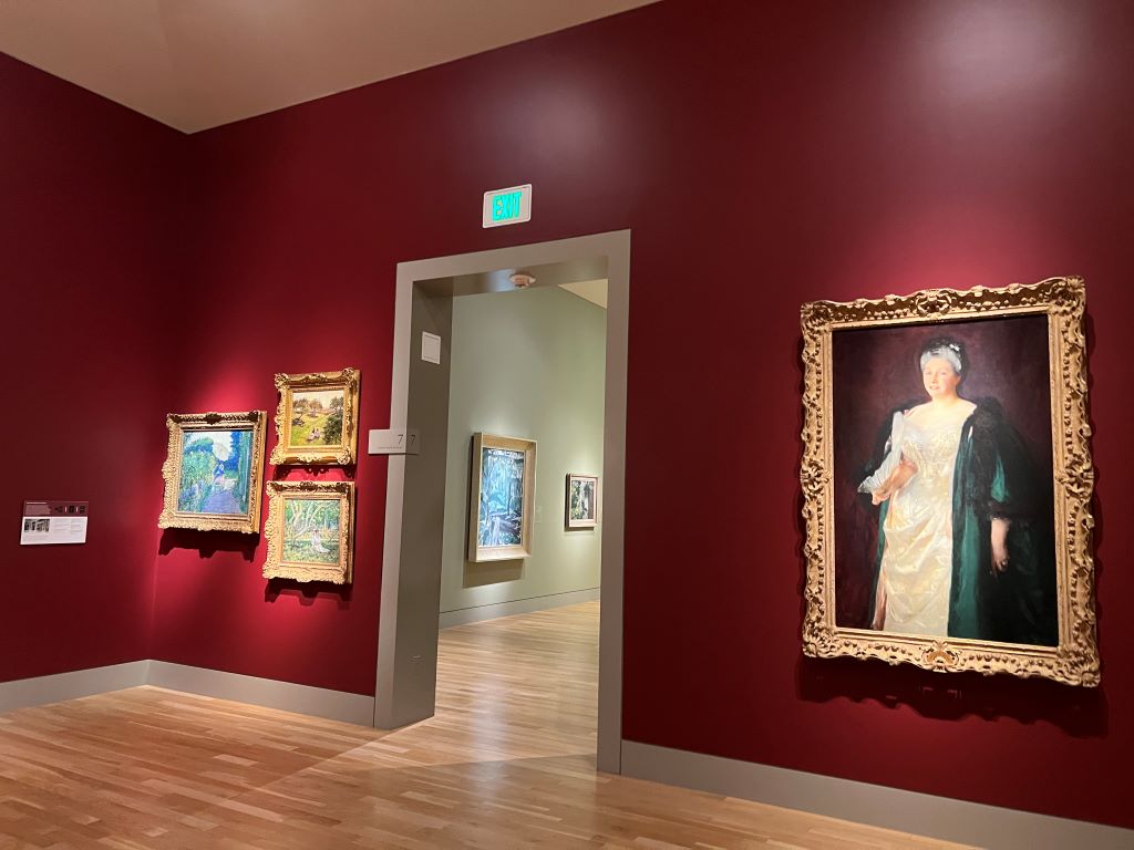
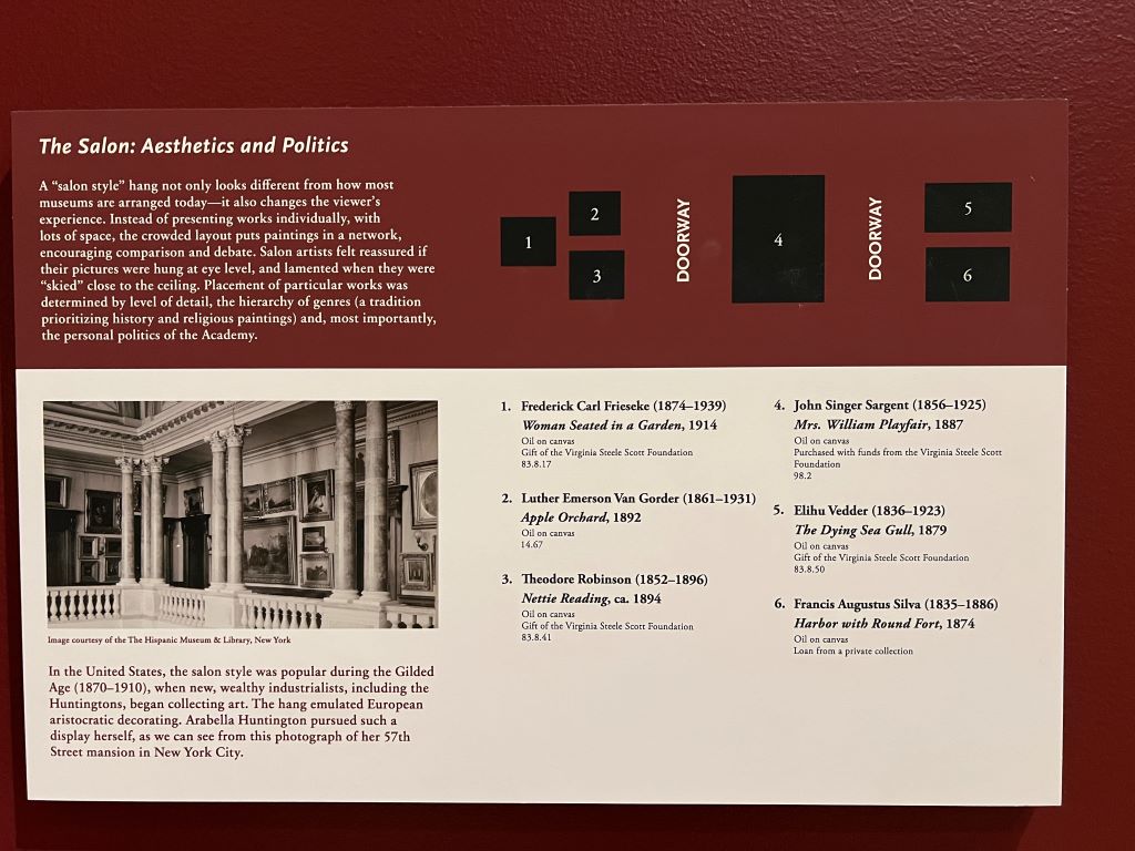
On a recent visit to the Huntington Library, Art Museum, and Botanical Gardens in Los Angeles, I was struck by the “salon style” display of paintings—a densely arranged presentation that contrasts with today’s minimalistic museum trend.

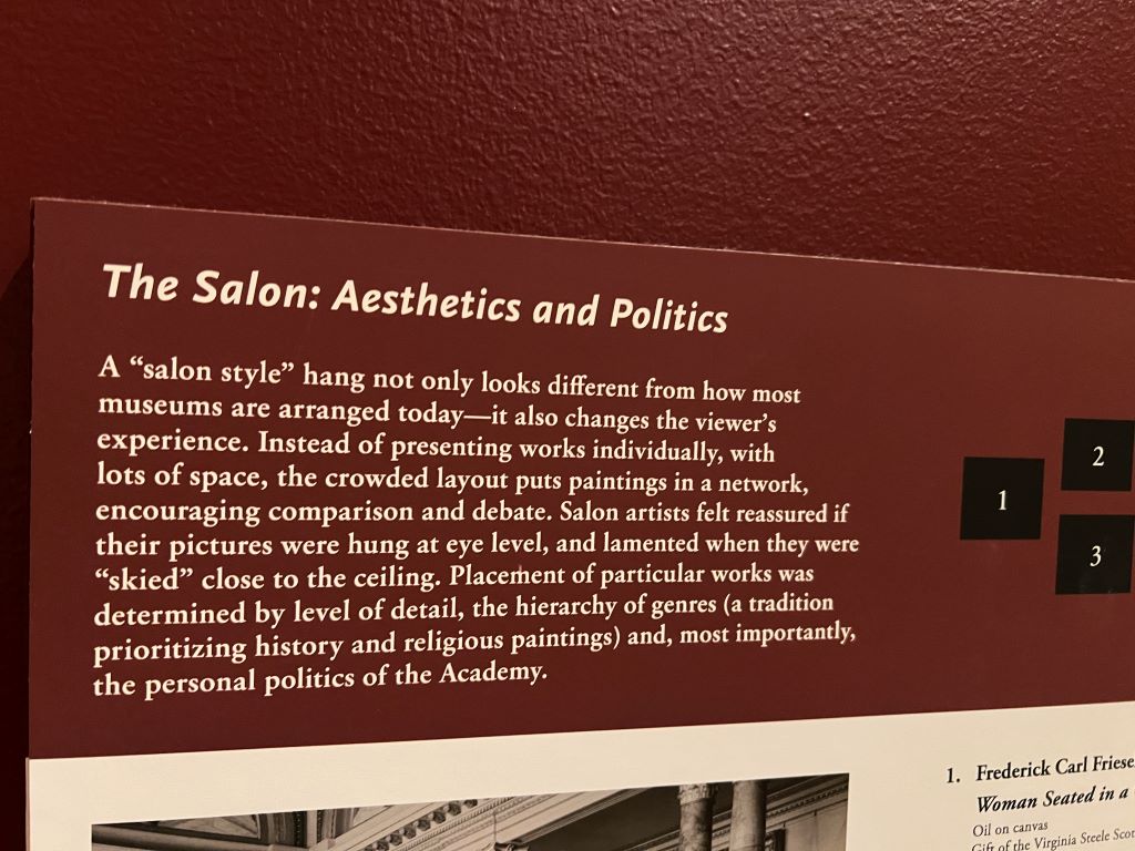
A “salon style” hang not only looks different from how most museums are arranged today-it also changes the viewer’s experience. Instead of presenting works individually, with lots of space, the crowded layout puts paintings in a network, encouraging comparison and debate. Salon artists felt reaccured if their pictures were hung at eye level, and lamented when they were “skied” close to the ceiling. Placement of particular works was determined by level of detail, the hierarchy of genres (a tradition prioritizing history and religious paintings) and, most importantly, the personal politicis of the Academy.
Unlike the single-piece-focused, widely spaced approach seen in contemporary galleries, salon-style hanging places artworks in close clusters, prompting viewers to think differently. Psychologically, this arrangement affects perception in two ways.

First, works displayed at eye level attract more attention—a phenomenon known as “eye level, buy level.” It is well known that eye-level placement in retail settings drives choices. Similarly, artists historically loved this prime placement, aiming to capture viewers’ gaze.

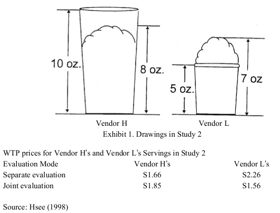
Second and more importantly, viewers are inclined to compare artworks side by side. This phenomenon aligns with Hsee’s research on “joint evaluation (JE) versus separate evaluation (SE). When items are displayed jointly, people place greater emphasis on attributes that may otherwise be hard to assess, fostering a richer, multi-dimensional engagement with items. In historical salons, this might have encouraged viewers to notice intricate qualities in each painting, which might go overlooked today when artworks are displayed individually in modern galleries.

Building on these insights with another pieces of insights found ten years ago at the Museum of Fine Arts (MFA), Boston, museum directors must carefully consider how presentation contexts shape visitor experiences. Museum visitors, like consumers, are influenced by cognitive biases and contextual cues, making behavioral economics principles crucial for optimizing the museum experience.”

***

Reference

Hsee, C. K. (1998). Less is better: When low‐value options are valued more highly than high‐value options. Journal of Behavioral Decision Making, 11(2), 107-121.

This research demonstrates a less-is-better effect in three contexts: (1) a person giving a $45 scarf as a gift was perceived to be more generous than one giving a $55 coat; (2) an overfilled ice cream serving with 7 oz of ice cream was valued more than an underfilled serving with 8 oz of ice cream; (3) a dinnerware set with 24 intact pieces was judged more favourably than one with 31 intact pieces (including the same 24) plus a few broken ones. This less-is-better effect occurred only when the options were evaluated separately, and reversed itself when the options were juxtaposed. These results are explained in terms of the evaluability hypothesis, which states that separate evaluations of objects are often infuenced by attributes which are easy to evaluate rather than by those which are important.

Language barrier makes virtual reality more real

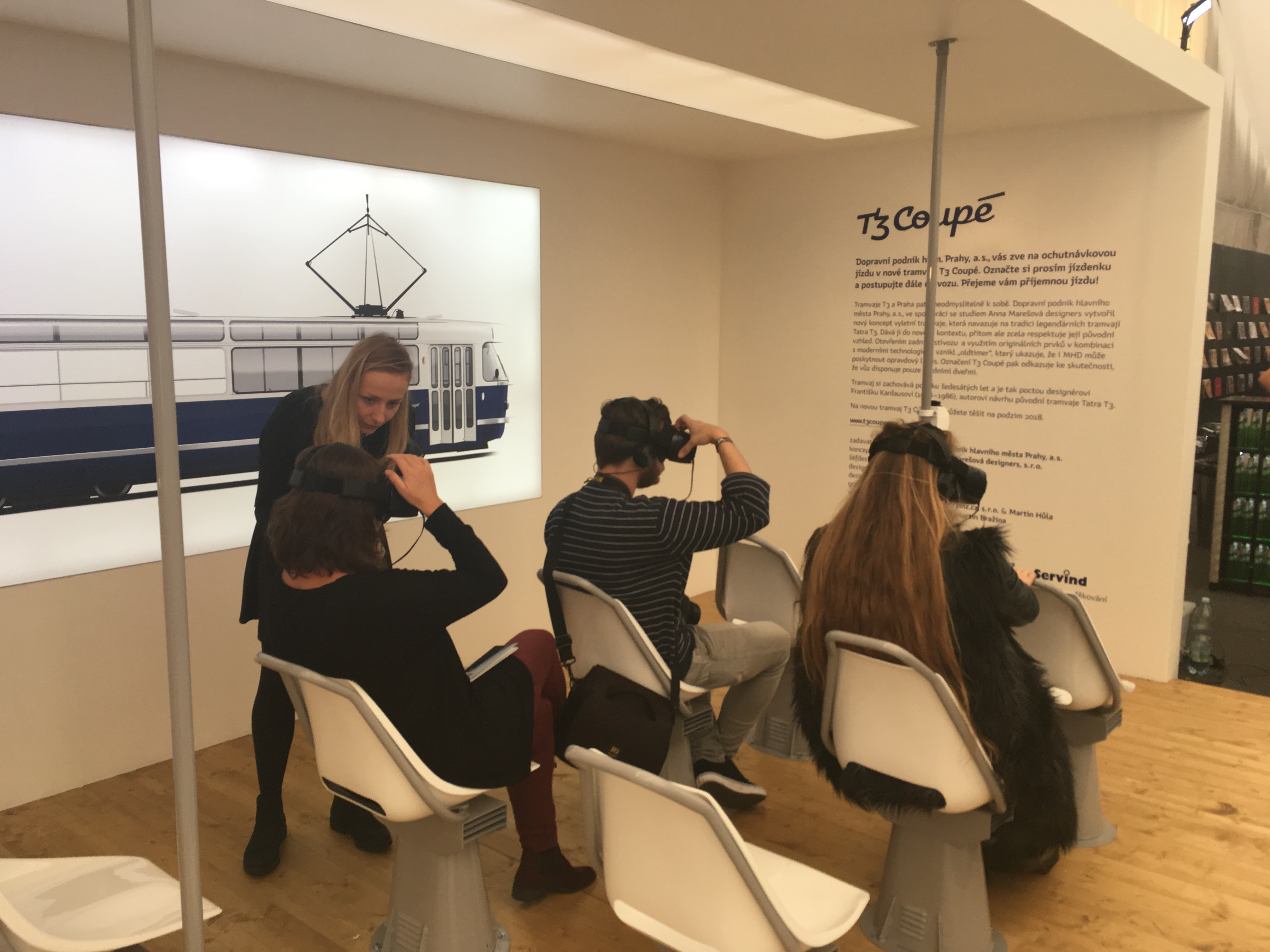
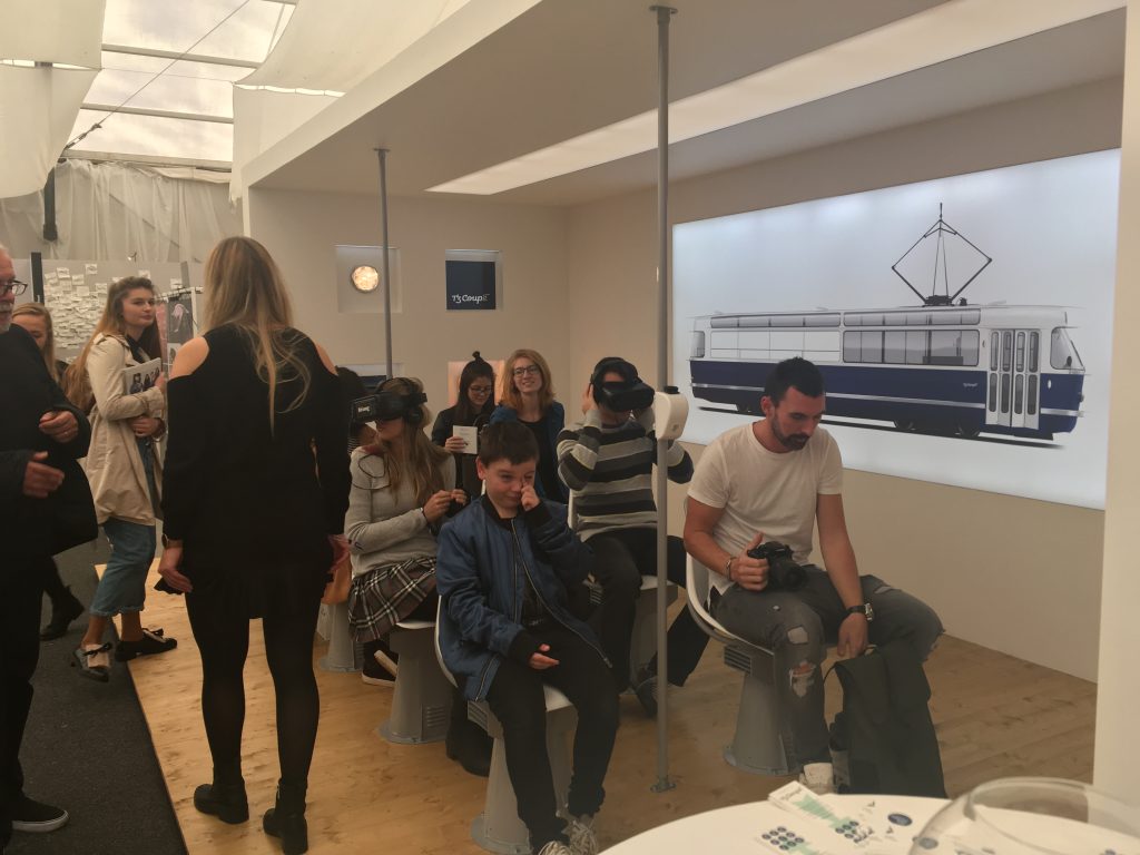
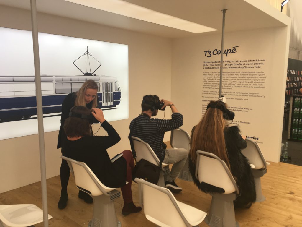
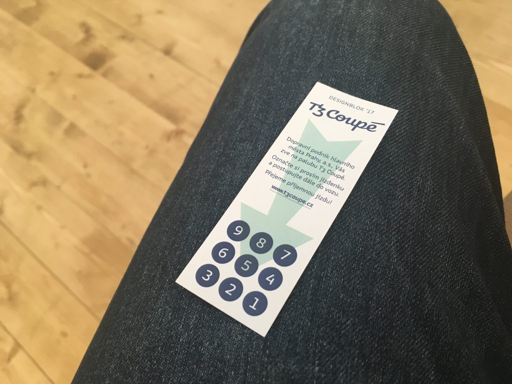
At Prague, Czech Republic, visitors experienced riding a new tram called T3 Coupe in virtual reality.

The T3 tram is an iconic component of the Prague city scape. In collaboration with Anna Marešová designers, the Prague Public Transit Co. has created a new pleasure tram concept based on the tradition of the Tatra T3 tram, putting this legendary vehicle in an entirely new context while respecting its authentic looks. By opening the rear of the tram and combining original elements with modern technologies, the project has given rise to an old-timer that demonstrates how even public transit can deliver real luxury. Because the tram has only one set of doors, it’s been dubbed the T3 Coupé. This special tram preserves the romance of the 1960s and is a tribute to the designer of the original Tatra T3 tram – František Kardaus (1908–1986). The new T3 Coupé tram hits the streets in autumn 2018.


They sit on the chairs, wore Samsung Gear VR headset, and watched a 360 degree video as passengers. A driver and other passengers appeared in the video.


Before having enjoyed the virtual tram, I asked a lady about what is T3 Coupe, where to sit, and how to start the device. Interestingly, this human interaction made my non-real experience more real. It was ironic that I was more immersed into the virtual world because of my experiencing language barrier; she could not explain to me about T3 Coupe in English and I could not understand any Czech written on the ticket.


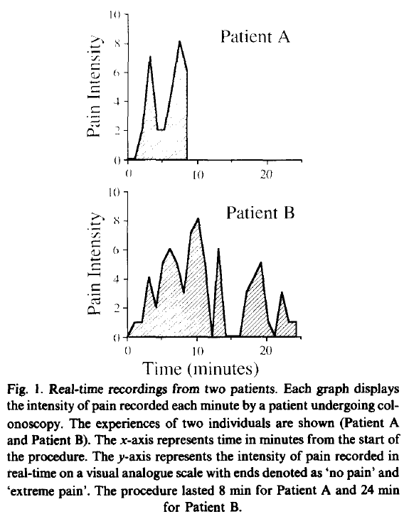
Peak end rule is probably one of the most well established psychological heuristic. Kahneman and his colleagues (1993) found that people tend to judge an experience based on how they felt at its peak and at its end. However, people might consider its beginning as well when the experience is virtual. Virtual experience might need to be carefully wrapped up by its beginning, its peak, and its end.

Kahneman, D., Fredrickson, B. L., Schreiber, C. A., & Redelmeier, D. A. (1993). When More Pain Is Preferred to Less: Adding a Better End. Psychological Science, 4(6), 401–405.

Subjects were exposed to two aversive experiences: in the short trial, they immersed one hand in water at 14 °C for 60 s; in the long trial, they immersed the other hand at 14 °C for 60 s, then kept the hand in the water 30 s longer as the temperature of the water was gradually raised to 15 °C, still painful but distinctly less so for most subjects. Subjects were later given a choice of which trial to repeat. A significant majority chose to repeat the long trial, apparently preferring more pain over less. The results add to other evidence suggesting that duration plays a small role in retrospective evaluations of aversive experiences; such evaluations are often dominated by the discomfort at the worst and at the final moments of episodes.


Read the clock, literally

Red Dot Design Museum is located in the heart of Singapore’s most iconic location, the Marina Bay. This area is one of the most fun places and interesting destination to visit and for sightseeing in Singapore, with numerous attractions within walk distance from the museum. There is an exhibition space in the museum and exhibitions are curated from the results of the Red Dot Design Award.

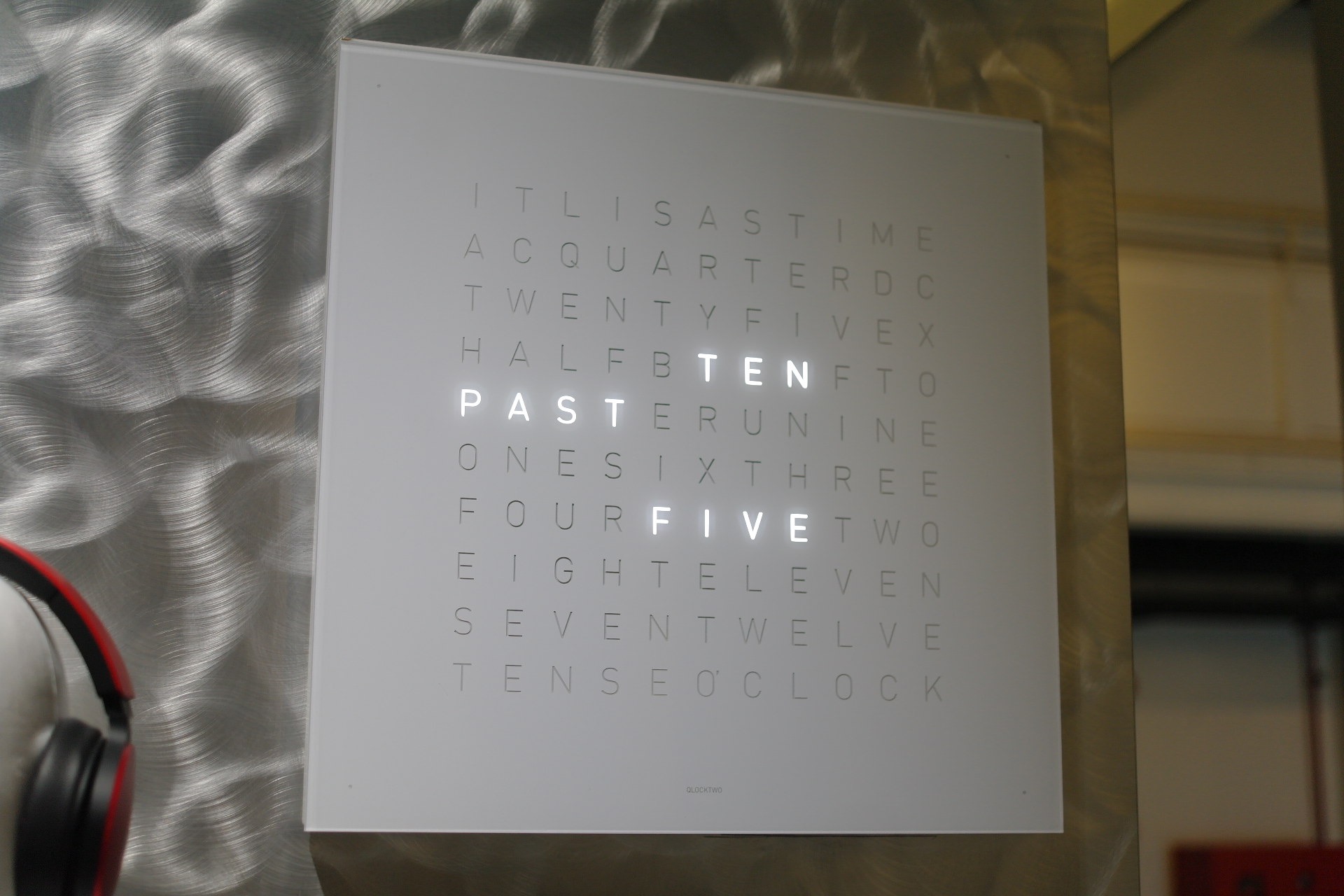
In the museum, I met an interesting clock named Qlocktwo (Wall and Table) Clock. It received an award of Honorouble Mention 2010. This clock was manufactured by Biergert & Funk Product GmbH & Co KG, and its in-house design was done by Marco Biergert Andreas Funk.

According to the information, “this clock contains a matrix with symmetrically arranged characters which are illuminated in white light to form words that describe time. The front surface is made of polished acrylic glass; the lacquered wooden body supports it by means of eight magnets. When it is activated, the timer sets itself exact to the second and adjusts the brightness of the characters to ambient light.”

The jury left a statement that “Qlocktwo turns the concept of “reading the clock” into a whole new experience. The time measurement in words is not only original but also practical.”
Glass shaped like milk carton

Most cocktail glasses are designed to hold the unique aroma of the cocktail to maximize its taste. However, some glasses play different roles. While I visited Singapore, my friend recommended me to visit Loof, a rooftop bar. It is located across the famous Raffels Hotel, a colonial-style super luxury hotel in the downtown. According to the website, this bar is

Awarded as Singapore’s best rooftop bar, Loof serves up quality whimsy, fresh nostalgia and unbridled playfulness in an urban garden atop Odeon Towers in downtown CBD. Enjoy carefully crafted Southeast Asian inspired cocktails with bar snacks that have a local twist. Then take a trip down memory lane and purchase little gems of locally-curated nostalgia at The Mama Shop. Bask in the cool shade of Loof’s urban garden and take in the best view of Raffles Hotel. Soak up infectious beats from resident DJs and themed party nights.


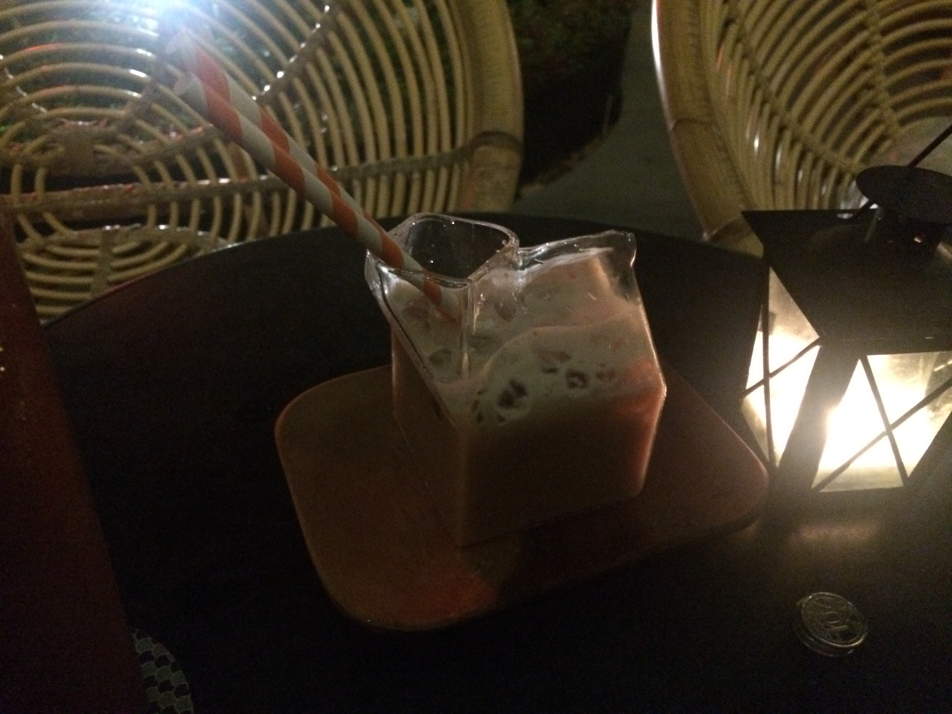
I wanted to drink energy booster since I spent a hot and humid daytime outside. I ordered “Milo Cocktail” because Milo is the chocolate malt beverage. Interestingly, this cocktail was served by a milk carton shaped glass. Although this glass did not capture the unique aroma the cocktail, it certainly improved my drinking experience because Milo is often served with milk and thus it tasted like Milo milky cocktail.

Stephen Hoch and Young-Won Ha proposed in their seminal marketing paper, Consumer Learning: Advertising and the Ambiguity of Product Experience (1986) that experience is a piece of evidence to test a hypothesis and the hypothesis is the advertising message. This cocktail glass led me to think that product design or package can be a hypothesis now. I thought milk was in there! 🙂


How could we design a better fire extinguisher?

IMG_1229

Since we spend most of our time in buildings, we are literally surrounded by fire extinguishers. It consists of a hand-held cylindrical pressure vessel containing an agent which can be discharged to extinguish a fire (Wikipedia). In general, we do not pay attention to them until needed. For me, I have never used any fire extinguisher in my life and have no interest in it. Interestingly, designers have noticed their problems and came up with two fairly different but equally interesting solutions.

Typical fire extinguishers have two critical problems. First, they are often ignored and difficult to be located. Even though they are red colored, fire extinguishers merely stand still and fail to grab our attention. Further, they do not go well with walls or interiors.

Recently, I found a series of eye-catching fire extinguishers at a store. In order to solve the first problem, some designers changed the appearance of the fire extinguishers. They painted skins to make them visually appealing and to make them go well with the walls. Some of the newly painted fire extinguishers look so nice that I even wanted to buy them for home decor.

DML_Fire distinguisher

The second problem is that typical fire extinguishers are difficult to use in emergency situations. Therefore, instruction manuals are prepared. A practice session runs for those who want to try to use them in advance.
Recently, I found another, newly designed fire extinguishers in a building. Designers changed the size and the container material so that the shape “says” how to use. Now, we do not have to spend time on learning how to use them; instead, we can simply  pick up one or a few water-bottle shaped fire extinguishers and throw them on a fire.
These two fire extinguishers teach me what designers do for us. Designers change the appearance of a product; alternatively, they change the way we use it.

Train experience: Mechanical vs. Electronic

I recently traveled on trains in UK (London – Edinburgh) and in Korea (Seoul – Busan) and found two interesting differences.

First, I used a physical train ticket in UK and used an electronic ticket in Korea. In UK, I collected a paper ticket at the station and then physically showed it to the conductor on board at the time of ticket control. Interestingly, a slot was designated for train ticket on the headrest of each seat; thus, I did not have to interact with the conductor. Differently from this mechanical system, I paid for a train ticket online and my seat was booked in advance in Korea. Overall, I preferred the traditional mechanical way of working over the electronic one. Although the electronic system sounds convenient, I had spent more than 2 hours at home on going through hundreds of websites to buy a single train ticket online. I wish people do not replace the mechanical approach with the electronic one simply because the electronic approach looks cool.

Another interesting difference was that train seats in UK are higher than the train seats in Korea. In the UK train, people find it difficult to confirm whether a seat was taken or empty. However, it was relatively easy in the Korean train. Certainly, train seats were designed differently based on the average height of the people in each country. However, this difference further suggest that privacy matters more in the UK culture whereas publicness seems to be weighted more in the Korean culture.

DML_Train UK (1)

UK train (London – Edinburgh)

vs.

Korean train (Seoul – Busan)

DML_Train Korea

SK Broadband B-Box, a better TV experience

SKT_bbox_UI (1)

SK Telecom/Broadband introduced a setup box called B Box. It was co-developed by a design consulting agency, Plus-ex, and recently received a red-dot design award. It not only looks way different from other ugly, bulky setup boxes, but it also provides several interesting services with TV viewers through immensely improved User Interface (UI). For instance, viewers can access the information about weather, stock prices, and his/her own schedule information watching the program. They can customize the layout and choose main screen size as well as select which information they want to get among traffic, home monitoring, pictures, and etc.

For me, I like the Dynamic Channel function. It allows me to “watch” up to 12 running TV programs on different channels. I review multiple contents, skip commercials, and choose the best channel. I wish other companies pay attention to improving viewers’ TV experiences as well.

SKT_bbox_UI (2)

Participation for immersive experience

Exhibition @ Seoul
http://blog.daum.net/runman67/7047692

When people visit a historical place, they wonder what happened long time ago. They sometimes enjoy watching an exhibition such as changing royal guards in Seoul (above). In the historic place at the Colonial Williamsburg in Virginia, however, young visitors go beyond watching an event; they march in the parade with soldiers. This immersive experience will give the visitors an unforgettable piece of memory.

[youtube=http://www.youtube.com/watch?v=3JpWEr7WbLA]