Tag Archives: Huntington

How knowing the creator enhances the beauty of a design: Frank Lloyd Wright

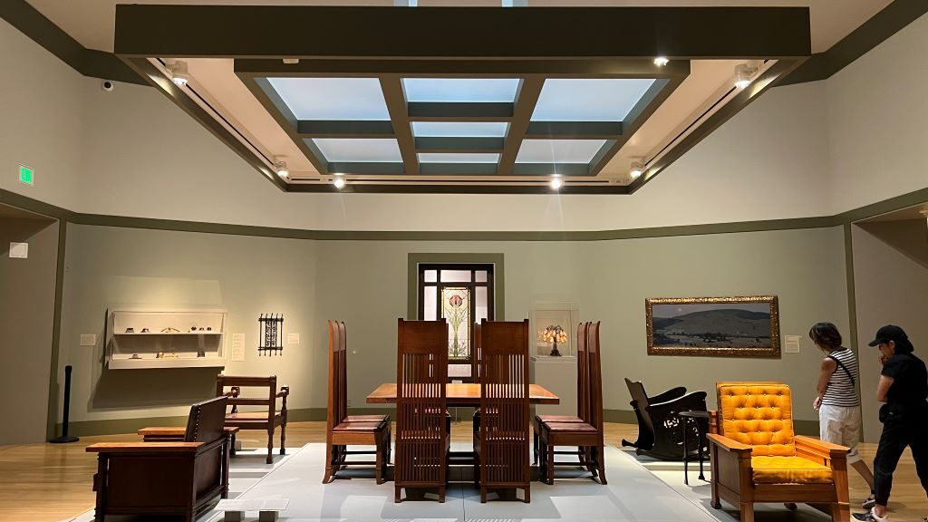
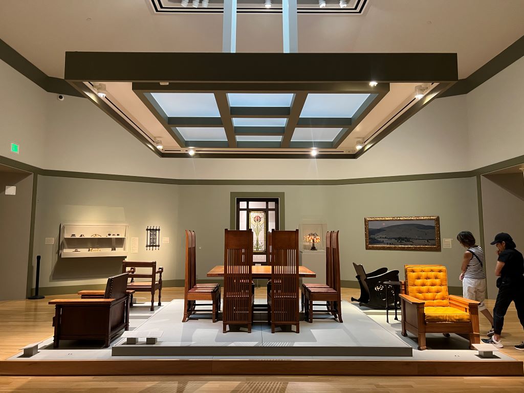
At the Huntington Art Museum in Los Angeles, I was captivated by a dining room table and chairs. They were not vibrant but organized. They were meticulously crafted. I could not take my eyes off these sophisticated colorful items.

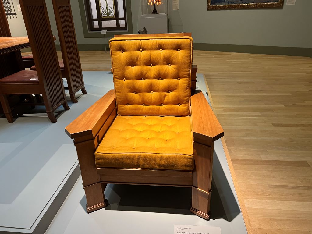
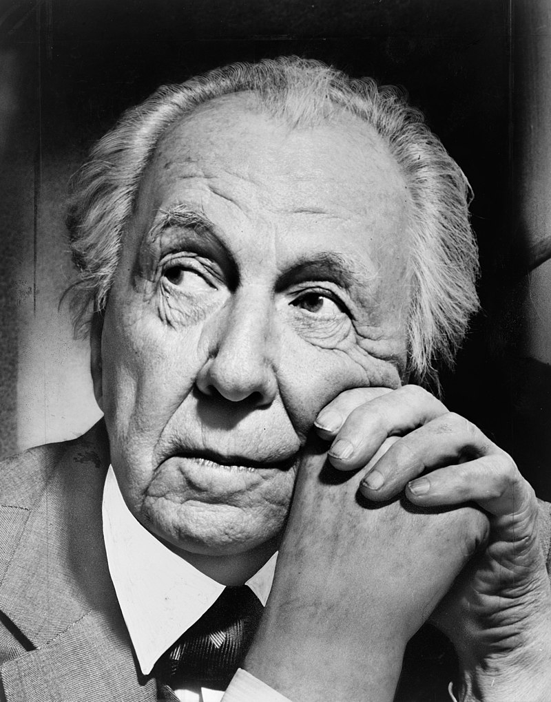
Nearby, a reclining chair caught my attention as well. When I looked closer, I discovered these pieces were designed by Frank Lloyd Wright.

Suddenly, everything made sense to me. His furniture mirrored his architecture—minimalistic, harmonious, and timeless. His work, including the famous Fallingwater, follows these principles.

This experience reminded me of how knowing the creator enhances our appreciation of a product. When we learn who made it, we love it more. This idea was supported by a research about wine, showing that a wine named after the winery founder’s grandfather boosts consumer confidence. Even Apple, under Tim Cook, continues to build on this principle. We are deeply connected to the stories behind the objects.

***

Reference (Fallingwater at Wikipedia)

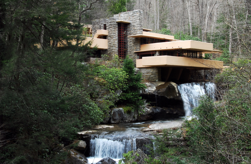
Fallingwater is, according to Wikipedia, a house designed by the architect Frank Lloyd Wright in 1935. Situated in the Mill Run section of Stewart township, in the Laurel Highlands of southwest Pennsylvania, about 70 miles (110 km) southeast of Pittsburgh in the United States, it is built partly over a waterfall on the Bear Run river. The house was designed to serve as a weekend retreat for Liliane and Edgar J. Kaufmann, the owner of Pittsburgh’s Kaufmann’s Department Store.

After its completion, Time called Fallingwater Wright’s “most beautiful job” and it is listed among Smithsonian’s “Life List of 28 Places to See Before You Die”. The house was designated a National Historic Landmark on May 11, 1976. In 1991, members of the American Institute of Architects named Fallingwater the “best all-time work of American architecture” and, in 2007, ranked Fallingwater 29th on its “America’s Favorite Architecture” list.

Eight of Frank Lloyd Wright’s buildings – Fallingwater, the Guggenheim Museum, the Hollyhock House, the Jacobs House, the Robie House, Taliesin, Taliesin West, and the Unity Temple – were inscribed on the list of UNESCO World Heritage Sites under the title The 20th-century Architecture of Frank Lloyd Wright in July 2019. UNESCO stated that these buildings were “innovative solutions to the needs for housing, worship, work or leisure” and “had a strong impact on the development of modern architecture in Europe.”

How salon-style displays enrich the art viewing experience

On a recent visit to the Huntington Library, Art Museum, and Botanical Gardens in Los Angeles, I was struck by the “salon style” display of paintings—a densely arranged presentation that contrasts with today’s minimalistic museum trend.

A “salon style” hang not only looks different from how most museums are arranged today-it also changes the viewer’s experience. Instead of presenting works individually, with lots of space, the crowded layout puts paintings in a network, encouraging comparison and debate. Salon artists felt reaccured if their pictures were hung at eye level, and lamented when they were “skied” close to the ceiling. Placement of particular works was determined by level of detail, the hierarchy of genres (a tradition prioritizing history and religious paintings) and, most importantly, the personal politicis of the Academy.

Unlike the single-piece-focused, widely spaced approach seen in contemporary galleries, salon-style hanging places artworks in close clusters, prompting viewers to think differently. Psychologically, this arrangement affects perception in two ways.

First, works displayed at eye level attract more attention—a phenomenon known as “eye level, buy level.” It is well known that eye-level placement in retail settings drives choices. Similarly, artists historically loved this prime placement, aiming to capture viewers’ gaze.

Second and more importantly, viewers are inclined to compare artworks side by side. This phenomenon aligns with Hsee’s research on “joint evaluation (JE) versus separate evaluation (SE). When items are displayed jointly, people place greater emphasis on attributes that may otherwise be hard to assess, fostering a richer, multi-dimensional engagement with items. In historical salons, this might have encouraged viewers to notice intricate qualities in each painting, which might go overlooked today when artworks are displayed individually in modern galleries.

Building on these insights with another pieces of insights found ten years ago at the Museum of Fine Arts (MFA), Boston, museum directors must carefully consider how presentation contexts shape visitor experiences. Museum visitors, like consumers, are influenced by cognitive biases and contextual cues, making behavioral economics principles crucial for optimizing the museum experience.”

***

Reference

Hsee, C. K. (1998). Less is better: When low‐value options are valued more highly than high‐value options. Journal of Behavioral Decision Making, 11(2), 107-121.

This research demonstrates a less-is-better effect in three contexts: (1) a person giving a $45 scarf as a gift was perceived to be more generous than one giving a $55 coat; (2) an overfilled ice cream serving with 7 oz of ice cream was valued more than an underfilled serving with 8 oz of ice cream; (3) a dinnerware set with 24 intact pieces was judged more favourably than one with 31 intact pieces (including the same 24) plus a few broken ones. This less-is-better effect occurred only when the options were evaluated separately, and reversed itself when the options were juxtaposed. These results are explained in terms of the evaluability hypothesis, which states that separate evaluations of objects are often infuenced by attributes which are easy to evaluate rather than by those which are important.