All posts by Jaewoo Joo

Jaewoo teaches and writes about design thinking and behavioral economics for customer experience, new product development, and new product adoption. He is an associate professor of marketing and participating professor of experience design at Kookmin University.

Secret for home deco store

20130517_145804

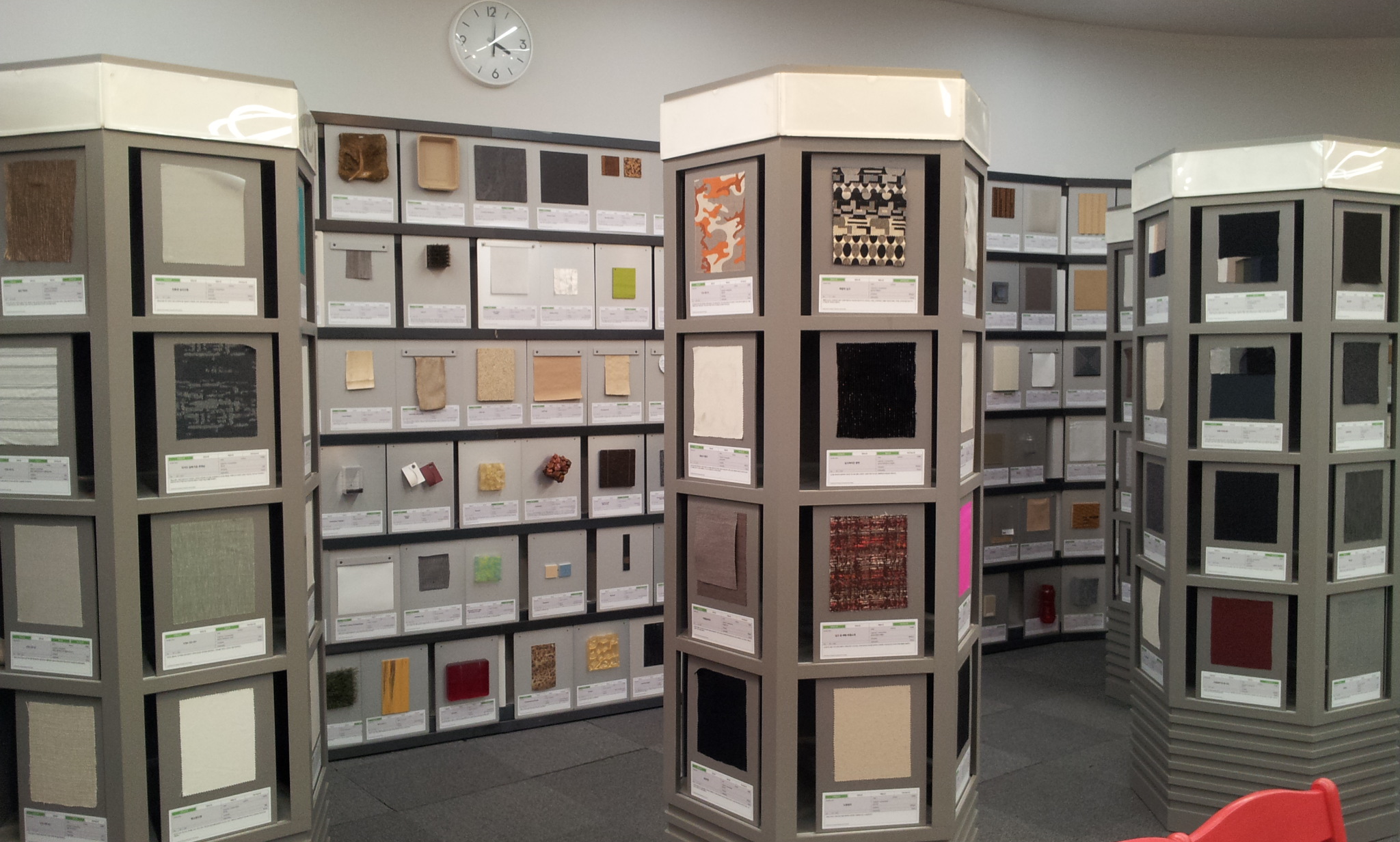
When consumers shop for home decorators, they often find it difficult to imagine how a space looks like if they buy and display specific items. Unfortunately, many typical home deco stores do not take into this issue seriously but take an easy or “analytic” approach: they simply pile up the whole decorators and categorize them by chairs, tables, and lighting (above).

However, up-scale home deco stores take a relatively demanding or “holistic” approach. Ando, for example, is divided into several sections. In this store, only a few items are selectively displayed that go well with the theme of each section. When a section represents a single-person studio, for instance, it has a desk, a chair, a mirror, and a hanger (below). Such a holistic approach relieves consumers’ mental burden, which in turn leads them to pay more in the store (see other examples in the IKEA or read a relevant article on designer vs. consumer).

www.ando.or.kr
www.ando.or.kr

Dessert design workshop @ Cognitive Science 2013

20130525_Dessert 11At the Korean Cognitive Science conference on May 25, 2013, Soren Petersen and I ran a workshop called “Design Tasty Dessert: The Art of Firing All The Five Senses!” In this workshop, we wanted to go beyond presenting our research projects; instead, we wanted to have some fun and creative experience with participants. Therefore, we asked participants to come up with as many creative dessert ideas as they could and then chose one to present. In order to help them to enjoy the workshop as well as to enjoy their own creativity, we provided them with a piece of chocolate, a piece of brown cake, a strawberry, a mandarin, and a cubic of cheese in the beginning of the workshop.

Surprisingly, some participants generated creative dessert recipes by utilizing typical food items such as banana, strawberry, raspberry, peach, ice cream, and chocolate (see the hat (above) and the peach hand (below)).

20130525_Dessert 12

Classroom for empathy, creativity and cooperation

20130503_@ NEXT (1)

Although classrooms are used by students, they are not student-friendly. NHN NEXT, however, provides its students with the carefully designed spaces so that its students listen to the lectures, do their group projects, read some books, and even take some rests conveniently and comfortably. Teaching public software developers (e.g., portal sites, games, and social network services), NHN NEXT was found in 2012 by NHN, the Korean version of Google.

In this educational institution, students learn how to understand users deeply, how to develop new programs, and how to work with other developers harmoniously. Therefore, its classrooms are designed to encourage its students to be empathic, creative, and cooperative. For instance, desks in the classroom have 6 power outlets, providing 2 power outlets for each student. The wall in the group study room is painted white, which allows students to write/draw/erase their thoughts and ideas freely. The library has multiple shelves in which faculty members leave their books so that students read the books that their favorite professors recommend. Finally, several game rooms are placed in the public space, allowing students to play console games to get excited or relaxed.

20130503_@ NEXT (2)

20130503_@ NEXT (4)

20130503_@ NEXT (3)

Studio blank, wood material for product line

20130427_Design @ Seoul (9)

About an year ago, I met two artists who opened StudioBlank and carved wood like a bowling pin. They produced a single product: wood massager called Tapi. We discussed how to increase sales and I suggested them to vary its size in order to target different segments. For example, sales representatives might be interested in small-sized Tapi because they want to give something special to their clients.

Recently, I visited StudioBlank’s newly opened shop and found that the two artists did not simply change the size of their product but developed the product line. Now, they make and sell from typical massagers to aroma diffusers, wooden pillows, and special (acupressure) massagers.

Marketers wonder how to develop/extend the product line without sacrificing the consistency among the products. They tend to focus on visual cues such as brands, logos, or colors. However, product designers can use material, the essence of the product, as a vehicle to develop a successful product line.

Kimjaejin.com
Kimjaejin.com

Wood wick for soothing sound

20130427_Design @ Seoul (3)

When we buy candles, we generally consider how they look or how they smell. Therefore, most candle makers carve their candles artistically or add scents to the candle waxes (e.g., Red Roses of Jo Malone). However, some candle makers pay attention to a different aspect of candle: wick.

A candle wick is usually a braided cotton that holds the flame of a candle. Wicks can be made of material other than string or cord, such as wood, although they are rare (Wikipedia). Recently, I met a candle maker who was selling wood wick candles. She told me her candles make a relaxing SOUND of burning wood. Since I was fascinated by the sound, I bought her candle without considering how it looked or how it smelled.

Designers and marketers are always searching for latent needs, the needs that consumers do not express verbally. Since a wide variety of shapes and scents are existing in the candle market, candle designers and marketers consider innovating their candles by offering different types of burning sounds.

Reference

Urban, G. L., & Hauser, J. R. (2004). “Listening in” to find and explore new combinations of customer needsJournal of Marketing68(2), 72-87.

By “listening in” to ongoing dialogues between customers and Web-based virtual advisers (e.g., Kelley Blue Book’s Auto Choice Advisor), the authors identify new product opportunities based on new combinations of customer needs. The data are available at little incremental cost and provide the scale necessary for complex products (e.g., 148 trucks and 129 customer needs in the authors’ application). The authors describe and evaluate the methodologies with formal analysis, Monte Carlo simulation (calibrated on real data), and a “proof-of-concept” application in the pickup-truck category (more than 1000 Web-based respondents). The application identified opportunities for new truck platforms worth approximately $2.4 billion–$3.2 billion and $1 billion–$2 billion, respectively.

Alternative to made in China

Apple
http://tradediversion.net/2011/03/24/made-in-a-series-of-places/

Wikipedia says,

The Made in China label is one of the most recognizable labels in the world today due to China’s  rapidly developing large manufacturing industry, China is currently the largest exporter in the world and the Made in China label can be seen on a wide range of goods from clothing to electronics. U.S. law requires the country of origin of a product to be clearly displayed on the product, or on the product’s container if it is enclosed, resulting in many corporations such as Apple labeling their products with “Designed by Apple in California Assembled in China.

Hello from Seattle
http://www.joelonsoftware.com/items/2007/10/05.html

Microsoft once labeled their Zune products as “Hello from Seattle, Assembled in China.”

LABC_C434
http://www.lab-c.co.kr/product/product_c400.html#c434

Plus-X is an established design consulting agency in Seoul, Korea. It completed a brand experience consulting project for YG entertainment successfully. YG entertainment has many Korean singers and Asian entertainers including Psy who suddenly appeared on the global music stage with his mega hit song, “Gangnam Style.”

Recently, Plus-X launched a smartphone case under the name of Lab C. Inspired by the PSY’s Gangnam Style, it labeled the case as “Designed by Lab C, in Gangnam, Material by Italy.” This label is eye-catching and more importantly works well because people in Gangnam are known to be trendy, hip and exude a certain supposed class (though it would have been more noticeable if it says “Stylized in Gangnam”). My friend and colleague, Soren Petersen, also wrote about what design can learn from Gangnam style. Thank you, PSY. You help Koreans to be creative!

Psy
Newman, George E. and Ravi Dhar (2014), “Authenticity Is Contagious: Brand Essence and the Original Source of Production,” Journal of Marketing Research, 51 (3), 371–386.

It is well established that differences in manufacturing location can affect consumer preferences through lay inferences about production quality. In this article, the authors take a different approach to this topic by demonstrating how beliefs in contagion (the notion that objects may acquire a special aura or “essence” from their past) influence perceptions of authenticity for everyday consumer products and brands. Specifically, they find that due to a belief in contagion, products from a company’s original manufacturing location are viewed as containing the essence of the brand. In turn, this belief in transferred essence leads consumers to view products from the original factory as more authentic and valuable than identical products made elsewhere. The authors further reveal that consumers who are higher in sensitivity to contagion are more likely to exhibit this effect and that activating the concept of contagion enhances preferences for products made in the brand’s original factory. The authors close by discussing theoretical and practical implications of these findings.

Should we go noisy or quiet when exporting goods?

Image

People like imported goods. Some like them so much that they even pick up the old license plates and place them outside their buildings for an aesthetic reason. (Note that this tiny run-down building is located in the center of Seoul and must have nothing to do with Nebraska or Iowa)

Image

Imported goods are welcomed in particular when exporting countries are highly qualified. This, so called, COO (Country Of Origin) effect is well established for Germany, France and Japan. Recently, I found that Canada Goose is also enjoying the same effect. It is a popular fashion brand designed for extreme cold weather conditions. According to my undergraduate students, Canada Goose is hugely popular because it is made in Canada not in US, Russia or China. They particularly love its huge label saying “Canada Goose Arctic Program.”

Differently from Canada Goose, M0851, another successful Canadian fashion brand says nothing about Canada. Although it started in Montreal and seems to be well established in Canada, it has no clue about where it comes from. One Canadian fashion brand speaks loudly, while the other keeps silent about where it was born. Interestingly, they both run business well.

Canada Goose LabelM0851

Different Ads, different people, same products

20130421_@ Museum (10)

I visited a special exhibition at the Seoul Museum of History and met an old day of Korean advertisement.

“Title: Seoul Nostalgia: A Retrospective Photographic Exhibition of Kim Hanyong

Having started as a news photographer in 1947 at ‘Gukje Bodo’ (International Report), Kim Han-yong is a renowned photographer who has devoted himself solely to photography throughout his life. His professional traces crossing genres such as news, art and advertisement can be translated into the records of Korea’s contemporary history. This exhibition consists broadly of the two themes: ‘Memories of City’ and ‘Portraits of the beauty’. ‘Memories of City’ displays the dynamic changes that Seoul and the people living in it have gone through since the 1950’s. ‘Portraits of the beauty’ presents some 70 advertising posters created by Kim, commonly referred to as an ‘advertising photography magnate’. He says that he has never forgotten photography for a moment in his life of 90 years. Thanks to this passionate artist, we can discover our own portraits of the days when we dreamed with hope despite difficult circumstances.”

20130421_@ Museum (5)

I had an interesting observation when I compared between the Coca-cola ad and Hyundai-Ford ad in the 1970s. About 40 years ago, Coca-cola was advertised WITH pencil-drawing consumers while the Hyundai-Ford car was advertised WITHOUT drivers. Since then, this trend has become opposite: Coca-cola is now showing Coke (or bear)  whereas Hyundai is now demonstrating how people drive vehicles.

How do we evaluate designs?

20130415_Design @ Kmu ID (1)

My friend teaches Product Design. He uses coffee maker in his course. Students disassemble and assemble a coffee maker and then design a new one.

A few days ago, I was invited to see the designs that his students submitted to his course. After discussing with him which ones are well designed and why, I made two interesting observations.

20130415_Design @ Kmu ID (3)

First, only few coffee maker designs have cords. He and I reached a consensus that most students failed to take into account how their newly designed coffee makers work or look like in reality. Only few thought these issues deeply and put some flavor of reality. Interestingly, we reached another consensus that the coffee makers with the cords are generally better designed than those without cords.

20130415_Design @ Kmu ID (5)

Next, we chose the identical coffee maker as well designed for different reasons. I chose it because its look and feel is appealing whereas he chose it because it may work well compared to others. Although I always assume that aesthetics and usefulness are in a trade-off situation, they are not necessarily traded off in the reality.

Timid-looking electric vehicle


20130330_@ Seoul Motor Show (22)

At the Seoul Motor Show, I met a vehicle operated by electricity. It attracts attention not because of its strong performance but because of its soft name and weak design. It is called Yebbujana, meaning “Beautiful, isn’t it?”. Further, it has a curvy body with four extremely small headlamps. In general, having an inviting name and approachable design is a good approach. Managers and designers might want to launch their rapidly new product in an unassertive way. However, this car sounds and looks too timid to drive.

“Timid, isn’t it?”