Tag Archives: interior

DDP, a controversial architecture

20140506_Ran Joo @ DDP (2)

DDP (Dongdaemun Design Park plaza), designed by Zaha Hadid, is an extremely controversial architecture in Seoul, Korea. Some argue that it is neither functional inside nor goes well with neighbors; they view it as a dead space next to a naturally dynamic communities. Others, however, argue that this building cannot be judged by the contemporary perspective; they believe it become the landmark of the city in the future, just as Eiffel Tower.

Here is the introduction on the Zaha Hadid’s website:

“The DDP has been designed as a cultural hub at the centre of Dongdaemun, an historic district of Seoul that is now renowned for its 24-hour shopping and cafes. DDP is a place for people of all ages; a catalyst for the instigation and exchange of ideas and for new technologies and media to be explored. The variety of public spaces within DDP include Art/Exhibition Halls, Conference Hall, Design Museum/Exhibition Hall/Pathway, Design Labs & Academy Hall, Media Centre, Seminar Rooms and Designers Lounge, Design Market open 24 hours a day; enabling DDP to present the widest diversity of exhibitions and events that feed the cultural vitality of the city.”

For now, a wide variety of shops run their own businesses in the building. They sell design products and books. It is worth a visit.

20140506_Ran Joo @ DDP (14)

20140506_Ran Joo @ DDP (25)

20140506_Ran Joo @ DDP (11)

Microsoft Store vs. Apple Store

I recently visited a MicroSoft Store in a shopping mall in Toronto. My first impression was that it looks highly similar to the Apple Store. For instance, the MS Store places a simple logo outside, displays a wide variety of working devices on the tables, and has many assistants wearing blue (!) T-shirts. However, many visitors in the MS Store spent their time on playing gesture-recognition X-BOX video games. Only few paid attention to the physical devices and virtually none of them had any conversation with the MS assistants.

DesignMarketingLab

DesignMarketingLab

Different from the MS Store, the Apple Store in the same shopping mall had more visitors who played with the working device on the tables or who had a conversation with the assistants. At the surface level, the visitors and the assistants in the MS store “played together” whereas, in the Apple store, they “communicated each other.” However, more importantly, the MS Store needs something unique rather than copying its competitor. Otherwise, it might follow what Sony showed after it opened Sony Stores. 

DesignMarketingLab

DesignMarketingLab

Holistic approach for furniture sellers

20130606_Ran @ Kyunggi (4)

20130606_Ran @ Kyunggi (6)

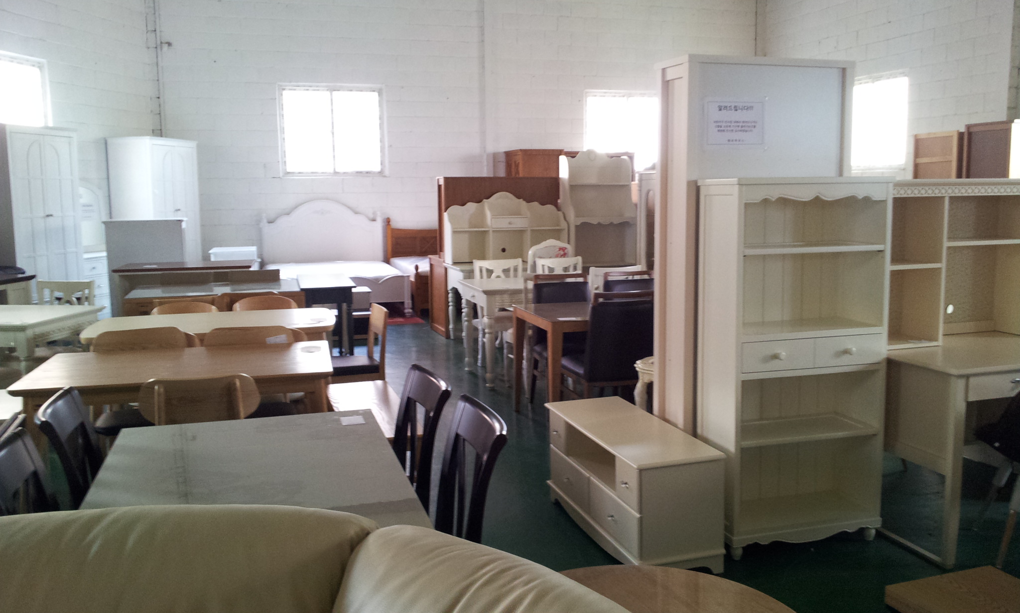
Analytic (holistic) approach makes a store look cheap (upscale). I have visited an outlet furniture store in which the whole items are simply piled up. This analytic approach made me difficult to imagine how a room looks like. Therefore, I decided not to buy any item in this store. If the manager in this store uses the holistic approach and displays carefully selected items in different sections with specific themes, not only the store looks upscale but also I purchase some items (e.g., What is the secret of the upscale home deco stores?).

Experiment for collaborative office space in Seoul (2)

> Continued from Experiment for collaborative office space in Seoul (1)

The team discovered two issues for building a collaborative office space in Seoul.

  • First, people have a double standard. They generally use the open space for serious reasons such as discussing business issues or having meetings with clients. However, when they notice others occupying the space, the others “seem to” chat over a cup of coffee, read casual books, or just have fun. This unnecessary strictness of others inhibits them from visiting the open space.
  • Second, people prefer the sofas located next to the window over the white table located in the middle. This skewed flow does not allow accidental interactions.

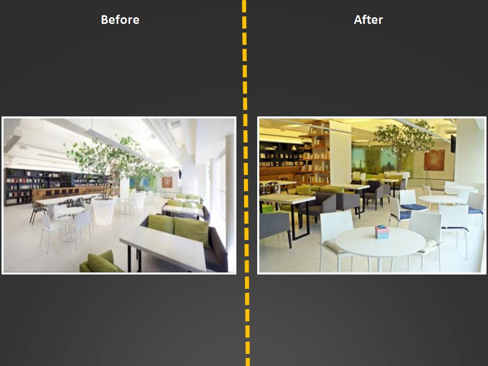
The team decided not to attack the first, psychological issue but to attack the second, technical issue and then conducted a few experiments to smooth the flow with a hope to make the whole space more vital. For example, the sofas and the round tables with chairs switched each other. As shown below, many people followed the sofas and while doing so, they made some accidental interactions, which is a key feature for collaborative office spaces (see Adam Alter’s post).

Space design (1)Space design (3)

This project shows that a minor change in an office space determines the flow, which in turn makes the space where collaboration can happen.

Experiment for collaborative office space in Seoul (1)

[youtube=http://www.youtube.com/watch?v=bpm_LIyMtMY]

Although many people want their offices similar to the Pixar’s office or the Google’s New York office, only few had them. Adam Alter, Assistant Professor of Marketing at New York University, wrote a piece of article on this issue at U99 (How to build a collaborative office space like Pixar and Google). In this article, he argues four key features of a collaborative office space.

  • An open plan and other design features (e.g., high-traffic staircases) that encourage accidental interactions.
  • More common areas than are strictly necessary—multiple cafeterias, other places to read and work that encourage workers to leave confined offices.
  • Emphasis on areas that hold two or more people, rather than single-occupancy offices.
  • Purpose-free generic “thinking” areas in open-plan spaces, which encourage workers to do their thinking in the presence of other people, rather than alone.

**

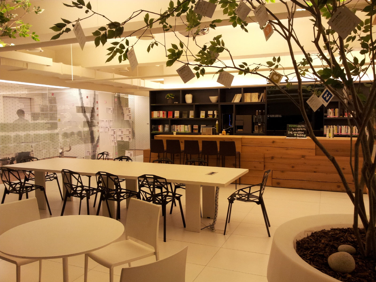
Dongwha holdings, a company selling interior items and dealing used cars based in Seoul, opened a space called Green Lounge in 2010. This space was dedicated to encourage collaboration among employees. It was equipped with sofas and tables, designer chairs, upscale coffee machines, and a plenty of casual books, etc.

20130306_Action Learning @ Dongwha (6)

This open space, however, was mostly empty. Very different from Californians and New Yorkers, people in Seoul avoided mingle with strangers and thus accidental interactions did not occur. Instead, they stopped by this space with their colleagues and picked up free coffee and left. Alternatively, they occupied meeting rooms for chatting with friends or keeping focused on their own businesses.

In order to revitalize this open space, a team of employees conducted research; they performed deep interviews with others, video recorded others’ behaviors, and collected and analyzed the flow in the open space. This research revealed two issues and the team decided to attack one of those issues by conducting several experiments.

> Go to Experiment for collaborative office space in Seoul (2)