MMCA (national Museum of Modern and Contemporary Art) is a representative museum located in the center of Seoul, Korea. In the museum stood an eye-popping art piece. It is “Home within Home within Home within Home within Home” and sponsored by Hanjin Shipping, the 8th biggest shipping company following Maersk, MSC, and CMA-CGM. Probably, it will take ages for a shipping company to obtain some artistic flavor. However, its effort will be paid off in the long run. Even a financial company such as Hyundai Card goes with musicians and support creative talents.


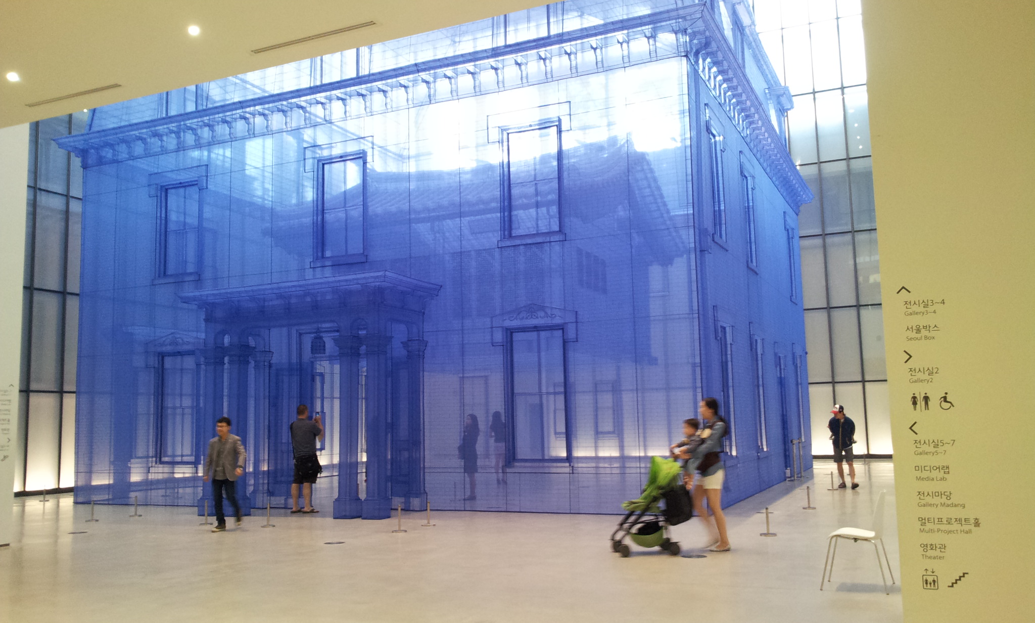
… Hanjin Shipping The Box Project is an MMCA’s ambitious project through which Seoul Box is accoutered with artists’ ingenious and stimulating ideas. MMCA has selected Do Ho Suh (1962- ) as the protagonist for the Project’s first chapter held in celebration of the historic opening of National Museum of Modern and Contemporary Art, Korea’s Seoul Branch…
This huge fabric installation of Suh entitled ‘Home Within Home Within Home Within Home Within Home’ is specially created to epitomize the vital spatial property of Seoul Box that can be undeniably characterized by its abundant natural light coming through its glass walls and the historical attribute of the Seoul branch’s compound in which traditional, modern and contemporary buildings embrace each other…
This work is comprised of a life-size (12 meters in height, 15 meters in width) replica of the three-story town house at Providence, Rhode Island, which was the artist’s first residence where he lived as a student in the United States in 1991 and ‘Seoul Home,’ a reproduction of his family’s traditional-style Korean house in Seoul, hanging in the middle of the former…
As one can infer from the title, the work elucidates and conjures the ever-expanding concept of space: traditional Korean house within Western-style house; Western-style house with Seoul Box; Seoul Box within the Seoul branch; the Seoul branch within Seoul… (written by Chuyoung Lee, Associate Curator. Click here for the complete introduction)