Tag Archives: function

Apply behavioral economics to sell design more

ADR_2019_v32n1_61_f001

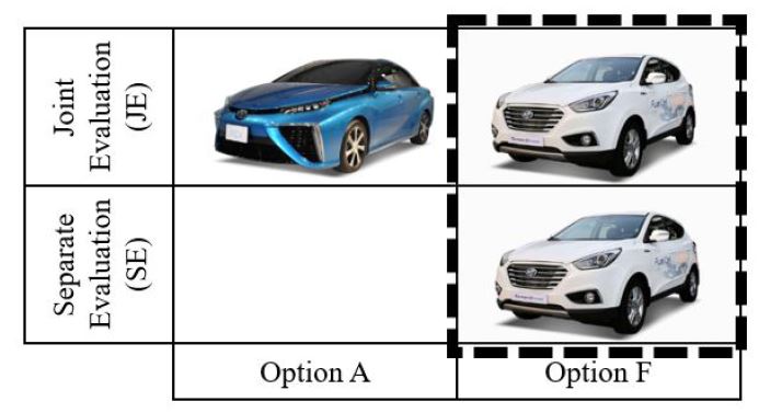
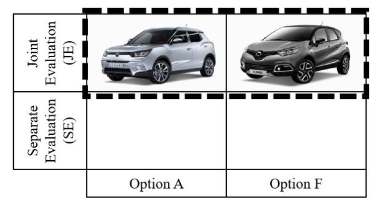
Background People often choose between two competing options: option A (aesthetically superior but functionally inferior) and option F (functionally superior but aesthetically inferior). We hypothesize that people like option A more when it is presented with option F (joint evaluation) than when presented alone (separate evaluation) because people find aesthetic attributes are hard to evaluate. We further hypothesize that this effect holds neither for option F nor among experts.

Methods We briefly reviewed two cases in the Korean automobile industry and then conducted two experiments in China. In the first experiment, we compared preferences about two USB drivers between two evaluation modes. In the second experiments, we compared preferences about two basketball shoes in the joint evaluation between novices and experts.

Results We found from the first experiment that participants increased their preferences for option A in the joint evaluation compared to the separate evaluation. Their preferences for option F did not differ between the two evaluation modes. In the second experiment, only novices preferred option A over option F in the joint evaluation. Experts did not prefer option A over option F.

Conclusions Our findings contribute to the scholarly discussions about form and function. They also provide practical implications to designers and marketers who need to sell aesthetically pleasing products. This work goes beyond design marketing interface to add evaluation mode as an intervention to nudge people to choose aesthetically pleasing products, which has been barely discussed in behavioral economics.

Keywords:

AestheticBehavioral EconomicsFunctionInterventionKnowledgeMarketingNudge

ADR_2019_v32n1_61_f002

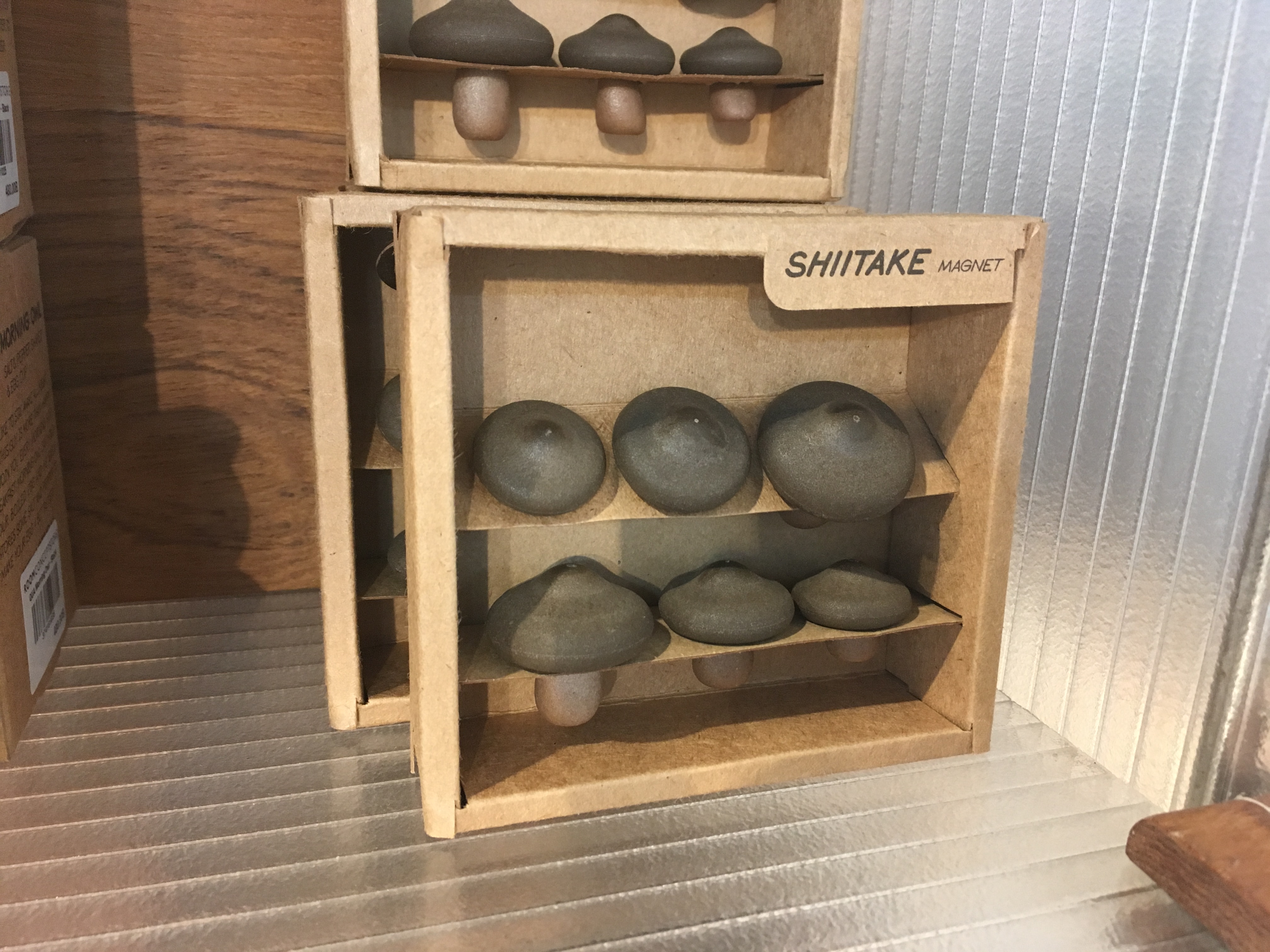
Mushroom shaped magnet

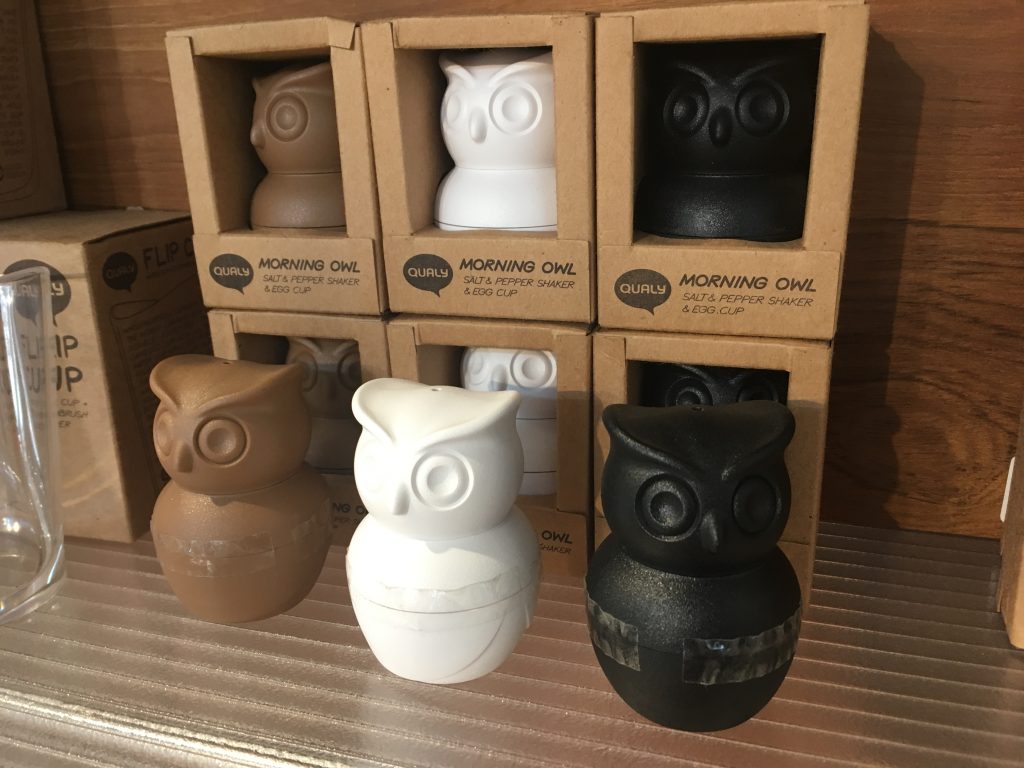
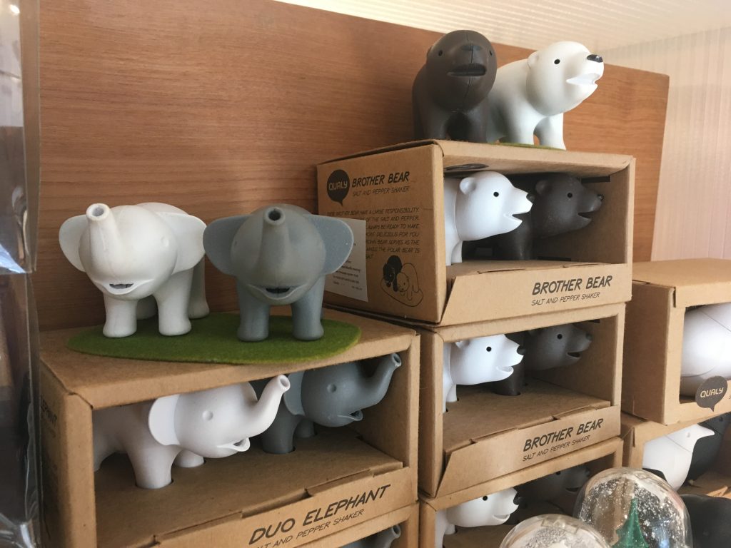
Thai designers make interesting experimentation. At a department store in Bangkok, I found several stationary items and kitchen utensils designed by Qualy, seems to be a local Thai design company. Although this company introduced a series of interesting products including owl-shaped salt and pepper shaker or bear-shaped one, the most interesting one is mushroom-shaped magnetic.


Shiitake is a mushroom native to East Asia and consumed in many Asian countries. It is considered a medicinal mushroom in some forms of traditional medicine. Qualy website says,

Shiitake magnet Make sure you don’t put these in your soup. They are actually mushroom shaped magnets. And not just any mushroom, they are shiitake mushrooms, to remind you to seize opportunity. Just place them on any metal surface to secure your notes. It’s like picking mushrooms from a field each time you remove a magnet.

Although I do not know why shiitake mushroom is related with seizing an opportunity, the form is certainly eye-catching and attractive enough to open wallet.


How could we design a better fire extinguisher?

IMG_1229

Since we spend most of our time in buildings, we are literally surrounded by fire extinguishers. It consists of a hand-held cylindrical pressure vessel containing an agent which can be discharged to extinguish a fire (Wikipedia). In general, we do not pay attention to them until needed. For me, I have never used any fire extinguisher in my life and have no interest in it. Interestingly, designers have noticed their problems and came up with two fairly different but equally interesting solutions.

Typical fire extinguishers have two critical problems. First, they are often ignored and difficult to be located. Even though they are red colored, fire extinguishers merely stand still and fail to grab our attention. Further, they do not go well with walls or interiors.

Recently, I found a series of eye-catching fire extinguishers at a store. In order to solve the first problem, some designers changed the appearance of the fire extinguishers. They painted skins to make them visually appealing and to make them go well with the walls. Some of the newly painted fire extinguishers look so nice that I even wanted to buy them for home decor.

DML_Fire distinguisher

The second problem is that typical fire extinguishers are difficult to use in emergency situations. Therefore, instruction manuals are prepared. A practice session runs for those who want to try to use them in advance.

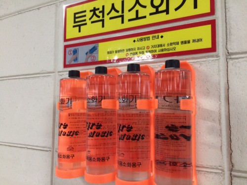
Recently, I found another, newly designed fire extinguishers in a building. Designers changed the size and the container material so that the shape “says” how to use. Now, we do not have to spend time on learning how to use them; instead, we can simply  pick up one or a few water-bottle shaped fire extinguishers and throw them on a fire.

These two fire extinguishers teach me what designers do for us. Designers change the appearance of a product; alternatively, they change the way we use it.