Tag Archives: marketing

Apply behavioral economics to sell design more

ADR_2019_v32n1_61_f001

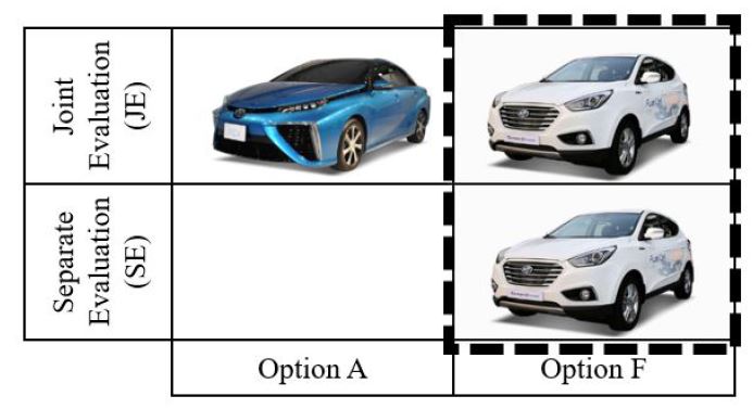
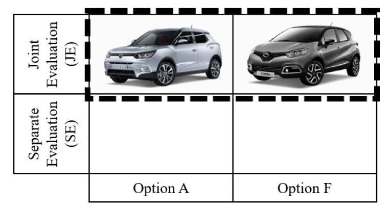
Background People often choose between two competing options: option A (aesthetically superior but functionally inferior) and option F (functionally superior but aesthetically inferior). We hypothesize that people like option A more when it is presented with option F (joint evaluation) than when presented alone (separate evaluation) because people find aesthetic attributes are hard to evaluate. We further hypothesize that this effect holds neither for option F nor among experts.

Methods We briefly reviewed two cases in the Korean automobile industry and then conducted two experiments in China. In the first experiment, we compared preferences about two USB drivers between two evaluation modes. In the second experiments, we compared preferences about two basketball shoes in the joint evaluation between novices and experts.

Results We found from the first experiment that participants increased their preferences for option A in the joint evaluation compared to the separate evaluation. Their preferences for option F did not differ between the two evaluation modes. In the second experiment, only novices preferred option A over option F in the joint evaluation. Experts did not prefer option A over option F.

Conclusions Our findings contribute to the scholarly discussions about form and function. They also provide practical implications to designers and marketers who need to sell aesthetically pleasing products. This work goes beyond design marketing interface to add evaluation mode as an intervention to nudge people to choose aesthetically pleasing products, which has been barely discussed in behavioral economics.

Keywords:

AestheticBehavioral EconomicsFunctionInterventionKnowledgeMarketingNudge

ADR_2019_v32n1_61_f002

Positioning map helps consumers make decisions

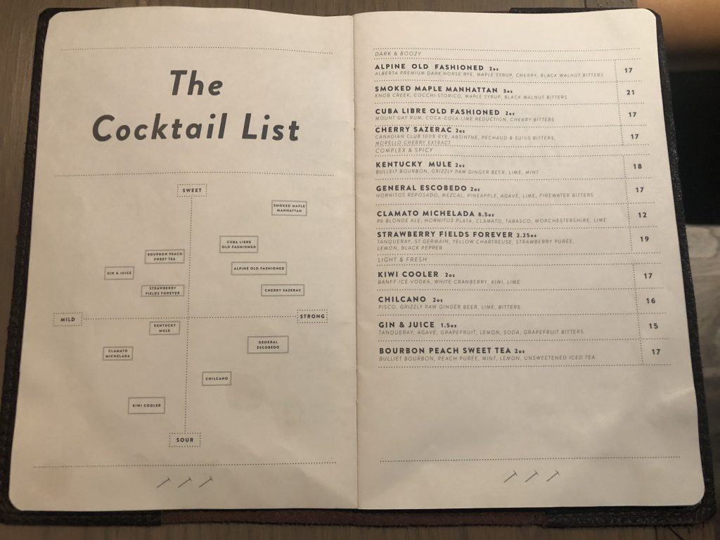
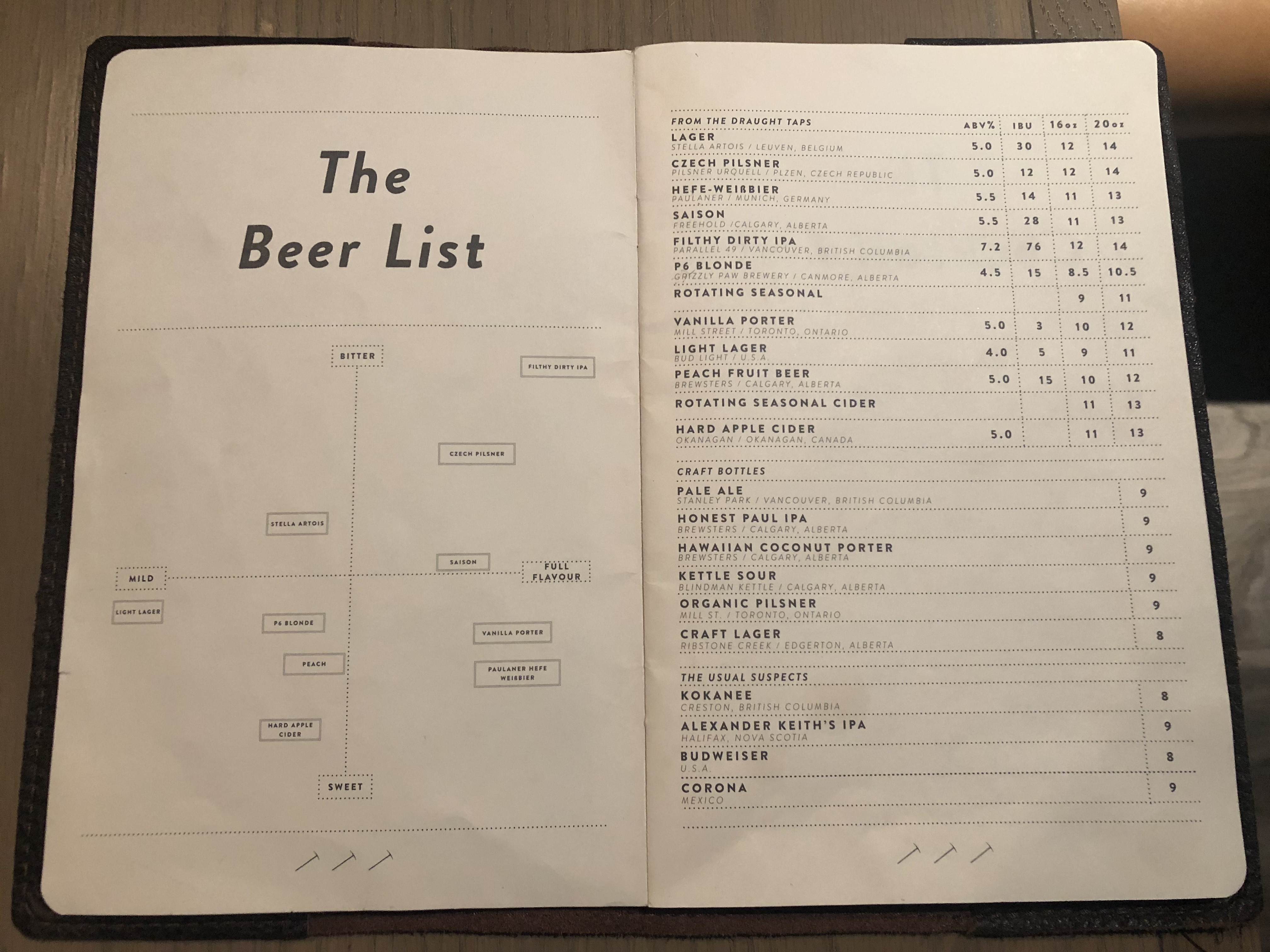
Fairmont Chateau Lake Louise is a hotel in Alberta, Canada. Surrounded by mountain peaks and an emerald lake in the Banff National Park, this hotel has a pub for the outdoor enthusiasts coming from all over the world. At the pub, the menu was carefully designed for foreigners by mapping local drinks in two dimensions: how bitter (vs. sweet) and mild (vs. full flavor) beers are and how sweet (vs. sour) and mild (strong) cocktails.

Visual mapping of existing products in two dimensions has been widely used among marketers who either modify existing products or introduce new products. Marketers rely on, so called, positioning map or perceptual map because map illustrates the customer perception of a company’s products and brands relative to their competition.

However, as the menu suggests, positioning map could benefit customers as well when provided with unfamiliar products. As persona helps designers communicate with users, map could help novice customers make informed decisions. In other words, positioning map aids consumers’ understanding of their own preferences, like consumption vocabulary.

***

Reference

West, P. M., Brown, C. L., & Hoch, S. J. (1996). Consumption Vocabulary and Preference Formation. Journal of Consumer Research, 23(2), 120–135.

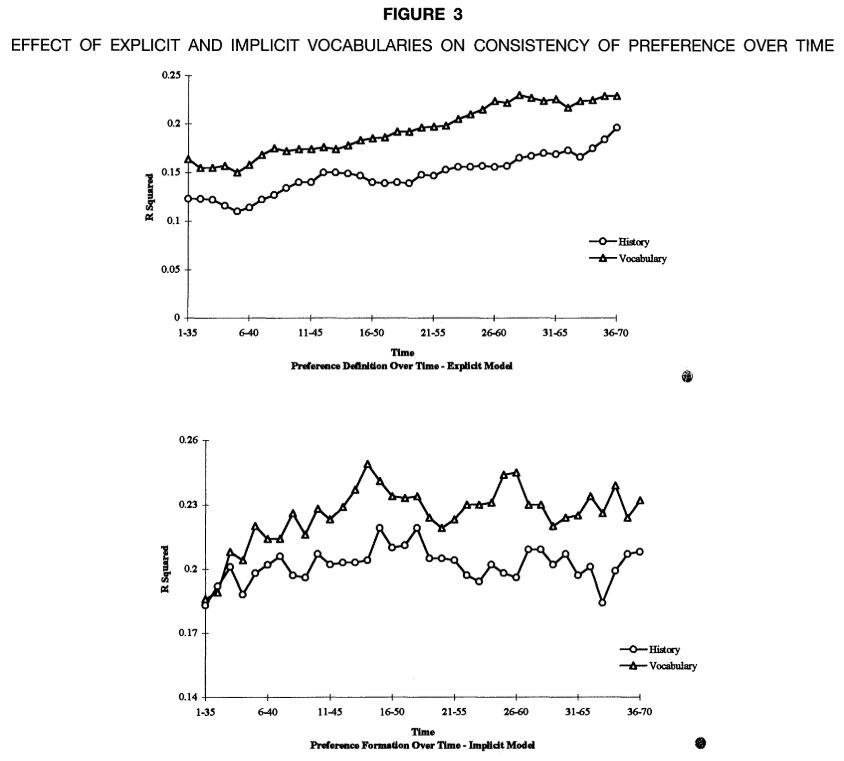
Consumers’ understanding of their own preferences can be aided by a “consumption vocabulary”-a taxonomy or framework that facilitates identifying the relation between a product’s features and one’s evaluation of the product. In the absence of such a vocabulary, consumers’ understanding of their own preferences will require more extensive experience and may never fully develop. The effect of such a vocabulary is tested in two experiments in which subjects provided with a vocabulary (1) exhibit better-defined and more consistent preferences than control subjects, (2) show improved cue discovery, and (3) show learning (i.e., increases in consistency over time). All results hold regardless of the functional form of the model used to assess subjects’ preference formation.

Is Iron Man banned in Denmark?

There is a Ninjago World at the Legoland in Denmark. In front of a flying dragon brick, I met an unfamiliar sign.


At first, I questioned why Lego hates Marvel so that pushing hand out like Iron Man was banned. Very soon, I realized it means “do not touch.” Later, I found the same sign at a construction site in downtown. It says “No entry for unauthorized people (Adgang forbudt for uvedkommende).”


Are these dynamic signs more effective than static ones? According to marketing research, people pay more attention to road signs when they are dynamic. We may need more “Iron Men” signs on the road.

Cian, L., Krishna, A., & Elder, R. S. (2015). A Sign of Things to Come: Behavioral Change through Dynamic Iconography. Journal of Consumer Research, 41(6), 1426–1446.

We propose that features of static visuals can lead to perceived movement (via dynamic imagery) and prepare the observer for action. We operationalize our research within the context of warning sign icons and show how subtle differences in iconography can affect human behavioral response. Across five studies incorporating multiple methodologies and technologies (click-data heat maps, driving simulations, surveys, reaction time, and eye tracking), we show that warning sign icons that evoke more (vs. less) perceived movement lead to a quicker propensity to act because they suggest greater risk to oneself or others and increase attentional vigilance. Icons used in our studies include children crossing signs near schools, wet floor signs in store settings, and shopping cart crossings near malls. Our findings highlight the importance of incorporating dynamic elements into icon design to promote imagery and thereby elicit desired and responsible consumer behavior.


3D food printers change brand image

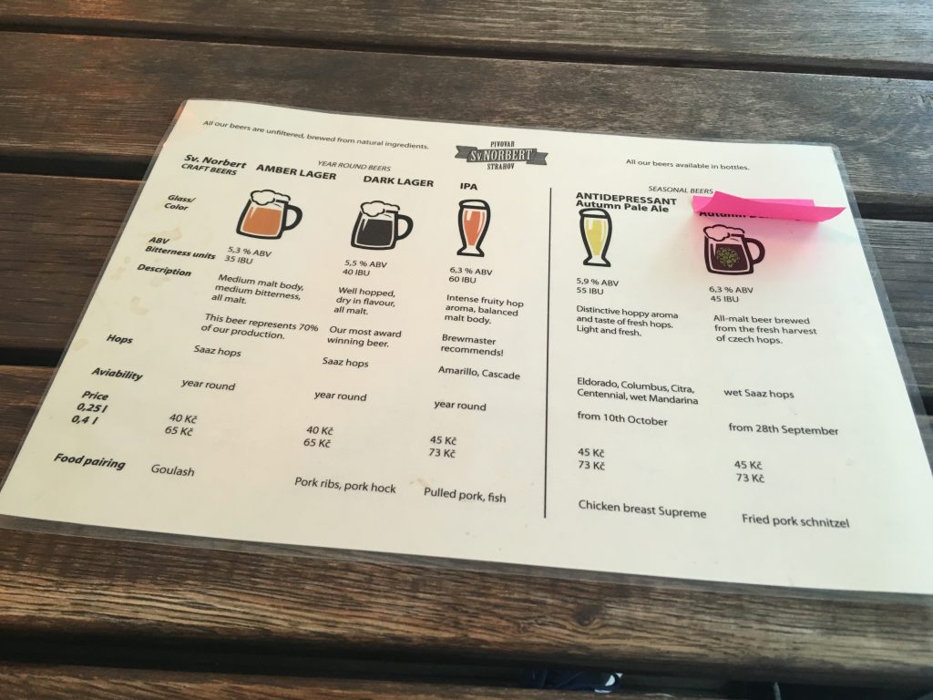
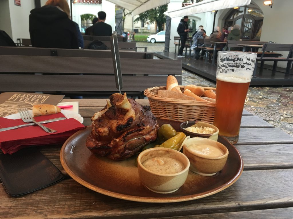
I followed map in Prague, Czech Republic. I crossed a bridge (Legions’ Bridge), climbed up a tower (Petrin Tower), and drank beer at a local brewery (Strahov Monastery Brewery). However, I went to one place most tourists are not interested in. I visited a design exhibition held at a convention center (Výstaviště Praha Holešovice).


Professional designers opened their booths and invited visitors in the convention center. I listened to presentations, tested products, talked to designers, and bought a few items.


At one corner, I met 3D printers printing out chocolates. Although media says 3D food printers will change what we eat and I myself play with a 3D printer, this was the first time to see that food was actually printed out.


Afterwards, I became curious about this product and googled “Love Magenta.” I expected to find a person who loves the purplish red color and sell 3D food printers. Surprisingly, Love Magenta is the online store of the Deutsche TelekomThe website of “Love Magenta” says:


Magenta – so much more than just Deutsche Telekom’s corporate color, the most important element of our corporate identity.

But Magenta means even more to us: It represents our attitude towards life. Our employees show their pride in our brand with our everyday products. We showcase our favorite color perfectly in our online shop: sometimes bold, sometimes understated – but always stylish and up to date.

The shop offers a constantly changing range of high-quality products, including fashion, accessories, and gadgets. What these items have in common is the color Magenta, of course – and the love and attention dedicated to each detail. All products are designed and produced exclusively for our shop. This ensures the highest possible quality, and gives our designers complete freedom to create truly unique items. It’s never been easier for our employees and customers to express their love for Magenta in so much style.

Take a look – we’re sure you’ll find something you like.


Color is an effective marketing tool and some colors are stylish. Silver Bang & Olufsen speakers and white Balmuda toasters are eye catching. However, most success cases come from product manufacturers. How can service companies link themselves with stylish colors when they have no tangible, visible products? Deutsche Telekom gave an answer; Really New Products (RNPs) such as 3D food printers help service companies link their colors and styles. In the near future, other Really New Products such as wearable devices, voice recognition devices, or drones will be effective marketing tools for service companies to promote their own colors in stylish ways.


People tip less when the tip jar looks like a human

Henckell is my favorite cafe in Frederiksberg, Copenhagen. It is a local place with great coffee and sandwich. I feel cozy inside. It has only four small tables.

There is a tip jar next to the credit card machine on the counter table. Interestingly, it has a smiley face, two arms, and two legs. One day out of curiosity, I kept watching how many guests tipped in this human-looking tip jar. Afterwards, I also asked a server whether guests liked it. Surprisingly, I noticed that a few guests hesitated putting coins into this jar for an unknown reason. The server even told me that not few guests complained about the tip jar because its mouth is too small to insert coins.

When human flavor is added to an object, people like the object. It is supported by academic studies about anthropomorphism. For instance, when a car is anthropomorphized and its characteristics are congruent with the proposed human schema, people evaluate it positively (Aggarwal and McGill 2007). When a garbage bin is anthropomorphized (e.g., “feed me”), people follow the message and show prosocial behaviors (Ahn, Kim, Aggarwal 2013). When an innovative, uncertain product is anthropomorphized (e.g., “this little guy”), people tend to adopt this product (Jiang, Hoegg, and Dahl 2011).

However, anthropomorphism might backfire if the usefulness of the product is sacrificed. When I come back to this cafe, I want to draw a different character with a bigger mouth and see what happens.

***

Reference

Ahn, H. K., Kim, H. J., & Aggarwal, P. (2014). Helping Fellow Beings: Anthropomorphized Social Causes and the Role of Anticipatory Guilt. Psychological Science, 25(1), 224–229.

People are often reluctant to comply with social causes because doing so may involve personal sacrifices of time, money, and effort for benefits that are shared by other members of society. In an effort to increase compliance, government agencies and public institutions sometimes employ financial tools to promote social causes. However, employing financial tools to induce prosocial behavior is expensive and often ineffective. We propose that anthropomorphizing a social cause is a practical and inexpensive tool for increasing compliance with it. Across three prosocial contexts, we found that individuals exposed to a message from an anthropomorphized social cause, compared with individuals exposed to a message relating to a nonanthropomorphized social cause, were more willing to comply with the message. This effect was mediated by feelings of anticipatory guilt experienced when they considered the likely consequences of not complying with the cause. The theoretical and practical implications of these findings are discussed.

In this study, we adopted a food-waste composting campaign. A total of 104 undergraduates (54% female and 46% male; mean age = 19.8 years) participated in return for course credit. Participants in the anthropomorphism condition were exposed to a campaign poster showing a garbage bin with humanlike features of eyes, a nose, and a mouth alongside the caption, “Please feed me food waste only!” Participants in the nonanthropomorphism condition were shown a campaign poster in which the garbage bin lacked humanlike features and was accompanied by the caption, “Please put food waste in only!”. Participants completed a measure of expected compliance with the campaign (α = .89) using response scales from 1 (very unlikely) to 9 (very likely). In addition, we employed a 4-item measure of anticipatory guilt adapted from Cotte, Coulter, and Moore (2005). The four items assessed the degree of guilt, shame, responsibility, and accountability, respectively, that participants would feel if they did not comply with the campaign and were administered with 9-point scales (α = .89).

As expected, we found increased compliance in the anthropomorphism condition (M = 6.99, SD = 1.62) compared with the nonanthropomorphism condition (M = 6.24, SD = 1.80), β = 0.22, SE = 0.34, p < .05. Moreover, anticipatory guilt was higher in the anthropomorphism condition (M = 5.16, SD = 1.39) compared with the nonanthropomorphism condition (M = 4.49, SD = 1.64), β = 0.22, SE = 0.30, p < .05, which in turn resulted in an increased level of compliance, β = 0.45, SE = 0.10, p < .001. When we controlled for anticipatory guilt, the direct effect of anthropomorphism on compliance was no longer significant, β = 0.12, SE = 0.32, p = .17, Sobel z = 2.04, p < .05, which suggests that anticipatory guilt mediated the effect of anthropomorphism on compliance. 

People do not prefer crowded restaurants over empty ones

About 36 million people live in Tokyo and its neighboring cities. Most restaurants well known to foreigners are heavily crowded. Therefore, when I dine out in Tokyo, I have to wait for a table for a decent amount of time. The fact that many local people are waiting for their tables relieves my concern that I might have chosen a wrong restaurant. Although crowdedness plays a role as social proof when I “choose” a restaurant, I think I may enjoy dish more if I have a breathing room or enough empty space inside when I “experience” a restaurant.

My thought was supported when I had a lunch at a restaurant run by D&Department in Tokyo. D&Department project is a store-style activist proposed by Nagaoka Kenmei, a Japanese designer, in 2000, with a theme of a “long-life design.” It introduces design products for our daily lives such as eating, drinking, publishing and traveling. It aims to spread all over the country the products excavated in local regions. Therefore, the design products introduced by D&Department are the durable items that should be used for a long time and regional items that each specific region of Japan uniquely identifies. Therefore, serving local, authentic dish at a restaurant made sense to me.

Going beyond design items and local dish, this restaurant provided sufficient empty space to each guest, which was rare in Tokyo. This restaurant limited the number of guests entering the space. Therefore, people focused on their own dish inside while a huge crowd of people waited for their tables outside. This space was quiet and well organized and guests were not visually distracted.

Do we like crowdedness or emptiness at restaurants? Marketing scientists have studied this issue. Some argue that crowdedness plays a role as a social proof while others argue that emptiness signals social class. We may like crowdedness when buying mass products or visiting casual restaurants, whereas we pursue emptiness when searching for luxury goods or dining out at Michelin starred restaurants.

***

Reference

O’Guinn, T. C., Tanner, R. J., & Maeng, A. (2015). Turning to space: Social density, social class, and the value of things in stores. Journal of Consumer Research, 42(2), 196–213.

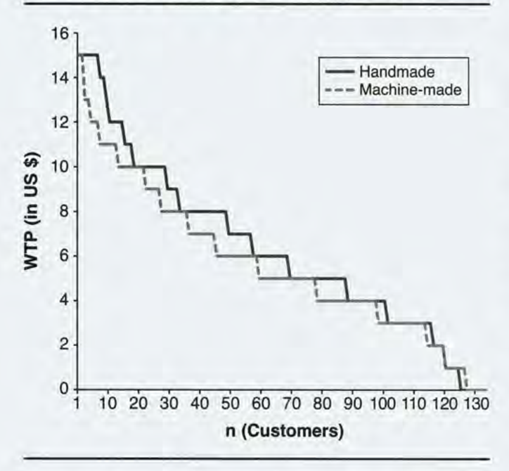
This article is about social space and material objects for sale within that space. We draw primarily on Goffman’s (1971) concepts of use space and possession territories to predict that as the social density of a given space increases, inferences of the subjective social class and income of people in that space fall. Eight studies confirm that this is indeed the case, with the result holding even for stick figures, thus controlling for typical visual indicators of social class such as clothing or jewelry. Furthermore, these social class inferences mediate a relationship between social density and product valuation, with individuals assessing both higher prices and a greater willingness to pay for products presented in less crowded contexts. This effect of inferred class on product valuation is explained by status-motivated individuals’ desire to associate with higher-status people. To the best of our knowledge, this research is the first to reveal the link between social density, status inferences, and object valuations. As such, it makes a novel contribution to what has come to be known in sociology as the topological turn: a renewed focus on social space.

Hide doors to be popular

Nightjar

Most bar owners promote their places by placing a sign board outside or updating their menus on social network services such as facebook or instagram. Interestingly however, some bar owners “hide” their doors. I had a chance to visit the bar called Nightjar in London. Surprisingly, it has a super tiny metal sign on a wood door. Therefore, I passed over its entrance door several times and spent many minutes until I decided to knock on it just in case. When the hidden door opened, as expected, this bar was fully packed with drinkers.

I had a similar experience when I first visited the bar called Charles H Bar at the Four Seasons Seoul, Korea. Although this hotel is easy to find, it took me long time again to find the entrance door of the bar. Since this bar has literally no sign outside, I could not help but ask someone to guide me to the entrance door. Again, when the hidden door opened, this bar was crowded.

DML_Charles H bar door

Why did Nightjar and Charles H Bar decide to hide their entrance doors? At first glance, hiding doors fails to attract by-passers and thus fails to increase traffic, which is important for most spaces. However, this spaces may have different objectives. For instance, they want to make their spaces exclusive only for those who were invited previously. Although there is no research about space exclusivity, there are some studies about the effect of exclusivity promotion or AREP (Advertised as Retailer Exclusive Products). Contrary to managerial expectations, their findings suggest that AREP exclusivity promotions are ineffective at influencing consumers.

***

Reference

Upshaw, D., Amyx, D., Upshaw, A., & Hardy, M. (2023). Do Products Labeled Retailer “Exclusive” Affect Consumer Behavior?Journal of Marketing Development and Competitiveness17(3).

Many large retailers offer “advertised as retailer exclusive products” or AREPs. Retailers work with manufacturers to produce these unique, retailer exclusive versions of otherwise common products. While not all retailer exclusive products are advertised as “exclusive,” AREPs are advertised and labeled as retailer exclusives. The retailer exclusive product attributes are often “trivial,” but still may add customer value and discourage price comparison shopping. Here, two experiments assess AREPs effects on consumers. Contrary to managerial expectations, the findings suggest that AREP exclusivity promotions are ineffective at influencing consumers, but that the choice of exclusive, seemingly “trivial” attribute can sometimes be a significant negative influence on consumers. Further, the authors suggest contexts that may encourage specific responses to retailer exclusive product promotions and trivial attributes.

Do-It-Yourself chocolate kit for Valentine’s day

DML_Valentine's day @ Fukuoka (2)

Valentines’ day is one of the most “commercially successful” holidays in Asian countries such as Japan and Korea. According to Wikipedia, this holiday was first introduced in Japan in 1936 when a company ran an advertisement aimed at foreigners.

Later in 1953, it began promoting the giving of heart-shaped chocolates; other Japanese confectionery companies followed suit thereafter. In 1958, the Isetan department store ran a “Valentine sale”. Further campaigns during the 1960s popularized the custom. The custom that only women give chocolates to men may have originated from the translation error of a chocolate-company executive during the initial campaigns. In particular, office ladies give chocolate to their co-workers. Unlike western countries, gifts such as greeting cards, candies, flowers, or dinner dates are uncommon, and most of the activity about the gifts is about giving the right amount of chocolate to each person. Japanese chocolate companies make half their annual sales during this time of the year.

Nowadays, many students around me complain expensive, poor-quality chocolates. However, some want to take this opportunity to express their feelings to others and make their own chocolates. Certainly, very few succeed in creating “the only” chocolate for their friends, colleagues, or significant others.

Recently, I met a clever solution at a Japanese department store: a do-it-yourself kit for chocolate. This is probably the best solution for those who do not want to waste money on buying ready-made chocolates but want to voluntarily invest an adequate amount of effort to create only one.

In one of my favorite research paper titled as “Why Consumers Enjoy Constrained Creative Experiences,” Darren Dahl and Page Moreau nicely articulated why DIY kits work.

DML_Valentine's day @ Fukuoka (1)

We used a combination of qualitative research and CET to understand why consumers participate in creative activities and the conditions under which they enjoy these experiences… Respondents consistently noted a motivation for personal accomplishment, which was achieved by satisfying the needs of both autonomy and competence… Importantly, this study also provides insight into the influence of external constraints (e.g., target outcomes, instructions) on consumers’ creative experiences. Indeed, the pros and cons of these creative products (e.g., kits, models, patterns, recipes) highlight the tension between consumers’ desire for instructional guidance and their need for individualism. Hobbyists value the feeling of competence that creative products provide, and they create their own strategies to overcome the constraints that such products impose on both the creative process and the outcome. (Dahl and Moreau 2007, pg. 367)

Who knows? We may see a lot of chocolate-only chefs in the near future who do not follow given instructions but use their own ingredients to develop new chocolates!

***

Reference

Dahl, D. W., & Moreau, C. P. (2007). Thinking inside the box: Why consumers enjoy constrained creative experiences. Journal of Marketing Research, 44(3), 357–369.

From cooking kits to home improvement shows, consumers are increasingly seeking out products that are designed to help them be creative. In this research, the authors examine why consumers participate in creative activities and under what conditions these experiences are the most enjoyable. A qualitative study explores the diverse motivations for undertaking creative tasks and identifies the role of constraints in such endeavors. Then, the authors conduct two experimental studies to understand the importance of constraints (e.g., instructional guidance, target outcomes) in facilitating a balance between perceived competence and autonomy for consumers involved in a creative task. When consumers engage in creative activities with a sense of both autonomy and competence, they enjoy the experience more. The authors discuss implications for managers and provide opportunities for further research.

Yido, a modern Korean pottery

Yido is a widely-known premium pottery brands in Korea. It was found by Yi, Yoonshin, a ceramic artist. She successfully established herself in the business world not only because her work reinterprets traditional Korean ceramics in refined contemporary design but also because she paid attention to the two marketing lessons.

First, she listens to market. Recently, Yido launches a new collection called Cera/Mano. Differently from other collections which has four pieces of bowls for a family of four, this newly launched collection consists in only one piece designed for single family buyers.

DML_Yido

Second, she goes beyond products. In the four-story flagship store, only one floor is dedicated to ceramic-ware sales. on other floors, a Italian restaurant, a brunch cafe, a ceramic academy, and a art and living store run. If other ceramic designers learn these marketing lessons, I assume, they will be able to become market-savvy designers.

Reference

Joo J. & Peterson, S. (2012), “Learning about innovative risk mediation strategies from entrepreneurs in creative industries,” AAG 2012, Working with Freedom: Learning about innovative risk mediation strategies from entrepreneurs in creative industries, New York.

Creative entrepreneurial ventures are characterized by uniquely personal branded offerings with enormous potential for profit, combined with huge market and execution risk. What differentiate creative entrepreneurial ventures from that of technology ventures are their dependency on a few individuals’ intangible breakthrough ideas. The absence of process control and metrics for evaluating cost, risk and required time commitment makes Return On Investment (ROI) impossible to assess.

Consequently, private investments are virtually unattainable. The subsequent extreme financial pressure combined with ineffective processes leads to destructive behaviors. Traditionally, three independent and mutually supportive approaches exist to mitigate risk and increase profit in creative ventures. These are: (1) Education: Providing market and executions knowledge and experiences through schooling, internships and apprenticeships, (2) Funding: Government and/or trade association backed with coaching and financing, and (3) Collaboration: Pooling of resources and creative talent to leverage individual talents and mitigating risk.

We propose using Design Research, Design Thinking and technology venture insights to develop methods and tools for sustainably running creative entrepreneurial ventures. First, we will identify best practices, by qualitative research within the creative fields of design, music, game, movie and art in the cultural settings of Los Angeles, Copenhagen and Seoul. Secondly, we identify knowledge transfer opportunities and conduct brainstorming sessions to synthesize new methods and tools. The outcome will be a creative portfolio management matrix, outlining how to best take ideas from concept to commercialization as a function of market and execution risk for the examined creative disciplines.

What is an advantage of having a popular first name?

First name (or given name) is the name that identifies a specific person. It differentiates a person from other members of a group, such as a family or clan, with whom that person shares a common last name (or family name). While last name is normally inherited, first name is “free to choose” and thus can be unique.

In some countries, however, only a few options seem to be highly popular. Many of my friends who were born and live in US, UK, or Canada have common first names. In English-based countries, Coke’s massively-distributed-but-highly-customized “first name” marketing campaign will work: each bottle of coke has its own first name label such as John, Sarah, Emma, and Alex. However, popular first names seem to be avoided in other countries. Most of my Korean friends have their own unique first names. In this country, Coke marketers may find it difficult to find popular first names and launch a marketing campaign using them.

DML_London_Firstnames on Coke

Then, why do some people pick up popular first names and others avoid them?