Jaewoo teaches and writes about design thinking and behavioral economics for customer experience, new product development, and new product adoption. He is an associate professor of marketing and participating professor of experience design at Kookmin University.
Space matters when we need creativity. According to research, when a ceiling is high, people become creative because a high (vs. low) ceiling primes the concept of freedom (vs. confinement). Similarly, Jump Associates has various types of cubicles for designers; “garage” cubicles are widely open for those who want to be creative, whereas “Zen rooms” are tiny small cubicles. Interestingly, Dev Patnaik, the founder of the Jump Associates, mentioned that US people prefer garage offices whereas Japanese clients like Zen rooms.
This article demonstrates that variations in ceiling height can prime concepts that, in turn, affect how consumers process information. We theorized that when reasonably salient, a high versus low ceiling can prime the concepts of freedom versus confinement, respectively. These concepts, in turn, can prompt consumers’ use of predominately relational versus item-specific processing. Three studies found support for this theorizing. On a variety of measures, ceiling height–induced relational or item-specific processing was indicated by people’s reliance on integrated and abstract versus discrete and concrete ideation. Hence, this research sheds light on when and how ceiling height can affect consumers’ responses.
When I visited the design department at the University of Sao Paulo, one of the best universities in Brazil, I found a clever and clear, visual information in a classroom. The wide classroom has four lines of bulbs on the ceiling from the front row to the back end. Although there are four bulb buttons on the wall, the way buttons are placed does not align with the way bulbs are on the ceiling. Instead of writing down “the first row, … the last row,” they match buttons and bulbs through color.
A large number of visualization tools have been created to help decision makers understand increasingly rich databases of product, customer, sales force, and other types of marketing information. This article presents a framework for thinking about how visual representations are likely to affect the decision processes or tasks that marketing managers and consumers commonly face, particularly those that involve the analysis or synthesis of substantial amounts of data. From this framework, the authors derive a set of testable propositions that serve as an agenda for further research. Although visual representations are likely to improve marketing manager efficiency, offer new insights, and increase customer satisfaction and loyalty, they may also bias decisions by focusing attention on a limited set of alternatives, increasing the salience and evaluability of less diagnostic information, and encouraging inaccurate comparisons. Given this, marketing managers are advised to subject insights from visual representations to more formal analysis.
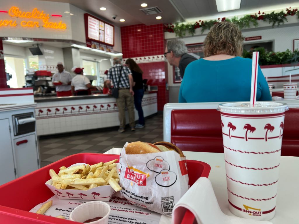
Script is a stereotyped sequence of activities. A good example of the script is for restaurant dining. We are greeted by a server who guides to a table, we receive a menu from a server, and the server takes our orders. Drinks arrive first and then meals arrive later. When we finish meals, we pay the bill at the cashier and leave the restaurant.
Marketers and designers use scripts to improve customer experience. We often assume the fewer activities customers perform in the restaurant, the more they are satisfied. Therefore, we hire more part-time servers. Alternatively, we try to design an unmanned store by installing vending machines or robots to automatize in-store activities.
Different from our assumptions, however, restaurant customers could be happy about doing everything by themselves. I found this when I met a friend at one of the Rainmaking cafe in Copenhagen, Denmark. Rainmaking is a corporate innovation and venture development firm.
When I entered the cafe, a refrigerator greeted me. No one was inside. I soon realized I should do everything by myself in this cafe. I picked up a beverage, paid it using my mobile phone, grabbed a table with my friend, and then cleaned up the table when leaving.
The whole experience did not bother me much but was quite pleasant. Everyone else seemed to follow this rule. This self-service cafe could be an alternative to automatization. Although many owners want vending machines or robots to make their stores unmanned or intact, not few customers are willing to perform in-store activities themselves.
The advent of electronic environments is bound to have profound effects on consumer decision making. While the exact nature of these influences is only partially known it is clear that consumers could benefit from properly designed electronic agents that know individual users preferences and can act on their behalf. An examination of the variousroles agents perform is presented as a framework for thinking about the design of electronic agents. In addition, a set of goals is established that include both outcome-based measures, such as improving decision quality, as well as process measures like increasing satisfaction and developing trust.
People seek for feedback about progress. When travelers arrive at the Chek Lap Kok International Airport, they catch a train to Kowloon and Hong Kong. In the train, there is a blue-light indicator which shows where the train is right now. This feedback gives correct information to travelers.
However, feedback is not always objectively given but can be subjectively manipulated. Virtual and illusory progress can be made by manipulating feedback. One of my favorite examples is the “purchase acceleration” suggested by marketing researchers. They reported that customers who received a 12-stamp coffee card with 2 preexisting “bonus” stamps (B) complete the 10 required purchases faster than customers who received a “regular” 10-stamp card (A). If the preexisting bonus stamps are presented in a more visually appealing way (like this), virtual progress could be further enhanced.
The goal-gradient hypothesis denotes the classic finding from behaviorism that animals expend more effort as they approach a reward. Building on this hypothesis, the authors generate new propositions for the human psychology of rewards. They test these propositions using field experiments, secondary customer data, paper-and-pencil problems, and Tobit and logit models. The key findings indicate that (1) participants in a real café reward program purchase coffee more frequently the closer they are to earning a free coffee; (2) Internet users who rate songs in return for reward certificates visit the rating Web site more often, rate more songs per visit, and persist longer in the rating effort as they approach the reward goal; (3) the illusion of progress toward the goal induces purchase acceleration (e.g., customers who receive a 12-stamp coffee card with 2 preexisting “bonus” stamps complete the 10 required purchases faster than customers who receive a “regular” 10-stamp card); and (4) a stronger tendency to accelerate toward the goal predicts greater retention and faster reengagement in the program. The conceptualization and empirical findings are captured by a parsimonious goal-distance model, in which effort investment is a function of the proportion of original distance remaining to the goal. In addition, using statistical and experimental controls, the authors rule out alternative explanations for the observed goal gradients. They discuss the theoretical significance of their findings and the managerial implications for incentive systems, promotions, and customer retention.
I love canned sardines. Whenever I visit different cities, I buy a dozen of canned fish on the way back home. I was excited to find Annam Gourmet at Ho Chi Minh city, Vietnam because it has a wide variety of canned fish, along with fresh fish.
Canned fish are fish which have been processed, sealed in an airtight container such as a sealed tin can, and subjected to heat. Canning is a method of preserving food, and provides a typical shelf life ranging from one to five years.
Thankfully, my love for canned sardines survives. However, it is difficult to correct a belief that canned fish are dangerous. Updating belief is unbearably challenging.
Since the emergence of neoclassical economics, individual decision making has been viewed largely from an outcome-maximizing perspective. Building on previous work, the authors suggest that when people make payment decisions, they consider not only their preferences for different alternatives but also guiding principles and behavioral rules. The authors describe and test two characteristics pertaining to one specific rule that dictates that consumers should not pay for delays, even if they are beneficial: rule invocation and rule override. The results show that money can function as the invoking cue for this rule, that the reliance on this rule can undermine utility maximization, and that this rule may be used as a first response to the decision problem but can be overridden. The article concludes with a discussion of more general applications of such rules, which may explain some of the seemingly systematic inconsistencies in the ways consumers behave.
Nowadays people avoid meeting others. We could buy products through mobile phones and order food at screens inside restaurants. A recent virus outbreak even encourages us to stop shaking hands with strangers.
Ironically, the more we avoid meeting others, I believe, the easier others sell their products to us. When I visited Prezzemolo & Vitale, a local grocery store in Notting Hill in London, an employee brought a lump of meat on a board, cut it into thin slices, and passed them over to passers by. Interestingly, most of those who tried samples bought several pieces of different types of meat. I was not exception.
When he looked at me with a slice of meat, I inferred, he made an effort to approach me. This inference is rarely made when I stand in front of machines such as mobile phones or kiosks. I conclude that when we meet people and machines, we may have different inference: people make effort to come close to us whereas machines do not. This inferred effort may play a critical role in determining our next behavior such as buying a product.
This research shows that consumers reward firms for extra effort. More specifically, a series of three laboratory experiments shows that when firms exert extra effort in making or displaying their products, consumers reward them by increasing their willingness to pay, store choice, and overall evaluations, even if the actual quality of the products is not improved. This rewarding process is defined broadly as general reciprocity. Consistent with attribution theory, the rewarding of generally directed effort is mediated by feelings of gratitude. When consumers infer that effort is motivated by persuasion, however, they no longer feel gratitude and do not reward high-effort firms.
Effort not only dictates our behavior. It helps us enjoy what we do.
In four studies in which consumers assembled IKEA boxes, folded origami, and built sets of Legos, we demonstrate and investigate boundary conditions for the IKEA effect-the increase in valuation of self-made products. Participants saw their amateurish creations as similar in value to experts’ creations, and expected others to share their opinions. We show that labor leads to love only when labor results in successful completion of tasks; when participants built and then destroyed their creations, or failed to complete them, the IKEA effect dissipated. Finally, we show that labor increases valuation for both “do-it-yourselfers” and novices.
When I had a lunch at Buenos Aires, Argentina, I ordered four bottles of Coca Cola. Interestingly, bottle sizes differed and the amount of soda in each bottle looked different. I simply thought this was due to the Quality Control failure of the Coca Cola in Argentina.
After coming back from Buenos Aires to Seoul, I met an interesting case about Corona Beer. When this competitive Mexican beer was initially introduced to US in 1980s, American beer companies were concerned about the disruptive competitor. Budweiser soon noticed that, however, the amount of beer differed across bottles. Corona claimed that this reflected the Mexican spirit of leisure. Similar to what Corona did, Coca Cola may want to express its Argentinian spirit of leisure.
One of the most well-known reframing strategies in marketing is PAD (Pennies-a-day) strategy, the temporal reframing of a transaction from an aggregate expense to a series of small daily or ongoing expenses. According to Gourville (1998), it fosters the retrieval and consideration of small ongoing expenses as the standard of comparison, whereas an aggregate framing of that same transaction is shown to foster the retrieval and consideration of large infrequent expenses. This difference in retrieval influences subsequent transaction evaluation and compliance.
To increase transaction compliance, marketers sometimes temporally reframe the cost of a product from an aggregate one-time expense to a series of small ongoing expenses, often in spite of the fact that the physical payments remain aggregated. This temporal reframing is identified in this article as the “pennies-a-day” (PAD) strategy. A two-step consumer decision-making process of (1) comparison retrieval and (2) transaction evaluation is posited to explain the effectiveness of this strategy. In a series of laboratory studies, general support for PAD effectiveness across a range of product categories and specific support for the proposed two-step model was found. The PAD framing of a target transaction is shown to systematically foster the retrieval and consideration of small ongoing expenses as the standard of comparison, whereas an aggregate framing of that same transaction is shown to foster the retrieval and consideration of large infrequent expenses. This difference in retrieval is shown to significantly influence subsequent transaction evaluation and compliance.
“Stroll”
as the commercial’s name might hint, portrays an Airpods user aloof in his own
music, strolling along the street with rhythmic movements. This particular ad’s
visual style is captured in a beautiful manner that gives off the impression of
a film like quality.
Although it may seem questionable to as
why we chose this specific commercial, but underneath all the fancy visual
style it displays, we realized that it lacks two major aspects. One that it
didn’t give full sight on the main product, the Airpods, and second that in the
ad itself it failed to persuade the viewers to the purchasing level.
Throughout most of the commercial, even
though it uses a colorless scheme to emphasize the white earphones, the attention
of the viewers is quickly taken away due to the dancing and ironically more on
the white shoes of the Airpods user. Hence confusing the viewers on what the
main item is for the ad. Also along with the confusion, it lacks the persuasion
for the consumer to the point where they actually buy the product. It is so by
not elaborating on the ‘wireless’ aspect (the innovative part of the product) and
not making it relevant for the consumer to identify the product within their
lives.
Taking account these factors we focused
the objective of increasing market share by using a more effective strategy and
tactic through our commercial. Since this is a relatively new industry, in
order to increase the market share of this sector we concluded that taking a
hold of the regular earphone users and having them flow into Airpods’ market
share would be the best strategy. To do so we focused our tactic on persuading
the regular earphone users by demonstrating how the wireless feature of this
product is relevant for them to have an ease when doing things in their
everyday lives.
We focused on showing a slice of life
aspect in our commercial through the demonstration of using the product. This
is to persuade the viewers that this product is truly something that they need
up front and first hand. We did so by using down to earth situations and show
them that they could be applied to them as well. Also by using a split screen
throughout the commercial we wanted to show a direct comparison of using
Airpods and not. We thought that this would be a good way to straightly point
out the differences of these two.
As for the slogan, we pondered about what would grasp the essence of what we know as Apple which is simple but has a significant meaning. So coming from the original slogan “Practically Magic” that sparked our inspiration, we came up with the slogan “Share your magic”. We thought that the whole wireless experience is somewhat of a magic that fits in with the last scene of our film and it implies to our viewers to share on this experience as well.
Heinz Ketchup released a new commercial in June 2019, staring British sing-a-song writer star Edward Sheeran. Heinz Ketchup explains on their YouTube clip that he came up to them with his personal experience based on his infamous love for ketchup, so the company decided to make an ad based on his story. The ad starts by showing Ed Sheeran being the main protagonist in the clip and the narrator, explaining that he had an idea for an Heinz Ketchup commercial based on his experience when he visited a ‘super posh restaurant’, where there were fancy forks, tables and classic music playing on. The waiter serves him ‘posh vegetables’ with ‘fancy sauce’. When he is served his food, he monologues that everything seems fine, but states that he feels something is missing. He then reaches towards his bag and pulls out the thing that will complete his meal, ketchup. After that moment, everybody in the restaurant starts putting on a shocked face due to his decision. And then, every time Sheeran knocks his ketchup bottle, the screen captures all kinds of shocked and disgusted reactions from the waiter and guests at the restaurant. The ad ends as Ed Sheeran satisfactorily starts cutting his meal, which is now sprayed with ketchup.
Our thoughts and what we
wanted to change
After
watching this ad, our team did not like the way how ketchup was portrayed.
Sure, nobody thinks of ketchup as a ‘posh’ adding, but we did not think it was
wise to portray ketchup as a dressing that is rejected from the rich. Also,
most of our team did not know who Ed Sheeran was, or about his infamous love
for ketchup. And the most decisive reason to why we wanted to change this ad
was for ketchup to be portrayed as a sauce that was enjoyed by only a
particular social class.
How we portrayed our commercial
We wanted to show that ketchup can be enjoyed in all kinds of different food. There were many suggestions in how to portray that, like an interview with various people or showing popping food shaped paper every time ketchup was added. Our main mission was to show the audience a clear message that ketchup can go with all kinds of food, in a fun, attractive and effective way. During one of our conferences, somebody got up with an idea based on the movie “Love Actually”, where there is a scene in which a man confesses his feelings to a woman by using a sketchbook. So, we decided to imitate the scene and give our message through sketchbooks. Our ad would be about all different types of foods confessing their love toward ketchup. We chose rich steak, healthy salad, obvious French fries and befitting hotdog as foods that will well represent various backgrounds to prove ketchup is enjoyed by everybody.
In the beginning of our ad, Heinz ketchup receives a visit from 4 types of foods. They all show through their sketchbooks that they believe ketchup completes them and try to cheer Heinz up. But Heinz hesitates and was not sure what to do and turns the visitors down. However, after a moment of thought, Heinz opens the door again, rushes toward the foods, and finally they are happily reunited. Through this commercial, we wanted to show that ketchup can be enjoyed on all kinds of food regardless of social class.
In the original advertisement, Samsung showed the features of the Galaxy Gear through the sequences that could happen in a ski resort. Rather than clearly explaining the features of the product, however, it made the Galaxy Gear an unlikeable product. We found 4 reasons why the original commercial has problems.
First, it shows the person who does not wear the gear as fool. Although such description was to show how a person with a Gear looks smart, it is not persuasive since the person without the Gear acting clumsy does not seem to be the problem of having the Gear or not. It looks like he is just a person who often makes mistakes.
Secondly, it shows a man trying to pick up a woman using the Gear. However, this may make audience feel that the Gear is just a tool to give a good impression to the opposite gender rather than something that could be useful in everyday life. In addition, the original advertisement was criticized by LA Times and Independent UK due to advertisement’s focus on two males trying to show off to the female.
Thirdly, its background is limited to the resort. Thus, the situations of the Gear being used is also limited making consumers to perceive the product as a gadget that could be useful only in certain circumstances.
Finally, the situations shown in the commercial are not natural. He used the Gear merely to highlight the product rather than because he needed it. Thus, some viewers may think “Did he really have to use it?” or “He could have used his phones. Why did he need Gear?” Without a doubt, such awkwardness and unrealistic usage is harmful for persuading consumers and making them to think they need or want the product.
Due to the four reasons above, people may not recognize the needs of the product. Furthermore, the features of Gear are not used for his or her own purpose but used to show off that he or she is an early adopter.
In order to tell that Gear gives convenience to users, we focus on showing the features in daily life instead of showing how others act when Gear is shown to someone else. To elaborate, the scenes and situations shown in the commercial are everyday activities such as making phone calls, waking up in the morning, and checking schedules, to name a few. Furthermore, since our main target consumers are 20s to 30s we focus on the situations that target consumers often face such as taking lectures, using kiosk machines, and working out. By doing so, we believe that it will be more persuasive to the consumers and make them think they can also enjoy the convenience of having Galaxy Gear in daily life by purchasing it. In other words, unlike the original commercial, the audience may see themselves through the characters of the advertisement because the characters are doing what they do in daily life in a place that is similar to the places where they spend most of their time.
Moreover, our target consumers are 20s to 30s who are smart shoppers. They don’t usually spend their money to simply boast unless it is extremely luxurious product. They check every information of the product and think if they really need it or what they would get if they buy one. Thus, we showed that it’ll make their life easier if they have one instead of just showing how you may look cool if you are wearing one and portraying someone who don’t have the product to look like as if he or she is clumsy.
Because of the reasons above, we also
changed the slogan ‘Are you Geared up?’ to ‘Gear is here. Gear easier’. We
believe that the changed slogan will give the impression to ad viewers that it
is new type of electronics that is a gadget they can buy since it is affordable
by saying ‘Gear is here’. Also, ‘Gear easier’ brings feeling of that it is easy
to use and it will make their life more convenient. Plus, the pronunciation of
‘Is here’ and ‘Easier’ is similar which gives a rhyme to the slogan and makes
the slogan more memorable.
It is more of pull strategy that we used. The new advertisement makes consumers want the product and think about how they would look or how they can make use out it by their own way while the original advertisement uses push strategy by implanting ideas that they will look smart and will be popular if they wear the Gear. In conclusion, we focused on features of Galaxy Gear that actually can be often used. Also, our team put a lot of effort to show the convenience of the features itself instead of describing the features as a tool of showing off to impress others. Hence, the new advertisement will be more persuasive and attractive to our main target consumers and generate the desire of owning Galaxy Gear.