Tag Archives: Consumer Behavior

Empty space sparks creativity

Space matters when we need creativity. According to research, when a ceiling is high, people become creative because a high (vs. low) ceiling primes the concept of freedom (vs. confinement). Similarly, Jump Associates has various types of cubicles for designers; “garage” cubicles are widely open for those who want to be creative, whereas “Zen rooms” are tiny small cubicles. Interestingly, Dev Patnaik, the founder of the Jump Associates, mentioned that US people prefer garage offices whereas Japanese clients like Zen rooms.

When I visited the design department at the University of Sao Paulo, one of the best universities in Brazil, I was shocked by its building. It has a huge empty space in the middle and has tons of bright, natural lights. I learned that empty space not only increases the perceived value of a product inside. It boosts the creativity of the people inside.

Inside the building, the walls allow people to write and erase easily, which also may enhance creativity.

Meyers-Levy, J., & Zhu, R. (Juliet). (2007). The Influence of Ceiling Height: The Effect of Priming on the Type of Processing That People Use. Journal of Consumer Research, 34(2), 174–186.

This article demonstrates that variations in ceiling height can prime concepts that, in turn, affect how consumers process information. We theorized that when reasonably salient, a high versus low ceiling can prime the concepts of freedom versus confinement, respectively. These concepts, in turn, can prompt consumers’ use of predominately relational versus item-specific processing. Three studies found support for this theorizing. On a variety of measures, ceiling height–induced relational or item-specific processing was indicated by people’s reliance on integrated and abstract versus discrete and concrete ideation. Hence, this research sheds light on when and how ceiling height can affect consumers’ responses.

Why does the amount of Coke differ across bottles?

When I had a lunch at Buenos Aires, Argentina, I ordered four bottles of Coca Cola. Interestingly, bottle sizes differed and the amount of soda in each bottle looked different. I simply thought this was due to the Quality Control failure of the Coca Cola in Argentina.

After coming back from Buenos Aires to Seoul, I met an interesting case about Corona Beer. When this competitive Mexican beer was initially introduced to US in 1980s, American beer companies were concerned about the disruptive competitor. Budweiser soon noticed that, however, the amount of beer differed across bottles. Corona claimed that this reflected the Mexican spirit of leisure. Similar to what Corona did, Coca Cola may want to express its Argentinian spirit of leisure.

One of the most well-known reframing strategies in marketing is PAD (Pennies-a-day) strategy, the temporal reframing of a transaction from an aggregate expense to a series of small daily or ongoing expenses. According to Gourville (1998), it fosters the retrieval and consideration of small ongoing expenses as the standard of comparison, whereas an aggregate framing of that same transaction is shown to foster the retrieval and consideration of large infrequent expenses. This difference in retrieval influences subsequent transaction evaluation and compliance.

**

Reference

Gourville, J. T. (1998). Pennies-a-day: The effect of temporal reframing on transaction evaluationJournal of Consumer Research24(4), 395-408.

To increase transaction compliance, marketers sometimes temporally reframe the cost of a product from an aggregate one-time expense to a series of small ongoing expenses, often in spite of the fact that the physical payments remain aggregated. This temporal reframing is identified in this article as the “pennies-a-day” (PAD) strategy. A two-step consumer decision-making process of (1) comparison retrieval and (2) transaction evaluation is posited to explain the effectiveness of this strategy. In a series of laboratory studies, general support for PAD effectiveness across a range of product categories and specific support for the proposed two-step model was found. The PAD framing of a target transaction is shown to systematically foster the retrieval and consideration of small ongoing expenses as the standard of comparison, whereas an aggregate framing of that same transaction is shown to foster the retrieval and consideration of large infrequent expenses. This difference in retrieval is shown to significantly influence subsequent transaction evaluation and compliance.
Why do people choose beers on the left side of the menu?

One of the most famous pubs in Prague, Czech Republic, is Strahov Monastery Brewery.

Perched atop the city part of the Strahov Monastery compound and the lush surrounding Petrin Hill, the Strahov Brewery is a delightful find in the bustling city of Prague. Just steps from the massive Prague Castle complex, the microbrewery serves about ten variations of St. Norbert beer (3 all year round and 7 seasonally) and the brews are all delicious and fresh with crisp hints of unique flavors.

This brewery has an eye -pleasing beer menu. It introduced five different beers with color, ABV (Alcohol By Volume), IBU (International Bittering Units) scale, description, hops, availability, price, and food pairing. Much like the positioning map beer menu at the Fairmont Chateau Lake Louise, the Strahov Brewery menu eased the burden of my decision-making.

Interestingly, I found that everyone ordered Amber Larger, Dark Larger, or IPA. These three beers were placed on the left side of the menu and each one was supported by its own comment: representing 70% of the production, award winning, or brew master recommended. I noticed that a vertical line in the middle of the menu plays a role of the “visual barrier” and therefore the two beers on the right side did not attract attention. The menu designer used mere categorization effect smartly.

Reference

Mogilner, C., Rudnick, T., & Iyengar, S. S. (2008). The Mere Categorization Effect: How the Presence of Categories Increases Choosers’ Perceptions of Assortment Variety and Outcome Satisfaction. Journal of Consumer Research, 35(2), 202–215.

What is the effect of option categorization on choosers’ satisfaction? A combination of field and laboratory experiments reveals that the mere presence of categories, irrespective of their content, positively influences the satisfaction of choosers who are unfamiliar with the choice domain. This “mere categorization effect” is driven by a greater number of categories signaling greater variety among the available options, which allows for a sense of self‐determination from choosing. This effect, however, is attenuated for choosers who are familiar with the choice domain, who do not rely on the presence of categories to perceive the variety available.

How could we stop cigarette butt litter?

Cigarette butts are the tail ends of the cigarette left over after someone has smoked it. They are under-acknowledged, but widespread, pollutants. At the Quora, someone said the following.

In fact, thanks to the fact that for decades smokers just didn’t care where they threw them, there are very likely cigarette butts in the Amazon rain forest, at the North Pole, and on the fast-disappearing Ross Ice Shelf in Antarctica. Practically the only place they are difficult to find is where they belong – in the trash bin.

To tackle this issue, various efforts have been suggested. According to Tara Rohan, for instance, posters and videos have been provided to educate people about the environmental impacts of cigarette-butt litter. Alternatively, cans have been installed in select neighborhoods. Most of these efforts aim to nudge smokers to throw cigarette butts in trash bins. Recently, I have noticed an interesting approach in London, UK.

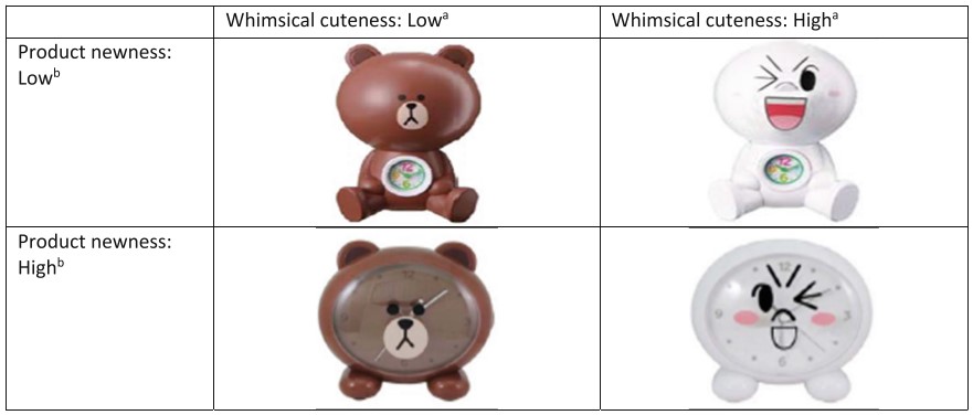
At the Portobello Road market in London, bins are installed for those who want to throw gums and cigarette butts. For an unidentified reason, these bins have baby faces. As research suggests that large, round eyes, high eyebrows, and a small chin yielded the perception of a babyish facial appearance.

Since baby face or Kindchenschema (baby schema) is “related to the vulnerable nature of a living entity, it elicits responses from adults that increase the infant’s chance of survival. These include increased attention to and protection of the helpless infant (Brosch, Sandder, and Scherer 2007; Lorenz 1943) and increased carefulness and caretaking behavior (Sherman, Haidt, and Coan 2009). (Nenkov et al. 2014, pg. 326)”

Nenkov, G. Y., & Scott, M. L. (2014). “So Cute I Could Eat It Up”: Priming Effects of Cute Products on Indulgent Consumption. Journal of Consumer Research, 41(2), 326–341.

Although adding a human face to the tip jar backfires, having a baby face even contributes to the success of high-ranking Black executives. Designing cigarette bins like cute babies must be effective to collect cigarette butts. I wish similar bins are installed in other markets and cities as well to stop cigarette butt litter.

Livingston, R. W., & Pearce, N. A. (2009). The teddy-bear effect: Does having a baby face benefit black chief executive officers?. Psychological science20(10), 1229-1236.

Prior research suggests that having a baby face is negatively correlated with success among White males in high positions of leadership. However, we explored the positive role of such “babyfaceness” in the success of high-ranking Black executives. Two studies revealed that Black chief executive officers (CEOs) were significantly more baby-faced than White CEOs. Black CEOs were also judged as being warmer than White CEOs, even though ordinary Blacks were rated categorically as being less warm than ordinary Whites. In addition, baby-faced Black CEOs tended to lead more prestigious corporations and earned higher salaries than mature-faced Black CEOs; these patterns did not emerge for White CEOs. Taken together, these findings suggest that babyfaceness is a disarming mechanism that facilitates the success of Black leaders by attenuating stereotypical perceptions that Blacks are threatening. Theoretical and practical implications for research on race, gender, and leadership are discussed.

How many items should be displayed in a store?

When we are curious about value of an unknown object, we often consider how many people surround it. If it is alone, we believe it is expensive. If it is surrounded by many others, we believe it is cheap. This is because, according to O’Guinn’s et al. (2015), as the social density of a given space increases, “inference of the subjective social class and income of people in that space” fall. Although we like different degrees of crowdedness (D&Department in Tokyo) and even view the same degree of crowdedness differently (Kronen Vanlose in Copenhagen), crowdedness decreases the value of a product.

O’Guinn, T. C., Tanner, R. J., & Maeng, A. (2015). Turning to space: Social density, social class, and the value of things in stores. Journal of Consumer Research, 42(2), 196-213.

This article is about social space and material objects for sale within that space. We draw primarily on Goffman’s (1971) concepts of use space and possession territories to predict that as the social density of a given space increases, inferences of the subjective social class and income of people in that space fall. Eight studies confirm that this is indeed the case, with the result holding even for stick figures, thus controlling for typical visual indicators of social class such as clothing or jewelry. Furthermore, these social class inferences mediate a relationship between social density and product valuation, with individuals assessing both higher prices and a greater willingness to pay for products presented in less crowded contexts. This effect of inferred class on product valuation is explained by status-motivated individuals’ desire to associate with higher-status people. To the best of our knowledge, this research is the first to reveal the link between social density, status inferences, and object valuations. As such, it makes a novel contribution to what has come to be known in sociology as the topological turn: a renewed focus on social space.

Then, could we apply the same logic to stores where products are surrounded by other products? In other words, does “product crowdedness” decrease product value as well? This is an important question as stores display items in different ways.

Some stores display various items with a lot of stocks. For instance, at Annam Gourmet, Ho Chi Minh, only a few cans of sea food are on the shelf space with multiple stocks.

Other stores display only few items with few stocks. For instance, Decium, a Canadian cosmetic company introduces a few items without showing their stocks.  

Two contrasting examples show that stocks determine the perceived value of products. Designers and marketers should decrease the number of products displayed in the store to increase their perceived value. There is a 8-minute video about an inside look at Decium to see how the company has managed to find success in the highly competitive, the multi-billion-dollar world of skin care.

Is Iron Man banned in Denmark?

There is a Ninjago World at the Legoland in Denmark. In front of a flying dragon brick, I met an unfamiliar sign.


At first, I questioned why Lego hates Marvel so that pushing hand out like Iron Man was banned. Very soon, I realized it means “do not touch.” Later, I found the same sign at a construction site in downtown. It says “No entry for unauthorized people (Adgang forbudt for uvedkommende).”


Are these dynamic signs more effective than static ones? According to marketing research, people pay more attention to road signs when they are dynamic. We may need more “Iron Men” signs on the road.

Cian, L., Krishna, A., & Elder, R. S. (2015). A Sign of Things to Come: Behavioral Change through Dynamic Iconography. Journal of Consumer Research, 41(6), 1426–1446.

We propose that features of static visuals can lead to perceived movement (via dynamic imagery) and prepare the observer for action. We operationalize our research within the context of warning sign icons and show how subtle differences in iconography can affect human behavioral response. Across five studies incorporating multiple methodologies and technologies (click-data heat maps, driving simulations, surveys, reaction time, and eye tracking), we show that warning sign icons that evoke more (vs. less) perceived movement lead to a quicker propensity to act because they suggest greater risk to oneself or others and increase attentional vigilance. Icons used in our studies include children crossing signs near schools, wet floor signs in store settings, and shopping cart crossings near malls. Our findings highlight the importance of incorporating dynamic elements into icon design to promote imagery and thereby elicit desired and responsible consumer behavior.


How crowded is crowded?

Copenhagen differs from Seoul. In Copenhagen, I have ample opportunities to feel emptiness. When I go to a shopping mall (Kronen Vanlose) at 5PM on a weekday, it is literally vacant. Only few are spotted.


In Seoul, people constantly bump into people on street. By default, I feel crowdedness. When I go to Costco Wholesale at 8PM on any weekday, I should stand in line more than 10 minutes to meet cashiers.


Feeling emptiness or feeling crowdedness affects us. According to marketing research, social density shapes how we value products in a space. I find this research interesting and insightful, but it does not say much about how (objectively) crowded is (subjectively) crowded. While Koreans find a store or mall empty, Danes may find the same space crowded.


This article is about social space and material objects for sale within that space. We draw primarily on Goffman’s (1971) concepts of use space and possession territories to predict that as the social density of a given space increases, inferences of the subjective social class and income of people in that space fall. Eight studies confirm that this is indeed the case, with the result holding even for stick figures, thus controlling for typical visual indicators of social class such as clothing or jewelry. Furthermore, these social class inferences mediate a relationship between social density and product valuation, with individuals assessing both higher prices and a greater willingness to pay for products presented in less crowded contexts. This effect of inferred class on product valuation is explained by status-motivated individuals’ desire to associate with higher-status people. To the best of our knowledge, this research is the first to reveal the link between social density, status inferences, and object valuations. As such, it makes a novel contribution to what has come to be known in sociology as the topological turn: a renewed focus on social space.


People tip less when the tip jar looks like a human

Henckell is my favorite cafe in Frederiksberg, Copenhagen. It is a local place with great coffee and sandwich. I feel cozy inside. It has only four small tables.

There is a tip jar next to the credit card machine on the counter table. Interestingly, it has a smiley face, two arms, and two legs. One day out of curiosity, I kept watching how many guests tipped in this human-looking tip jar. Afterwards, I also asked a server whether guests liked it. Surprisingly, I noticed that a few guests hesitated putting coins into this jar for an unknown reason. The server even told me that not few guests complained about the tip jar because its mouth is too small to insert coins.

When human flavor is added to an object, people like the object. It is supported by academic studies about anthropomorphism. For instance, when a car is anthropomorphized and its characteristics are congruent with the proposed human schema, people evaluate it positively (Aggarwal and McGill 2007). When a garbage bin is anthropomorphized (e.g., “feed me”), people follow the message and show prosocial behaviors (Ahn, Kim, Aggarwal 2013). When an innovative, uncertain product is anthropomorphized (e.g., “this little guy”), people tend to adopt this product (Jiang, Hoegg, and Dahl 2011).

However, anthropomorphism might backfire if the usefulness of the product is sacrificed. When I come back to this cafe, I want to draw a different character with a bigger mouth and see what happens.

***

Reference

Ahn, H. K., Kim, H. J., & Aggarwal, P. (2014). Helping Fellow Beings: Anthropomorphized Social Causes and the Role of Anticipatory Guilt. Psychological Science, 25(1), 224–229.

People are often reluctant to comply with social causes because doing so may involve personal sacrifices of time, money, and effort for benefits that are shared by other members of society. In an effort to increase compliance, government agencies and public institutions sometimes employ financial tools to promote social causes. However, employing financial tools to induce prosocial behavior is expensive and often ineffective. We propose that anthropomorphizing a social cause is a practical and inexpensive tool for increasing compliance with it. Across three prosocial contexts, we found that individuals exposed to a message from an anthropomorphized social cause, compared with individuals exposed to a message relating to a nonanthropomorphized social cause, were more willing to comply with the message. This effect was mediated by feelings of anticipatory guilt experienced when they considered the likely consequences of not complying with the cause. The theoretical and practical implications of these findings are discussed.

In this study, we adopted a food-waste composting campaign. A total of 104 undergraduates (54% female and 46% male; mean age = 19.8 years) participated in return for course credit. Participants in the anthropomorphism condition were exposed to a campaign poster showing a garbage bin with humanlike features of eyes, a nose, and a mouth alongside the caption, “Please feed me food waste only!” Participants in the nonanthropomorphism condition were shown a campaign poster in which the garbage bin lacked humanlike features and was accompanied by the caption, “Please put food waste in only!”. Participants completed a measure of expected compliance with the campaign (α = .89) using response scales from 1 (very unlikely) to 9 (very likely). In addition, we employed a 4-item measure of anticipatory guilt adapted from Cotte, Coulter, and Moore (2005). The four items assessed the degree of guilt, shame, responsibility, and accountability, respectively, that participants would feel if they did not comply with the campaign and were administered with 9-point scales (α = .89).

As expected, we found increased compliance in the anthropomorphism condition (M = 6.99, SD = 1.62) compared with the nonanthropomorphism condition (M = 6.24, SD = 1.80), β = 0.22, SE = 0.34, p < .05. Moreover, anticipatory guilt was higher in the anthropomorphism condition (M = 5.16, SD = 1.39) compared with the nonanthropomorphism condition (M = 4.49, SD = 1.64), β = 0.22, SE = 0.30, p < .05, which in turn resulted in an increased level of compliance, β = 0.45, SE = 0.10, p < .001. When we controlled for anticipatory guilt, the direct effect of anthropomorphism on compliance was no longer significant, β = 0.12, SE = 0.32, p = .17, Sobel z = 2.04, p < .05, which suggests that anticipatory guilt mediated the effect of anthropomorphism on compliance. 

Green package design: Boxed water stands out from the crowd

Many people are now buying water in bottles rather than drink straight from the tap because bottled water has been perceived to be safer and of higher quality than tap water, and it was viewed as a healthful alternative beverage to soft drinks or alcohol. Although purity marketing successfully increases sales of bottled water, it failed to address that plastic water bottles waste our environment.


DML_Boxed water is better(1)


One company takes a bold and interesting step forward. Water is in paper boxes and its brand name is “Boxed Water Is Better.” The package says boxes are better than plastic bottles for several reasons.

  • 76% of our box is composed of a renewable resource.
  • Our boxes are made of trees from well-managed, FSC certified forests.
  • We efficiently ship our boxes flat to our filler to lower our carbon foot print.
  • Our boxes are recyclable at participating facilities.


DML_Boxed water is better(2)

Do-It-Yourself chocolate kit for Valentine’s day

DML_Valentine's day @ Fukuoka (2)

Valentines’ day is one of the most “commercially successful” holidays in Asian countries such as Japan and Korea. According to Wikipedia, this holiday was first introduced in Japan in 1936 when a company ran an advertisement aimed at foreigners.

Later in 1953, it began promoting the giving of heart-shaped chocolates; other Japanese confectionery companies followed suit thereafter. In 1958, the Isetan department store ran a “Valentine sale”. Further campaigns during the 1960s popularized the custom. The custom that only women give chocolates to men may have originated from the translation error of a chocolate-company executive during the initial campaigns. In particular, office ladies give chocolate to their co-workers. Unlike western countries, gifts such as greeting cards, candies, flowers, or dinner dates are uncommon, and most of the activity about the gifts is about giving the right amount of chocolate to each person. Japanese chocolate companies make half their annual sales during this time of the year.

Nowadays, many students around me complain expensive, poor-quality chocolates. However, some want to take this opportunity to express their feelings to others and make their own chocolates. Certainly, very few succeed in creating “the only” chocolate for their friends, colleagues, or significant others.

Recently, I met a clever solution at a Japanese department store: a do-it-yourself kit for chocolate. This is probably the best solution for those who do not want to waste money on buying ready-made chocolates but want to voluntarily invest an adequate amount of effort to create only one.

In one of my favorite research paper titled as “Why Consumers Enjoy Constrained Creative Experiences,” Darren Dahl and Page Moreau nicely articulated why DIY kits work.

DML_Valentine's day @ Fukuoka (1)

We used a combination of qualitative research and CET to understand why consumers participate in creative activities and the conditions under which they enjoy these experiences… Respondents consistently noted a motivation for personal accomplishment, which was achieved by satisfying the needs of both autonomy and competence… Importantly, this study also provides insight into the influence of external constraints (e.g., target outcomes, instructions) on consumers’ creative experiences. Indeed, the pros and cons of these creative products (e.g., kits, models, patterns, recipes) highlight the tension between consumers’ desire for instructional guidance and their need for individualism. Hobbyists value the feeling of competence that creative products provide, and they create their own strategies to overcome the constraints that such products impose on both the creative process and the outcome. (Dahl and Moreau 2007, pg. 367)

Who knows? We may see a lot of chocolate-only chefs in the near future who do not follow given instructions but use their own ingredients to develop new chocolates!

***

Reference

Dahl, D. W., & Moreau, C. P. (2007). Thinking inside the box: Why consumers enjoy constrained creative experiences. Journal of Marketing Research, 44(3), 357–369.

From cooking kits to home improvement shows, consumers are increasingly seeking out products that are designed to help them be creative. In this research, the authors examine why consumers participate in creative activities and under what conditions these experiences are the most enjoyable. A qualitative study explores the diverse motivations for undertaking creative tasks and identifies the role of constraints in such endeavors. Then, the authors conduct two experimental studies to understand the importance of constraints (e.g., instructional guidance, target outcomes) in facilitating a balance between perceived competence and autonomy for consumers involved in a creative task. When consumers engage in creative activities with a sense of both autonomy and competence, they enjoy the experience more. The authors discuss implications for managers and provide opportunities for further research.