Tag Archives: Techno design

When less fails: The cost of removing diagnostic design elements

At the recent O’Malley School of Business (OMSB) Seminar at Manhattan University, I shared our research on minimalist design. This collaborative work with Yooncheol Shin, then a graduate student at the Techno Design Graduate School at Kookmin University and now a UX researcher at the Customer Experience Center at Woori Bank, explores when simplicity enhances consumer preference, and when it backfires.

We conducted one lab experiment and one field experiment to test a key idea: not all design elements contribute equally to how consumers form their preferences.

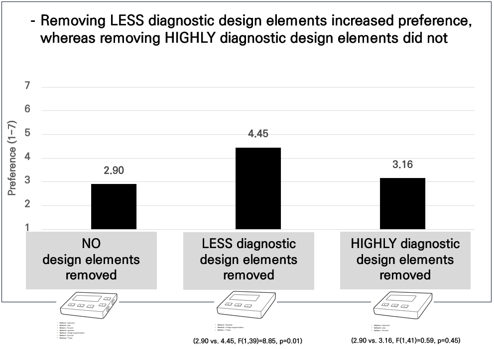
We found that removing LESS diagnostic design elements (e.g., buttons for play, forward, or backward songs) from an MP3 player increased participants’ preference. However, removing HIGHLY diagnostic design elements (e.g., buttons for equalizer, foreign song translation, or T-base) did not produce the same effect.

Our findings challenge the widely accepted “less is more” mantra. By connecting design practice and marketing theory, we offer practical insights for UX designers and brand managers who want to simplify without losing impact.

***

Reference

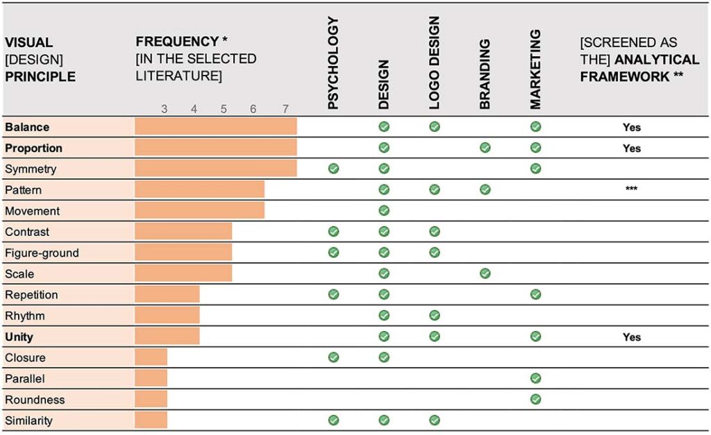
Pieters, R., Wedel, M., & Batra, R. (2010). The stopping power of advertising: Measures and effects of visual complexity. Journal of Marketing, 74(5), 48–60.

Advertising needs to capture consumers’ attention in likable ways, and the visual complexity of advertising plays a central role in this regard. Yet ideas about visual complexity effects conflict, and objective measures of complexity are rare. The authors distinguish two types of visual complexity, differentiate them from the difficulty of comprehending advertising, and propose objective measures for each. Advertisements are visually complex when they contain dense perceptual features (“feature complexity”) and/or when they have an elaborate creative design (“design complexity”). An analysis of 249 advertisements that were tested with eye-tracking shows that, as the authors hypothesize, feature complexity hurts attention to the brand and attitude toward the ad, whereas design complexity helps attention to both the pictorial and the advertisement as a whole, its comprehensibility, and attitude toward the ad. This is important because design complexity is under direct control of the advertiser. The proposed measures can be readily adopted to assess the visual complexity of advertising, and the findings can be used to improve the stopping power of advertisements.

When AI tries to be a logo designer… and fails

In our newly published paper in Visual Communication, Renato Bertao, MyeongHeum Yeoun, and I explored how well AI powered logo makers actually perform. We tested several popular tools and asked design experts to evaluate the results. Many of the logos they produced lacked essential design principles such as proportion, balance, and unity. AI can generate logos quickly, but when it comes to well crafted design, it still falls short.

***

Reference

Bertao, R. A., Yeoun, M., and Joo, J. (2025), A blind spot in AI-powered logo makers: visual design principles, Visual Communication, 24 (1), 222-250.

Abstract

Artificial intelligence is already embedded in several digital tools used across design disciplines. Although it offers advantages in automating and facilitating design tasks, this technology has constraints to empowering practitioners. AI systems steadily incorporate machine learning to deliver meaningful designs but fail in critical dimensions such as creativity. Moreover, the intensive use of AI features to provide a design solution – so-called AI design – challenges the boundaries of the design field and designers’ roles. AI-powered logo makers exemplify a horizon where non-designers can access design tools to create a personal or business visual identity. However, in the current context, these online businesses are limited to randomize layout solutions lacking the visual properties a logo requires. This article reports mixed-method research focusing on AI-powered logo makers’ processes and outcomes. We investigated their capability to deliver consistent logo designs and to what extent their algorithms address logo design principles. Initially, our study identified representative visual principles in logo design-related literature. After probing AI-powered logo makers’ features that enable logo creation, we conducted an exploratory experiment to obtain solutions. Finally, we invited logo design experts to evaluate whether three visual principles (proportion, balance and unity) were incorporated into the layouts. The assessment’s results suggest that these AI design tools must calibrate the algorithms to provide solutions that meet expected logo design standards. Even focusing on a particular AI tool and a few visual principles, our research contributes to initial directions for developing algorithms that embody the complex aspects of visual design syntax.

Keywords

AI-powered logo maker, logo design, visual design principles, AI design, artificial intelligence