Since we spend most of our time in buildings, we are literally surrounded by fire extinguishers. It consists of a hand-held cylindrical pressure vessel containing an agent which can be discharged to extinguish a fire (Wikipedia). In general, we do not pay attention to them until needed. For me, I have never used any fire extinguisher in my life and have no interest in it. Interestingly, designers have noticed their problems and came up with two fairly different but equally interesting solutions.
Typical fire extinguishers have two critical problems. First, they are often ignored and difficult to be located. Even though they are red colored, fire extinguishers merely stand still and fail to grab our attention. Further, they do not go well with walls or interiors.
Recently, I found a series of eye-catching fire extinguishers at a store. In order to solve the first problem, some designers changed the appearance of the fire extinguishers. They painted skins to make them visually appealing and to make them go well with the walls. Some of the newly painted fire extinguishers look so nice that I even wanted to buy them for home decor.

The second problem is that typical fire extinguishers are difficult to use in emergency situations. Therefore, instruction manuals are prepared. A practice session runs for those who want to try to use them in advance.
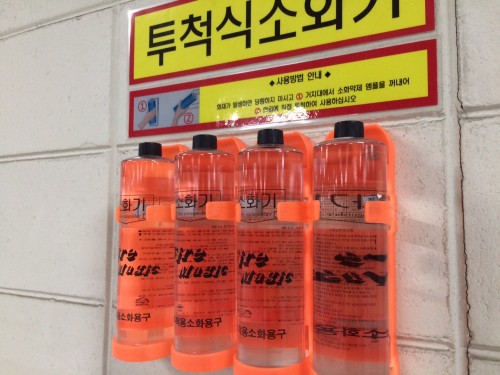
Recently, I found another, newly designed fire extinguishers in a building. Designers changed the size and the container material so that the shape “says” how to use. Now, we do not have to spend time on learning how to use them; instead, we can simply pick up one or a few water-bottle shaped fire extinguishers and throw them on a fire.
These two fire extinguishers teach me what designers do for us. Designers change the appearance of a product; alternatively, they change the way we use it.