Tag Archives: Advertisement

Commercial Renewal Project: Apple AirPods (2019): “Share your magic”

“Stroll” as the commercial’s name might hint, portrays an Airpods user aloof in his own music, strolling along the street with rhythmic movements. This particular ad’s visual style is captured in a beautiful manner that gives off the impression of a film like quality.

Although it may seem questionable to as why we chose this specific commercial, but underneath all the fancy visual style it displays, we realized that it lacks two major aspects. One that it didn’t give full sight on the main product, the Airpods, and second that in the ad itself it failed to persuade the viewers to the purchasing level.

Throughout most of the commercial, even though it uses a colorless scheme to emphasize the white earphones, the attention of the viewers is quickly taken away due to the dancing and ironically more on the white shoes of the Airpods user. Hence confusing the viewers on what the main item is for the ad. Also along with the confusion, it lacks the persuasion for the consumer to the point where they actually buy the product. It is so by not elaborating on the ‘wireless’ aspect (the innovative part of the product) and not making it relevant for the consumer to identify the product within their lives.

Taking account these factors we focused the objective of increasing market share by using a more effective strategy and tactic through our commercial. Since this is a relatively new industry, in order to increase the market share of this sector we concluded that taking a hold of the regular earphone users and having them flow into Airpods’ market share would be the best strategy. To do so we focused our tactic on persuading the regular earphone users by demonstrating how the wireless feature of this product is relevant for them to have an ease when doing things in their everyday lives. 
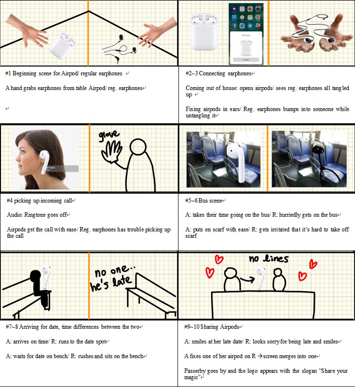
We focused on showing a slice of life aspect in our commercial through the demonstration of using the product. This is to persuade the viewers that this product is truly something that they need up front and first hand. We did so by using down to earth situations and show them that they could be applied to them as well. Also by using a split screen throughout the commercial we wanted to show a direct comparison of using Airpods and not. We thought that this would be a good way to straightly point out the differences of these two.

As for the slogan, we pondered about what would grasp the essence of what we know as Apple which is simple but has a significant meaning. So coming from the original slogan “Practically Magic” that sparked our inspiration, we came up with the slogan “Share your magic”. We thought that the whole wireless experience is somewhat of a magic that fits in with the last scene of our film and it implies to our viewers to share on this experience as well.

Written by Hyunkyung Kim, Jina Shim, Jieun Kwon, Hohyun Shin, and Seungbin Baek | Marketing Communication 2019 Fall | College of Business Administration, Kookmin University


There are behind-the-scenes of the renewed commercial.

Commercial Renewal Project: Heinz Ketchup (2019): “To me, Heinz makes everything perfect”

Heinz Ketchup released a new commercial in June 2019, staring British sing-a-song writer star Edward Sheeran. Heinz Ketchup explains on their YouTube clip that he came up to them with his personal experience based on his infamous love for ketchup, so the company decided to make an ad based on his story. The ad starts by showing Ed Sheeran being the main protagonist in the clip and the narrator, explaining that he had an idea for an Heinz Ketchup commercial based on his experience when he visited a ‘super posh restaurant’, where there were fancy forks, tables and classic music playing on. The waiter serves him ‘posh vegetables’ with ‘fancy sauce’. When he is served his food, he monologues that everything seems fine, but states that he feels something is missing. He then reaches towards his bag and pulls out the thing that will complete his meal, ketchup. After that moment, everybody in the restaurant starts putting on a shocked face due to his decision. And then, every time Sheeran knocks his ketchup bottle, the screen captures all kinds of shocked and disgusted reactions from the waiter and guests at the restaurant. The ad ends as Ed Sheeran satisfactorily starts cutting his meal, which is now sprayed with ketchup.

  • Our thoughts and what we wanted to change

After watching this ad, our team did not like the way how ketchup was portrayed. Sure, nobody thinks of ketchup as a ‘posh’ adding, but we did not think it was wise to portray ketchup as a dressing that is rejected from the rich. Also, most of our team did not know who Ed Sheeran was, or about his infamous love for ketchup. And the most decisive reason to why we wanted to change this ad was for ketchup to be portrayed as a sauce that was enjoyed by only a particular social class.

  • How we portrayed our commercial

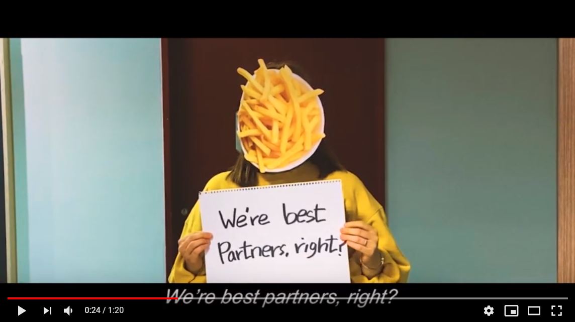
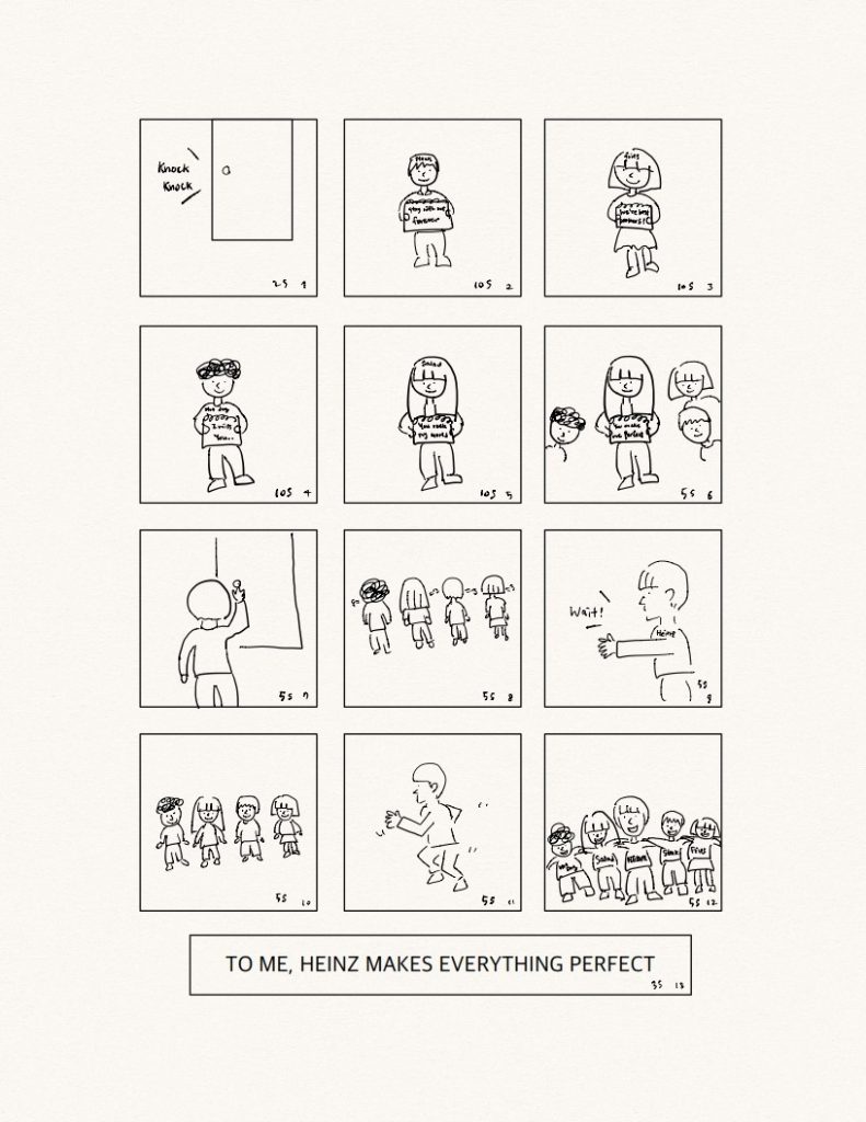
We wanted to show that ketchup can be enjoyed in all kinds of different food. There were many suggestions in how to portray that, like an interview with various people or showing popping food shaped paper every time ketchup was added. Our main mission was to show the audience a clear message that ketchup can go with all kinds of food, in a fun, attractive and effective way. During one of our conferences, somebody got up with an idea based on the movie “Love Actually”, where there is a scene in which a man confesses his feelings to a woman by using a sketchbook. So, we decided to imitate the scene and give our message through sketchbooks. Our ad would be about all different types of foods confessing their love toward ketchup. We chose rich steak, healthy salad, obvious French fries and befitting hotdog as foods that will well represent various backgrounds to prove ketchup is enjoyed by everybody.

In the beginning of our ad, Heinz ketchup receives a visit from 4 types of foods. They all show through their sketchbooks that they believe ketchup completes them and try to cheer Heinz up. But Heinz hesitates and was not sure what to do and turns the visitors down. However, after a moment of thought, Heinz opens the door again, rushes toward the foods, and finally they are happily reunited. Through this commercial, we wanted to show that ketchup can be enjoyed on all kinds of food regardless of social class.

Written by Sunkyung Kim, Song Sunwoo, Doeun Kim, Dahae Park, and Hongkuk Lee | Marketing Communication 2019 Fall | College of Business Administration, Kookmin University
Commercial Renewal Project: Samsung Galaxy Gear (2019): “Gear is here. Gear easier”

In the original advertisement, Samsung showed the features of the Galaxy Gear through the sequences that could happen in a ski resort. Rather than clearly explaining the features of the product, however, it made the Galaxy Gear an unlikeable product. We found 4 reasons why the original commercial has problems.

First, it shows the person who does not wear the gear as fool. Although such description was to show how a person with a Gear looks smart, it is not persuasive since the person without the Gear acting clumsy does not seem to be the problem of having the Gear or not. It looks like he is just a person who often makes mistakes.

Secondly, it shows a man trying to pick up a woman using the Gear. However, this may make audience feel that the Gear is just a tool to give a good impression to the opposite gender rather than something that could be useful in everyday life. In addition, the original advertisement was criticized by LA Times and Independent UK due to advertisement’s focus on two males trying to show off to the female.

Thirdly, its background is limited to the resort. Thus, the situations of the Gear being used is also limited making consumers to perceive the product as a gadget that could be useful only in certain circumstances.

Finally, the situations shown in the commercial are not natural. He used the Gear merely to highlight the product rather than because he needed it. Thus, some viewers may think “Did he really have to use it?” or “He could have used his phones. Why did he need Gear?” Without a doubt, such awkwardness and unrealistic usage is harmful for persuading consumers and making them to think they need or want the product.

Due to the four reasons above, people may not recognize the needs of the product. Furthermore, the features of Gear are not used for his or her own purpose but used to show off that he or she is an early adopter.

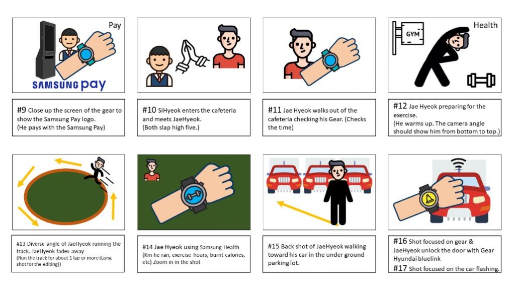
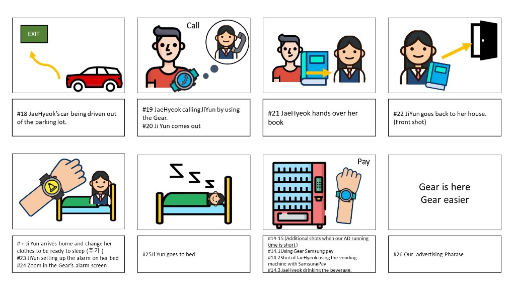
In order to tell that Gear gives convenience to users, we focus on showing the features in daily life instead of showing how others act when Gear is shown to someone else. To elaborate, the scenes and situations shown in the commercial are everyday activities such as making phone calls, waking up in the morning, and checking schedules, to name a few. Furthermore, since our main target consumers are 20s to 30s we focus on the situations that target consumers often face such as taking lectures, using kiosk machines, and working out. By doing so, we believe that it will be more persuasive to the consumers and make them think they can also enjoy the convenience of having Galaxy Gear in daily life by purchasing it. In other words, unlike the original commercial, the audience may see themselves through the characters of the advertisement because the characters are doing what they do in daily life in a place that is similar to the places where they spend most of their time.

Moreover, our target consumers are 20s to 30s who are smart shoppers. They don’t usually spend their money to simply boast unless it is extremely luxurious product. They check every information of the product and think if they really need it or what they would get if they buy one. Thus, we showed that it’ll make their life easier if they have one instead of just showing how you may look cool if you are wearing one and portraying someone who don’t have the product to look like as if he or she is clumsy.

Because of the reasons above, we also changed the slogan ‘Are you Geared up?’ to ‘Gear is here. Gear easier’. We believe that the changed slogan will give the impression to ad viewers that it is new type of electronics that is a gadget they can buy since it is affordable by saying ‘Gear is here’. Also, ‘Gear easier’ brings feeling of that it is easy to use and it will make their life more convenient. Plus, the pronunciation of ‘Is here’ and ‘Easier’ is similar which gives a rhyme to the slogan and makes the slogan more memorable.

It is more of pull strategy that we used. The new advertisement makes consumers want the product and think about how they would look or how they can make use out it by their own way while the original advertisement uses push strategy by implanting ideas that they will look smart and will be popular if they wear the Gear. In conclusion, we focused on features of Galaxy Gear that actually can be often used. Also, our team put a lot of effort to show the convenience of the features itself instead of describing the features as a tool of showing off to impress others. Hence, the new advertisement will be more persuasive and attractive to our main target consumers and generate the desire of owning Galaxy Gear.

Written by Sihyuk Lee, Jiyoon Heo, Hyemi Kim, Kyuyeop Shim, and Jaehyuk Yoo| Marketing Communication 2019 Fall | College of Business Administration, Kookmin University
Commercial Renewal Project: FedEx (2019): “FedEx Tape”

In the original FedEx commercial (2019), a man walking in the woods tastes sap flowing from a maple tree and decides to make and sell syrup. The process of making syrup comes out and delivers the final product through FedEx each time. At first, it started in a shabby warehouse but at the end, he packed maple syrup in a clean factory. This commercial ends with the phrase Opportunity.

https://www.youtube.com/watch?v=YOhyQs2VXmc

The purpose of this advertisement is to show that FedEx offers opportunities to small business in the production and supply process. With FedEx, individual business owners can sell their products without much difficulty. However, this commercial has two weaknesses.

1. FedEx is not highlighted – Throughout the ad, FedEx’s logo only appears four times. Also, the logo is inconspicuous except for the FedEx truck, which is used as an indirect component when loading luggage. As a result, when people first saw the advertisement, they said they thought it was a maple syrup ad.

2. FedEx is not different – The original commercial does not reveal much of the purpose of advertising. Delivering the product is a service that other carriers also offer. Therefore, FedEx does not deliver any special opportunities or value to small businesses or individual businesses that start their own businesses. The message “FedEx offers opportunities for small and medium-sized companies” is not convincing because people do not have to use FedEx unless its delivery services are differentiated from other companies.

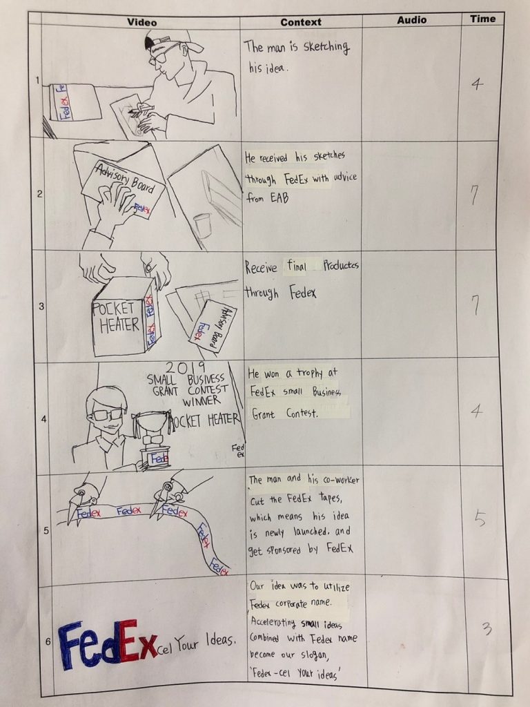
Therefore, we renewed commercial. Storyboard was used.

1. We repeat and emphasize the FedEx logo – Unlike previous advertisements, FedEx’s logo appeared 9 times and highlighted tapes or boxes containing FedEx’s logo during design or product delivery. It also emphasized that this is FedEx’s advertising by minimizing attention to products being developed through indirect placement.

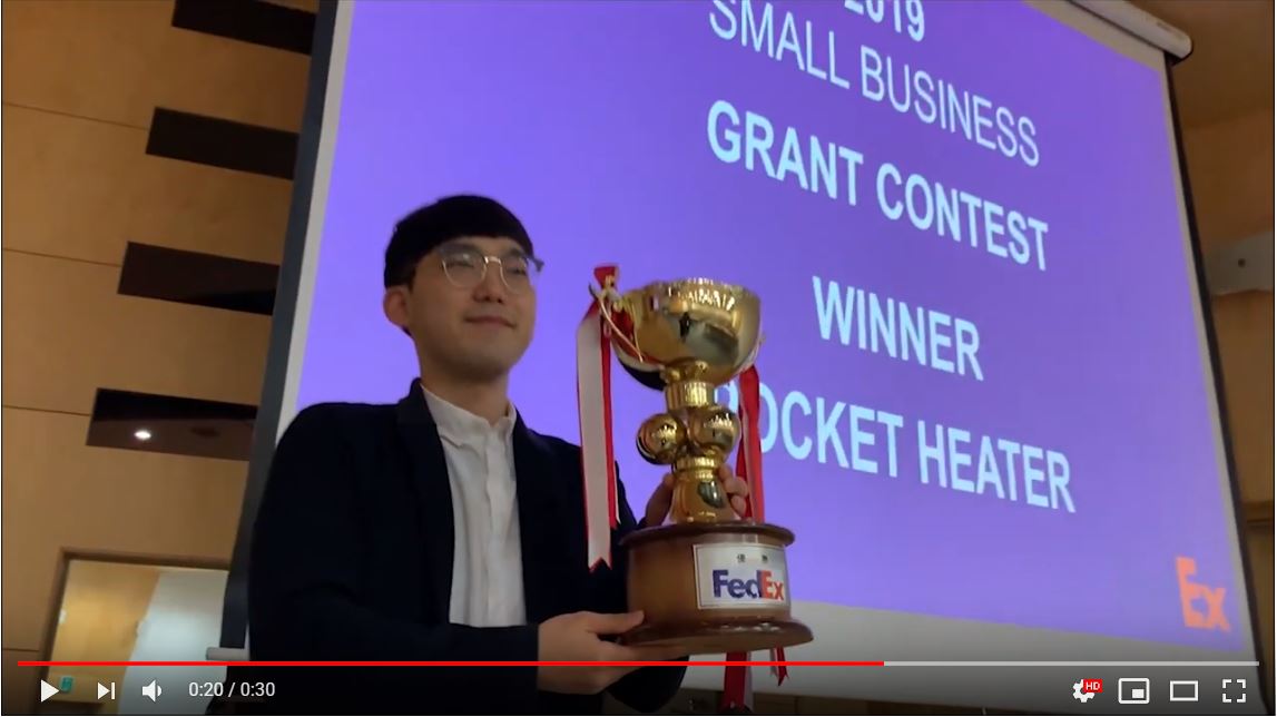
2. We present the FedEx’s Small Medium Enterprise support policy through the props – FedEx carries out various support policies, such as the Entrepreneur Advisory Board (EAB) or FedEx Small Business Grant Winner (FSBGW), to support the business activities of small and medium businesses or individual businesses. The new ads indicated that FedEx provides various support policies showing by placing letters from EAB or trophies from FSBGW. By supporting the process of ideas becoming products, FedEx has shown that it is not limited to delivery services, but offers differentiated opportunities compare to other companies.

3. We give meanings to the objects in the commercial – Each delivery starts and ends with the ‘FedEx tape’.  Through the commercial, small idea which was just a sketch, becomes the product that everyone pays attention to. Tape represents a linear delivery process through which small ideas are connected to success. Ordinary tape, which sealed the envelope that contained the initial small idea of man, later becomes the tape that is used for cutting ceremony, celebrating the success of the idea. Tape cutting ceremony means success and the bright future of entrepreneurs. FedEx tape represents the secure delivery and help from FedEx, which is the key of the success.

Written by Seungwon Lee, Jinkwan Lee, Minjung Kim, Minkyung Song, Joonyeol Hwang, and Jungyeup Kim| Marketing Communication 2019 Fall | College of Business Administration, Kookmin University
Commercial renewal project: Canada Goose Light Weight Down Jacket 2018

People are afraid of cold winter. The Canadian Outdoors brand, Canada Goose, was born in 1957 for the Canadian Arctic Guards, researchers and explorers of the scientific institutes of the polar regions, and those working in the extreme weather conditions. This brand became popular under the slogan of freeing people from the cold. The current ad about the Canada Goose Light Weight Down Jacket emphasizes its core feature with the phrase of “Where warm can take you” as well as its light weight. In sum, the ad emphasizes that the jacket is warm and light.

The current ad with the magnificent nature of Canada’s Avalon Peninsula conveys how warm the Canada Goose jackets are. However, will this add lead Korean customers to buy the jacket? Korea is quite cold in winter but not as cold as polar regions. Canada Goose Ad needs to prove why its jacket is valuable to Korean customers.

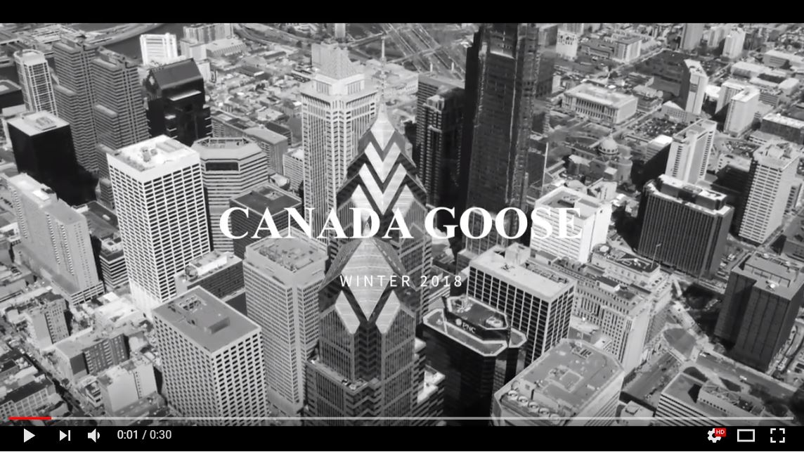
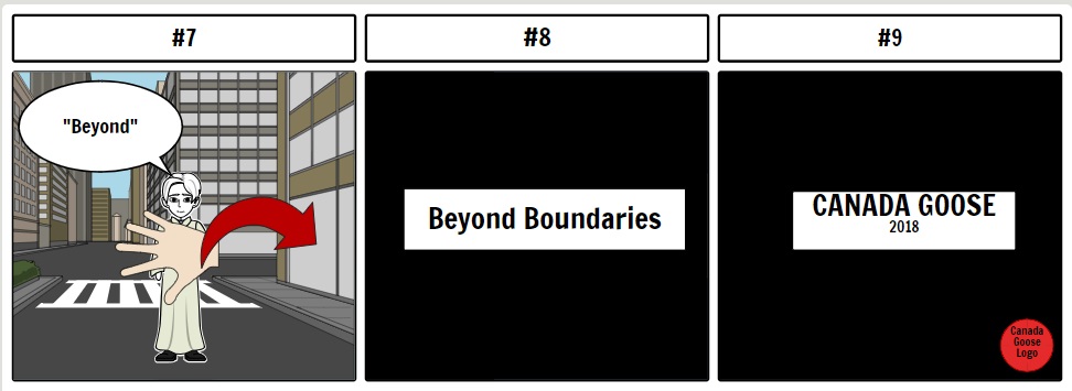
We have changed the background of the current advertisement from nature to city. The current advertisement is of interest to mountaineers but may not attract urban dwellers. While doing so, we tried not to dilute the unique brand image. We also newly generated a phrase, Beyond Boundaries, to break the existing frame and get close to Korean customers.

Written by Junhyuk Kwon, Baliworin Dastan, Jungtaek Lim, Jieun Lim, and Suna | Marketing Communication 2018 Fall | College of Business Administration, Kookmin University
Commercial renewal project: Uniqlo Ezy Ankle Pants

https://www.youtube.com/watch?v=vcbQ-uTVONA


Uniqlo represents SPA brands and its reasonable price attracts customers. Recently, it launched new pants called EZY ankle pants. Uniqlo promoted it on air but seemed to fail to attract attention compare to its other best selling products such as AIRISM and HEATTECT.

We decided to renew the commercial of the EZY ankle pants because the commercial highlighted color and fabric and demonstrated comfort through people dancing on the street. In our renewed commercial, we highlighted comfort, color, and fabric, all of which are competitive advantages. We filmed a person wearing EZY ankle pants and walking, running, doing exercise, and even attracting others.

Written by Yoonsu Kim, Hakyum Lee, Yoonsu Jang, and Chanhee Hong | Marketing Communication 2018 Fall | College of Business Administration, Kookmin University


Printed vs. Online newspaper: Humor

Washingtonpost_Website

Imagine that you are looking for tenants. Typically, you go to the websites of flea markets (e.g., Craiglist or Kijiji) or newspaper. You rarely pick up and open the classified section of the printed newspaper.

However, I recently met a funny ad in the classified section of the printed Washington Post and, thanks to it, enjoyed the newspaper a lot (see below). I enjoyed this ad because I did not expect to meet a humorous ad on the printed newspaper which is supposed to be serious. If I meet the same ad online, I might not laugh because online websites are not as serious as printed newspapers. Contrast works! 🙂

20130804_@ Williamsburg (7)

20130804_@ Williamsburg (8)

Different Ads, different people, same products

20130421_@ Museum (10)

I visited a special exhibition at the Seoul Museum of History and met an old day of Korean advertisement.

“Title: Seoul Nostalgia: A Retrospective Photographic Exhibition of Kim Hanyong

Having started as a news photographer in 1947 at ‘Gukje Bodo’ (International Report), Kim Han-yong is a renowned photographer who has devoted himself solely to photography throughout his life. His professional traces crossing genres such as news, art and advertisement can be translated into the records of Korea’s contemporary history. This exhibition consists broadly of the two themes: ‘Memories of City’ and ‘Portraits of the beauty’. ‘Memories of City’ displays the dynamic changes that Seoul and the people living in it have gone through since the 1950’s. ‘Portraits of the beauty’ presents some 70 advertising posters created by Kim, commonly referred to as an ‘advertising photography magnate’. He says that he has never forgotten photography for a moment in his life of 90 years. Thanks to this passionate artist, we can discover our own portraits of the days when we dreamed with hope despite difficult circumstances.”

20130421_@ Museum (5)

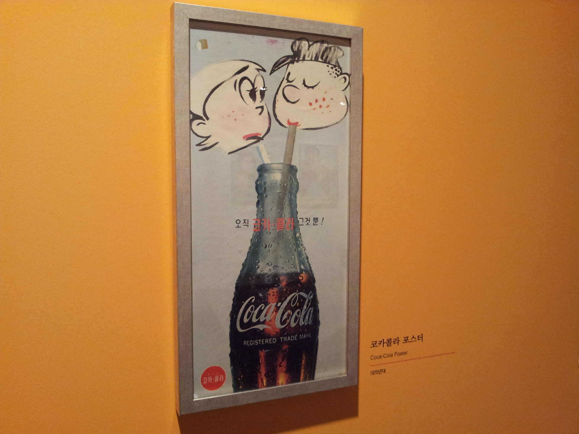
I had an interesting observation when I compared between the Coca-cola ad and Hyundai-Ford ad in the 1970s. About 40 years ago, Coca-cola was advertised WITH pencil-drawing consumers while the Hyundai-Ford car was advertised WITHOUT drivers. Since then, this trend has become opposite: Coca-cola is now showing Coke (or bear)  whereas Hyundai is now demonstrating how people drive vehicles.