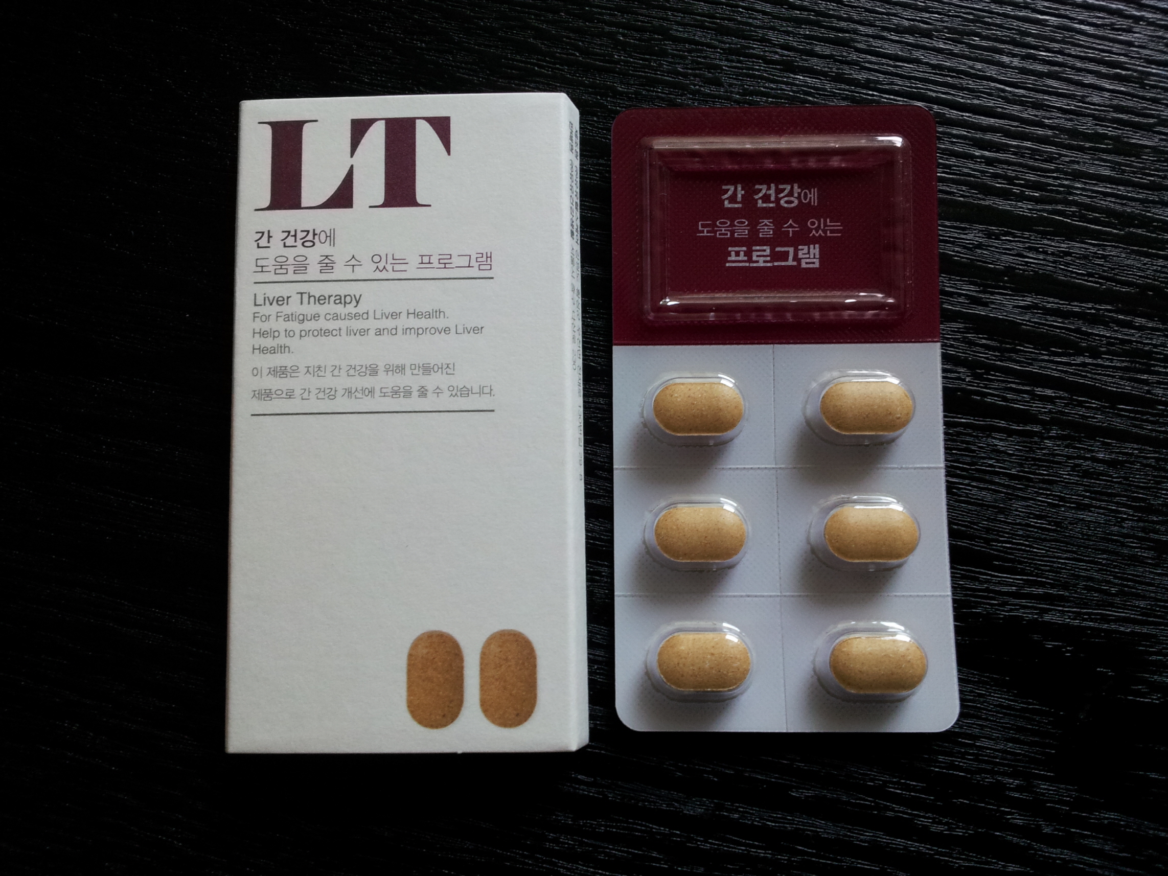
Recently, Yuyu changed the package of its health supplement. Its previous package provides information mostly in the front side and mostly in the verbal format, which makes it challenging for its sale representatives to communicate with potential buyers.
The new package embraces visual design and zoning. It now provides much information visually as well as provides different types of information in different spaces (front/back). First, it has a huge alphabetical name similar to chemistry acronym (LT = Liver Therapy) and provides detailed instruction in a visual format. Moreover, the overview/functional information about the health supplement (what it is for) is provided in the front side, whereas its more detailed/usage information (how to take it) is provided in the back side.


