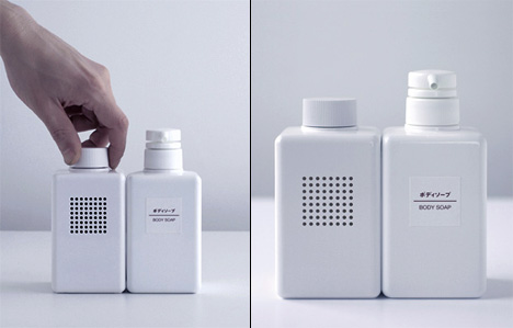
Many design awards have their own answers about what makes a product well designed; it must be original, it must be aesthetically appealing, and it must be useful. Similarly, marketing researchers have also studied that newness, beauty, and usefulness contributes to the evaluation of a product. However, whether product usage context or the outer space of a product affects whether a product is well designed has been little discussed.
I found a nice example which shows the impact of usage context on design. Designers from Industrial Facility, a UK design studio, developed a Bath Radio for Muji. It is a radio but looks like a set of shampoo and rinse. This example shows that consumers may consider a product well designed when its design matches its usage context.


To summarize the post, it says that consumers consider a product well-designed when the design matches the context of use. He uses the example of developing a bath radio as an example. I chose this post for my first class because it showed how context of use affects design through an example. Now that I’ve read it again, I’m able to elaborate on the context of use and see it from different perspectives. I can now say that the answer to the question of whether the context of use of a product, or the external space of a product, affects whether a product is well designed or not, is a definite yes.
Context for good design plays an important role in the design process. Context refers to factors including the environment in which the design exists, its purpose, and the user’s needs, and we’re going to talk about the contexts that need to be considered to make a design effective and meaningful.
A design that makes a product look like a set of items, such as a bath radio, makes it convenient for the user to use the radio while bathing. This design approach helps users to naturally embrace the product and integrate it into their daily activities. It improves the user experience and makes the product enjoyable to use. By using a radio in the bath, consumers can enjoy music or broadcasting while relaxing. By matching the design to the context of use, consumers can easily understand and use the product, which can improve its usability and satisfaction. You can also see that a design similar to a shampoo and rinse set has a clean and simple shape, making the product visually appealing and more appealing to consumers. Product design can make or break a product’s success and contribute to a better experience for the user.
The next position is that the design itself is more important than the context of use. It is argued that the product’s design is important, and how the consumer uses the product has a minimal impact. Design reflects the visual appeal and creativity of a product, and provides uniqueness and aesthetic satisfaction to consumers, so the design of a product should be the primary evaluation factor rather than the context of use. The universal design approach can also exclude or limit other consumers by changing the design based on the context of use. Universal design advocates that products should be suitable for a wide range of consumers, regardless of the context in which they are used or the external space in which they are placed. An example of this is a building with a ramp designed with wheelchair users in mind, so that it is accessible regardless of the context of use.
While the context of use can be an important factor in influencing design, the opposing view emphasizes the importance of the design itself, universal design, and the diversity of consumer needs. It’s important to approach design with these different perspectives in mind. Comparing the post I chose at the beginning of the semester to now, I was able to analyze the two views on context of use in a short post, which reminded me of a marketing technique. Through the class, I was able to look at various articles and cases and analyze and think about them in relation to marketing.