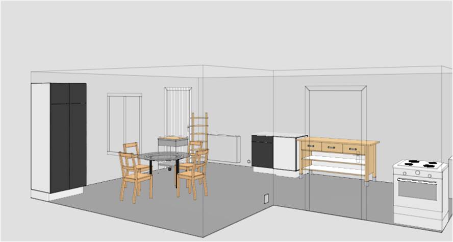
Consumers find it difficult to evaluate an object when it consists of many components. For instance, they cannot evaluate whether the designer’s interior with furniture, clock, wall, and window is good or bad.
In this case, according to decision research, consumers should break down an object into detailed components in order to evaluate it better. Doing so helps consumers identify how much each component contributes to the object. This suggests that, for instance, if consumers find the value of furniture, the value of clock and the value of wall to the whole interior, they can evaluate the interior as a whole. At this moment, LEARNING needs; If consumers are exposed to multiple interiors and each of which has its evaluation score and various interior components, consumers are able to LEARN how much each interior component contributes to each interior. In sum, breaking down a holistic object into components and learning the degree to which each component contribute to the holistic object help consumers evaluate the holistic object.
Recently, I believe that there is an alternative way to evaluate a holistic object; instead of breaking it down into pieces but by putting together the pieces. Doing so helps consumers infer the THEME that designers propose. If the designer decides the theme of her interior as jungle, for instance, she may choose a brown desk and green chairs to represent a tree with leaves, paint the walls with red dots to represent bugs, and place a round-shaped yellow clock on the wall to represent the sun. If consumers identify the jungle theme, they will be able to evaluate how much each component contributes to the theme.
Now, my question is whether consumers identify the designers’ themes. Put differently, I wonder whether consumers can reversely engineer the designers’ messages? If not, how can we help consumers find them?
It probably would be interesting to compare the consumer behavior of easily identified theme (brown table, green chair etc.) , and the reduced theme factors (change the brown table to white). I am very interested in this topic, personally.
Thank you, Sumiko, for your comment. I think this topic has a potential to explain many things. It can be a proxy for consumers’ design evaluation and designers’ ability to design. For instance, when a product has an easy-to-identify theme (e.g., Apple), it might be viewed as better designed than a product with an hard-to-identify theme. Or, when designers use an easy-to-identify theme, they might elicit better responses from consumers than when they use a hard-to-identify theme.